Carbon dioxide (CO₂) concentrations grew by 3.75 parts per million (ppm) during 2024, the highest growth rate on record.

The annual global average surface concentration of CO₂ for 2024 was 422.79 ppm, according to NOAA data. The image below shows monthly global average surface concentrations of CO₂.

The above image shows the monthly global average surface concentration of CO₂ through January 2025.

The above image shows that, on April 16, 2025, concentrations of CO₂ at Mauna Loa, Hawaii, had exceeded 430 ppm for six days in a row.

On April 20, 2025, CO₂ concentrations reached 430.64 ppm at Mauna Loa, Hawaii, the highest daily average on record.

On April 27, 2025, CO₂ was 431.13 ppm at Mauna Loa, Hawaii, the highest daily average on record. To find higher levels, one needs to go back millions of years, as illustrated by the image below from an earlier post.

Not only are concentrations of CO₂ very high, but additionally there has been an increase in total solar irradiance of ∼400 Wm⁻² since the formation of the Earth. The image below, from an earlier post, shows the combined climate forcing by changing CO₂ and solar output for the past 450 million years.

Between 14 and 15 million years ago, while concentrations of CO₂ were below 400 ppm as illustrated by the image further above (Figure 1), the temperature in central Europe was 20°C higher than today, as illustrated by the image below (adapted by Andrew Glikson from a 2020 study by Methner et al.).
 |
| [ image from earlier post, click on images to enlarge ] |
In the past, large changes in concentrations of CO₂ took a long time to eventuate. The speed at which CO₂ is currently rising is unprecedented, as illustrated by the image below.
 |
| [ from earlier post ] |

 |
| [ Arctic temperature anomaly in 2100 ] |
The image on the right shows an Arctic projection of temperature anomalies in 2100 versus 1851-1900 in a CMIP6 SSP585 scenario.
The image below shows an almost linear rise in the global temperature anomaly reaching 5.194°C in a CMIP6 SSP585 scenario in February 2100 versus 1901-2000.
CMIP6 SSP585 is the IPCC's worst-case scenario and the IPCC goes to great lengths to argue that it is merely hypothetical and that will never become real. However, there are indications that in reality, things may be even worse.

There are several points indicating that the CMIP6 SSP585 anomalies may be too conservative, as discussed before and below. One point is that different base periods are used in above images, but none of them is pre-industrial. When using a genuinely pre-industrial base, the global temperature rise will be higher. Using different bases can make a difference of more than 1°C. A higher historic rise means stronger feedbacks, e.g. that there will be more water vapor in the atmosphere.
In a CMIP6 SSP585 scenario, temperatures are projected to keep rising beyond 2100, as illustrated by the image below, from a 2016 analysis by Brian O'Neill et al.
.png)
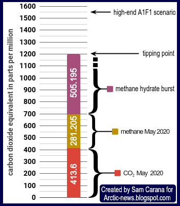
A second point indicating that anomalies could be too conservative is that a more recent study has found that crossing the clouds tipping point at 1200 ppm CO₂ could - on its own - push temperatures up by 8°C globally, in addition to the temperature rise caused by the extra CO₂ to reach the tipping point. The image below shows a trend based on 2019 through 2024 annual NOAA data that points at 1200 ppm CO₂ getting crossed in 2030.

Moreover, the clouds tipping point is actually at 1200 ppm CO₂e (carbon dioxide equivalent), so when taking into account the impact of growth of other greenhouse gases and further mechanisms, the tipping point could be crossed much earlier than in 2030. Below are discussed potential rises in methane (CH₄) and nitrous oxide (N₂O).
A third point indicating that the above anomalies could be too conservative is that emissions are increasing if not accelerating, while feedbacks are increasingly kicking in with greater ferocity and while there are additional mechanisms that are contributing to further acceleration of the temperature rise. In conclusion, a huge and accelerating temperature rise could occur soon.
Non-CO₂ warming
Less than half of the warming in the 10 years from 2010 to 2019 (unmasked, relative to 1850–1900) is caused by carbon dioxide, as illustrated by the image below, based on IPCC AR6 data. Masking (cooling) caused by specific gases and aerosols (such as sulfates) is not included in the image.

Non-CO₂ warming can be caused by many different gases and aerosols, as illustrated by the image. Warming caused by ground-level ozone, water vapor and loss of ice and lower clouds is included in the impact of the gases and aerosols mentioned on the image.
Importantly, the GWP of the non-CO₂ gases and aerosols can be very high over a short horizon, which means that rises in their concentrations can result in a huge and rapid temperature rise. Two of them, nethane and nitrous oxide, are discussed below in more detail.
Importantly, the GWP of the non-CO₂ gases and aerosols can be very high over a short horizon, which means that rises in their concentrations can result in a huge and rapid temperature rise. Two of them, nethane and nitrous oxide, are discussed below in more detail.
Methane
 |
| [ from earlier post, also note the recent discussion on monthly methane ] |
 |
| [ from earlier post ] |
Nitrous oxide
The image below shows globally averaged marine surface monthly mean nitrous oxide (N₂O) data through December 2024 (red circles), with a trend added that points at 1000 ppb getting crossed in 2031, tripling current levels.

While using different periods and types of trends can result in trends that don't show such a steep rise, the point is that such steep rises in concentrations of greenhouse gases could eventuate, based on recent data.
Large increases in N₂O emissions could occur and since N₂O is a potent greenhouse gas with a long lifetime, the impact would accumulate rapidly and the rise could follow a steep curve, the more so since N₂O emissions caused by people come mainly from applying nitrogen fertilizers and animal waste to farmland and pastures, and policy control over emissions from nitrogen fertilizers is largely absent or ineffective, while farmers are increasingly using nitrogen fertilizers in efforts to increase crop yield, especially where yields are falling due to rising temperatures and more extreme weather events. IPCC AR6 gives N₂O a global warming potential (GWP) of 273 over both 500 years and 100 years, and of 118 over 20 years, while its lifetime is 120 years.
Large increases in N₂O emissions could occur and since N₂O is a potent greenhouse gas with a long lifetime, the impact would accumulate rapidly and the rise could follow a steep curve, the more so since N₂O emissions caused by people come mainly from applying nitrogen fertilizers and animal waste to farmland and pastures, and policy control over emissions from nitrogen fertilizers is largely absent or ineffective, while farmers are increasingly using nitrogen fertilizers in efforts to increase crop yield, especially where yields are falling due to rising temperatures and more extreme weather events. IPCC AR6 gives N₂O a global warming potential (GWP) of 273 over both 500 years and 100 years, and of 118 over 20 years, while its lifetime is 120 years.

Additionally, the impact of nitrogen fertilizers appears to have been underestimated; a 2022 study concludes that when ammonia, nitric acid and sulfuric acid are present together, they contribute strongly to the formation of cirrus clouds. Cirrus clouds exert a net positive radiative forcing of about 5 W m⁻², according to IPCC AR6, as discussed in this 2022 post.
Furthermore, nitrogen fertilizers are typically produced with natural gas, thus further driving up concentrations of methane in the atmosphere. Also, a further huge increase in both methane and N₂O emissions could result from thawing permafrost, as discussed in earlier posts. The potential for further N₂O emissions from thawing permafrost is illustrated in the screenshot below.
 |
| [ from earlier post ] |
Finally, N₂O is currently the most significant ozone depleting substance (ODS) being emitted. The impact of N₂O as ODS has grown strongly over the years, relative to other ODS. Further loss of ozone in the stratosphere would cause more UV radiation to reach the surface and harm humans, animals and plants, in turn resulting in vegetation taking less CO₂ from the atmosphere and thus further driving up temperatures.
Highest temperatures on record for time of year
On April 25, 2025, the surface air temperature in the Northern Hemisphere was 16.31°C (or 61.36°F), the highest temperature on record for this day for the 6th day in a row, as illustrated by the image below.

On April 25, 2025, the global surface air temperature was 15.37°C (or 59.67°F), the highest temperature on record for this day, higher than the 15.29°C reached on April 25, 2024, and much higher than the 15.04°C reached on April 25, 2023. The temperature for April 25, 2025, was later upgraded to 15.38°C.

The image below shows ERA5 daily temperature anomalies from end 2022 through April 29, 2025, with two trends added, a black linear trend and a red cubic (non-linear) trend that reflects stronger feedbacks and that follows ENSO (El Niño/La Niña) conditions more closely. This red trend warns about further acceleration of the temperature rise.

The shading added in the above image reflects the presence of El Niño conditions that push up temperatures (pink shading), La Niña conditions that suppress temperatures (blue shading), or neutral conditions (gray shading). Meanwhile, NOAA has announced that La Niña conditions have ended, meaning that temperatures are no longer suppressed and the red trend warns about a rise of more than 1°C in the course of 2026.
Such short-term variables are smoothed out in the black linear trend which shows a steady but much slower rise of 0.5°C over about 3½ years (Jan 2023 - Sep 2026), and this rise is a much steeper rise than the 1.1°C rise over 81 years (from 1941 to 2022) of a linear trend in the image below, from an earlier image.


The image below shows the NCEP global temperature anomaly for February-March 2025 versus 1951-1980.


Feedbacks and further mechanisms

IPCC persists in downplaying the danger
Meanwhile, the IPCC persists in downplaying the potential for dangerous developments in efforts to hide the need for the most effective climate action. The IPCC keeps pointing at less effective policies such as support for BECCS and biofuel, while continuing to make it look as if there was a carbon budget to divide among polluters, as if polluters could continue to pollute for decades to come, as discussed in many earlier posts such as this one, this one and this one.
Climate Emergency Declaration
Such short-term variables are smoothed out in the black linear trend which shows a steady but much slower rise of 0.5°C over about 3½ years (Jan 2023 - Sep 2026), and this rise is a much steeper rise than the 1.1°C rise over 81 years (from 1941 to 2022) of a linear trend in the image below, from an earlier image.

Arctic hit most strongly
A fourth point indicating that the above anomalies could be conservative is that, as the images below show, very high anomalies are already now showing up over the Arctic Ocean. The Arctic is hit most strongly by the temperature rise, as illustrated by the image below showing the ERA5 global temperature anomaly for February-March 2025 versus 1951-1980.

The image below shows the ERA5 global temperature anomaly for March 2025 versus 1951-1980.


Temperature anomalies for February-March 2025 over the Arctic were as much as 20°C higher than 1951-1980, as illustrated by the image on the right.
The fact that these air temperature anomalies occurred at a time of year when little or no sunlight was yet reaching the Arctic indicates the strong contribution of ocean heat to these high air temperature anomalies.
The fact that these air temperature anomalies occurred at a time of year when little or no sunlight was yet reaching the Arctic indicates the strong contribution of ocean heat to these high air temperature anomalies.
Ocean heat is pushed along the path of the Gulf Stream all the way from the Gulf of Mexico to the Arctic Ocean, by an ocean current that is formed by prevailing wind patterns that move heat from the Equator in the direction of the North Pole, while the resulting ocean current is deflected by the Coriolis Effect caused by the rotation of the Earth around its axis.
 |
| [ Gulf Stream, click to enlarge ] |
A deformed Jet Stream can at times speed up this flow, causing huge amounts of Ocean heat to get abruptly pushed into the Arctic Ocean in the path of the Gulf Stream.
The image on the right shows sea surface temperatures as high as 32°C on April 25, 2025, with markedly higher sea surface temperatures than at similar latitudes appearing in the path of the Gulf Stream, resulting from the strong flow of ocean heat from the Gulf of Mexico in the direction of the Arctic Ocean.
The result is illustrated by the image below which shows high sea surface temperature anomalies for March 2025 compared to 1980-1997, with very high anomalies (higher than 3°C) showing up in areas of the Arctic Ocean where the sea ice has disappeared.

On the above map, a blue-colored area shows up over the North Atlantic south of Greenland, indicating relatively low temperatures. Similarly, a blue-colored area shows up over the North Atlantic on the map (image below) with ocean heat content trends, from Trenberth (2025).

The danger is that this cooler surface water is the result not only from meltwater (from melting glaciers and sea ice), but also from stronger evaporation in the North Atlantic and stronger precipitation further down the path of the Gulf Stream toward the Arctic Ocean. Both meltwater and precipitation are forms of freshwater with low salt content compared to the high salt content of the ocean water in the North Atlantic. Formation of a cold freshwater lid at the surface of the North Atlantic can reduce heat transfer from the ocean surface to the atmosphere, resulting in more ocean heat instead moving underneath this lid toward the Arctic Ocean, as discussed at this page.
The danger increases as temperature rise and cause more deformation of the Jet Stream, which can at times cause more heat to abruptly be moved into the Arctic Ocean, especially when combined with the occurrence of hurricanes.
Outlook is bleak
Conditions are dire. Temperatures and concentrations of greenhouse gases are high and rising fast and Arctic sea ice is retreating. The image below, by Eliot Jacobson, shows that Earth's albedo hit yet another record low recently, as a result of less incoming solar radiation reflected back into space. This is caused by a number of things, including loss of snow and ice, loss of lower clouds, and reductions of cooling aerosols such as previously emitted by shipping.

The image below, by Leon Simons, shows Earth's Energy Imbalance, i.e. the difference between Absorbed Solar Radiation and Outgoing Long-wave Radiation.

Furthermore, sunspots are at a high point in this cycle and a new El Niño may emerge soon. The image below shows NOAA's outlook.

The image below shows temperatures through April 20, 2025, in Niño 3.4, an area in the Pacific (inset) that is critical to the development of El Niño.

 |
| [ Arctic sea ice volume, click to enlarge ] |
These conditions threaten to further drive up temperatures, while further acceleration of the temperature rise threatens to occur due to strengthening feedbacks and further mechanisms, including sea ice loss causing eruptions of seafloor methane and changes in ocean currents and wind patterns.
High ocean temperatures are already causing Arctic sea ice volume to be very low compared to earlier years, as illustrated by the image on the right and as discussed in this earlier post.
The combination image below compares Arctic sea ice thickness on March 13, 2025, with thickness on April 26, 2025, when open water (dark blue) shows up in a number of places inside the area covered with sea ice, which is quite striking, given that Arctic sea ice volume typically reaches its annual maximum in April.

The temperature rise itself comes with many self-reinforcing feedbacks such as further loss of snow and ice and changes in wind patterns and ocean currents, as said, and this can cause rapid additional warming and thus extra water vapor, which also constitutes a self-reinforcing feedback, since water vapor is a potent greenhouse gas.
 |
| [ from the Extinction page ] |
The image on the right illustrates how much such conditions and mechanisms could each contribute to such a huge temperature rise.
Very fast mechanisms include panic. As more people start to realize how dire the situation is and as they seek to occupy the last few habitable areas left, more people may stop showing up for work, resulting in a rapid loss of the aerosol masking effect, as industries that now co-emit cooling aerosols (such as sulfates) come to a grinding halt (see reductions in cooling aerosols).
As it becomes harder to obtain food and fuel for cooking and heating, and as the grid shuts down due to conflicts and people no longer showing up for work, many people may start collecting and burning more wood, decimating the forests that are left and resulting in more emissions that further speed up the temperature rise.
As temperatures rise, huge fires could also break out in forests, peatlands, grassland and urban areas (including backyards, landfills and buildings, in particular warehouses containing flammable materials, chemicals and fluorinated gases), further contributing to more emissions that speed up the temperature rise.
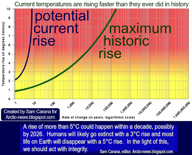
As the likeliness of further accelerating warming, the severity of its impact, and the ubiquity and the imminence with which it will strike all become more manifest—the more sobering it is to realize that a mere 3°C rise may suffice to cause human extinction.
Indeed, humans will likely go extinct with a 3°C rise and most life on Earth will disappear with a 5°C rise, as discussed in an earlier post and illustrated by the image below.
 |
| [ from earlier post ] |
Meanwhile, the IPCC persists in downplaying the potential for dangerous developments in efforts to hide the need for the most effective climate action. The IPCC keeps pointing at less effective policies such as support for BECCS and biofuel, while continuing to make it look as if there was a carbon budget to divide among polluters, as if polluters could continue to pollute for decades to come, as discussed in many earlier posts such as this one, this one and this one.
The situation is dire and the precautionary principle calls for rapid, comprehensive and effective action to reduce the damage and to improve the situation, as described in this 2022 post, where needed in combination with a Climate Emergency Declaration, as discussed at this group.

Links
• Copernicus
https://climate.copernicus.eu
• NOAA - ENSO: Recent Evolution, Current Status and Predictions - 14 April 2025
https://www.cpc.ncep.noaa.gov/products/analysis_monitoring/lanina/enso_evolution-status-fcsts-web.pdf
• Danish Meteorological Institute - Arctic sea ice volume and thickness
https://ocean.dmi.dk/arctic/icethickness/thk.uk.php
• Transforming Society
https://arctic-news.blogspot.com/2022/10/transforming-society.html
• Climate Plan
https://arctic-news.blogspot.com/p/climateplan.html
• Climate Emergency Declaration
https://arctic-news.blogspot.com/p/climate-emergency-declaration.html

Links
• NOAA - Global averaged marine surface annual mean carbon dioxide data
https://gml.noaa.gov/webdata/ccgg/trends/co2/co2_annmean_gl.txt
• NOAA - Annual Mean Global Carbon Dioxide Growth Rates
https://gml.noaa.gov/webdata/ccgg/trends/co2/co2_annmean_gl.txt
• NOAA - Annual Mean Global Carbon Dioxide Growth Rates
https://gml.noaa.gov/ccgg/trends/gl_gr.html
discussed on facebook at:
https://www.facebook.com/groups/arcticnews/posts/10162561012229679
• Climate Reanalyzer
https://climatereanalyzer.org
• The Scenario Model Intercomparison Project (ScenarioMIP) for CMIP6 - by Brian O'Neill et al. (2016)
https://gmd.copernicus.org/articles/9/3461/2016
• IPCC - warming in 2010–2019 relative to 1850–1900
https://www.ipcc.ch/report/ar6/wg1/figures/summary-for-policymakers/figure-spm-2
• NOAA - Nitrous oxide emissions grew 40 percent from 1980 to 2020, accelerating climate change
https://research.noaa.gov/nitrous-oxide-emissions-grew-40-percent-from-1980-to-2020-accelerating-climate-change
• N₂O is currently the most significant ozone-depleting substance being emitted
• N₂O is currently the most significant ozone-depleting substance being emitted
• Copernicus
https://climate.copernicus.eu
• NOAA - ENSO: Recent Evolution, Current Status and Predictions - 14 April 2025
https://www.cpc.ncep.noaa.gov/products/analysis_monitoring/lanina/enso_evolution-status-fcsts-web.pdf
• Danish Meteorological Institute - Arctic sea ice volume and thickness
https://ocean.dmi.dk/arctic/icethickness/thk.uk.php
• Transforming Society
https://arctic-news.blogspot.com/2022/10/transforming-society.html
• Climate Plan
https://arctic-news.blogspot.com/p/climateplan.html
• Climate Emergency Declaration
https://arctic-news.blogspot.com/p/climate-emergency-declaration.html