Arctic sea ice
A Blue Ocean Event could be declared when Arctic sea ice reaches or crosses a threshold of 1 million km² in extent. On April 24, 2026, Arctic sea ice extent was 13.21 million km², the lowest extent on record for the time of year and a deviation from 1981-2010 of -2.71σ, as illustrated by the image below.
A Blue Ocean Event could be declared when Arctic sea ice reaches or crosses a threshold of 1 million km² in extent. On April 24, 2026, Arctic sea ice extent was 13.21 million km², the lowest extent on record for the time of year and a deviation from 1981-2010 of -2.71σ, as illustrated by the image below.

The situation is very dangerous, because this low sea ice extent comes at a time when El Niño is developing and may become a very strong El Niño. Loss of sea ice extent is only one way to measure decline. Extent can include holes, gaps or cracks in the sea ice and melt ponds on top of the ice, all having a darker color than ice. By contrast, sea ice area is the total region covered by ice alone, making it a more critical measurement in regard to albedo and the capacity of sea ice to act as a buffer that consumes incoming ocean heat. Accordingly, the critical threshold for a Blue Ocean Event to occur can be said to be 1 million km² in area.
The image below shows Arctic sea ice area over the years, with 2012 highlighted in blue and 2026 highlighted in black. On September 12, 2012, Arctic sea ice area was 2.24 million km². On April 24, 2012, Arctic sea ice area was 12.82 million km². On April 24, 2026, Arctic sea ice area was 11.50 million km², a record low for the time of year and 1.32 million km² lower than it was on April 24, 2012. A Blue Ocean Event may occur in September 2026, if Arctic sea ice area would then be at least 1.24 million km² lower than it was in 2012.

Yet another way to measure Arctic sea ice decline is volume, and yes, Arctic sea ice volume was also the lowest on record for the time of year on April 24, 2026, as it has been for a long time. The image below, adapted from the Danish Meteorological Institute, shows Arctic sea ice volume at a record low for the time of year on April 29, 2026.


At the end of April 2025, Arctic sea ice maximum volume was about 19,000 km³, as highlighted by the image on the right, and the 2026 maximum appears to be even lower, about 18,000 km³.
That 18,000 km³ is an important number. The image below shows Arctic sea ice volume through April 18, 2026, with the strength of the melting between April (annual maximum, blue) and September (annual minimum, red) indicated by bars colored magenta (strong melting, 18,000 km³) and green (little melting, 15,000 km³).

A record low maximum volume was reached in April 2025. Relatively little melting took place from April 2025 to September 2025, yet a record low minimum volume was reached in September 2025. The April 2026 maximum looks set to be even lower, i.e. about 18,000 km³.
In the above image, the difference between strong melting (magenta) and little melting (green) is 3000 km³. With strong melting taking place from April 2026, this may well cause a Blue Ocean Event to occur, with virtually all Arctic sea disappearing in September 2026.
In the above image, the difference between strong melting (magenta) and little melting (green) is 3000 km³. With strong melting taking place from April 2026, this may well cause a Blue Ocean Event to occur, with virtually all Arctic sea disappearing in September 2026.

The above combination image, adapted from images by the University of Bremen, illustrates two further ways to measure sea ice decline. The panel on the left shows Arctic sea ice thickness on April 24, 2026. The panel on the right shows Arctic sea ice concentration on April 24, 2026.
Methane threat
The image below, from an earlier post, illustrates the threat of thinning of Arctic sea ice resulting in increased ocean heat and methane eruptions. Arctic sea ice decline could strongly contribute to the temperature rise, as illustrated by the image below and also discussed in this earlier post.
 |
| [ The Buffer is gone ] |

The image below, adapted from the same study, shows that the majority of samples analyzed of Laptev Sea methane releases contains subsea permafrost-associated methane (SPAM) from the upper subsea permafrost layer, as opposed to methane from thermogenic and microbial gas (FOPRIM and FOTSEM) from deeper sedimentary basins.

Temperature
The world (60°S–60°N, 0–360°E) sea surface temperature (SST) was at a record high for the time of year on April 19, 2026, as illustrated by the image below.

Recently, the 2026 SST was just short of the record high SST of 21.17°C reached in 2024. The 2026 SST has risen strongly and keeps rising, even as the average anomaly for earlier years is coming down due to the change of seasons that is causing SST to come down in the Southern Hemisphere where most of the world oceans are located.
The image below, adapted from NOAA, shows a forecast for August 2026 of sea surface temperature anomalies.

In the Southern Hemisphere, the surface air temperature remains at a record high for the time of year, as illustrated by the image below that shows SH temperatures through April 14, 2026.

What makes the situation particularly dangerous is that an El Niño is on the way that may be very strong. With high SST in the Southern Ocean in December 2026, Antarctic sea ice will undergo very strong melting, threatening an Antarctic Blue Ocean Event to occur early 2027.
Antarctic sea ice
Could an Antarctic Blue Ocean Event occur in early 2027? As illustrated by the image below, Antarctic sea ice area was only 1.09 million km² on February 22, 2023, very close to the 1 million km² threshold when a Blue Ocean Event could be called.

 |
| [ Saltier water, less sea ice - from earlier post ] |
What caused the 2023 Antarctic sea ice decline? Until 2015, rising temperatures resulted in melting of ice and enhanced precipitation that freshened the surface of the Southern Ocean, exacerbated by increasing stratification that prevented mixing. The temperature rise over the years also caused winds to be stronger, at the time causing the sea ice to spread out wider.
The higher the water's salt content, the lower its melting point. Seawater typically has a salinity of about 3.5% (35 grams of salt per liter of water). Sea ice starts melting when the temperature rises to about -2°C (28.4°F). By contrast, freshwater remains frozen as long as the temperature remains below 0°C (32°F).
A recent study led by Theo Spira finds that, in 2015, anomalously strong winds enhanced mixing across the thin Winter Water layer, entraining warm and salty subsurface waters, which broke down upper-ocean stratification. Another recent study led by Earle Wilson find that in 2015, intensified wind-driven upwelling reversed the freshening trends, releasing years of accumulated ocean heat that contributed to unprecedented sea ice loss.
A recent study led by Theo Spira finds that, in 2015, anomalously strong winds enhanced mixing across the thin Winter Water layer, entraining warm and salty subsurface waters, which broke down upper-ocean stratification. Another recent study led by Earle Wilson find that in 2015, intensified wind-driven upwelling reversed the freshening trends, releasing years of accumulated ocean heat that contributed to unprecedented sea ice loss.
An earlier post discusses a study led by Alessandro Silvano that finds how, around 2015, surface salinity in the Southern Ocean began rising sharply – just as sea ice extent started to crash. The post describes that higher temperatures come with feedbacks such as stronger wind and stronger evaporation, resulting in increased water vapor in the atmosphere. Much of the water vapor will return to the surface in the form of precipitation such as rain and snow, but part of this precipitation will fall over Antarctica, with the net result of an increase in salinity of surface of the Southern Ocean. The post also points at the danger that heat, previously stored in the deep ocean by sinking circumpolar waters, will instead remain at the surface and cause atmospheric temperatures to rise.
A recent study warns that Antarctic regions (60°S − 90°S) may warm by around 6°C due to the collapse of the Atlantic meridional overturning circulation (AMOC).
A recent study warns that Antarctic regions (60°S − 90°S) may warm by around 6°C due to the collapse of the Atlantic meridional overturning circulation (AMOC).
El Niño
An earlier post describes how the upcoming El Niño could cause dramatic loss of Arctic sea ice and further emissions that could jointly increase global temperatures and contribute to an Antarctic sea ice decline even stronger than in 2023.
The image below shows an April 1, 2026, ECMWF forecast for the Niño3.4 region on the right, with a map of the El Niño regions on the left.

The upcoming El Niño is likely to peak at the end of 2026, as illustrated by the image below. El Niño is named after the Spanish phrase "El Niño de Navidad," meaning "the Christ Child" or "the little boy," as South American fishermen in the 1800s noticed that the unusually warm ocean waters—which reduced their fish catch—tended to peak around Christmas time.

The above image, adapted from NOAA, shows a forecast issued April 28, 2026, for the Niño3.4 region (which is indicative for El Niño development), with forecasts going partly off the scale for some forecast members, while part of the forecast for the Coupled Forecast System version 2 (CFS.v2) ensemble mean (black dashed line) exceeds 3°C. The image below shows forecasts for the Niño3 region issued April 29, 2026.

Forecasts of anomalies in sea surface temperature anomalies in El Niño regions reaching or exceeding 3°C indicate that the 2026 El Niño will be even stronger than the 2015-16 El Niño, as illustrated by the image below, adapted from NOAA and with a potential 2026-27 El Niño anomaly of 3°C added in red. Note that the image below uses the relative Oceanic Nino Index (RONI), whereas the above forecasts use the Oceanic Nino Indec (ONI) that can show slightly higher anomalies.


The combination image below shows sea surface temperature anomalies in the Niño 1+2 region (located closer to South America) with a rise of more than 3°C (from less than -1.5°C to above +1.5°C) occurring over the past four months through April 23, 2026.

For more on forecasts of the strengthening of the upcoming El Niño, see this earlier post.
Conclusion
In conclusion, an Arctic Blue Ocean Event could occur in September 2026, followed by an Antarctic Blue Ocean Event in early 2027.
Climate Emergency Declaration
The feedbacks map below is adapted from an image by Peter Carter, Climate Emergency Institute.
 |
| [ click on images to enlarge ] |
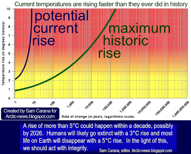
The situation is dire and unacceptably dangerous, and the precautionary principle necessitates rapid, comprehensive and effective action to reduce the damage and to improve the outlook, where needed in combination with a Climate Emergency Declaration, as described in posts such as in this 2022 post and this 2025 post, and as discussed in the Climate Plan group.

Links
• Danish Meteorological Institute - Arctic sea ice volume and thickness
https://ocean.dmi.dk/arctic/icethickness/thk.uk.php
https://ocean.dmi.dk/arctic/icethickness/thk.uk.php
• Kevin Pluck - Sea ice visuals
https://seaice.visuals.earth
• University of Bremen - sea ice
https://seaice.uni-bremen.de/start
• Triple-isotopic analyses pinpoint microbial methane release from subsea permafrost in the inner Laptev Sea - by Marenka Brussee et al.
https://www.nature.com/articles/s43247-026-03222-7
discussed on facebook at:
https://www.facebook.com/groups/arcticnews/posts/10164176083474679
• Climate Reanalyzer
https://climatereanalyzer.org
• Tropicaltidbits.com
https://www.tropicaltidbits.com
• Wind-triggered Antarctic sea-ice decline preconditioned by thinning Winter - by Theo Spira et al. Water https://www.nature.com/articles/s41558-026-02601-4
discussed on facebook at:
https://www.facebook.com/groups/arcticnews/posts/10164023607639679
• Recent extremes in Antarctic sea ice extent modulated by ocean heat ventilation - by Earle Wilson et al. https://www.pnas.org/doi/10.1073/pnas.2530832123
discussed on facebook at:
https://www.facebook.com/groups/arcticnews/posts/10164149040674679
• Collapse of the Atlantic meridional overturning circulation would lead to substantial oceanic carbon release and additional global warming - by Da Nian et al. (2026)
https://www.nature.com/articles/s43247-026-03427-w
discussed on Facebook at:
discussed on Facebook at:
https://www.facebook.com/groups/arcticnews/posts/10164168209144679
• ECMWF El Nino forecasts
https://charts.ecmwf.int/products/seasonal_system5_nino_plumes?base_time=202604010000&nino_area=NINO3-4
• NOAA - Seasonal climate forecast from CFSv2
• ECMWF El Nino forecasts
https://charts.ecmwf.int/products/seasonal_system5_nino_plumes?base_time=202604010000&nino_area=NINO3-4
• NOAA - Seasonal climate forecast from CFSv2
https://www.cpc.ncep.noaa.gov/products/CFSv2/CFSv2_body.html
• NOAA - ENSO: Recent Evolution, Current Status and Predictions - Update issued April 27, 2026
https://www.cpc.ncep.noaa.gov/products/analysis_monitoring/lanina/enso_evolution-status-fcsts-web.pdf
• Copernicus - Nino 3.4 Sea Surface Temperature time series from Reanalysis
https://data.marine.copernicus.eu/product/GLOBAL_OMI_CLIMVAR_enso_sst_area_averaged_anomalies/description
• Peter Carter - Climate Emergency Institute
https://www.climateemergencyinstitute.com
• Transforming Society
https://arctic-news.blogspot.com/2022/10/transforming-society.html
https://arctic-news.blogspot.com/2022/10/transforming-society.html
• Climate Plan
https://arctic-news.blogspot.com/p/climateplan.html
https://arctic-news.blogspot.com/p/climateplan.html
• Climate Emergency Declaration
https://arctic-news.blogspot.com/p/climate-emergency-declaration.html
https://arctic-news.blogspot.com/p/climate-emergency-declaration.html


.png)