The image below is the same, but the anomaly is more closely specified (12 colors instead of 11), adding a pink color for anomalies higher than 6°C, by Makiko Sato. This highlights the very high anomalies that occurred over the Arctic Ocean during La Niña conditions, i.e. despite suppression of the temperature.
The image below shows NASA data for March 2025. The monthly temperature anomaly has now been more than 1.5°C higher than the 1903-1924 custom base (not pre-industrial) for 21 consecutive months (July 2023 through March 2025). Anomalies are rising rapidly, the red line (2-year Lowess Smoothing trend) points at 2°C rise by the end of 2026.
On April 10, 2025, the global surface air temperature was 14.86°C (or 58.75°F), the highest temperature on record for this day. The image below shows ERA5 daily temperature anomalies from end 2022 through April 10, 2025, with two trends added, a black linear trend and a red cubic (non-linear) trend that reflects stronger feedbacks and that follows ENSO (El Niño/La Niña) conditions more closely. This red trend warns about further acceleration of the temperature rise.
The shading added in the above image reflects the presence of El Niño conditions that push up temperatures (pink shading), La Niña conditions that suppress temperatures (blue shading), or neutral conditions (gray shading). Meanwhile, NOAA has announced that La Niña conditions have ended, meaning that temperatures are no longer suppressed.
Such short-term variables are smoothed out in the black linear trend that shows a steady rise of 0.5°C over 3½ years (from 2023 to half 2026), a much steeper rise than the 1.1°C rise over 81 years (from 1941 to 2022) of a linear trend in an earlier image.
The image below shows NOAA's forecast outlook issued April 7, 2025, with rising El Niño probabilities.
[ Arctic sea ice volume, click to enlarge ]
A new El Niño may emerge soon and the red trend warns that the temperature rise could accelerate further, crossing 2°C from 1991-2020 in the course of 2026. Such acceleration could occur not only due to El Niño but also due to feedbacks and further mechanisms such as loss of sea ice.
High ocean temperatures result in low Arctic sea ice volume, as illustrated by the image on the right and as discussed in this earlier post.
As the likeliness of a huge and accelerating temperature rise, the severity of its impact, and the ubiquity and the imminence with which it will strike all become more manifest—the more sobering it is to realize that a mere 3°C rise may suffice to cause human extinction.
The situation is dire and the precautionary principle calls for rapid, comprehensive and effective action to reduce the damage and to improve the situation, as described in this 2022 post, where needed in combination with a Climate Emergency Declaration, as discussed at this group.
The Northern Hemisphere temperature was 12.86°C on March 19, 2025, a record daily high and 1.65°C higher than 1979-2000.
Very high temperature anomalies are forecast over the Arctic Ocean for November 2025.
[ Nov 2025 temperature anomaly forecast ]
The image on the right shows the same forecast of temperature anomalies for November 2025, in this case with a Northern Hemisphere projection. Very high anomalies are visible over the Arctic Ocean, showing anomalies of 13°C, i.e. at the end of the scale, so anomalies may be even higher over some parts of the Arctic Ocean.
What makes such high temperatures possible is a combination of conditions and mechanisms as described below. Some conditions have been building up for a long time, whereas some mechanisms can contribute to a very rapid acceleration of the temperature rise.
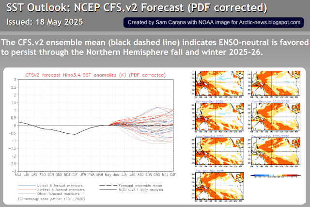
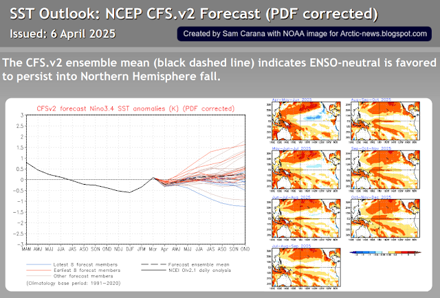
1. ENSO - a new El Niño could emerge in 2026. The image below shows NOAA's forecast outlook issued March 30, 2025, with rising El Niño probabilities.
2. Sunspots - have long been far higher than predicted, while expected to reach their peak in the current cycle in July 2025. NOAA has meanwhile added new predictions based on a nonlinear curve fit to the observed monthly values for the sunspot number and F10.7 Radio Flux, updated every month as more observations become available.
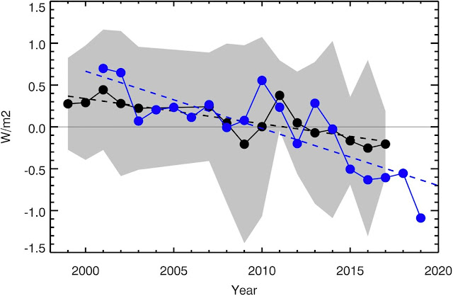
3. Earth's Energy Imbalance - very high and rising, as illustrated by the image below by Leon Simons.
4. Greenhouse gases
High concentrations of greenhouse gases and other gases such as carbon monoxide result in high temperatures. The daily average carbon dioxide (CO₂) at Mauna Loa, Hawaii, was 430.60 parts per million (ppm) on March 7, 2025, the highest daily average on record. To find CO₂ levels this high back in history, one needs to go back millions of years, as illustrated by the image below, from an earlier post.
What makes current conditions even more dire is that not only are concentrations of CO₂ very high, but the speed at which CO₂ is rising is also unprecedented, while additionally there has been an increase in total solar irradiance of ∼400 Wm⁻² since the formation of the Earth.
Between 14 and 15 million years ago, the temperature in central Europe was 20°C higher than today, as illustrated by the image below (adapted from a 2020 study by Methner et al.).
Given today's very high CO₂ levels, why is the temperature in central Europe not 20°C higher today? It can take long for oceans to heat up due to their mass, while ice also acts as a buffer, consuming heat in the process of melting and ice can also reflect a lot of sunlight back into space, as long as there is ice present.
A trend, based on 2015-2024 annual data, points at 1200 ppm CO₂ getting crossed in the year 2032, as illustrated by the image below.
The above trend illustrates that the clouds tipping point could get crossed in early 2032 due to rising CO₂ alone, which on its own could push temperatures up by an additional 8°C. The clouds tipping point is actually at 1200 ppm CO₂e, so when taking onto account growth of other greenhouse gases and further mechanisms, the tipping point could be crossed much earlier than in 2033.
Methane in the atmosphere could be doubled soon if a trend unfolds as depicted in the image below. A rapid rise is highlighted in the inset and reflected in the trend.
The trend points at a doubling of methane by March 2026. If the trend would continue, methane concentrations in the atmosphere would by September 2026 increase to more than triple the most recent value, and would increase to more than fourfold the October 2024 value by the end of 2026.
A rise like the one depicted in the trend could eventuate as rising ocean heat destabilizes methane hydrates contained in sediments at the seafloor of the Arctic Ocean. The temperature rise in the Arctic would accelerate since the methane would have a huge immediate impact on temperatures over the Arctic and cause depletion of hydroxyl, of which there is very little in the atmosphere over the Arctic in the first place. Such a rise in methane would also cause dramatic increases in tropospheric ozone and in stratospheric water vapor. A large increase in methane over the Arctic would also trigger massive forest fires and tundra fires, devastating terrestrial permafrost and resulting in huge amounts of further emissions.
5. Sea surface temperatures
While it can take long for oceans to heat up due to their mass, sea surface temperatures can rise rapidly and what makes the situation worse is that as temperatures rise, stratification increases.
Slowing down of the Atlantic meridional overturning circulation (AMOC) results in a huge amount of ocean heat accumulating in the North Atlantic. Much of the heat in the North Atlantic could soon be pushed abruptly into the Arctic Ocean, as storms can temporarily speed up currents strongly, carrying huge amounts of ocean heat with them into the Arctic Ocean.
The mechanism behind this has been described often in earlier posts and this page. Meanwhile, sea surface temperatures remain very high. The red trend on the image below points at a huge rise by 2026.
6. Less lower clouds - as temperatures rise, there is a decrease in lower clouds that have previously reflected a lot of sunlight back into space. A 2021 study finds that warming oceans cause fewer bright clouds to reflect sunlight into space, admitting even more energy into Earth's climate system.
Reductions in sulfates and other cooling aerosols also result in albedo loss. Similarly, terpines from healthy trees can cause a lot of sunlight to be reflected back into space. Droughts, fires and deforestation can cause decreases in terpines. A recent study led by Annele Virtanen concludes that the indirect cooling effect of aerosols is at the higher end of the uncertainty range of IPCC AR6 and of satellite-derived forcing estimates.
8. More heating aerosols
Heating aerosols such as soot are caused by road traffic, burning biomass for energy, burning wood for heat and forests fires. Such aerosols cause heat to remain in the atmosphere, while they also speed up the decline of sea ice and glaciers through albedo loss and growth of algae.
9. Less sea ice and glaciers
Sea ice and glaciers have been in decline for many years and the decline may soon reach tipping points.
Arctic sea ice extent was 14.35 million km² on March 28, 2025, a record daily low for the time of year and 1.17 million km² lower than the extent in 2012 on this date. The comparison with extent in 2012 is important since Arctic sea ice extent was 3.18 million km² on September 16, 2012, an all-time low in this record dating back to 1981. A tipping point could be reached when sea ice falls below a critical threshold.
[ Arctic-sea-ice extent, click on images to enlarge ]
A Blue Ocean Event could be declared when Arctic sea ice reaches or crosses a threshold of 1 million km² in extent. However, extent can include holes, gaps or cracks in the sea ice and melt ponds on top of the ice, all having a darker color than ice. By contrast, sea ice area is the total region covered by ice alone, making it a more critical measurement in regard to albedo than extent. Accordingly, the threshold for a Blue Ocean Event can be 1 million km² in area.
Arctic sea ice area typically reaches its annual minimum about half September. Arctic sea ice area was only 2.24 million km² on September 12, 2012, i.e. 1.24 million km² away from a Blue Ocean Event. On March 19, 2025, Arctic sea ice area was 1.34 million km² lower than on March 19, 2012, as also discussed in an earlier post. Therefore, would there be such a difference about half September 2025, a Blue Ocean Event could be declared.
The above image illustrates this, with the black dashed line indicating the threshold for a Blue Ocean Event and the red dotted line indicating Arctic sea ice area 1.34 million km² below what it was in 2012 for the respective date.
Loss of albedo can occur due to retreat of sea ice, due to developments of cracks and holes in the sea ice, and due to discoloring of sea ice, which includes soot settling on the sea ice, growth of algae and ponding water on ice due to melting, as discussed in a recent study led by Philip Dreike.
Loss of albedo can also occur due to loss of lower clouds and due to reduction in cooling aerosols (mechanism 3). Thawing of terrestrial permafrost is a further self-reinforcing feedback mechanisms that can cause more albedo loss as well as more emissions of carbon dioxide, methane and nitrous oxide, thus further accelerating the temperature rise in the Arctic.
10. Latent heat buffer loss - as sea ice, permafrost and glaciers disappear.
Arctic sea ice decline comes not only with loss of albedo, but also with loss of the latent heat buffer that previously consumed a lot of heat entering the Arctic Ocean from the Atlantic Ocean and the Pacific Ocean. This mechanism constitutes a critical tipping point.
[ Arctic sea ice volume, click to enlarge ]
Loss of Arctic sea ice volume is illustrated by the image on the right, indicating that Arctic sea ice has become much thinner over the years.
Sea ice acts as a Buffer that previously consumed much incoming ocean heat. As temperatures rise, sea ice thins and the Buffer disappears.
The disappearance of the Buffer occurs at the same time as increasingly larger amounts of ocean heat are entering the Arctic Ocean from the North Atlantic Ocean and the Pacific Ocean.
Consequently, the temperature of the water of the Arctic Ocean threatens to increase dramatically.
[ Arctic sea ice volume, click to enlarge ]
The image on the right illustrates the decline of Arctic sea ice volume over the years.
More heat in turn threatens to reach sediments at the seafloor of the Arctic Ocean and destabilize hydrates contained in the these sediments, resulting in eruptions of huge amounts of methane from hydrates as well as from methane stored in the form of free gas underneath these hydrates.
The image below illustrates these mechanisms and their interaction and amplification, i.e. the thinning of Arctic sea ice, the increase in ocean heat and the threat of methane eruptions.
[ The Buffer is gone ]
Further mechanisms
There are many further mechanisms that jointly can rapidly speed up the temperature rise. Many of these mechanisms are self-reinforcing feedbacks that can interact and amplify each other, such as the formation of a freshwater lid at the surface of the North Atlantic, as also illustrated by the images above and below.
[ formation of a freshwater lid at the surface of the North Atlantic ]
Global warming is causing more extreme weather events all around the world, and as temperatures keep rising, these events look set to become more extreme, i.e. hitting larger areas for longer, with higher frequency, more ubiquity and greater intensity.
For more on mechanisms behind a steep rise in temperature, also see this earlier post.
Warnings ignored
A 2013 post issued a runaway global warming warning, i.e. that a 2°C global temperature rise could eventuate by 2024 and that a 10°C global temperature rise could eventuate by 2040. A post later in 2013 warned that the global temperature rise could continue beyond 20°C, with the added comment that it is in many respects irrelevant whether a temperature rise of 20°C will be reached in 2049, 2050 or 2051; the point is, as Sam Carana said in 2013, that we're facing a global temperature rise of potentially more than 20°C and that such a temperature rise would devastate Earth and drive most species (including human beings) to extinction well before such a temperature rise is reached.
A 2015 post shows an update of the 10°C global temperature rise image, as well as an image with estimates of the climate-related deaths that could occur would such a rise eventuate, while a post later in 2015 shows an update of the warning of a 20°C global temperature rise combined with the accumulated climate-related deaths in a single image (copy below).
Sadly, politicians have long ignored warnings that a steep rise in temperature could occur and that this would result in a horrific number of associated deaths. In some respects, warnings were confusing and too conservative, e.g. the above image may have given the wrong impression that the temperature rise would be gradual and that we had until the year 2054 to get into action, whereas over the years indications have become ever stronger that a huge rise could take place within a few years, even within one year, as discussed below.
A warning was issued in 2016 that the temperature could rise by more than 10°C by 2026. The 2016 analysis is recreated below. The most recent NASA data gives the February 2016 temperature an anomaly of 1.35°C above 1951-1980. A number of non-linear trends can be calculated based on the anomalies, including one trend based on 2000-2016 data pointing at 10°C getting crossed by 2026 and another trend based on 1880-2016 data pointing at 1.5°C getting crossed in 2030, as shown by the chart and the details below.
Three further trends can be calculated, based on different periods, two of them pointing at a rise of 10°C by 2017 and one trend pointing at a rise of 10°C by 2016, thus indicating that such a steep rise could happen very fast.
The clouds tipping point is mentioned above. A 2019 study concludes that crossing a tipping point of 1200 ppm CO₂e could cause the disappearance of marine stratus clouds, resulting in a global temperature rise of 8°C, which would come on top of the rise associated with greenhouse gases reaching 1200 ppm CO₂e.
The image on the right illustrates how much conditions and mechanisms could each contribute to such a huge temperature rise.
Very fast mechanisms include panic. As more people start to realize how dire the situation is and as they seek to occupy the last few habitable areas left, more people may stop showing up for work, resulting in a rapid loss of the aerosol masking effect, as industries that now co-emit cooling aerosols (such as sulfates) come to a grinding halt (mechanism 7 above).
As it becomes harder to obtain food and fuel for cooking and heating, and as the grid shuts down due to conflicts and people no longer showing up for work, many people may start collecting and burning more wood, decimating the forests that are left and resulting in more emissions that further speed up the temperature rise.
As temperatures rise, huge fires could also break out in forests, peatlands, grassland and urban areas (including backyards, landfills and buildings, in particular warehouses containing flammable materials, chemicals and fluorinated gases), further contributing to more emissions that speed up the temperature rise.
As the likeliness of a huge and accelerating temperature rise, the severity of its impact, and the ubiquity and the imminence with which it will strike all become more manifest—the more sobering it is to realize that a mere 3°C rise may suffice to cause human extinction. Indeed, humans will likely go extinct with a 3°C rise and most life on Earth will disappear with a 5°C rise, as discussed in an earlier post and illustrated by the image below.
According to a recent study lead by Richard Meade,many regions may soon experience heat and humidity levels that exceed the safe limits for human survival. "Our research provided important data supporting recent suggestions that the conditions under which humans can effectively regulate their body temperature are actually much lower than earlier models suggested," states co-author Glen Kenny.
Climate Emergency Declaration
The situation is dire and the precautionary principle calls for rapid, comprehensive and effective action to reduce the damage and to improve the situation, as described in this 2022 post, where needed in combination with a Climate Emergency Declaration, as discussed at this group.
• Broadband radiometric measurements from GPS satellites reveal summertime Arctic Ocean Albedo decreases more rapidly than sea ice recedes - by Philip Dreike et al. https://www.nature.com/articles/s41598-023-39877-x
NASA data show that 2020 was the hottest year on record.
The image below shows that high temperature in 2020 hit Siberia and the Arctic Ocean.
In above images, the temperature anomaly is compared to 1951-1980, NASA's default baseline. When using an earlier baseline, the data need to be adjusted. The image below shows a trendline pointing at an 0.31°C adjustment for a 1900 baseline.
Additional adjustment is needed when using a 1750 baseline, while it also makes sense to add further adjustment for higher polar anomalies and for air temperatures over oceans, rather than sea surface water temperatures. In total, a 0.78°C adjustment seems appropriate, as has been applied before, such as in this analysis. For the year 2020, this translates in a temperature rise of 1.8029°C versus the year 1750.
Three trends: blue, purple and red
Will the global temperature rise to 3°C above 1750 by 2026? The blue trend below is based on 1880-2020 NASA Land+Ocean data and adjusted by 0.78°C to reflect a 1750 baseline, ocean air temperatures and higher polar anomalies, and it crosses a 3°C rise in 2026.
The trend shows a temperature for 2020 that is slightly higher than indicated by the data. This is in line with the fact that we're currently in a La Niña period and that we're also at a low point in the sunspot cycle, as discussed in an earlier post. The blue trend also shows that the 1.5°C treshold was already crossed even before the Paris Agreement was accepted.
The second (purple) trend is based on a shorter period, i.e. 2006-2020 NASA land+ocean (LOTI) data, again adjusted by 0.78°C to reflect a 1750 baseline, ocean air temperatures and higher polar anomalies. The trend approaches 10°C above 1750 by 2026. The trend is based on 15 years of data, making it span a 30-year period centered around end 2020 when extended into the future for a similar 15 year period. The trend approaches 10°C above 1750 in 2026.
The trend is displayed on the backdrop of an image from an earlier post, showing how a 10°C rise could eventuate by 2026 when adding up the impact of warming elements and their interaction.
The stacked bars are somewhat higher than the trend. Keep in mind that the stacked bars are for the month February, when anomalies can be significantly higher than the annual average.
Temperature rise for February 2016 versus 1900.
In the NASA image on the right, the February 2016 temperature was 1.70°C above 1900 (i.e. 1885-1914). In the stacked-bar analysis, the February 2016 rise from 1900 was conservately given a value of 1.62°C, which was extended into the future, while an additional 0.3°C was added for temperature rise from pre-industrial to 1900.
Later analyses such as this one also added a further 0.2°C to the temperature rise, to reflect ocean air temperatures (rather than water temperatures) and higher polar anomalies (note the grey areas on the image in the right).
Anyway, the image shows two types of analysis on top of each other, one analysis based on trend analysis and another analysis based on a model using high values for the various warming elements. The stacked-bar analysis actually doesn't reflect the worst-case scenario, an even faster rise is illustrated by the next trend, the red line.
The third (red) trend suggests that we may have crossed the 2°C treshold in the year 2020. The trend is based on a recent period (2009-2020) of the NASA land+ocean data, again adjusted by 0.78°C to reflect a 1750 baseline, ocean air temperatures and higher polar anomalies.
Where do we go from here?
It's important to acknowledge the danger of acceleration of the temperature rise over the next few years. The threat is illustrated by the image below and shows up most prominently in the red trend.
Of the three trends, the red trend is based on the shortest period, and it does indicate that we have aready crossed the 2°C treshold and we could be facing an even steeper temperature rise over the next few years.
We're in a La Niña period and we're also at a low point in the sunspot cycle. This suppresses the temperature somewhat, so the 2020 temperature should actually be adjusted upward to compensate for such variables. Importantly, while such variables do show up more when basing trends on shorter periods, the data have not be adjusted for this in this case, so the situation could actually be even worse.
At a 3°C rise, humans will likely go extinct, while most life on Earth will disappear with a 5°C rise, and as the temperature keeps rising, oceans will evaporate and Earth will go the same way as Venus, a 2019 analysis warned.
Dangerous acceleration of the temperature rise
There are many potential causes behind the acceleration of the temperature rise, such as the fact that the strongest impact of carbon dioxide is felt ten years after emission, so we are yet to experience the full wrath of the carbon dioxide emitted over the past decade. However, this doesn't explain why 2020 turned out to be the hottest year on record, as opposed to - say - 2019, given that in 2020 carbon dioxide emissions were 7% lower than in 2019.
James Hansen confirms that the temperature rise is accelerating, and he points at aerosols as the cause. However, most cooling aerosols come from industries such as smelters and coal-fired power plants that have hardly reduced their operations in 2020, as illustrated by the image below, from the aerosols page.
Above image shows that on December 17, 2020, at 10:00 UTC, sulfate aerosols (SO₄) were as high as 6.396 τ at the green circle. Wind on the image is measured at 850 hPa.
Could the land sink be decreasing? A recent study shows that the mean temperature of the warmest quarter (3-month period) passed the thermal maximum for photosynthesis during the past decade. At higher temperatures, respiration rates continue to rise in contrast to sharply declining rates of photosynthesis. Under business-as-usual emissions, this divergence elicits a near halving of the land sink strength by as early as 2040. While this is a frightening prospect, it still doesn't explain why 2020 turned out to be the hottest year on record.
Oceans are taking up less heat, thus leaving more heat in the atmosphere. The danger is illustrated by the image below.
The white band around -60° (South) indicates that the Southern Ocean has not yet caught up with global warming, featuring low-level clouds that reflect sunlight back into space. Over time, the low clouds will decrease, which will allow more sunlight to be absorbed by Earth and give the world additional warming. A recent study finds that, after this 'pattern effect' is accounted for, committed global warming at present-day forcing rises by 0.7°C. While this is very worrying, it still doesn't explain why 2020 turned out to be the hottest year on record.
Ocean stratification contributes to further surface warming, concludes another recent study:
"The stronger ocean warming within upper layers versus deep water has caused an increase of ocean stratification in the past half century. With increased stratification, heat from climate warming less effectively penetrates into the deep ocean, which contributes to further surface warming. It also reduces the capability of the ocean to store carbon, exacerbating global surface warming. Furthermore, climate warming prevents the vertical exchanges of nutrients and oxygen, thus impacting the food supply of whole marine ecosystems."
"By uptaking ~90% of anthropogenic heat and ~30% of the carbon emissions, the ocean buffers global warming. [The] ocean has already absorbed an immense amount of heat, and will continue to absorb excess energy in the Earth’s system until atmospheric carbon levels are significantly lowered. In other words, the excess heat already in the ocean, and heat likely to enter the ocean in the coming years, will continue to affect weather patterns, sea level, and ocean biota for some time, even under zero carbon emission conditions."
Many feedbacks are starting to kick in with greater ferocity, with tipping points threatening to get crossed or already crossed, such as the latent heat tipping point, i.e. loss of the ocean heat buffer, as Arctic sea ice keeps getting thinner. As the above map also shows, the temperature rise is hitting the Arctic Ocean particularly hard. At least ten tipping points are affecting the Arctic, including the latent heat tipping point and the methane hydrates tipping point, as illustrated by the image below.
A combination of higher temperatures and the resulting feedbacks such as stronger ocean stratification, stronger wind, decline of Arctic snow and ice and a distorted Jet Stream is threatening to cause formation of a lid at the surface of the North Atlantic Ocean that enables more heat to move to the Arctic Ocean. This could cause huge amounts of methane to erupt from the seafloor, thus contributing to cause the 1,200 ppm CO₂e cloud tipping point to get crossed, resulting in an extra 8°C rise, as an earlier post and a recent post warned.
Dangerous acceleration of the temperature rise
The danger is that methane is erupting in the Arctic from the seafloor and that this increasingly contributes to methane reaching the stratosphere.
While methane initially is very potent in heating up the atmosphere, it is generally broken down relatively quickly, but in the atmosphere over the Arctic, there is very little hydroxyl to break down the methane.
Methane also persists much longer in the stratosphere, which contributes to its accumulation there.
Large amounts of methane may already be erupting from the seafloor of the Arctic Ocean, rising rapidly and even reaching the stratosphere.
This danger is getting little public attention. The NOAA image on the right shows the globally-averaged, monthly mean atmospheric methane abundance derived from measurements from marine surface sites. Measurements that are taken at sea level do not reflect methane very well that is rising up from the seafloor of the Arctic Ocean, especially where the methane rises up high in plumes.
Satellite measurements better reflect the danger. The image on the right shows that the MetOp-1 satellite recorded peak methane levels as high as 2715 ppb at 469 mb on the morning of January 6, 2021.
Most of the high (magenta-colored) levels of methane are located over oceans and a lot of them over the Arctic Ocean.
The next image on the right shows the situation closer to sea level, at 586 mb, where even less of the high levels of methane show up over land, indicating that the methane originated from the seafloor.
The third image on the righ shows the situation even closer to sea level, at 742 mb, and almost all high levels of methane show up over the Arctic Ocean and over areas where the Atlantic Ocean and the Pacific Ocean border on the Arctic.
Because methane is lighter than air and much lighter than water, methane erupting from the seafloor will quickly rise up vertically. While much of the methane that is released from the seabed can get broken down in the water by microbes, methane that is rising rapidly and highly concentrated in the form of plumes will leave little opportunity for microbes to break it down in the water column, especially where waters are shallow, as is the case in much of the Arctic Ocean.
As methane hydrates destabilize, methane will erupt with an explosive force, since methane is highly compressed inside the hydrate (1 m³ of methane hydrate can release 160 m³ of gas). Such eruptions can destabilize further hydrates located nearby. Because of this explosive force, plumes of methane can rise at high speed through the water column.
Because methane is so much lighter than water, large methane releases from the seafloor will form larger bubbles that merge and stick together, developing more thrust as they rise through the water.
Because of this thrust, methane plumes will keep rising rapidly after entering the atmosphere, and the plumes will more easily push away aerosols and gases that slow down the rise in the air of methane elsewhere, such as where methane is emitted by cows.
A further image of another satellite is added on the right. The N2O satellite recorded methane levels as high as 2817 ppb at 487 mb on the morning of January 10, 2021.
Such sudden and very high peaks can hardly be caused by agriculture or wetlands, but instead they are likely caused by destabilization of methane hydrates in sediments at the seafloor.
Further contributing to the danger is the fact that little hydroxyl is present in the atmosphere over the Arctic, so it is much harder for this methane to get broken down in the air over the Arctic, compared to methane emissions elsewhere.
Finally, the edge of the stratosphere is much lower over the Arctic, as discussed in an earlier post.
All this makes that methane that is erupting from the seafloor of the Arctic Ocean is more prone to accumulate in the stratosphere. Once methane is in the stratosphere, it's unlikely that it will come back into the troposphere.
The IPCC AR5 (2013) gave methane a lifetime of 12.4 years. The IPCC TAR (2001) gave stratospheric methane a lifetime of 120 years, adding that less than 7% of methane did reach the stratosphere at the time. According to IPCC AR5, of the methane that gets broken down by hydroxyl in the atmosphere, some 8.5% got broken down in the stratosphere.
Conclusions
The situation is dire and calls for immediate, comprehensive and effective action as described in the Climate Plan.