How much did temperatures rise since 1900?
Differences in baseline (reference period) can result in dramatic differences in temperature rise. The U.K. Met Office HadCRUT4 dataset typically presents temperature anomalies relative to a 1961-1990 baseline. NASA typically uses a 1951-1980 baseline, but the NASA website allows for different baselines to be selected. When selecting a 1961-1990 baseline, the temperature of the past period of six months was 1.05°C (1.89°F) higher than this baseline, as illustrated by the NASA map in the left panel of the image below. But when compared to 1890-1910, the temperature of the past period of six months was 1.48°C (or 2.664°F) higher, as illustrated by the NASA map in the right panel of the image below.

A polynomial trend can reduce variability such as caused by volcanoes and El Niño events. The graph below was created with the NASA L-OTI monthly mean global surface temperature anomaly, which has a 1951-1980 baseline, and then with 0.29°C added, which makes the anomaly 0°C in the year 1900 for the added polynomial trend.

This gives an idea of how much temperatures have risen since the year 1900, with a rise for both February and March 2016 showing up that was more than 1.5°C, as also illustrated by the image below. The trend further points at temperature anomalies that will be more than 1.5°C (from 1900) within a decade and more than 2°C soon thereafter.
Temperature Rise before 1900
To see by how much temperatures have risen compared to pre-industrial levels, we need to go back further than 1900. The graph below shows that carbon dioxide concentrations have gone up and down between levels of roughly 180 ppm and 280 ppm over the past 800,000 years. Recently, carbon dioxide levels reached a peak of well above 400 ppm (411 ppm peak hourly average on May 11, 2016).
The image below, from an
earlier post, shows how in the past, over the past 420,000 years, temperatures have gone up and down within a window of approximately 10°C (18°F), in line with cycles in the Earth orbit (
Milankovitch cycles). Levels of carbon dioxide and methane have gone up and down accordingly, with carbon dioxide moving between 180 ppm and 280 ppm and methane roughly between 300 ppb and 700 ppb.
Meanwhile, carbon dioxide concentrations have been as high as 411 ppm (as discussed further above), i.e. a 131 ppm rise on top of the historic maximum of 280 ppm. The rise in methane concentrations is even steeper, as discussed at the
Methane page.
Has the rise in greenhouse gases due to emissions by humans set the scene for a temperature rise of some 10°C (18°F) above 1750 levels, and how rapidly could such a temperature rise eventuate? Could warming caused by humans result in a temperature rise of more than 10°C (18°F) within a decade?
In its First Assessment Report, the IPCC explains that temperatures have come down since the Holocene peak, i.e. the natural maximum of the most recent Milankovitch cycle (image right, top panel). As the bottom panel shows, temperatures have risen since the 1600s. There has been a rise from the year 1750 to the year 1900 and there has been a further rise from the year 1900 onward up to recent times (the dotted line indicates the temperature at the year 1900).
The graph on the right, created by
Jos Hagelaars, shows that temperatures started rising some 20,000 years ago, reaching a peak some 7000 years ago (in the blue part of the graph). For more detail, also see the comic added at the end of this post.
The graph underneath, based on
work by Marcott et al., focuses on this blue part of the graph, while using a 1961-1990 baseline. Temperatures reached a peak some 7000 years ago, and then came down to reach a low a few hundred years ago.
The peak and the bottom temperatures (highlighted in red on image on the right below) for that period suggest there was a fall of more than 0.7°C.
So, a few hundred years ago, temperatures were falling and they would have kept falling, in line with the Milankovitch cycles, had there been no warming caused by humans.
From that bottom point, temperatures first rose by about 0.4°C, overwhelming the downward trend that would otherwise have taken temperatures down further, and then there was an additional rise of at least 1.05°C, when using a baseline of 1961-1990, indicating that humans caused a total of at least 1.45°C warming.
Lewis & Maslin (2015) suggest that, because CO2 began to rise from a low point in 1610, that year could be taken as the start of the Anthropocene. The image on the right also shows that the year 1750 was a low point for CO2 levels and temperature, i.e. well below the baseline of 1961-1990.
The image below shows Northern Hemisphere temperature reconstructions by
Moberg et al.
The image on the right is from
BerkeleyEarth.org. The wider fluctuations back in time reflect volcanic activity and greater uncertainty, while a simple fit shows a temperature rise of
1.5°C in the past 250 years (1750-2000), of which about 0.9°C occurred in the past 50 years.
Humans have caused even more warming?
The situation looks to be even worse than what the above figures may suggest. Indeed, the bottom low point in the Marcott graph would have been even lower had there been no warming by humans.
The fact that humans did cause substantial warming between 1800 and 1900 is illustrated by the graph below, from a
recent post by Michael Mann, who adds that some 0.3°C greenhouse warming had already taken place between the year 1800 and the year 1900.
 |
| Some 0.3C greenhouse warming had already taken place by 1900, and some 0.2C warming by 1870 |
Further studies suggest that humans also caused substantial warming well before 1800, as illustrated by the image on the right. While this study focuses on Europe, it does suggest a rise from 1600 to 1800.
Another example of warming caused by humans before 1800 is presented in
research by Dull et al., which suggests that burning of Neotropical forests increased steadily in the Americas, peaking at a time when Europeans arrived in the late fifteenth century. By 1650, some 95% of the indigenous population had perished. Regrowth of forests led to carbon sequestration of some 2 to 5 Pg C, thereby contributing to a fall in atmospheric carbon dioxide recorded in Antarctic ice cores from about 1500 through 1750.

Since at least the fourth century A.D., coal has
been burned in China. W. F. Ruddiman further points in a
2007 paper at human emissions from burning biomass and irrigation, livestock and human waste, and the resulting climate system feedbacks. As illustrated by the image on the right, this had already caused substantial warming prior to the industrial revolution.
In conclusion, substantial warming took place before 1900, making that temperatures were higher than what they would have been had humans caused no warming. Greenhouse gases emitted by people held off a temperature fall that would otherwise have naturally occurred, and they caused a temperature rise on top of that.
Paris Agreement
NASA data suggest that it was 1.48°C (or 2.664°F) warmer than in 1890-1910 for the period from November 2015 to April 2016. Note again that this 1890-1910 baseline is much later than pre-industrial times. The
Paris Agreement had pledged to limit the temperature rise to 1.5°C above pre-industrial levels. On land on the Northern Hemisphere, it was 1.99°C (or 3.582°F) warmer (right map of the image below).
 |
| [ Temperature anomalies for the period from November 2015 to April 2016, see also comments ] |
The above images only account for a half-year period (November 2015 to April 2016), so they are only indicative for what the total rise will be for the year 2016. Nonetheless, when taking into account warming caused by people before 1900, the year 2016 looks set to hit or even exceed the guardrails that the
Paris Agreement had pledged would not be crossed. The situation looks even worse when considering that temperatures measured in ice cores already included a substantial amount of warming due to humans even before the start of the Industrial Revolution.
 |
| February 2016 was 1.67°C (3°F) warmer than 1890-1910 |
Again, at the
Paris Agreement nations pledged to hold the increase in the global average temperature to well below 2°C above pre-industrial levels and to pursue efforts to limit the temperature increase to 1.5°C above pre-industrial levels.
When looking at a single month, February 2016 was 1.67°C (3°F) warmer than 1890-1910 (see image right). When adding a mere 0.34°C to account for warming before 1900, total warming in February 2016 did exceed 2°C. Looking at it that way, the guardrails set in Paris in December 2015 were already crossed in February 2016.
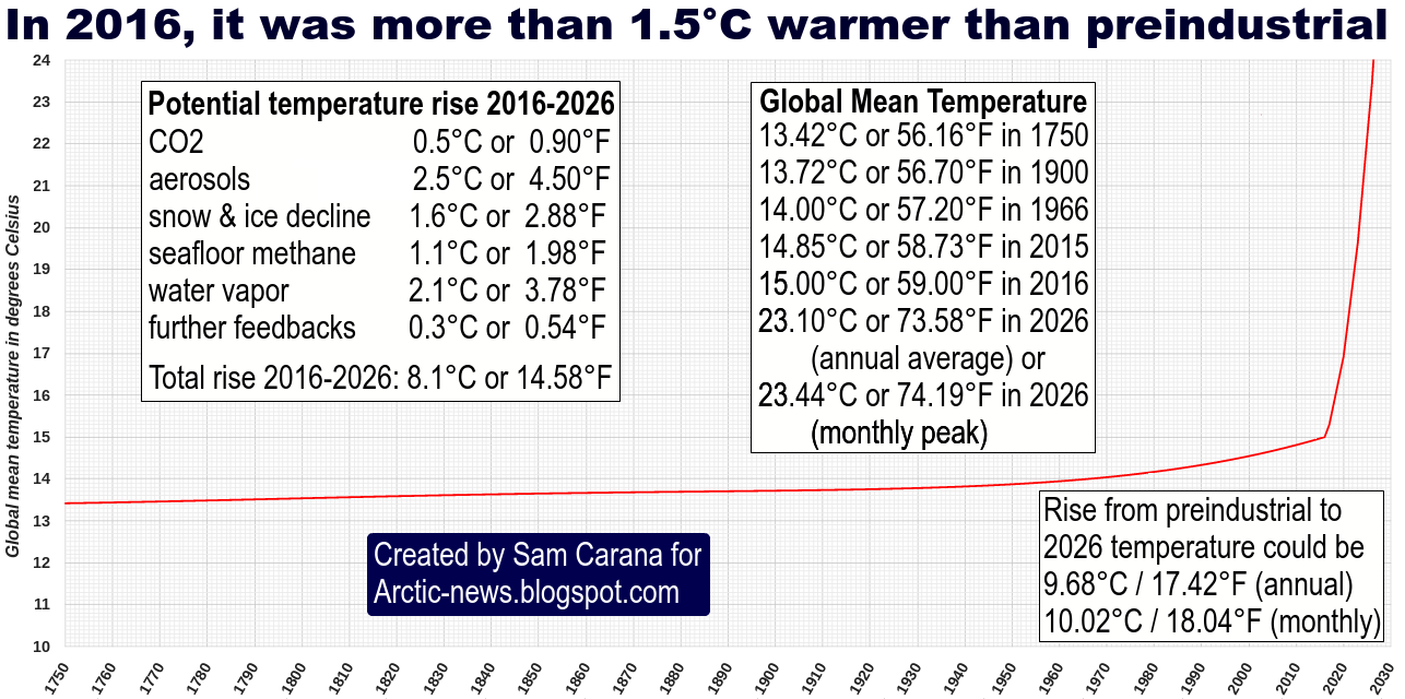
Situation
So, what is the situation? On the one hand, there's the current observed temperature rise (∆O). This rise is typically calculated as the difference between the current temperature and the temperature at a given baseline.
However, this ∆O does not reflect the full impact of human emissions. Temperatures would have been lower had there been no emissions by humans. The full warming impact due to people's greenhouse gas emissions therefore is ∆E. This ∆E is higher than the often-used observed rise, since the baseline would have been lower without warming caused by humans, i.e. including the warming that was already caused before the year 1750.
At the same time, part of global warming caused by people is currently masked due the aerosol emissions (∆M). Such aerosol emissions result mainly from burning of fossil fuel and biomass. There's no doubt that such emissions should be reduced, but the fact remains that the current temperature rise may increase substantially, say, by half when the masking effect disappears.
Thus, the full (unmasked) current warming caused by humans is the sum of these two, i.e. ∆E + ∆M, and the sum could be well over 3°C.
In addition, there is a future temperature rise that's already baked into the cake (∆F). Some feedbacks are not yet very noticeable, since some changes take time to become more manifest, such as melting of sea ice and non-linear changes due to feedbacks that are only now starting to kick in. Furthermore, the full effect of CO2 emissions reaches its peak only a decade after emission, while even with the best efforts, humans are likely to still be causing additional emissions over the coming decade. All such factors could jointly result in a temperature rise greater than ∆E + ∆M together, i.e. ∆F could alone cause a temperature rise of more than 5°C within a decade.
In summary, total anthropogenic global warming warming (∆A) or all warming caused by humans (∆E + ∆M + ∆F) could be more than
10°C (18°F) within one decade, assuming that no geoengineering will take place within a decade.
 |
| [ image added later from this post, click on images to enlarge ] |
The situation is dire and calls for comprehensive and effective action as described in the
Climate Plan.
Links
• Climate Plan
https://arctic-news.blogspot.com/p/climateplan.html
• Feedbacks
https://arctic-news.blogspot.com/p/feedbacks.html
• Extinction
https://arctic-news.blogspot.com/p/extinction.html
• Methane Erupting From East Siberian Arctic Shelf
https://arctic-news.blogspot.com/2014/11/methane-erupting-from-east-siberian-arctic-shelf.html
• Jos Hagelaars' graph, created with graphs by Shakun et al., Marcott et al. and more, is at:
https://ourchangingclimate.wordpress.com/2013/03/19/the-two-epochs-of-marcott/
• Global warming preceded by increasing carbon dioxide concentrations during the last deglaciation, by Shakun et al.
http://www.nature.com/nature/journal/v484/n7392/full/nature10915.html
• A Reconstruction of Regional and Global Temperature for the Past 11,300 Years, by Marcott et al.
http://science.sciencemag.org/content/339/6124/1198
• The Columbian Encounter and the Little Ice Age: Abrupt Land Use Change, Fire, and Greenhouse Forcing, by Dull et al., in:
https://www.sciencenews.org/article/columbus-arrival-linked-carbon-dioxide-drop
• Arctic Climate Records Melting
https://arctic-news.blogspot.com/2016/05/arctic-climate-records-melting.html
• 2500 Years of European Climate Variability and Human Susceptibility, Ulf Büntgen et al. (2011)
http://science.sciencemag.org/content/331/6017/578
• Paris Agreement
https://arctic-news.blogspot.com/2015/12/paris-agreement.html
http://unfccc.int/documentation/documents/advanced_search/items/6911.php?priref=600008831
https://unfccc.int/resource/docs/2015/cop21/eng/l09r01.pdf
• February Temperature
https://arctic-news.blogspot.com/2016/03/february-temperature.html
• Defining the Anthropocene, Lewis & Maslin (2015)
http://www.nature.com/nature/journal/v519/n7542/full/nature14258.html
• Highly variable Northern Hemisphere temperatures reconstructed from low- and high-resolution proxy data, Anders Moberg et al. (2005)
http://www.nature.com/nature/journal/v433/n7026/full/nature03265.html
• The early anthropogenic hypothesis: Challenges and responses, by W.F. Ruddiman (2007)
http://onlinelibrary.wiley.com/doi/10.1029/2006RG000207/abstract
• Berkeley Earth, Summary Of Findings
http://berkeleyearth.org/summary-of-findings
• Reconciling divergent trends and millennial variations in Holocene temperatures, by Marsicek et al. (2018)
https://www.nature.com/articles/nature25464
Reconciling divergent trends and millennial
variations in Holocene temperatures
Jeremiah Marsicek


 Furthermore, when using a 30-year period centered on January 2018, the current temperature will have to be calculated over the past 15 years and estimated for the next 15 years, i.e. up to the year 2033.