Clouds Tipping Point
The PBS Terra video below features the clouds tipping point, as also discussed in a recent post at the ArcticNews group.
The video mentions the 2019 analysis by Tapio Schneider that stratocumulus cloud decks become unstable and break up into scattered clouds when CO₂ levels rise above 1200 ppm, resulting in an abrupt additional temperature rise of 8°C (14°F), as discussed at the Clouds Tipping Point page.
The SSP5-8.5 pathway (Shared Socioeconomic Pathway, used by the IPCC), corresponding with a radiative forcing of 8.5 W/m⁻² in 2100, projects CO₂ concentration rises to levels as high 2206.4 ppm in the year 2250, i.e. well above 1200 ppm, as illustrated by the image below, from a 2020 study led by Malte Meinshausen. So, how much temperature rise could this cause?
SSP5-8.5 is often said to be a "worst-case" scenario, yet current developments may even exceed SSP5-8.5 projections, as discussed in an earlier post. The image below features in IPCC AR6 WG1 SPM. The total warming of the IPCC pathways (panel b) is dominated by CO₂ emissions that keep growing steadily in SSP5-8.5, while the maximum temperature rise stays well below 6°C.

Is this in conflict with the additional 8°C rise when the Clouds Tipping Point gets crossed? Let's analyze this. Importantly, the Clouds Tipping Points is at 1200 CO₂e, with contributions not only from CO₂, but also from methane, water vapor, etc.
 |
| [ from earlier post ] |
Reductions in methane emissions can strongly reduce the total CO₂e, given methane's high Global Warming Potential (GWP). Could reductions in methane emissions keep the total CO₂e below 1200 ppm? In both the SSP1-1.9 and SSP1-2.6 pathways, methane emissions would fall after 2015, and methane emissions would also fall over time for SSP2-4.5, in which 2°C does get crossed, and for SSP5-8.5.
So, if the impact of methane is high and if methane emissions would strongly decline, could it be possible that 1200 CO₂e wouldn't get crossed? Conversely though, if growth in methane emissions continues, this can strongly push up the total CO₂e, as occurs in SSP3-7.0, but in that pathway there are less CO₂ emissions and less reductions in sulfur dioxide emissions.
Anyway, what happened after 2015, the year when politicians pledged at the Paris Agreement to take efforts to limit the temperature rise to 1.5°C? Lo and behold, methane emissions kept rising after 2015! There was record growth in methane concentrations in 2021, after which there was a bit of a slowdown in growth during the following years, but growth in methane concentration picked up pace again recently, as illustrated by the image below, from an earlier post.

So, it appears again that SSP5-8.5 isn't the "worst-case scenario" in more than one way. An even worse case scenario would see strong emissions of both CO₂ and methane. Once more, it appears that politicians and collaborating scientists have been downplaying the temperature rise that is about to unfold. The IPCC produced a special report, called Global Warming of 1.5 °C above pre-industrial levels and related global greenhouse gas emission pathways and the report's pathways don't seem to make sense in many ways, as also discussed in an earlier post.
The image below is also from that earlier post. The image depicts an alternative pathway in which methane concentrations grow in line with the added magenta-colored trend that points at methane more than doubling by 2043. Such developments should have been included, at least in the margin of uncertainty, i.e. as a potential development.

Such developments were discussed in a 2021 post that featured the image below, with the caption that a 5 Gt burst of seafloor methane would double the methane in the atmosphere and could instantly raise CO₂e level to above 1200 ppm, thus triggering the cloud feedback (panel top right). Even with far less methane, levels of further pollutants could rise and feedbacks could strengthen, while sulfate cooling could end, and a 18.44°C rise (from pre-industrial) could occur by 2026 (left panel).
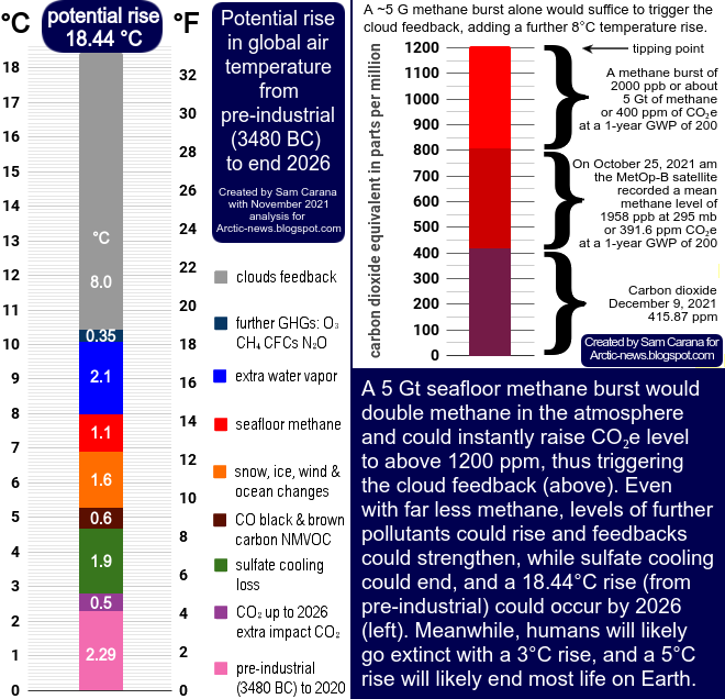

A short horizon makes sense when calculating the immediate impact of, say, a 5 Gt burst of methane from the seafloor of the Arctic Ocean.
There are other ways to calculate the impact, e.g. one can also look at radiative forcing. It makes sense to also take into account the indirect impact of methane, as done in the image below. The image conceptually dates back to 2019 when the analysis by Tapio Schneider et al. was published, hence the use of radiative forcing from the IPCC AR5 WG1 SPM report that was published in 2013.
The image below shows three blocks each of about 400 ppm CO₂e, adding up to 1200 ppm CO₂e. The bottom block (purple) represents the CO₂ present in the atmosphere, i.e. on May 9, 2013, CO₂ surpassed 400 ppm at Mauna Loa. It is noted that extra CO₂ has less impact as its abundance grows, whereas extra CH₄ has a stronger impact.
The block in the middle (dark red) shows the methane already in the atmosphere, with the note that IPCC AR5 gives CH₄ an impact of 0.97 W/m⁻² (see top of image), or 57.74% of the impact of about 400 ppm CO₂. Yet, the impact of methane could rise to 400 ppm CO₂e, for reasons described in the following paragraph.
The spectral band where most heat is trapped by CO₂ is more saturated than the band where most heat is trapped by CH₄. The impact of additional CH₄ will increase as its abundance grows, whereas the impact of additional CO₂ will decrease as abundance grows. Abrupt eruptions of 5 Gt of seafloor CH₄ will cause hydroxyl depletion. Since there is already very little hydroxyl present over the Arctic, large eruptions of CH₄ from the seafloor of the Arctic Ocean would strongly increase the lifetime of CH₄ there, trigger feedbacks and increase its global warming impact. The warming impact of an extra 5 Gt of CH₄ could therefore approach the impact of the CO₂ that was in the atmosphere on May 9, 2013, and this would not only apply to the methane that is added by such eruptions, but it would also increase the impact of CH₄ already present in the atmosphere.
The block of 400 ppm CO₂e at the top of the bar (red) represents an extra 5 Gt of CH₄ resulting from a burst of methane erupting from the seafloor of the Arctic Ocean. Some of the methane arising from the seafloor will be broken down in the water by microbes, but many of the seas in the Arctic Ocean are very shallow and when large amounts of methane erupt in the form of plumes and move at high speed through the water column, only a small part of the methane can be broken down on its way up through the water column. Anyway, the point is that 5 Gt of methane abruptly entering the atmosphere could have an immediate impact of 400 ppm CO₂e which would also raise the impact of the block of existing CH₄ to 400 ppm CO₂e.

Jointly, the three blocks each of 400 ppm CO₂e add up to 1200 ppm CO₂e, i.e. the tipping point where stratocumulus decks start to disappear abruptly, resulting in an additional temperature rise of 8°C. Even when CO₂ levels are lowered again after the stratocumulus breakup, the stratocumulus decks only reform once the CO₂ levels drop below 300 ppm, as discussed at the Clouds Tipping Point page.
Historic growth in methane concentrations

In fact, the rise in emission by people had already started well before 1750. Thousands of years ago emissions started to grow in agriculture, herding of animals and associated deforestation, as illustrated by the combination image below, adopted from Ruddiman et al. (2015).
Thousands of years ago, methane concentrations were as low as 550 ppb, while CO₂ concentrations were as low as 260 ppm. So, methane in 2024 was 335% of what it was thousands of years ago, whereas CO₂ in 2024 was 163% of what it was thousands of years ago. In other words, methane concentrations have risen twice as fast as CO₂ concentrations.
 |
| [ from earlier post ] |
As discussed in earlier posts such as this one and this one, the IPCC keeps downplaying the dangers that we're facing, and one way the IPCC does so is by manipulating the outlook of CO₂, methane and sulfur dioxide emissions. Another way is to downplay the historic temperature rise, which is important, since a larger historic rise would also come with more water vapor in the air, a powerful greenhouse gas that causes a self-amplifying feedback further increasing the temperature rise.
Existential threat
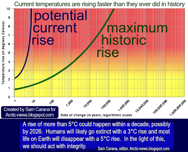
So, are we facing an existential threat? The speed at which temperatures are rising is unprecedented in the historic record. Historically, people have been pushing up the temperature for thousands of years, due to deforestation and further activities by people.
 |
| [ image from Tierney et al (2025), also discussed at ArcticNews group ] |
Activities by people have been pushing up the temperature from a genuinely pre-industrial base for thousands of years, maybe by more than 2°C, as illustrated by the bottom panels on the image below.

 |
| [ from the post When will humans go extinct? ] |
A 3°C rise constitutes an important threshold, since humans will likely go extinct with such a rise. The top panel in the above image shows a potential 10°C rise, while we may already be more than 2°C above pre-industrial. A further 1°C can quickly be added due to the move from a La Niña into the next El Niño, albedo loss and further feedbacks such as extra water vapor as temperatures rise, seafloor methane eruptions, fires, collapse of society causing abrupt termination of the sulfur aerosol masking effect. If society collapses, greenhouse gases with a high GWP and long lifetime could be emitted as substances leak from warehouses, waste dump fires, etc. Furthermore, aerosols from sulfur dioxide could fall out of the air in a matter of weeks, all contributing to a rapid temperature rise.
The IPCC appears to have painted scenarios that are shrouded in dubious politics, rather than relating to best-available science and a realistic outlook on future developments. As an example, the speed in the projected decline in aerosols from sulfur dioxide in the various Shared Socioeconomic Pathways can make a huge difference.
How much could temperatures rise? James Hansen points out that equilibrium global warming for today’s GHG amount is 10°C, which is reduced to 8°C by today’s human-made aerosols. This 10°C rise is held back by oceans and ice acting as a buffer and by aerosols. How long would it take for a 10°C rise to unfold? Heat sinks could abruptly turn into sources, e.g. due to sea ice loss and changes in wind, soil and oceans such as ocean stratification.
Keep in mind that concentrations of greenhouse gases are still rising. Also keep in mind that the land-only temperature rise is higher than the global rise and most people live on land. Many people also live in areas where the rise is stronger than average during heatwaves and due to the Urban Heat Island effect. The conclusion is that humans are functionally extinct if temperatures keep rising. Importantly, changes in biodiversity can have terrible consequences, and much of this is ignored by the IPCC.
Biodiversity collapse
Biodiversity collapse
 |
| [ from: When Will We Die? ] |
A 2025 analysis by David Fastivich et al. finds that, historically, vegetation responded at timescales from hundreds to tens of thousands of years, but not at timescales shorter than about 150 years. It takes centuries for tree populations to adapt - far too slow to keep pace with today’s rapidly warming world. Vegetation depends on the presence of a lot of things including healthy soil, microbes, moisture, nutrients and habitat.
A 2025 analysis led by Thiago Gonçalves-Souza concludes that species turnover does not rescue biodiversity in fragmented landscapes.
A 2018 study by Strona & Bradshaw indicates that most life on Earth will disappear with a 5°C rise (see box on the right). Humans, who depend on a lot of other species, will likely go extinct with a 3°C, as discussed in the earlier post When Will We Die?
Terrestrial vertebrates are more in danger than many other species, as they depend on numerous other species for food. Humans are terrestrial vertebrates and humans are large warm-blooded mammals with high metabolic rates, thus requiring more food and habitat. It also takes humans many years to reach maturity. Humans have become addicted to processed food, fossil fuels, plastic, etc. Furthermore, humans require large amounts of fresh water, including for sweating when temperatures rise. A 3°C rise may therefore suffice to cause humans to go extinct, as discussed in earlier posts such as this one and this one.
A 2025 analysis led by Joseph Williamson concludes that many species that live together appear to share remarkably similar thermal limits. That is to say, individuals of different species can tolerate temperatures up to similar points. This is deeply concerning as it suggests that, as ecosystems warm due to climate change, species will disappear from an ecosystem at the same time rather than gradually, resulting in sudden biodiversity loss. It also means that ecosystems may exhibit few symptoms of heat stress before a threshold of warming is passed and catastrophic losses occur. A 2024 analysis by Michael Van Nuland et al. finds that tree symbioses with ectomycorrhizal fungi mean that they need to move together for successful migration.
In the video below, Guy McPherson explains that forests cannot keep up with the speed at which temperatures are rising.

• Climate mismatches with ectomycorrhizal fungi contribute to migration lag in North American tree range shifts - by Michael van Nuland et al. (2024)
https://www.pnas.org/doi/10.1073/pnas.2308811121
Guy McPherson mentions the study by William Farfan-Rios et al. that finds that Amazonian and Andean tree communities are not tracking current climate warming. Further science snippets: The Amazon is also getting drier as deforestation shuts down atmospheric rivers. Thunderstorms are a major driver of tree death in tropical forests. Hot droughts cause catastrophic tree die-offs. Aboveground biomass in Australian tropical forests now a net carbon source.
Huge temperature rise
 |
| [ from the Extinction page ] |
The image on the right illustrates how such dangers could be further amplified by the threat of war and collapse of centralized society.
As people seek to occupy the last few habitable areas left, many people may stop showing up for work, resulting in a rapid loss of the aerosol masking effect, as industries that now co-emit cooling aerosols (such as sulfates) come to a grinding halt. As it becomes harder to obtain food and fuel for cooking and heating, and as the grid shuts down due to conflicts, many people may start collecting and burning more wood, decimating the forests that are left and resulting in more emissions that further speed up the temperature rise.
As temperatures rise, huge fires could also break out not only in forests, peatlands and grassland, but also in urban areas (including backyards, landfills and buildings, in particular warehouses containing flammable materials, chemicals and fluorinated gases), further contributing to more emissions that speed up the temperature rise.
As the likeliness of further accelerating warming, the severity of its impact, and the ubiquity and the imminence with which it will strike all become more clear and manifest—the more sobering it is that, while a mere 3°C rise may suffice to cause human extinction, a much larger temperature rise may unfold abruptly, as illustrated by the bar-chart on the right.
The image below, from an earlier post, shows monthly data from May 2022 through May 2025, with a trend added that warns about 1200 parts per million (ppm) getting crossed in 2028.

As said, crossing the clouds tipping point at 1200 ppm CO₂ could - on its own - push temperatures up by 8°C globally, on top of the temperature rise caused by the forcing that resulted in the crossing of this tipping point. Moreover, the clouds tipping point is actually at 1200 ppm CO₂e (carbon dioxide equivalent), so when taking into account the impact of growth of other gases, strengthening feedbacks and further mechanisms, this tipping point could be crossed much earlier than in 2028, potentially as early as in 2026.
Methane in the atmosphere could be doubled within years if a trend unfolds as depicted in the image below, from an earlier post. A rapid rise is highlighted in the inset and reflected in the trend, which is based on January 2023-October 2024 methane data, as issued in February 2025.
 |
| [ Double the methane in March 2026? Image from earlier post, click on images to enlarge ] |
A rise like the one depicted in the trend could eventuate as rising ocean heat destabilizes methane hydrates contained in sediments at the seafloor of the Arctic Ocean. The temperature rise in the Arctic would accelerate since the methane would initially have a huge temperature impact over the Arctic and cause depletion of hydroxyl, of which there is very little in the atmosphere over the Arctic in the first place. Such a rise in methane would also dramatically increase concentrations of ozone in the troposphere and concentrations of water vapor in the stratosphere.
Climate Emergency Declaration
The situation is dire and unacceptably dangerous, and the precautionary principle necessitates rapid, comprehensive and effective action to reduce the damage and to improve the outlook, where needed in combination with a Climate Emergency Declaration, as described in posts such as in this 2022 post and this 2025 post, and as discussed in the Climate Plan group.

Links
• Advances in Paleoclimate Data Assimilation - by Jessica Tierney et al. (2025)
• Coupled, decoupled, and abrupt responses of vegetation to climate across timescales - by David Fastivich et al. (2025)
• Amazonian and Andean tree communities are not tracking current climate warming - by William Farfan-Rios et al. (2025)
https://www.pnas.org/doi/10.1073/pnas.2425619122
• Clustered warming tolerances and the nonlinear risks of biodiversity loss on a warming planet - by Joseph Williamson et al. (2025)
https://royalsocietypublishing.org/rstb/article/380/1917/20230321/109625/Clustered-warming-tolerances-and-the-nonlinear
The situation is dire and unacceptably dangerous, and the precautionary principle necessitates rapid, comprehensive and effective action to reduce the damage and to improve the outlook, where needed in combination with a Climate Emergency Declaration, as described in posts such as in this 2022 post and this 2025 post, and as discussed in the Climate Plan group.

Links
• Clouds feedback and tipping point
• Advances in Paleoclimate Data Assimilation - by Jessica Tierney et al. (2025)
discussed on Facebook at:
https://www.facebook.com/groups/arcticnews/posts/10163934412354679
https://www.facebook.com/groups/arcticnews/posts/10163934412354679
discussed on facebook at:
https://www.facebook.com/groups/arcticnews/posts/10163832954534679
https://www.facebook.com/groups/arcticnews/posts/10163832954534679
• Amazonian and Andean tree communities are not tracking current climate warming - by William Farfan-Rios et al. (2025)
https://www.pnas.org/doi/10.1073/pnas.2425619122
• Clustered warming tolerances and the nonlinear risks of biodiversity loss on a warming planet - by Joseph Williamson et al. (2025)
https://royalsocietypublishing.org/rstb/article/380/1917/20230321/109625/Clustered-warming-tolerances-and-the-nonlinear
https://www.pnas.org/doi/10.1073/pnas.2308811121
discussed on facebook at:
https://www.facebook.com/groups/arcticnews/posts/10163832955574679
https://www.facebook.com/groups/arcticnews/posts/10163832955574679
• Species turnover does not rescue biodiversity in fragmented landscapes - by Thiago Gonçalves-Souza et al. (2025)
https://www.nature.com/articles/s41586-025-08688-7
discussed on facebook at:
https://www.facebook.com/groups/arcticnews/posts/10162452301209679
• Transforming Society
https://arctic-news.blogspot.com/2022/10/transforming-society.html
• Climate Plan
https://arctic-news.blogspot.com/p/climateplan.html
• Climate Emergency Declaration
https://arctic-news.blogspot.com/p/climate-emergency-declaration.html


