Earlier posts have warned that the upcoming El Niño could contribute to loss of virtually all Arctic sea ice in September 2026, which would in turn result in albedo loss, transfer of ocean heat to the atmosphere and additional emissions that could jointly increase the global temperature dramatically and could subsequently also cause virtually all Antarctic sea to disappear a few months later.
Forecasts indicate that the upcoming El Niño threatens to become a monster within a few months time.
The image below shows an anomaly forecast update for May 15, 2026, for the Niño3 region, with forecasts exceeding 4°C for parts of some forecast members and exceeding 3.5°C for part of the mean.
Both subsurface ocean heat and ocean heat that has moved from the ocean to the atmosphere during the upcoming El Niño can be expected to contribute to strong loss of Arctic sea ice over the next few months.
The April 2026 Arctic sea ice volume was about 18,500 km³ (as illustrated by the image on the right), which is very close to the magenta bar which stands for strong melting (18,000 km³) from the annual maximum volume.
Feedbacks, thresholds and tipping points
Sea ice loss comes many feedbacks and there is interaction between feedbacks. As an example, sea ice decline comes with both loss of albedo (Feedback #1) and loss of the latent heat buffer (Feedback #14), each of which will accelerate the temperature rise of the water of the Arctic Ocean, thus contributing to the threat that hydrates contained in sediments at the seafloor of the Arctic Ocean will be destabilized, which in turn threatens to cause eruption of huge amounts of methane (Feedback #16), which will further drive up the temperature in the Arctic and cause stronger melting of terrestrial permafrost.
A further danger lies in changes occurring to wind and ocean current patterns; the temperature rise will cause stronger wind, waves and storms, as well as deformation of the
Jet Stream (Feedback #19). In addition, the temperature rise causes
loss of reflectivity of clouds (Feedback #25) and more ocean
stratification (Feedback #29), exacerbated by more freshwater accumulating at the surface of oceans, due to stronger ice melting, due to heavier runoff from land and rivers and due to changes in wind patterns and ocean currents and circulation. In the North Atlantic, there is the additional danger that
formation of a freshwater lid (Feedback #28) will cause huge amounts of ocean heat to be pushed into the Arctic Ocean and enter the atmosphere as sea ice disappears.
Higher temperatures come with
feedbacks, as illustrated by the image below, from an
earlier post. The image illustrates the mechanism of multiple feedbacks increasing and accelerating the temperature rise (the yellow horizontal bar), and of thresholds and tipping points causing the temperature rise to jump up a step when crossed.
 |
| [ the temperature in the atmosphere can keep rising, even in the absence of further emissions ] |
Feedback numbers correspond with the list at the
feedbacks page. Some of them are discussed below.
Feedback #1: albedo loss (loss of reflectivity) as sea ice melts due to rising temperatures and due to the ice getting covered by soot, dust, algae, meltpools and rainwater pools;
Feedback #14: loss of the latent heat buffer - as sea ice disappears, heat can no longer be consumed by the process of melting, and the heat will instead go into increasing the temperature;
Feedback #16: eruptions of seafloor methane - as more heat reaches the seafloor of the Arctic Ocean, sediments and hydrates contained in them destabilize, resulting in methane releases. Vast amounts of methane are held in
hydrates at the seafloor of the Arctic Ocean.
Miesner et al. (2023) warn that 2822 Gt of organic carbon is stored in subsea Arctic shelf permafrost and
Huang et al. (2024) warn that the top two meters of soil globally holds about 2300 Gt of inorganic carbon, which has been left out of environmental models, and 23 Gt of this carbon may be released over the next 30 years. By comparison, the atmosphere contains about 5 Gt of methane. The image below, from an
earlier post, illustrates the threat of thinning of Arctic sea ice resulting in increased ocean heat and methane eruptions.
 |
[ The Buffer is gone ]
|
Feedback #19: distortion of the Jet Stream as the temperature difference narrows between the Arctic and the Tropics, in turn causing further feedbacks to kick in stronger, such as hot air moving into the Arctic and cold air moving out, and more
extreme weather events bringing heavier rain and more intense heatwaves, droughts and forest fires that cause black carbon to settle on the sea ice;
Feedback #23: open oceans hold more far-infrared energy than sea ice, resulting in warmer oceans, stronger melting of sea ice, with a study showing a 2°C rise in the polar climate after a 25-year run;
Feedback #25:
extra water vapor feedback - rising temperatures will result in more water vapor in the atmosphere (
7% more water vapor for every 1°C warming), further amplifying the temperature rise, since water vapor is a potent greenhouse gas;
Feedback #28:
freshwater lid on the North Atlantic - melting of sea ice and glaciers and thawing of the permafrost results in meltwater accumulating at the surface of the North Atlantic Ocean, where it forms a cold freshwater lid on top of the water; this lid grows further due to more rain falling on top of this lid. This results in less evaporation and transfer of heat from the North Atlantic to the atmosphere, and more ocean heat getting carried by the Gulf Stream underneath the sea surface into the Arctic Ocean;
Feedback #30: The clouds feedback reduces the reflectivity of lower clouds and comes with a tipping point at 1200 CO₂e that, when crossed, causes the temperature rise to increase by an abrupt 8°C. Such a high CO₂e could be reached due to eruption of methane from the seafloor, as discussed in an
earlier post and as illustrated by the image below.
Ominously, the forecast for August 2026 below shows very high sea surface temperature anomalies for the Arctic Ocean, which spells bad news for Arctic sea ice, which typically reaches its annual minimum in September.
Antarctic sea ice
Could a Double Blue Ocean Event occur in 2026/2027? The global sea ice area anomaly (versus 1981-2010) was the second lowest on record for the time of year on May 11, 2026 (black line), as illustrated by the image below. Also highlighted are 2016, 2023 and 2024 (purple lines).
The above image shows that the global sea ice area anomaly reached a record low in November 2016 (purple line, bottom right), a year when there was a super El Niño—very worrying, since the 2026 El Niño threatens to be even stronger than the 2016 El Niño. The lowest annual area anomaly on record actually was the year 2025 (blue line), which makes the situation even more worrying, since 2025 was mostly a La Niña year (see image below), so much of the record low global sea area anomaly in the year 2025 can be attributed to the recent acceleration in global temperatures.
Antarctic sea ice typically reaches its annual minimum in February. As illustrated by the image below, Antarctic sea ice area was only 1.09 million km² on February 22, 2023, very close to the 1 million km² threshold when a Blue Ocean Event could be called.
What caused the 2023 Antarctic sea ice loss? Until 2015, rising temperatures resulted in melting of ice and enhanced precipitation that freshened the surface of the Southern Ocean, exacerbated by increasing stratification that prevented mixing. The temperature rise over the years also caused winds to be stronger, at the time causing the sea ice to spread out wider.
The higher the water's salt content, the lower its melting point. Seawater typically has a salinity of about 3.5% (35 grams of salt per liter of water). Sea ice starts melting when the temperature rises to about -2°C (28.4°F). By contrast, freshwater remains frozen as long as the temperature remains below 0°C (32°F).
A
recent study led by Theo Spira finds that, in 2015, anomalously strong winds enhanced mixing across the thin Winter Water layer, entraining warm and salty subsurface waters, which broke down upper-ocean stratification. Another
recent study led by Earle Wilson find that in 2015, intensified wind-driven upwelling reversed the freshening trends, releasing years of accumulated ocean heat that contributed to unprecedented sea ice loss.
A recent
study led by Aditya Narayanan finds that East Antarctic sea ice loss was primarily subsurface driven via enhanced upward circumpolar deep water flux, whereas West Antarctic sea ice loss was also forced by longwave radiative flux anomalies. Findings suggest that persistent upwelling-favorable conditions under anthropogenic forcing may push the Southern Ocean into a prolonged low sea ice state.
The post also points at the danger that heat, previously stored in the deep ocean by sinking circumpolar waters, will instead remain at the surface and cause atmospheric temperatures to rise, as illustrated by the image on the right.
The post describes that higher temperatures come with feedbacks such as stronger wind and stronger evaporation, resulting in increased water vapor in the atmosphere.
The post warns that, while much of the water vapor will return to the surface in the form of precipitation such as rain and snow, part of this precipitation will fall over Antarctica, with the net result of an increase in salinity of surface of the Southern Ocean, as illustrated by the image below.
 |
| [ click on images to enlarge ] |
A
recent study led by Da Nian warns that Antarctic regions (60°S − 90°S) may warm by around 6°C due to the collapse of the Atlantic meridional overturning circulation (AMOC).
Ominously, the forecast below for January 2027 shows very high sea surface temperatures anomalies around Antarctica, which spells bad news for Antarctic sea ice, which typically reaches its annual minimum in February, as mentioned above.
 |
| [ Sea surface temperature anomaly - click on images to enlarge ] |
Temperature rise
On May 6, 2026, a record high sea surface temperature was recorded for that day, tiered with May 6, 2024, as illustrated by the image below.
On May 8, 2026, the Northern Hemisphere temperature was 17.53°C, the highest temperature on record for the time of year and 1.13°C higher than 1979-2000 (which is not pre-industrial). The image below also shows that the annual highest temperatures in the Northern Hemisphere are typically reached in July and that very high anomalies were recorded in July in the three previous years, i.e. in 2023, 2024 and 2025 (orange), even though the year 2025 was mostly a La Niña year (see image further above).
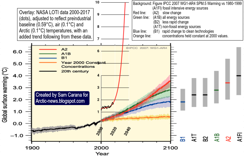
The image below shows NASA Land-Only anomalies versus 1880-1890 (not pre-industrial) updated through April 2026.
The above image indicates that anomalies (versus 1880-1890) have been high since 2021, i.e. the rise in temperature has been at or above 1.5°C for each month since 2021 (black squares connected by the black lines). The Lowess 3-year smoothing trend (red line) indicates that the temperature rise accelerated in 2022 and crossed 2°C in 2022, while the trend further indicates that 3°C may get crossed soon on land (where most people live), in 2029 if this trend continues (linear dashed red extension) or even earlier if the trend's rise accelerates further (as illustrated by the image below with a polynomial trend).
The image below illustrates that the upcoming El Niño could trigger a rapid and steep rise in temperature on land in the Northern Hemisphere in the course of 2026.
The above image shows land-only data in the Northern Hemisphere through March 2026, with a polynomial trend added that points at 3°C crossed later in 2026. About 0.5°C of the rise can be attributed to
El Niño, with further contributions from feedbacks and further forcers. Note that the 1901-2000 base is not pre-industrial, the outlook may be even more dire when using a genuinely
pre-industrial base.
The image below, from an
earlier post, uses
NASA monthly data through March 2023. Data are first adjusted from NASA's default 1951-1980 base to an earlier 30-year base, i.e. a 1886-1915 base, and then further adjusted by 0.99°C to reflect ocean air temperatures, higher polar anomalies and a
pre-industral base.
The image below is a 2025
update, the same adjustments are made to data through April 2025.
The image below is a 2026 update, the same adjustments are made to data through March 2026.
While the above images indicate that we have dodged a few bullets, we keep playing
Russian roulette and keep pulling the same
clathrate gun's trigger until one day the bullet will be in the chamber. Note also that we've been in a La Niña and that a monster El Niño is on the way.
How the 0.99°C adjustment in the above images is calculated is shown in the bright yellow inset of the image below.
The images show that, when adjusting the data and using a genuinely
pre-industrial base, the temperature rise may have already crossed both the 1.5°C and the 2°C thresholds that politicians at the 2015 Paris Agreement pledged shouldn't and wouldn't be crossed.
Human extinction
In 2022, the
IPCC said that limiting warming to 2°C would require global greenhouse gas emissions to peak before 2025 at the latest. As discussed in an
earlier post, it looks like emissions didn't peak in 2025 and we're on track for a 3°C rise, yet the IPCC refuses to warn people about how dire the situation is, despite mounting indications that humans are likely to go extinct with a 3°C rise in temperature.
An
earlier post pictures where we area: As the likeliness of a huge and accelerating temperature rise, the severity of its impact, and the ubiquity and the imminence with which it will strike all become more apparent and manifest—the more sobering it is to realize that a mere
3°C rise will likely suffice to cause human extinction.
A 2018 study (by
Strona & Bradshaw) indicates that most life on Earth will disappear with a 5°C rise. What does this mean for humans? Terrestrial vertebrates are more in danger than many other species, since they depend on numerous other species for food. Humans are terrestrial vertebrates and humans are also large warm-blooded mammals with high metabolic rates, thus requiring more habitat. It also takes a long time for humans to reach maturity. Additionally, humans have become addicted to processed food, fossil fuels, plastic, etc. Furthermore, humans require large amounts of fresh water, including for sweating when temperatures rise.
A
2016 study led by F. Alice Cang finds projected climate change by 2070 to be consistently faster than rates of niche change in grasses, typically by more than 5000-fold for temperature-related variables. As discussed in
this post on facebook, a recent
analysis led by Nicolas Gauthier confirms the 2016 study findings, adding that grasses include staples, such as rice, maize, wheat, and barley, which now provide the majority of the global human caloric intake. Among these vital crops, domesticated Asian rice serves as a primary food source for over half the global population.
Conclusion
The situation is dire and unacceptably dangerous, and the precautionary principle necessitates the danger to be acknowledged, while facilitating rapid, comprehensive and effective action to reduce the damage and to improve the outlook, where needed in combination with a
Climate Emergency Declaration, as described in posts such as in
this 2022 post and
this 2025 post, and as discussed in the
Climate Plan group.
Links


