Monday, September 30, 2013

Earthquake hits Laptev Sea

An earthquake with a magnitude of 4.6 on the Richter scale hit the Laptev Sea on September 28, 2013.

[ click on image to enlarge ]
This follows a number of earthquakes on or close to the fault line that crosses the Arctic Ocean and extends into Siberia, as shown on above map and on the map below.

[ click to enlarge ]
Furthermore, as earlier discussed in the post Methane release caused by earthquakes, there has been a lot of seismic activity in the Aleutian Islands region all the way up into Alaska, including an earthquake with a magnitude of 7 on the Richter scale on August 30, 2013, and several more recent earthquakes with a higher magnitude than 6 on the Richter scale.

This is a lot of seismic activity for the Arctic, given that this is a relatively quiet part of the globe in terms of earthquakes.

[ click on image to enlarge ]
As above map shows, there were 1250 earthquakes with a magnitude of 2.5 or higher over the past 30 days globally. About 90% of the world's earthquakes occur along the Ring of Fire, on the edges of the Pacific Ocean.

The fault line that crosses the Arctic Ocean marks the boundery between the North American Plate and the Eurasian Plate. Along this fault, huge amounts of methane are held in sediments, in the form of free gas and hydrates. The danger is that earthquakes along this fault will destabilize methane, causing it to rise abruptly in large amounts and enter the atmosphere.

As the top image shows, a lot of methane is currently present in the atmosphere along this fault line. Methane has shown up there repeatedly, indicating that methane there has been prone to release for some time and warning that even larger releases could occur soon.

Related posts

- Methane release caused by earthquakes (2013)
http://arctic-news.blogspot.com/2013/09/methane-release-caused-by-earthquakes.html

- North Hole (2013)

- Sea of Okhotsk (2013)
Methane-hydrates.blogspot.com/2013/06/sea-of-okhotsk.html

- Seismic activity, by Malcolm Light and Sam Carana (2011)
Arctic-news.blogspot.com/p/seismic-activity.html

- Thermal expansion of the Earth's crust necessitates geoengineering (2011)
Arctic-news.blogspot.com/p/thermal-expansion.html


Saturday, September 28, 2013

Arctic Methane Monster

The Intergovernmental Panel on Climate Change (IPCC) has just released the Summary for Policymakers of Working Group I.

Sadly, the document contains little or no warning on the looming Arctic Methane Monster.

The IPCC does warn that people's emissions of carbon dioxide (CO2) must be reduced to avoid dangerous temperature rises.

The IPCC does add that "accounting for warming effects of increases in non-CO2 greenhouse gases, reductions in aerosols, or the release of greenhouse gases from permafrost will also lower the cumulative CO2 emissions for a specific warming target".

Yet, the IPCC fails to warn that huge amounts of methane, contained in sediments under the Arctic Ocean, are ready for release any time.

There are no warnings about high sea surface temperatures in the Arctic Ocean. In August 2013, sea surface temperatures of over 20°C (68°F) were recorded in some areas in the Beauford Sea and up to 18°C in the Bering Strait. Even this late in the melting season (September 28, 2013), sea surface temperatures of over 12°C are still recorded close to Svalbard (image right), in an area where methane hydrates are known to have become destabilized over the past few years. There are no warnings that, wherever the sea ice retreats, sea surface temperature anomalies are coloring the Arctic Ocean scarlet red, with temperature anomalies of over 4°C all over the place (image below). No warnings that earthquakes can destabilize hydrates that have become vulnerable due to temperature rises.

This lack of warning gives the false impression that the situation could only become dangerous until after decades of further emissions.  

Indeed, the IPCC acts as if there was a carbon budget to divide among countries, whereas the reality is that there is a huge carbon debt to our children, while the situation could become catastropic any time soon. It appears that the IPCC has been trying desperately to please those with vested interests in maintaining the status quo.


In reality, the situation calls for comprehensive and effective action, such as proposed at the ClimatePlan blog.


Related

- Just do NOT tell them the moster exists
http://arctic-news.blogspot.com/2013/10/just-do-not-tell-them-the-monster-exists.html


Saturday, September 21, 2013

High Methane Readings over Arctic Ocean

The image below shows a lot of methane over the Arctic Ocean on September 19, 2013 (pm).


Very worrying are the high methane readings close to Gakkel Ridge, the divergent fault line at the center of the Arctic Ocean, as earlier discussed in the post Methane Release caused by Earthquakes.

Furthermore very worrying are the high methane readings in between Greenland and Novaya Zemlya that coincide with high sea surface temperatures in that area. As discussed in the earlier post Is the North Pole no ice-free?, there are hot spots in the Arctic Ocean where sea surface temperatures are well over 10°C (50°F), which could be caused by undersea volcanic activity; this is the more dangerous as the area has seen methane bubbling up from destabilized hydrates.

For reference, images are added below of sea surface temperatures (top) and sea surface temperature anomalies (underneath) for September 19, 2013, showing sea surface temperatures recorded close to Svalbard that are far higher than even in the waters closer to the Atlantic Ocean.


Also for reference, highest mean and peak methane readings up to September 19, 2013, are added below.


Friday, September 20, 2013

A RUNAWAY GREENHOUSE EVENT

by John Davies

A linear trendline shows steady growth in the annual increase in CO2 levels, despite promises to reduce emissions.
Furthermore, recent increases show a worrying trend illustrated in the graph by a 4th order polynomial trendline.

GROWTH RATE OF CARBON DIOXIDE IN THE ATMOSPHERE

The world is probably at the start of a runaway Greenhouse Event which will end most human life on Earth before 2040. This will occur because of a massive and rapid increase in the carbon dioxide concentration in the air which has just accelerated significantly. The increasing Greenhouse Gas concentration, the gases which cause Global Warming, will very soon cause a rapid warming of the global climate and a chaotic climate.

Immediately before the Industrial Revolution, in 1750, the concentration of carbon dioxide in the air which had been stable for millennia, the main Greenhouse gas, was 280 parts per million, but in 2013 it is likely to average 395 parts per million. It has been increasing at an increasing rate since 1750.

In 1960 the carbon dioxide concentration was 315 parts per million and in the 1960’s the concentration was increasing at 0.8 parts per million per year, in the 1980’s at 1.6 parts per million and from 2003 until 2011 inclusive it rose at 2 .0 parts per year.

In 2012 it rose 2.39 parts. Between July 2012 and July 2013 atmospheric carbon dioxide increased in concentration by 3.35 parts, by far the largest 12 month increase ever.


THIS HUGE INCREASE SHOULD BE PUBLISHED EVERYWHERE WORLDWIDE NOW

ASSESSMENT

When there have been large anomalous increases in the past, though nothing like this, there has been a rapid return to near normal but this is probably slightly different. The most likely growth in the calendar year 2013 is likely to be about 2.85 parts per million, a calendar year record , but much below the growth from July 2012 until July 2013. The growth for 2012 and 2013 is likely to average out at about 2.62 parts per million, a record for a two year period.

Again, looking to the past, when there has been a rise in concentration like we will have had in 2012 and 2013 the rate of increase in concentration diminishes for a couple of years before rising again. I would expect the rise in concentration in 2014 and 2015 to average 2.55 parts per million before rising at an increasing rate thereafter assuming the world carries on with business as usual. Nevertheless this average rate is faster than we have yet witnessed except for the 2012 and 2013 period. This rate of increase is much faster than that which preceded the greatest ever wipe out of life on earth 249 million years ago.

There is a significant uncertainty about the above growth rate in the near term, with a chance of a higher and lower growth rate though the above forecast is the most likely outcome.

There must be a small chance that this is really the start of a very fast runaway event. Should the growth rate of atmospheric carbon dioxide in 2013 be greater than about 3.1 parts per million then the world will probably have entered a very fast runaway event.

It is even more absolutely critical that carbon dioxide concentrations from August 2013 onwards are rising at a slower rate than between July 2012 and July 2013 otherwise the world will have entered a very fast runaway Greenhouse Event. Carbon Dioxide concentrations will almost certainly be rising at a slower rate from August 2013 onwards.

The runaway greenhouse event, or a very fast runaway Greenhouse Event is probably just starting, and can only be stopped by an immediate response. The danger is that it will very rapidly run out of our control. I think the net negative feedback to greenhouse gas emissions is just starting to diminish. It is not clear whether this is because the sinks are absorbing less carbon dioxide or a form of positive feedback is starting probably a bit of both.

The rising carbon dioxide levels will probably lead to rising global temperatures from about 2015 onwards which will cause more climatic disruption, especially severe droughts, and thus more carbon emissions almost certainly before 2020.

This is going to occur at a time when the Arctic Ocean will probably become free of sea ice leading to a different set of runaway events which will coalesce with the build-up of carbon dioxide in the atmosphere.

This will lead to societal collapse after rising global temperatures have caused severe droughts and a global famine at some time prior to 2040, but probably much sooner in about 2020 or in the 2020’s.

IMMEDIATE ACTION IS CRUCIAL

The absolute priority is that the world’s public and politicians are told about the rapidly increasing rate of carbon dioxide concentrations in the air which will cause a runaway Greenhouse Event, both in the media and in social media. The gravity of the situation needs to be accepted and all nations agree to co-operate to solve the problem.

There needs to be a world conference at which all nations agree the grave situation that the world is facing and that urgent and drastic action is essential. They need to accept and agree that all nations will cut greenhouse gas emissions to an accepted and equal low level of emissions per person. This will mean that only nations with very small emissions per person like the Central African Republic will not need to make any emission cuts. The rate of increase in Carbon Dioxide needs to be cut to 2 parts per million per annum by 2015 onwards. The arctic needs to be cooled so that the sea ice does not all melt before the end of the Arctic Summer.

Reducing the rate of carbon dioxide build-up in the atmosphere will be astoundingly difficult. Emissions must be cut drastically, but this will lead to a reduction of Sulphate aerosols in the atmosphere, which might cause temperatures to rise and more carbon to be emitted from biomass as droughts become more severe. The solution is to try the relatively easy route and then use geo-engineering as necessary. This involves huge societal changes, a more egalitarian society and a smaller global economy, but if it is not done almost everybody will die.

Secondly, a group of scientists needs to be formed under the authority of the United Nations to formulate geo-engineering technologies, to go together with cuts in emissions, to reduce the carbon dioxide content of the atmosphere, such as planting forests, and to cool the arctic to save the arctic sea ice.

The immediate priority is to accept the gravity of the situation and that all nations and peoples will co-operate to solve the problem.

These measures will give humanity a chance of saving civilization.


Thursday, September 19, 2013

Is the North Pole now ice-free?

Is the North Pole now ice-free? It could well be that, by the time you read this, there will be no ice left at all at the North Pole. The image below, created by Sam Carana from a nowcast from the Naval Research Laboratory, run on September 17, 2013 and valid for September 18, 2013, shows open water extending all the way to a spot very close to the North Pole.


As the color indicates, sea ice thickness in this area is virtually zero (i.e. ice-free). This development of an ice-free area at the North Pole has been discussed in earlier posts such as:
  • Arctic sea ice thickness falls by 2m in 21 days in some areas (June 13, 2013)
  • Open Water In Areas Around North Pole (June 22, 2013), describing areas around the North Pole where sea ice thickness had fallen to virtually zero, i.e. open water. 
  • Open Water at North Pole (July 22, 2013), descibing a wide corridor that had developed with very thin ice between the North Pole and Siberia. The post added that surface water on top of this thin ice could extend along this corridor, all the way from the North Pole to edge of the ice, in which case the surface water effectively becomes part of open water.
  • North Hole (September 2, 2013), describing areas close to the North Pole where ice volume had fallen to virtually zero, while pointing at how devastating the impact of sea surface temperature anomalies can be. 
This sea ice thinning in areas close to the North Pole has been one of the most important developments in 2013. Yet, many people keep watching sea ice extent.

Why was Arctic sea ice not smaller in extent in 2013 than in 2012?

The comparison below shows both volume and the extent of the sea ice for the same day in 2013 (left), respectively 2012 (right). Natural variability can make Arctic sea ice slightly smaller or larger than projected. There are many factors that influence things from year to year, such as weather conditions, sea currents and temperatures of the water in the Atlantic and Pacific Oceans; some factors are discussed in more detail below.


The above comparison shows a lot more ice north of Alaska in 2013 (above left) than in 2012 (above right). The comparison below shows that salinity levels in the Beaufort Sea were lower in 2013 (below left) than in 2012 (below right).


Seawater typically has a salinity level of over 3%; it freezes at about −2°C (28°F). Where mixing occurs with fresh water runoff from melting glaciers and permafrost, the water in the Arctic Ocean can become substantially less saline. Other substances added to the water, such as sand, can also cause a freezing point drop. The freezing and melting point of fresh water (i.e. zero salinity) is 0°C (or 32°F).  Less salinity means the water will remain frozen until the temperature reaches levels closer to 0°C.

Thinning continues

Heatwave conditions in Alaska caused greater melting of the permafrost. The result was more fresh water run-off through the MacKenzie River into the Beaufort Sea. This has contributed to keep sea ice extent larger in 2013. Yet, the warm water has also contributed to further thinning of the ice, reinforcing warnings that the sea ice looks set to disappear altogether within years. 


As illustrated by the above image by Neven, from the Arctic Sea Ice blog, average Arctic sea ice thickness (crudely calculated by dividing PIOMAS (PI) volume numbers with Cryosphere Today (CT) sea ice area numbers) has been very low in 2013.

The image below shows that annual minimum volumes appear to follow an exponential trend downward to zero, firstly reached in September 2015, followed by zero ice in the surrounding months over subsequent years.

Some people have objected against using PIOMAS data for such projections, with arguments ranging from suggestions that PIOMAS data were not reliable, that natural variability could prove such projections to be wrong, to questioning whether an exponential trend was appropriate. Nonetheless, it seems that over the years arguments in favor of an exponential trend have only become stronger:
  • Further measurements such as by CryoSat have confirmed that the PIOMAS data are indeed reliable and that the sea ice decline may well be even more dramatic. 
  • Natural variability goes both ways, it can either speed up or slow down ice melt. Had there been less runoff from the MacKenzie River, the sea ice in 2013 may not have been able to refreeze after being hit by cyclones several times. Next year we may not be so lucky and sea ice could disappear altogether, due to natural variability.  
  • Thick ice along the northern coast of Greenland is indeeed more persistent because of on-shore winds that cause the ice to drift and pile-up there. This would favor a Gompertz (or Sigmoid) trend in extrapolations (see image on the right). However, the new development of an ice-free North Pole shows that the sea ice is capable of breaking up abruptly, not only from the outer edges toward Greenland, but also starting at the North Pole and even moving from there toward Greenland. Moreover, as the 30-day animation below shows, thick sea ice north of Greenland can thin very quickly, suggesting it could well disappear altogether within one season.  


Sea ice can thin rapidly, even when it is multiple meters thick 

Earlier in 2013, much warm water entered the Arctic Ocean from the mouths of rivers, as discussed in the post Arctic Ocean is turning red. As said, this resulted in lower salinity levels in the Beaufort Sea that prevented cyclones from demolishing the sea ice altogether. Nonetheless, the joint impact of cyclones and warm water does appear to have caused rapid decline of the thick ice north of Greenland and Canada, as earlier discussed in an earlier post

Furthermore, sea surface temperatures have been recorded close to Svalbard that are far higher than even in the waters closer to the Atlantic Ocean. This phenomenon is illustrated by the image below, showing sea surface temperatures (top) and sea surface temperature anomalies (underneath). 


In some of these spots, sea surface temperatures are well over 10°C (50°F). Where does this heat come from? 

These hot spots could be caused by undersea volcanic activity; this is the more dangerous as the area has seen methane bubbling up from hydrates that have become destabilized; such dangers have been discussed repeatedly, e.g. in the post Runaway Global Warming. Hot spots can also contribute to even more dramatic thinning of the sea ice, including the thickest parts. 

In conclusion, there is no reason to assume that the sea ice in the Arctic will somehow magically recover. Instead, there are many indications that exponential decline of Arctic sea ice will continue. Less salinity may have temporarily prolonged the extent of the sea ice in some areas, but as sea surface temperatures keep rising, the ever thinner ice looks set to collapse within years, with dire consequences. This calls for comprehensive and effective action, such as described at the ClimatePlan blog.  


Related posts

- Arctic sea ice thickness falls by 2m in 21 days in some areas
Arctic-news.blogspot.com/2013/06/arctic-sea-ice-thickness-falls-by-2m-in-21-days-in-some-areas.html

- Open Water In Areas Around North Pole
Arctic-news.blogspot.com/2013/06/open-water-in-areas-around-north-pole.html

- Open Water at North Pole
Arctic-news.blogspot.com/2013/07/open-water-at-north-pole.html

- North Hole
Arctic-news.blogspot.com/2013/09/north-hole.html

- CryoSat - New Dimensions on Ice
esa.int/Our_Activities/Observing_the_Earth/Living_Planet_Symposium_2013/New_dimensions_on_ice

- Arctic Ocean is turning red
Arctic-news.blogspot.com/2013/08/arctic-ocean-is-turning-red.html

- Cyclone raging on thin ice
Arctic-news.blogspot.com/2013/08/cyclone-raging-on-thin-ice.html

- Runaway Global Warming
Geo-engineering.blogspot.com/2011/04/runaway-global-warming.html

- Climate Plan
ClimatePlan.blogspot.com

Monday, September 16, 2013

Is climate change already dangerous?

by David Spratt

Download PDF 
(23 pages)
In a compelling survey, this report answers the question many are afraid to ask: is climate change already dangerous?

This science survey measures the current manifestations and impacts of climate change against the "safe boundaries" metric; surveys the literature on tipping points and non-linear climate events; and provides a detail study of significant recent events in the Arctic.

Three big questions are asked and answered:
  • Is climate change dangerous for just the current increase in global temperature?
  • Is climate change dangerous for the further increases in temperature already implied by the current level of greenhouse gases?
  • By looking at events in climate history where greenhouse gas levels were similar to today, can further light be shone on the "already dangerous" question?
The answers are both shocking, and necessary, if climate policy-making is to escape the delusional paradigm within which it is stuck.

In a concluding section, this report argues that with clear evidence that climate change is already dangerous, we are in an emergency and face "…an unavoidably radical future". And we know from past experience that societies, once in emergency mode, are capable of facing up to and solving seemingly impossible problems.


This post was originally published at:

Sunday, September 15, 2013

Colorado flooding, what does the IPCC say?

Flooding in Colorado has caused at least five death. As of 14 September, more than 500 were unaccounted for. Nearly 19,000 homes are damaged or destroyed.

Paul Beckwith comments:

Total destruction. Roads. Homes. Power lines. Water pipelines. Sewer culverts and pipes. And an oil pipeline. Not to mention the lives lost and disrupted forever.

Just be glad that the oil pipeline was not something like Keystone XL or Line 9 or Line 6.

Wake up people. Isn't it ironic that extreme weather events are accelerating in frequency, magnitude, spatial extent, and duration and are due to the very abrupt climate change that is being rapidly worsened from fossil fuel emissions; from burning the very stuff that is carried by the oil pipeline infrastructure.

And politicians are either very stupid or simply slaves to the fossil fuel companies since they ignore all laws protecting the environment, and even rewrite the legal system to eliminate any laws that slow or prevent pipelines, tar sands, fracking and any other fossil fuel infrastructure from being built. While publishing outright lies slamming renewable energy.

No wonder police forces across the world are becoming branches of the military; they realize that the public will soon be furious at the politicians and corporations and government corruption at all levels.

Meanwhile, according to the dailymail leaked IPCC reports say that "Global warming is just HALF what we said". So, what's going on? For starters, it appears that the IPCC has been fooled into ignoring the dangerous situation in the Arctic, i.e. albedo changes, methane and further feedbacks. The cartoon below illustrates this, please comment and share widely! 


Methane Release caused by Earthquakes


Methane hydrates can become destabilized due to changes in temperature or pressure, as a result of earthquakes and shockwaves accompanying them, severe storms, volcanic activity, coastal collapse and landslides. As an example, an earthquake followed by methane release was discussed in the post Sea of Okhotsk a few months back. Such events can be both primed and triggered by global warming, particularly in the Arctic, as follows:
  • As more ice melts away on Greenland and more water runs off into the sea, there is less weight on the Earth’s crust under Greenland. The crust and mantle can bounce back during a large melt, an effect that is called 'isostatic rebound'. This rebound can not only trigger earthquakes and landslides, it can also suck up the magma in the Earth’s crust to the surface and trigger volcanic eruptions.
  • The added weight of water from melting glaciers stresses the Earth’s crust underneath the sea, which can cause earthquakes. This is especially the case for coastal waters, where the impact of the water that flows into the sea is huge, not only in terms of weight, but also in terms of the currents they cause. 
  • As the permafrost melts, mountain ranges, soil and submarine sediments all become less robust. Where the permafrost previously held things together, we can now expect more coastal collapse, avalanches and landslides, which can send shockwaves through the sea that in turn trigger earthquakes and hydrate destabilization.
  • Methane hydrates that are on the edge of stabilization can be disturbed by global warming in two additional ways, temperature and pressure: Warming of the Earth's crust as heat penetrates sediments on the seafloor. Thermal expansion of the Earth's crust means that the crust will expand slightly in volume, resulting in expansion of the cavity that holds the hydrates. 
  • Finally, there's the additional impact of methane itself. Permafrost previously kept methane stable in sediments. Methane converting from hydrates into free gas will expand some 160 times in volume; this explosive process can trigger further destabilization. Once released into the atmosphere, the methane has a huge local warming potential, adding to the threat that further methane releases will occur locally.   


Back in 2006, Bill McGuire said: "A particular worry is that this in turn will contribute to large-scale releases of methane gas from the solid gas hydrate deposits that are trapped in marine sediments. Gas hydrates have been identified around the margins of all the ocean basins, and outbursts of gas may occur as sea temperatures climb or as rising sea levels trigger underwater quakes in the vicinity."

For more than a decade, Malcolm Light, contributor to the Arctic-news blog, has been warning about the danger of methane hydrate destabilization due to earthquakes (see the poster at the bottom of the page on seismic activity).

With this in mind, let's take a look at the most recent picture of Earth.

September 13, 2013, 3am - Sep 14, 2013 1am    [ click on image to enlarge ]

The large number of yellow spots in the top left corner are related to the flooding in the Basin of the Amur River (Heilong Jiang). Such extreme weather events are becoming ever more prominent, due to global warming and the feedbacks such as methane releases. Similarly, extreme weather events such as droughts and heatwaves lead to wildfires that also produce large amounts of methane.

The image only shows the Northern Hemisphere, but on the Southern Hemisphere, high levels of methane have been recorded for a long time on Antarctica. While huge amounts of snow fall on Antartica, the amount of snow and ice that melts each year is even larger, widening the difference between the weight the snow and ice exercize between periods. This difference in weight could similarly cause rebounds of the Earth's crust, sucking up the magma and causing methane hydrates to be destabilized, as described in the earlier post Antarctic methane peaks at 2249 ppb.

The image also shows fault lines. Several yellow spots are present on the fault line over the Arctic, including some that point at the coast of Norway; they appear to be caused by seismic activity along the fault line, as discussed in the recent post Methane reaches 2571 ppb.

Meanwhile, methane readings peaked at 2416 ppb on September 14, 2013. Very worrying are also the high methane readings close to the Gakkel Ridge, the fault line at the center of the Arctic Ocean, and the spots closer to the Laptev Sea.

Finally, there are high readings along the Aleutian Islands, Alaska. The islands, with their 57 volcanoes, are in the northern part of the Pacific Ring of Fire and they have experienced a lot of seismic activity lately, including an earthquake with a magnitude of 7 on the Richter scale on August 30, 2013, and several more recent earthquakes with a higher magnitude than 6 on the Richter scale.

[Editor: The images below, added September 24 and 26, 2013, show high methane releases at a spot just north of Greenland that was hit by an earthquake with a magnitude of 4.5 on the Richter scale on September 1, 2013, as also discussed in the post Methane reaches 2571 ppb. The two bottom images also show the magnitude 5 earthquake that hit Russia on September 24, 2013.]

September 20, 2013, 11am - Sep 22, 2013 3pm    [ click on image to enlarge ]

Sept. 25, 2013 am - the orange spot just north of Greenland indicates a recent earthquake [ click on image to enlarge ]

Map specifying details of two recent earthquakes. Size of spots indicating earthquakes on the map is relative. [ click image to enlarge ]

References and related posts

- Climate Change: Tearing the Earth Apart, by Bill McGuire (2006)

- Seismic activity, by Malcolm Light and Sam Carana (2011)
Arctic-news.blogspot.com/p/seismic-activity.html

- Thermal expansion of the Earth's crust necessitates geoengineering (2011)
Arctic-news.blogspot.com/p/thermal-expansion.html

- Runaway Warming (2011)
Arctic-news.blogspot.com/p/runaway-warming.html

- Methane reaches 2571 ppb (2013)

- Sea of Okhotsk (2013)

- Is Global Warming breaking up the Integrity of the Permafrost? (2013)

- Antarctic methane peaks at 2249 ppb (2013)

Thursday, September 12, 2013

Methane reaches 2571 ppb


Methane as recorded by IASI* reached levels of up to 2571 parts per billion (ppb) on September 11, 2013.

The image below shows the peak levels that have been reached recently, as well as the highest mean methane level for each day.

Where did the methane come from?

IASI data do not identify locations, other than that all locations where methane is present in concentrations higher than 1950 ppb show up in yellow.

Yet, there are some ways to further examine where these high levels came from. To create the top image, only four layers were selected. The yellow spots on the image show locations where methane is present at the selected layers (695-766 mb) at concentrations of 1950 ppb and higher. At these relatively low altitudes, yellow spots will show up at fewer locations than at some of the higher altitudes, yet one can assume that the largest sources will be included among those showing up; and indeed, peak methane levels at these altitudes ranged from 2193 ppb to 2328 ppb, which are extremely high levels.

On the top image, there are several locations that look suspicious, including a large spot north of the New Siberian Islands, while the Kara Sea and the Barents Sea, and many locations around Greenland all feature suspicious yellow spots.

Most worrying are the numerous spots clustered off the coast of Norway, which show up quite prominently at many altitudes. The situation is reminiscent of the Storegga Slides, the underwater landslides that occurred at the edge of Norway's continental shelf thousands of years ago. The latest incident occurred some 8,000 years ago.

Seismic Activity

Earthquakes can cause tremors over long distances, especially along fault lines.


There has been some seismic activity close to Greenland that could have triggered one or more landslides off the cost of Norway, since the fault line points that way. An earthquake with a magnitude of 4.5 on the Richter scale occurred occured on September 1, 2013, 08:49:19 UTC, at a location 214km NE of Nord, Greenland, as illustrated by above image and the image below.


* IASI (Infrared Atmospheric Sounding Interferometer) is a hyperspectral infrared sounder residing on the European Space Agencys (ESA) MetOp series of polar orbiting satellites.

Temperature Rise

Surface Temperature Rise

How much have temperatures risen over the past 100 years or so? In the image below, Peter Carter points at the aerosols from volcanic eruptions and fossil fuel combustion that temporarily delay the full impact of global warming.


Temperature Rise hits Arctic most strongly

In above image, temperature anomalies are compared to a 3-decade base period from 1951 to 1980. To highlight the full wrath of global warming, it is more informative to compare anomalies with an earlier base period. Furthermore, a short running mean better shows how high peaks can reach.


NASA typically compares temperature change relative to 1951-1980, because the U.S. National Weather Service uses a three-decade period to define "normal" or average temperature. The NASA GISS analysis effort began around 1980, so the most recent 30 years at the time was 1951-1980.1

But as said, it is more informative to use a 30-year base period that starts earlier. To show Gobal & Arctic Temperature Change, James Hansen and Makiko Sato used a 1951-1980 base period next to a 1880-1920 base period. For this post, a 1883-1912 base period was selected to create the above image, and this same base period was selected to create the image below.


Above image shows that the Arctic is hit most strongly by the temperature rise. Note that the anomalies in above image are visualized by latitude, but are averaged by longitude globally, masking even higher anomalies that can be experienced at specific longitudes. At times, some areas in the Arctic do already experience anomalies of over 20°C, as shown in the animation below, based on NOAA data for the period December 7, 2011 - January 21, 2012.

Wednesday, September 4, 2013

Existential risks to our planetary life-support systems

By Andrew Glikson

Figure 1. The future of Earth’s living environment is a non-issue in the current
Australian election - NASA image: Earth rising over the Moon
“We’re simply talking about the very life support system of this planet.”– Hans Joachim Schellnhuber, chief climate advisor to the German Government
It is not news that we are over stretching our planetary support systems: we have known for some time. In a 2009 keynote paper in Nature titled “A safe operating space for humanity”, a group of 26 prominent scientists showed three of nine interlinked planetary boundaries – boundaries we must stay within to keep Earth safe – have already been overstepped (see figure 2. below).

Those boundaries include:
  • climate change
  • biodiversity loss
  • the biogeochemical cycles.

Kevin Trenberth, chief scientist of the National Center for Atmospheric Research in Boulder, Colorado, states:
“Some of the human-induced changes are occurring 100-times faster than they occur in nature … And this is one of the things that worries me more than climate change itself. It’s actually the rate of change that’s most worrying … Ecosystems are not prepared for this jolt … And neither are many human endeavours, built around assumptions about how hot it’s going to be, how much it’s going to rain on our croplands, and how high the seas will rise.”

Figure 2. Planetary boundaries - the colored star-like area represents the estimated current state and the corners of the red octagon circumscribed by the Earth are the estimated boundaries. Systems whose safe operating space could not yet be determined were left out. Image from: Wikipedia / A safe operating space for humanity, Rockström et al, 2009.

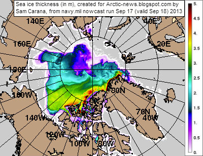
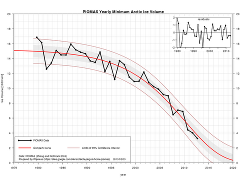
This observation is dramatically demonstrated by the current rise of atmospheric greenhouse gases: this is at an unprecedented rate of 2 to 3 parts per million per year (see figure 3. below). This renders our era – the Anthropocene – a major oxidation event.

Such a growth rate of atmospheric greenhouse gases is extremely rare in geological history. The only analogue is the excavation of billions of tons of carbon from carbonate and shale formation hit by asteroids, such as the K-T impact 65 million years ago and massive global volcanic eruptions.

The consequences for the biosphere – the sixth mass extinction of species – threatens to become a tragedy for human ideals and for nature.

What or who is responsible for the unfolding calamity?

As defined, the Anthropocene is a new geological era triggered by a species which has uniquely mastered ignition. We are using it to excavate and release hundreds of billions of tons of carbon accumulated in Earth’s crust over geological eras into atmosphere.

Once a species masters sources of energy larger by orders of magnitude than its own physiological process (for Homo Sapiens this has been fire, electricity and nuclear fission), the species can hardly be expected to have the wisdom and degree of responsibility to stop its inventions from getting out of control.

Figure 3. Estimates of fossil fuel resources and equivalent atmospheric CO2 levels, including (1) emissions to date;
(2) estimated reserves, and (3) recoverable resources (1 ppm CO2 ~ 2.12 GtC). 
Hansen, 2012, figure 1; http://www.columbia.edu/~jeh1/mailings/2012/20120127_CowardsPart1.pdf
Unique among all species, humans adopted fire and combustion as their source of energy and power over nature. Over the last two million years, camped around fires, watching the flames, human imagination has grown to inquire, perceive future possibilities, develop fears, the craving for immortality, and the concept of gods. Fire has imparted a mythological quality to the human mind.

Once a stable climate was established in the Holocene (about 10,000 years ago), allowing cultivation and production of surplus food, this craving for omnipotence and omniscience was expressed by the building of monuments to immortality, the pyramids, as well as endless wars acquiring loot for this purpose.

Spiritual pantheism by pre-historic people such as the Australian Aboriginals has been transformed into admiration of sky gods and monotheism, then into crass materialism and the space cult.

But space exploration has taught us no other planet exists in the solar system on which the conditions exist for advanced life of the type hosted by Earth.

Since the greenhouse effect and its underlying laws of physics and chemistry were decoded in the 19th century, the question has arisen: to what extent will societies and their leaders accept the implications of the science for human industry and human future? Will the scientific method itself and the enlightenment form the basis of future decisions?

In 21st century Australia, the answer has been a resounding “no”.

Government and corporate decisions on climate change are being influenced by misrepresentations of the evidence. What began some 20 years ago as demonstration of solid empirical evidence has deteriorated to media-controlled debate replete with misunderstandings of the basic laws of physics, paleo-climate science, climate science, biological and ecological principles.

Figure 4. Relations between CO2 rise rates and mean global temperature rise rates during warming periods,
including the Paleocene-Eocene Thermal Maximum, Oligocene, Miocene, late Pliocene, Eemian (glacial termination),
Dansgaard-Oeschger cycles, Medieval Warming Period, 1750-2012 and 1975-2012 periods.
A multitude of media outlets and hundreds of websites proliferate notions ignorant of peer-reviewed science. The lesson of numerous attempted debates with those who deny the reality of global warming, or attempt to attribute it to natural non-human factors, is that those entertaining these notions cannot be dissuaded by any amount of scientific evidence.

Climate change misconceptions include claims that:
  • temperature rise came before CO2 rise during the glacial terminations and that therefore the current rise of temperature is not the result of CO2 rise. However, the effects of CO2and temperature variations are intertwined. During the last ~400,000 years glacial eras were terminated by periods of intense solar activity, affecting decreased CO2 solubility in warming water and thereby a rise in CO2 levels of the atmosphere. By contrast climate developments since the 18th century, when there was negligible or no rise in solar energy hitting the earth, were triggered by the anthropogenic greenhouse effect of the release of 560 billion tonnes of carbon, consistent with the basic laws of physics.
  • global warming is a recovery from the Little Ice Age. However, the Little Ice Age was caused when sunspot activity nearly ceased between 1650 and 1700, depressing global temperatures by 0.2-0.3C relative to preceding periods. By contrast, global warming from about 1975 has tracked toward more than 1.5C over the continents relative to pre-industrial temperatures.
  • cosmic rays flux affects warming. However, a dominant solar effect on the climate since 1970 is ruled out by measurements of solar radiation. The incidence of cosmic rays, which oscillate reciprocally with the 11 years sunspot cycle, has been shown to have minor effects on cloud nucleation and has not varied significantly since the mid-20th century.
  • carbon dioxide is emitted mainly from volcanoes. However, according to the United States Geological Survey (2012), sub-aerial and sub-marine volcanism emits approximately 150–260 million tons of CO2 a year. Anthropogenic emissions total about 35 billion tons CO2 a year.
Meanwhile, the unthinkable consequences of 4 degrees Celsius and higher temperature rise on the terrestrial atmosphere-ocean system have already begun. We are seeing a series of extreme weather events, reflecting the rise in energy/temperature of the atmosphere-ocean system – the “new normal”.

Andrew Glikson
Does responsibility lie with vested interests and fossil fuel lobbies promoting carbon saturation of the atmosphere? Does it lie with media barons and their mouthpieces hijacking the information systems of democracies, or with cowardly political “leaders” – presiding over extensive demise of future generations? Or does responsibility lie with all of us, with the species?

Deceived by pseudoscientific misconceptions, Homo “sapiens” continues to march toward a cliff, taking much of nature with it.

Earlier published at The Conversation.

Monday, September 2, 2013

North Hole

Sea Surface Temperature Anomalies

A dust storm approaches Stratford, Texas, in 1935. From: Wikipedia: Dust Bowl
During the 1930s, North America experienced a devastating drought affecting almost two-thirds of the United States as well as parts of Mexico and Canada. The period is referred to as the Dust Bowl, for its numerous dust storms.

Rapid creation of farms and use of gasoline tractors had caused erosion at massive scale.

Extensive deep plowing of the virgin topsoil of the Great Plains in the preceding decade had removed the natural deep-rooted vegetation that previously kept the soil in place and trapped moisture even during periods of drought and high winds.

So, when the drought came, the dust storms emerged. But what caused the drought?

A 2004 study concludes that the drought was caused by anomalous sea surface temperatures (SST) during that decade and that interactions between the atmosphere and the land surface increased its severity (see image above right with SST anomalies).

Sea Surface Temperature Anomalies in the Arctic

As the above chart shows, SST anomalies in the days of the Dust Bowl were not greater than one degree Celsius. It is in this context that the current situation in the Arctic must be seen. This year, SST anomalies of 5 degrees Celsius or more are showing up in virtually all areas in the Arctic Ocean where the sea ice has disappeared; some areas are exposed to sea surface temperature anomalies higher than 8°C (14.4°F), as discussed in the post Arctic Ocean is turning red.

High SST anomalies can change weather patterns in many places, as discussed in an earlier post on changes to the Polar Jet Stream. The world is now stumbling from one extreme weather event into another, and things look set to get worse every year.

Feedbacks in many ways make things even worse in the Arctic, as described in the post Diagram of Doom. A recent paper by Feng et al. notes that river runoff has significantly increased across the Eurasian Arctic in recent decades, resulting in increased export of young surface carbon. In addition, the paper says, climate change-induced mobilization of old permafrost carbon is well underway in the Arctic. An earlier paper already warned about coastal erosion due to the permafrost melt. In conclusion, the Arctic is hit by climate change like no other place on Earth.

North Hole

As the ice thickness map below shows, holes have appeared in the sea ice in places that once were covered by thick multi-year sea ice.


One such hole, for its proximity to the North Pole, has been aptly named the "North Hole". On the sea ice concentration map below, this hole shows up as a blue spot (i.e. zero ice).


The "Methane Catastrophe"

Why do we care? For starters, methane appears to be rising up from these holes in the sea ice, forming a cloud of high methane concentrations over the Arctic Ocean.


Perhaps this is a good occasion to again look at the methane plume over one km in diameter that appeared in the Laptev Sea end September 2011. The image is part of a paper on the unfolding "Methane Catastrophe".


Back in 2008, Shakhova et al., in the study Anomalies of methane in the atmosphere over the East Siberian shelf: Is there any sign of methane leakage from shallow shelf hydrates? considered release of up to 50 Gt of predicted amount of hydrate storage as highly possible for abrupt release at any time.

For more on the methane threat, please read the post methane hydrates or view the FAQ page.

Action

The threat of the "Methane Catastrophe" requires action to be taken urgently, such as discussed at the Climate Plan.


Links

• Climate Plan
https://arctic-news.blogspot.com/p/climateplan.html

• On the Cause of the 1930s Dust Bowl - by Siegfried Schubert
https://science.sciencemag.org/content/303/5665/1855

• Anomalies of methane in the atmosphere over the East Siberian shelf: Is there any sign of methane leakage from shallow shelf hydrates? - by Natalia Shakhova et al.
http://www.cosis.net/abstracts/EGU2008/01526/EGU2008-A-01526.pdf

• The degradation of submarine permafrost and the destruction of hydrates on the shelf of east arctic seas as a potential cause of the “Methane Catastrophe”: some results of integrated studies in 2011 - by V. I. Sergienko et al.
https://link.springer.com/article/10.1134/S1028334X12080144

• Methane hydrates
https://methane-hydrates.blogspot.com/2013/04/methane-hydrates.html

• Frequently Asked Questions (FAQ)
https://arcticmethane.blogspot.com/p/faq.html