Thursday, September 29, 2022

Crossing 3C

The Northern Hemisphere is where most people live. Furthermore, most people live on land. Let's first look at the temperature rise on the Northern Hemisphere. 

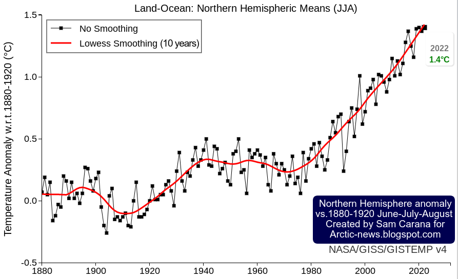
The image below, created with a September 30, 2022 screenshot from NASA customized analysis plots, shows June-July-August temperature anomalies from 1880-1920 on the Northern Hemisphere with June-July-August 2022 highlighted with an anomaly of 1.4°C or 2.52°F, a record high in a tie with 2020. 


Secondly, most people live on land. The image below shows the monthly mean global surface temperature anomaly on land. It is similarly created with a September 30, 2022 screenshot from NASA customized analysis plots and shows a peak anomaly from 1880-1920 of 2.95°C or 5.31°F (for February 2016, land only).


The year 2016 was an El Niño year. During an El Niño, temperatures are higher than usual. We are currently in the depths of a persistent La Niña, which suppresses temperatures. We look set to move into another El Niño within years. 

In conclusion, the temperature rise on land on the Northern Hemisphere looks set to cross 3°C soon, the more so since we are also facing a peak in sunspots (by 2025), which may coincide with peak temperatures associated with the upcoming El Niño. Also keep in mind that the above temperature anomalies are measured from 1880-1920, so the temperature rise from pre-industrial is significantly higher than that. 


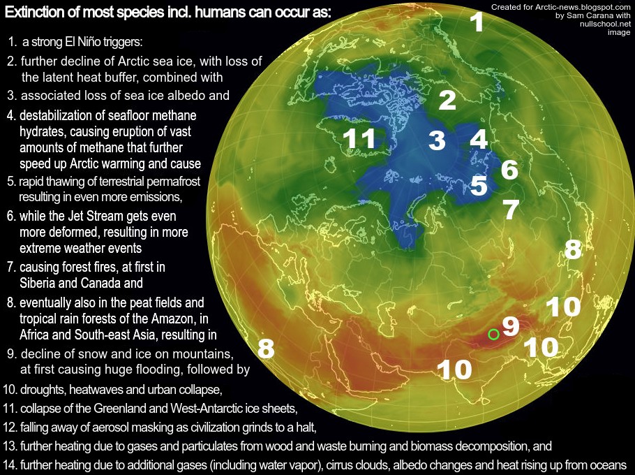
There are further events and developments that could additionally speed up the temperature rise, as discussed at the extinction page. Humans are likely to go extinct with a rise of 3°C, as illustrated by the above image, from an analysis discussed in an earlier post.

Methane levels keep rising

The image below, from an earlier post, shows annual global mean methane with a trend added that points at a methane rise that could in 2028 represent a forcing of 780 ppm CO₂e (with a 1-year GWP of 200).

In other words, the clouds tipping point at 1200 ppm CO₂e could be crossed in 2028 due to the forcing of methane and CO₂ alone, assuming that CO₂ concentration in 2028 will exceed 420 ppm. Moreover, this could happen even earlier, since there are further forcers, while there also are further events and developments that could additionally speed up the temperature rise, as discussed in earlier posts such as this one. Furthermore, the NOAA data used in the above image rise are for marine surface measurements. Methane is accumulating at higher altitude, as illustrated by the compilation images below. 


The top image of above compilation image shows that the MetOp-B (also known as MetOp-1) satellite recorded a mean methane concentration of 1979 parts per billion (ppb) at 293 mb on September 30, 2022 pm. 

The above compilation image shows high concentrations of methane close to sea level, all the way up to the Tropopause. Does this indicate that methane is rising up from the seafloor of the Arctic Ocean?  

Polar Jet Stream (blue) and Subtropical
Jet Stream (red) - NOAA image
Let's first take a look at prevailing wind pattern and how they changed. On the Northern Hemisphere, the coldest point used to be the North Pole, so wind used to flow from the tropics to the North Pole.

This and the deflection due to the Coriolis force resulted in two Jet Streams forming, circumnavigating the globe in what used to be narrow and straight bands, i.e. the Polar Jet Stream at 60° North and the Subtropical Jet Stream at about 30°, both on the Northern and Southern Hemisphere, resulting in a total of four Jet Streams.

The Jet Stream used to circumnavigate the globe in narrow and straight bands, predominantly following a path from East to West, in line with its strength and with this deflection.

Polar Jet Stream and Subtropical Jet Stream - NOAA image
The Jet Stream used to circumnavigate the globe at specific latitudes, as illustrated by the images on the right.

Prevailing wind patterns cause carbon dioxide to accumulate at the poles, as illustrated by the image underneath on the right that shows a high carbon dioxide concentration of 235 ppm over the North Pole. 

Some things changed as, due to emissions by people, the difference in temperature between the Arctic and the Tropics narrowed. 

This decreases the speed at which heat is moving to the North on the Northern Hemisphere and it deforms the Jet Stream and the prevailing wind patterns, which can make it even more easy for methane that is released from the Arctic Ocean to rise up and accumulate at the Tropopause, and move from there toward the Equator as it rises. 

Emissions by people are also causing the Troposhere to expand. 

Note the important difference in weight between carbon dioxide and methane. Carbon dioxide tends to accumulate at lower altitudes since it is heavier than air. Methane, on the other hand, is lighter than air, causing methane to rise and accumulate at altitudes near the Tropopause, from where methane moves closer to the Equator, since the Tropopause is higher in altitude at the Tropics than at the Poles. 

The accumulation of methane at higher altitudes is further illustrated in the compilation image below that shows that methane mean levels are highest where the troposphere ends over the Arctic. 


The situation is dire and the right thing to do now is to help avoid or delay the worst from happening, through action as described in the Climate Plan.


Links

• NASA - GISS Surface Temperature Analysis
https://data.giss.nasa.gov/gistemp/graphs_v4/customize.html

• Cataclysmic Alignment
https://arctic-news.blogspot.com/2022/06/cataclysmic-alignment.html

• Sunspots
https://arctic-news.blogspot.com/p/sunspots.html

• Pre-industrial
https://arctic-news.blogspot.com/p/pre-industrial.html

• When will we die?
https://arctic-news.blogspot.com/2019/06/when-will-we-die.html

• Extinction
https://arctic-news.blogspot.com/p/extinction.html

• Blue Ocean Event 2022?

• Jet Stream

• nullschool.net

Thursday, September 8, 2022

Blue Ocean Event 2022?

The image on the right shows a NASA Worldview satellite image of a blue Beaufort Sea (with Barrow, Alaska, at the top left, on September 7, 2022). 

The image shows that there is a lot of open water between the coast of Alaska and the sea ice.

Such a satellite image provides a visual way to determine how much sea ice is present. It can be hard to determine where there is open water and where the sea ice starts; the sea ice is often covered by clouds; furthermore, even when there are no clouds, the question remains what is to be regarded as sea ice and what is to be regarded as water. 

Another way to measure how much sea ice is there is to look at sea ice concentration. Sea ice concentration in the Central Arctic region has been very low for some time. 

The image on the right, from an earlier post, shows that on August 12, 2022, sea ice concentration in a large area close to the North Pole was as low as 0%. 

In the two images below, Nico Sun calculates the impact of albedo loss based on NSIDC sea ice concentration data. The images illustrate why sea ice loss in the Central Arctic region is so important.

The image below shows that further albedo loss in the Barents Sea, which is virtually icefree at the moment, doesn't make much difference now. 


The image below shows that, by contrast, more albedo loss in the Central Arctic region makes much more difference, even in September. 


Arctic sea ice has become extremely thin, so the latent heat buffer loss is also very strong. This loss of the latent heat buffer can continue to result in higher temperatures of the water for a long time, even long after insolation has passed its annual peak on the Northern Hemisphere, thus causing the combined accumulative impact to continue to be high.

Another way to measure how much sea ice is present is to look at the extent of the sea ice. According to many, a Blue Ocean Event starts once the Arctic sea ice falls below 1 million km² in extent.

Arctic sea ice extent was 4.912 million km² on September 6, 2022, which is larger than the extent in many previous years around this time of year (see NSIDC image below). However, the sea ice has become very thin, resulting in many areas where only small pieces of ice are present. 


NSIDC regard a cell to have sea ice if it has at least 15% sea ice, but when regarding a cell to have sea ice if it has at least 50% ice and if that's the case for ⅕ of the cells where there is (some) ice, then we're already in a Blue Ocean Event right now.

So let's have another look at how much of the above 4.912 million km² can be regarded as sea ice, by using the NSIDC map with sea ice concentration as a guide. 

The roughly-sketched outline drawn over the NASA map below indicates that there may only have been some 991 thousand km² of concentrated sea ice left on September 6, 2022 (inset shows NSIDC sea ice concentration for the day). 


As said, it's a rough sketch, so some cells with a higher concentration of sea ice may have been left out. Having said that, we're currently in the depth of a persistent La Niña and the associated lower air temperatures contribute to a relatively larger sea ice extent than would otherwise be the case. 

In conclusion, depending on what is counted as sea ice, we could already be experiencing a Blue Ocean Event right now. 

Further events and developments

A Blue Ocean Event constitutes the crossing of a huge tipping point and, as a strong El Niño looks set to emerge, this could trigger the unfolding of further events and developments leading to extinction of most species (including humans), as: 
  1. a strong El Niño triggers: 
  2. further decline of the Arctic sea ice, with loss of the latent heat buffer, combined with
  3. associated loss of sea ice albedo and
  4. destabilization of seafloor methane hydrates, causing eruption of vast amounts of methane that further speed up Arctic warming and cause
  5. rapid thawing of terrestrial permafrost, resulting in even more emissions,
  6. while the Jet Stream gets even more deformed, resulting in more extreme weather events
  7. causing forest fires, at first in Siberia and Canada and
  8. eventually also in the peat fields and tropical rain forests of the Amazon, in Africa and South-east Asia, resulting in
  9. decline of snow and ice on mountains, at first causing huge flooding, followed by 
  10. drought, heatwaves and urban collapse,
  11. collapse of the Greenland and West-Antarctic ice sheets,
  12. falling away of aerosol masking as civilization grinds to a halt, 
  13. further heating due to gases and particulates from wood and waste burning and biomass decomposition, and 
  14. further heating due to additional gases (including water vapor), cirrus clouds, albedo changes and heat rising up from oceans. 


Importantly, depicted above is only one scenario out of many. Things may eventuate in different order and occur simultaneously, i.e. instead of one domino tipping over the next one sequentially, many events may occur simultaneously and reinforce each other. Further events and developments could be added to the list, such as ocean stratification and stronger storms that can push large amounts of warm salty water into the Arctic Ocean.


Here is another example of such a scenario. Recent studies indicate that human-caused climate change will soon increase El Niño frequency and intensity. Accordingly, the upcoming El Niño may well be strong. As illustrated with above image, we're currently in the depth of a persistent La Niña, which suppresses the temperature rise, whereas the opposite occurs during El Niño, which amplifies the temperature rise, and this especially affects the Arctic, which is already heating up much faster than the rest of the world. Also, the upcoming El Niño may very well coincide with a peak in sunspots in 2025, further pushing up temperatures.

The image below shows that the rise in sea surface temperatures on the Northern Hemisphere has been suppressed during the ongoing La Niña, but as we move into the next El Niño, the seafloor methane tipping point could be crossed even earlier than the current trend indicates, say by 2025. 


One reason for this is that the narrowing temperature difference between the Arctic and the Tropics will further deform the Jet Stream and in turn cause more extreme weather, leading to more loss of sea ice and thus of its capacity to reflect sunlight and act as a buffer against incoming ocean heat.

A huge amount of heat has built up in the North Atlantic off the coast of North America, as illustrated by the image on the right.

Furthermore, the temperature of the water may well be substantially higher some 50 meter below the sea surface than at the sea surface. 

As discussed in an earlier post, rising temperatures result in stronger winds along the path of the Gulf Stream that can make huge amounts of warm, salty water travel from the Atlantic Ocean toward the Arctic and reach shallow parts of the Arctic Ocean such as the East Siberian Arctic Shelf (ESAS), where most of the sea is less than 50 m deep. The danger is illustrated by the Argo float compilation below.


Very high methane levels

The image below, from an earlier post, shows annual global mean methane with a trend added that points at a methane rise that could in 2028 represent a forcing of 780 ppm CO₂e (with a 1-year GWP of 200). 

In other words, the clouds tipping point at 1200 ppm CO₂e could be crossed in 2028 due to the forcing of methane and CO₂ alone, assuming that CO₂ concentration in 2028 will exceed 420 ppm. Moreover, this could happen even earlier, since there are further forcers, while further events and developments could additionally push up the temperature further, as discussed above. Furthermore, the NOAA data used in the above image are for marine surface measurements. More methane tends to accumulate at higher altitudes, as illustrated by the compilation image below. 


NOAA's globally averaged marine surface mean for April 2022 was 1909.9 ppb. The above image shows that, on September 4, 2022 am, the MetOp satellite recorded a mean methane concentration of 1904 ppb at 586 mb, which is close to sea level. At 293 mb, however, the MetOp satellite recorded a mean of 1977 ppb, while at 218 mb it recorded a peak of 2805 ppb. 

Such high methane levels could be caused by destabilization of methane hydrates at the seafloor of the Arctic Ocean, with large amounts of methane erupting (increasing 160 x in volume) and rising up at accelerating speed through the water column (since methane is lighter than water), concentrated in the form of plumes, which makes that less methane gets broken down in the water by microbes and in the air by hydroxyl, of which there is very little in the Arctic in the first place. Such a methane eruption entering the atmosphere in the form of a plume can be hard to detect as long as it still doesn't cover enough of the 12 km in diameter footprint to give a pixel the color associated with high methane levels. 


The above Copernicus image shows a forecast  for September 9, 2022 18 UTC, of methane at 500 hPa. 

In the video below, from this page, Guy McPherson addresses the question: Has the “Methane Bomb” Been Triggered?


Conclusion

The situation is dire and the right thing to do now is to help avoid or delay the worst from happening, through action as described in the Climate Plan


Links

• NSIDC - Frequently asked questions

• NASA Worldview

• NSIDC - sea ice concentration

• Nico Sun - CryosphereComputing

• NSIDC - sea ice extent

• More Frequent El Niño Events Predicted by 2040
Cutting-edge models predict that El Niño frequency will increase within 2 decades because of climate change, regardless of emissions mitigation efforts.

• Emergence of climate change in the tropical Pacific - by Yun Ying et al. 
https://www.nature.com/articles/s41558-022-01301-z

• Climate Reanalyzer

• Argo Float

• Monitoring of atmospheric composition using the thermal infrared IASI/MetOp sounder - by C. Clerbaux et al. 

• NOAA - MetOp satellite methane data 

• Copernicus methane forecasts

• Clouds feedback and tipping point

• NOAA - global methane

• NOAA - Sea surface temperature anomalies on the Northern Hemisphere 

• NOAA - Monthly Temperature Anomalies Versus El Niño

• NOAA - ENSO: Recent Evolution, Current Status and Predictions
https://www.cpc.ncep.noaa.gov/products/analysis_monitoring/lanina/enso_evolution-status-fcsts-web.pdf

• WMO predicts first “triple-dip” La Niña of the century