Note: there is a similar (older) page at:
This page replaces the old controversy page and also includes more recent debate
For comments on either pages, click on the facebook box at the bottom
This page discusses some of the issues where there appear to be opposing views among contributors.
Names of contributors are typically added at the top of posts, sometimes accompanied by descriptions with further background on contributors. Posts without the name of one or more specific contributors are written by Sam Carana. For more background on contributors, see the About page.
1. What kind of actions should be taken
Sam Carana was a founding member of the Arctic Methane Emergency Group (AMEG). In January 2013, persistent differences in view as to what action should be taken prompted Sam Carana to leave the group and to articulate the action proposed by Sam Carana in the Climate Plan, a comprehensive plan that advocates several lines of action to be implemented in parallel.
Differences in view on this issue can exist among Arctic-News blog contributors, e.g. some contributors may focus mainly on specific action, others may focus mainly on specific warnings. Mark Jacobson focuses on reducing energy emissions, e.g. in The Solutions project. Nathan Currier has a strong focus on methane and has articulated the action he proposes at the site 1250now. David Spratt wrote the book Climate Code Red in 2008 with Philip Sutton, and they are now both on the advisory board of the Climate Mobilization. Paul Beckwith writes at paulbeckwith.net and Nick Breeze and Bru Pearce both write at Envisionation.
2. The appropriateness of non-linear trendlines (polynomial, exponential, etc.)
Concerns have been expressed over the use of polynomial trendlines, such as that polynomial trends, given their focus on recent data, would not be appropriate in climate change projections. Some contributors therefore argue that, from a climate perspective, they need to take distance from graphs using polynomial trendlines, which of course is their prerogative.
There should be no doubt that polynomials can be useful in climate analysis, though. The IPCC in SR1.5 uses a 4th-order polynomial, as the image below shows.

Indeed, there are good reasons for sometimes using non-linear trends. A few examples are discussed below.
Climate science should include the study of abrupt climate change and the danger of this eventuating in the near future. This can make it necessary to focus in on a period that is relatively short. The precautionary principle calls for appropriate action when dangerous situations threaten to develop. How can we assess such danger? Risk is a combination of probability that something will eventuate and severity of the consequences. On the probability dimension, the chance of something happening may be small but severe consequences could make the risk huge. There's a third dimension, i.e. timescale. Imminence could make that a danger needs to be acted upon immediately, comprehensively and effectively, even if the risk may appear to be low.

Polynomial trendlines can point at imminent danger by highlighting that acceleration could eventuate in the near future, e.g. due to feedbacks. Polynomial trendlines can highlight such acceleration and thus warn about dangers that could otherwise be overlooked. This can make polynomial trendlines very valuable in climate change analysis.
Above image shows a chart from a 2019 post, featuring two polynomial trends (in blue and in red) and one linear trend (in green), for comparison. The chart illustrates that polynomial trends can be important tools in highlighting acceleration of the recent temperature rise and the dangers that are contained in acceleration of the rise.
Some argue that the recent acceleration in the temperature rise took place over a period of less than one decade, which would be too short to determine whether changes in climate did take place. Climate change obviously takes place over many years, as opposed to seasonal changes that take place within a period of one year, while the weather can of course change by the hour. Yet, the recent acceleration in the temperature rise should not be ignored in discussions about climate change.
Trendlines can be powerful tools to calculate what the climate was like over a short period of time or at a given moment, say in the year 1750, 1900 or 2020. Trendlines can smooth out variation that could distort the picture when focusing on a short period, while polynomial trendlines can also better capture acceleration than linear trendlines.
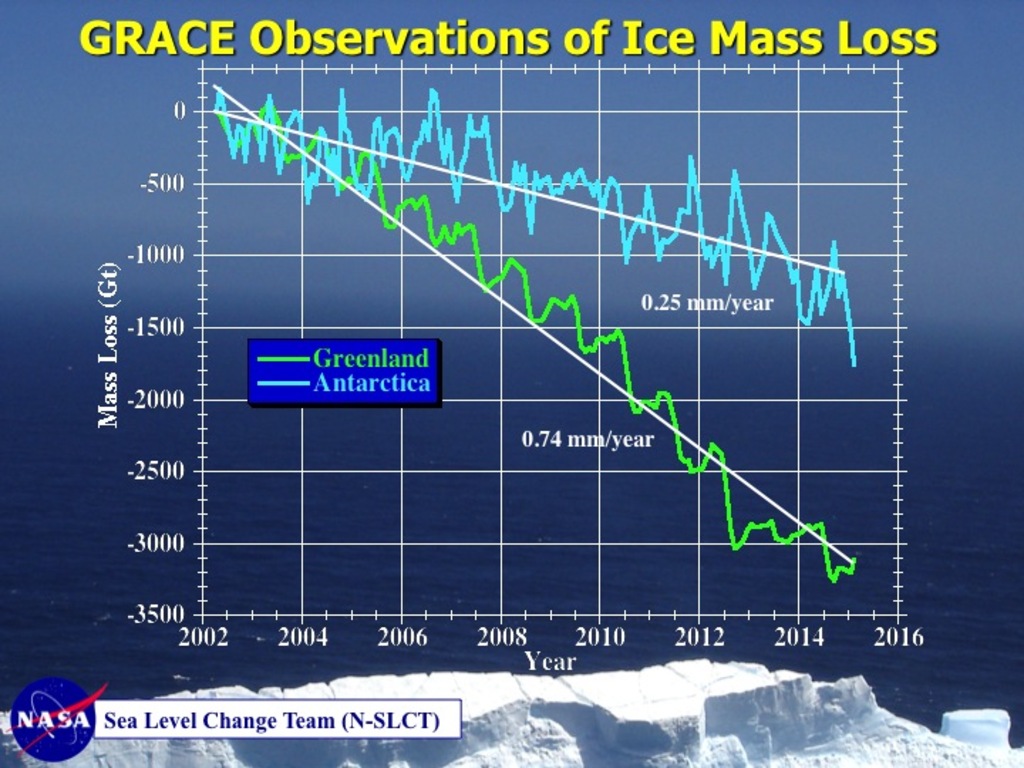
 Polynomial trendlines are not the only way to warn about accelerating developments. The image on the right shows ice mass loss on Greenland and Antarctica. The Grace satellites were launched in March 2002, so we only have these data from 2002 to 2015. The baseline can be put anywhere between 2002 and 2015, without changing the shape of graphs. Putting the baseline at 2002, as in the top image right, could create the false impression that no melting had occurred prior to 2002. Putting the baseline halfway in between 2002 and 2015, as in the image on the right below, therefore makes more sense.
The baseline is thus put halfway in between the years for which data are available, which shows that the ice mass has fallen more steeply on Greenland than on Antarctica. It also makes it easier to spot acceleration of ice loss. Acceleration of ice loss on Antarctica is relatively minor, starting at about +1000 Gt and ending at about -1000 Gt It was actually somewhat below -1000 Gt for a while in 2014. Anyway, ice loss on Greenland was not only more, the loss is also speeding up, starting at +1500 Gt and ending at far below -1500 Gt, i.e. at about -2000 Gt. This way, the graph shows more clearly that Greenland's ice loss is speeding up in a non-linear way, without resorting to polynomial trendlines to show this.
Nonetheless, a polynomial trendline is much stronger in making this point, when extending the trend into the future, as illustrated by the graph below.
For an example of a post using polynomial versus linear trendlines, see also the post 'More than 2.5m Sea Level Rise by 2040?'
Polynomial trendlines may amplify relatively small recent rises (or falls), making the trendline go through the roof (or floor) when extended further into the future. To some extent, this can be avoided by changing the plot area of the chart. Below is an example of this, with both polynomial and linear trendlines shown in an inset, from the post Arctic sea ice remains at a record low for time of year.
Above graphs of Antarctica and Greenland illustrate the threat of sea level rise. The graphs are also useful in the discussions as to how much change in ice there has been on Antarctica and Greenland over the years, e.g. in studies such as at:
Regarding the length of the base period, the NASA images below show that the temperature difference between 1920 and 2020 is 1.3°C, both for a 1910-1930 base, for a 1951-1980 base, a 1915-1925 base, a 1901-1920 base, a 1885-1825 base, a 1887-1927 base and a 1880-1960 base.


The image below uses a 1880-1960 base. The difference in temperature between 1920 and 2020 is 1.3°C.

In conclusion, the difference in temperature between 1920 and 2020 is 1.3°C for a number of base periods, including short as well as long periods.
6. Origin, accuracy and significance of high methane readings over the Arctic Ocean
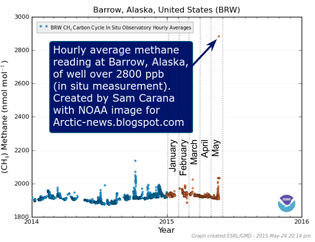
Nathan Currier has concerns about an image showing a high methane reading being posted at the Arctic-news blog (see image below).

Sam Carana, on the other hand, sees no good reason not to post this peak reading, since the global mean at this pressure level is also added to the image. Sam Carana points at a more recent Barrow, Alaska, methane reading that confirms that methane levels as high as the above 2845 ppb are indeed recorded (image below). The veracity of both above image and the image below was confirmed by Harold Hensel who independently downloaded these images from the NOAA websites.

Sam Carana further argues that the reading is noteworthy as it is an additional indication that large abrupt methane releases from the seafloor of the Arctic Ocean constitute a threat that should be acted upon. As the post adds, the big danger is that the combined impact of these feedbacks will accelerate warming in the Arctic to a point where huge amounts of methane will erupt abruptly from the seafloor of the Arctic Ocean.
The image below shows high methane concentrations over the Arctic Ocean on October 11, 2015, pm, at 840 mb, i.e. relatively close to sea level, recorded by the SNPP satellite. Note that methane concentrations over most of the Arctic Ocean are approaching 2000 ppb.

The image below shows high levels of methane over the Arctic Ocean recorded by the MetOp-2 satellite at higher altitude (469 mb) on October 28, 2015, pm, when methane levels were as high as 2345 ppb.

Note that the above two images have different scales. The data are from different satellites. The video below shows images from the MetOp-2 satellite, October 31, 2015, p.m., at altitudes from 3,483 to 34,759 ft or about 1 to 11 km (241 - 892 mb).
Peak methane levels were as high as 2450 ppb on November 1, 2015. Above images and video were part of the post at http://arctic-news.blogspot.com/2015/10/methane-vent-hole-in-arctic-sea-ice.html This post also covers another controversial issue, i.e. what is the origin of hotspots that appear in the sea ice?
Polynomial trendlines can point at imminent danger by highlighting that acceleration could eventuate in the near future, e.g. due to feedbacks. Polynomial trendlines can highlight such acceleration and thus warn about dangers that could otherwise be overlooked. This can make polynomial trendlines very valuable in climate change analysis.
 |
| [ click on images to enlarge ] |
Above image shows a chart from a 2019 post, featuring two polynomial trends (in blue and in red) and one linear trend (in green), for comparison. The chart illustrates that polynomial trends can be important tools in highlighting acceleration of the recent temperature rise and the dangers that are contained in acceleration of the rise.
Some argue that the recent acceleration in the temperature rise took place over a period of less than one decade, which would be too short to determine whether changes in climate did take place. Climate change obviously takes place over many years, as opposed to seasonal changes that take place within a period of one year, while the weather can of course change by the hour. Yet, the recent acceleration in the temperature rise should not be ignored in discussions about climate change.
Trendlines can be powerful tools to calculate what the climate was like over a short period of time or at a given moment, say in the year 1750, 1900 or 2020. Trendlines can smooth out variation that could distort the picture when focusing on a short period, while polynomial trendlines can also better capture acceleration than linear trendlines.
 |
| NASA image |
 Polynomial trendlines are not the only way to warn about accelerating developments. The image on the right shows ice mass loss on Greenland and Antarctica. The Grace satellites were launched in March 2002, so we only have these data from 2002 to 2015. The baseline can be put anywhere between 2002 and 2015, without changing the shape of graphs. Putting the baseline at 2002, as in the top image right, could create the false impression that no melting had occurred prior to 2002. Putting the baseline halfway in between 2002 and 2015, as in the image on the right below, therefore makes more sense.
The baseline is thus put halfway in between the years for which data are available, which shows that the ice mass has fallen more steeply on Greenland than on Antarctica. It also makes it easier to spot acceleration of ice loss. Acceleration of ice loss on Antarctica is relatively minor, starting at about +1000 Gt and ending at about -1000 Gt It was actually somewhat below -1000 Gt for a while in 2014. Anyway, ice loss on Greenland was not only more, the loss is also speeding up, starting at +1500 Gt and ending at far below -1500 Gt, i.e. at about -2000 Gt. This way, the graph shows more clearly that Greenland's ice loss is speeding up in a non-linear way, without resorting to polynomial trendlines to show this.
Nonetheless, a polynomial trendline is much stronger in making this point, when extending the trend into the future, as illustrated by the graph below.
 |
| Dramatic ice mass loss on Greenland looks set to get even worse. |
For an example of a post using polynomial versus linear trendlines, see also the post 'More than 2.5m Sea Level Rise by 2040?'
Polynomial trendlines may amplify relatively small recent rises (or falls), making the trendline go through the roof (or floor) when extended further into the future. To some extent, this can be avoided by changing the plot area of the chart. Below is an example of this, with both polynomial and linear trendlines shown in an inset, from the post Arctic sea ice remains at a record low for time of year.
 |
| INSET: while a polynomial trendline captures the rise from 2000 and extends it into the future, a linear trendline doesn't project temperature anomalies to rise above 1°C before 2020, even though the January 2016 value was 1.82°C |
3. How much change in ice has there been on Antarctica and Greenland over the years and why is this an important issue?
Above graphs of Antarctica and Greenland illustrate the threat of sea level rise. The graphs are also useful in the discussions as to how much change in ice there has been on Antarctica and Greenland over the years, e.g. in studies such as at:
Lead author Jay Zwally concludes: "If the 0.27 millimeters per year of sea level rise attributed to Antarctica in the IPCC report is not really coming from Antarctica, there must be some other contribution to sea level rise that is not accounted for.”
Sam Carana comments that it may well be that more sea level rise than previously thought is actually coming from Greenland, especially from its interior. As the above graph shows, ice loss on Antarctica is relatively minor compared to Greenland, where there was not only more ice loss, this loss is also speeding up, from +1500 Gt in 2002 to about -2000 Gt in 2014, with a trendline pointing at -7500 Gt in 2025. This shows how useful non-linear trendlines can be.
Melting on Greenland (and North-East Canada) could be enlarging a cold freshwater lid over the North Atlantic. This could speed up warming of the Arctic Ocean seafloor, threatening to unleash huge amounts of methane from destabilizing hydrates, as discussed at many posts at the Arctic-news blog, such as this one:
https://arctic-news.blogspot.com/2015/10/september-2015-sea-surface-warmest-on-record.html
Another related issue is that melting of glaciers and ice in the Arctic results in cold, fresh meltwater that impacts the Atlantic meridional overturning circulation (AMOC). This issue is also discussed at the 'Cold freshwater lid on North Atlantic' page, at:
https://arctic-news.blogspot.com/p/cold-freshwater-lid-on-north-atlantic.html
4. The accuracy of linear versus non-linear trends
Some may think that the trend with the highest R² is always the best one. However, as the above chart with the three trends shows, each trend can have a separate useful purpose, while the trend that shows the steepest rise has the highest R².
To work out the temperature rise from pre-industrial, one approach is to look at each of the parts (or periods) that make up the total temperature rise for the full period from pre-industrial up to the current temperature. The sum of the temperature rises of all these parts then equals the total rise from pre-industrial to the current temperature.
The image below is part of a 2021 post, and the post and the image are also discussed at facebook.

The image below shows values for the selected periods in the inset.

Some people have suggested that periods such as 1916-1925 and 1910-1930 were too short to be used as a base. They argue that a longer period as base was needed in climate analysis (NASA's default base is the 30-year period from 1951 to 1980). Similarly, they argue that a single year (2020) should not be used as the end point for climate analysis, since a single year may be subject to short-term variability such as an El Niño.
Regarding the latter point, Sam Carana points out that the temperature in 2020 was reached during a La Niña, while the temperature rise is accelerating. Regarding the choice of the year 1920, it was the most recent year at the time of the analysis and while the anomaly may have been slightly less when a somewhat different base period was used, one of the purposes of the analysis was to find out how how the anomaly from pre-industrial could be. Having said that, the analysis in the pre-industrial page was conducted before NASA adjusted the rise 1920-2020 upward by 0.01°C, so the difference between 1920 and 2020 initially was 1.29°C, which turned out to be somewhat conservative. Similarly, things may change somewhat in line with future updates of temperature values.
4. The accuracy of linear versus non-linear trends
Some may think that the trend with the highest R² is always the best one. However, as the above chart with the three trends shows, each trend can have a separate useful purpose, while the trend that shows the steepest rise has the highest R².
The comparison image below, from the FAQ page, highlights another method that is sometimes used to decide which trend to use, e.g. an exponential trendline or a linear trendline. In this case, a linear trendline has 9 years that fall outside its 95% confidence interval, versus only 4 years for an exponential trendline.

There are further reasons to use an exponential trendline as a warning. There are many feedbacks that can be expected to reinforce sea ice decline. Two such feedbacks are:These two feedbacks have been active from 1979 when satellites first started to measure sea ice, which justifies the use of an exponential trendline. As such feedbacks start to kick in more, though, warming water threatens to cause destabilization of sediments that can contain huge amounts of methane. Even relatively small increases of methane releases over the Arctic Ocean can therefore justify the use of polynomial trendlines.
There are further reasons to use an exponential trendline as a warning. There are many feedbacks that can be expected to reinforce sea ice decline. Two such feedbacks are:
- albedo change, i.e. less sea ice means that more sunlight will be absorbed by the Arctic Ocean, rather than being reflected back into space as before; and
- storms that have more chance to grow stronger as the area with open water increases.
In hindsight, the exponential trend did not eventuate as the chart indicated. Does this mean that the warning expressed in the exponential trend therefore was incorrect? It was actually appropriate to warn about the situation, but sea ice volume is a combination of extent and thickness. Arctic sea ice thickness has fallen dramatically, reducing the capacity of the sea ice to act as a buffer that consumes incoming heat. In hindsight, the warning could have focused more on the fall in thickness, as the heat resulting from a shrinking buffer may well cause all sea ice to disappear soon during the peak of the melting season. Anyway, the point is that, if a potential danger becomes visible when non-linear trendlines are used, the thing to do is to further examine what could cause this, rather than to reject the use of non-linear trends.
5. What is pre-industrial?
To work out the temperature rise from pre-industrial, one approach is to look at each of the parts (or periods) that make up the total temperature rise for the full period from pre-industrial up to the current temperature. The sum of the temperature rises of all these parts then equals the total rise from pre-industrial to the current temperature.
The image below is part of a 2021 post, and the post and the image are also discussed at facebook.


Above image shows the most recent part of the full period used in this analysis, i.e. the temperature rise over the century from 1920 to 2020. In the above image, the temperature is compared to the period 1910-1930 as base. A more recent version of the image using 1916-1925 as baseline appears at the pre-industrial page.
Regarding the latter point, Sam Carana points out that the temperature in 2020 was reached during a La Niña, while the temperature rise is accelerating. Regarding the choice of the year 1920, it was the most recent year at the time of the analysis and while the anomaly may have been slightly less when a somewhat different base period was used, one of the purposes of the analysis was to find out how how the anomaly from pre-industrial could be. Having said that, the analysis in the pre-industrial page was conducted before NASA adjusted the rise 1920-2020 upward by 0.01°C, so the difference between 1920 and 2020 initially was 1.29°C, which turned out to be somewhat conservative. Similarly, things may change somewhat in line with future updates of temperature values.
Regarding the length of the base period, the NASA images below show that the temperature difference between 1920 and 2020 is 1.3°C, both for a 1910-1930 base, for a 1951-1980 base, a 1915-1925 base, a 1901-1920 base, a 1885-1825 base, a 1887-1927 base and a 1880-1960 base.
The image below uses NASA's default base, i.e. 1951-1980. The difference in temperature between 1920 and 2020 is 1.3°C.

The image below uses a 1915-1925 base. The difference in temperature between 1920 and 2020 is 1.3°C.

The image below shows that 1920 was 0.5°C above 1901-1920 as base, but the difference in temperature between 1920 and 2020 remains 1.3°C.

The image below uses a 1885-1925 base. The difference in temperature between 1920 and 2020 is 1.3°C.

The image below uses a 1887-1927 base. The difference in temperature between 1920 and 2020 is 1.3°C.


Other parts of the rise from pre-industrial are calculated based on estimates and on the work such as by Bova et al., as discussed at the pre-industrial page.
6. Origin, accuracy and significance of high methane readings over the Arctic Ocean
Nathan Currier has concerns about an image showing a high methane reading being posted at the Arctic-news blog (see image below).
Sam Carana, on the other hand, sees no good reason not to post this peak reading, since the global mean at this pressure level is also added to the image. Sam Carana points at a more recent Barrow, Alaska, methane reading that confirms that methane levels as high as the above 2845 ppb are indeed recorded (image below). The veracity of both above image and the image below was confirmed by Harold Hensel who independently downloaded these images from the NOAA websites.
Sam Carana further argues that the reading is noteworthy as it is an additional indication that large abrupt methane releases from the seafloor of the Arctic Ocean constitute a threat that should be acted upon. As the post adds, the big danger is that the combined impact of these feedbacks will accelerate warming in the Arctic to a point where huge amounts of methane will erupt abruptly from the seafloor of the Arctic Ocean.
The image below shows high methane concentrations over the Arctic Ocean on October 11, 2015, pm, at 840 mb, i.e. relatively close to sea level, recorded by the SNPP satellite. Note that methane concentrations over most of the Arctic Ocean are approaching 2000 ppb.

The image below shows high levels of methane over the Arctic Ocean recorded by the MetOp-2 satellite at higher altitude (469 mb) on October 28, 2015, pm, when methane levels were as high as 2345 ppb.

Note that the above two images have different scales. The data are from different satellites. The video below shows images from the MetOp-2 satellite, October 31, 2015, p.m., at altitudes from 3,483 to 34,759 ft or about 1 to 11 km (241 - 892 mb).
Peak methane levels were as high as 2450 ppb on November 1, 2015. Above images and video were part of the post at http://arctic-news.blogspot.com/2015/10/methane-vent-hole-in-arctic-sea-ice.html This post also covers another controversial issue, i.e. what is the origin of hotspots that appear in the sea ice?
No comments:
New comments are not allowed.