Showing posts with label Guy McPherson. Show all posts

Thursday, September 8, 2022

Blue Ocean Event 2022?

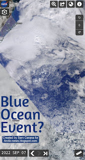
The image on the right shows a NASA Worldview satellite image of a blue Beaufort Sea (with Barrow, Alaska, at the top left, on September 7, 2022). 

The image shows that there is a lot of open water between the coast of Alaska and the sea ice.

Such a satellite image provides a visual way to determine how much sea ice is present. It can be hard to determine where there is open water and where the sea ice starts; the sea ice is often covered by clouds; furthermore, even when there are no clouds, the question remains what is to be regarded as sea ice and what is to be regarded as water. 

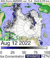
Another way to measure how much sea ice is there is to look at sea ice concentration. Sea ice concentration in the Central Arctic region has been very low for some time. 

The image on the right, from an earlier post, shows that on August 12, 2022, sea ice concentration in a large area close to the North Pole was as low as 0%. 

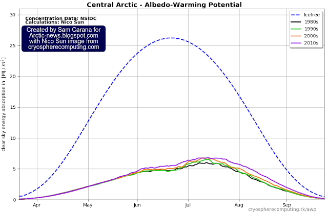
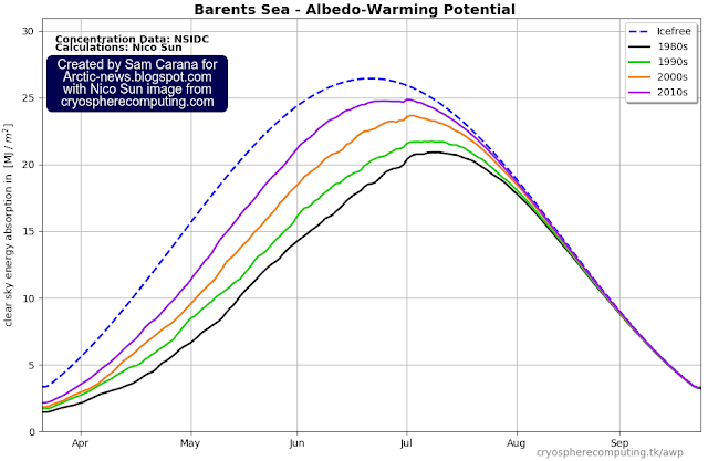
In the two images below, Nico Sun calculates the impact of albedo loss based on NSIDC sea ice concentration data. The images illustrate why sea ice loss in the Central Arctic region is so important.

The image below shows that further albedo loss in the Barents Sea, which is virtually icefree at the moment, doesn't make much difference now. 


The image below shows that, by contrast, more albedo loss in the Central Arctic region makes much more difference, even in September. 


Arctic sea ice has become extremely thin, so the latent heat buffer loss is also very strong. This loss of the latent heat buffer can continue to result in higher temperatures of the water for a long time, even long after insolation has passed its annual peak on the Northern Hemisphere, thus causing the combined accumulative impact to continue to be high.

Another way to measure how much sea ice is present is to look at the extent of the sea ice. According to many, a Blue Ocean Event starts once the Arctic sea ice falls below 1 million km² in extent.

Arctic sea ice extent was 4.912 million km² on September 6, 2022, which is larger than the extent in many previous years around this time of year (see NSIDC image below). However, the sea ice has become very thin, resulting in many areas where only small pieces of ice are present. 


NSIDC regard a cell to have sea ice if it has at least 15% sea ice, but when regarding a cell to have sea ice if it has at least 50% ice and if that's the case for ⅕ of the cells where there is (some) ice, then we're already in a Blue Ocean Event right now.

So let's have another look at how much of the above 4.912 million km² can be regarded as sea ice, by using the NSIDC map with sea ice concentration as a guide. 

The roughly-sketched outline drawn over the NASA map below indicates that there may only have been some 991 thousand km² of concentrated sea ice left on September 6, 2022 (inset shows NSIDC sea ice concentration for the day). 


As said, it's a rough sketch, so some cells with a higher concentration of sea ice may have been left out. Having said that, we're currently in the depth of a persistent La Niña and the associated lower air temperatures contribute to a relatively larger sea ice extent than would otherwise be the case. 

In conclusion, depending on what is counted as sea ice, we could already be experiencing a Blue Ocean Event right now. 

Further events and developments

A Blue Ocean Event constitutes the crossing of a huge tipping point and, as a strong El Niño looks set to emerge, this could trigger the unfolding of further events and developments leading to extinction of most species (including humans), as: 
  1. a strong El Niño triggers: 
  2. further decline of the Arctic sea ice, with loss of the latent heat buffer, combined with
  3. associated loss of sea ice albedo and
  4. destabilization of seafloor methane hydrates, causing eruption of vast amounts of methane that further speed up Arctic warming and cause
  5. rapid thawing of terrestrial permafrost, resulting in even more emissions,
  6. while the Jet Stream gets even more deformed, resulting in more extreme weather events
  7. causing forest fires, at first in Siberia and Canada and
  8. eventually also in the peat fields and tropical rain forests of the Amazon, in Africa and South-east Asia, resulting in
  9. decline of snow and ice on mountains, at first causing huge flooding, followed by 
  10. drought, heatwaves and urban collapse,
  11. collapse of the Greenland and West-Antarctic ice sheets,
  12. falling away of aerosol masking as civilization grinds to a halt, 
  13. further heating due to gases and particulates from wood and waste burning and biomass decomposition, and 
  14. further heating due to additional gases (including water vapor), cirrus clouds, albedo changes and heat rising up from oceans. 


Importantly, depicted above is only one scenario out of many. Things may eventuate in different order and occur simultaneously, i.e. instead of one domino tipping over the next one sequentially, many events may occur simultaneously and reinforce each other. Further events and developments could be added to the list, such as ocean stratification and stronger storms that can push large amounts of warm salty water into the Arctic Ocean.


Here is another example of such a scenario. Recent studies indicate that human-caused climate change will soon increase El Niño frequency and intensity. Accordingly, the upcoming El Niño may well be strong. As illustrated with above image, we're currently in the depth of a persistent La Niña, which suppresses the temperature rise, whereas the opposite occurs during El Niño, which amplifies the temperature rise, and this especially affects the Arctic, which is already heating up much faster than the rest of the world. Also, the upcoming El Niño may very well coincide with a peak in sunspots in 2025, further pushing up temperatures.

The image below shows that the rise in sea surface temperatures on the Northern Hemisphere has been suppressed during the ongoing La Niña, but as we move into the next El Niño, the seafloor methane tipping point could be crossed even earlier than the current trend indicates, say by 2025. 


One reason for this is that the narrowing temperature difference between the Arctic and the Tropics will further deform the Jet Stream and in turn cause more extreme weather, leading to more loss of sea ice and thus of its capacity to reflect sunlight and act as a buffer against incoming ocean heat.

A huge amount of heat has built up in the North Atlantic off the coast of North America, as illustrated by the image on the right.

Furthermore, the temperature of the water may well be substantially higher some 50 meter below the sea surface than at the sea surface. 

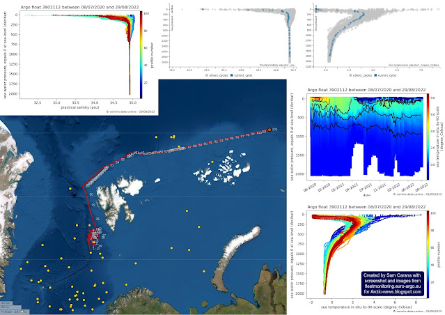
As discussed in an earlier post, rising temperatures result in stronger winds along the path of the Gulf Stream that can make huge amounts of warm, salty water travel from the Atlantic Ocean toward the Arctic and reach shallow parts of the Arctic Ocean such as the East Siberian Arctic Shelf (ESAS), where most of the sea is less than 50 m deep. The danger is illustrated by the Argo float compilation below.


Very high methane levels

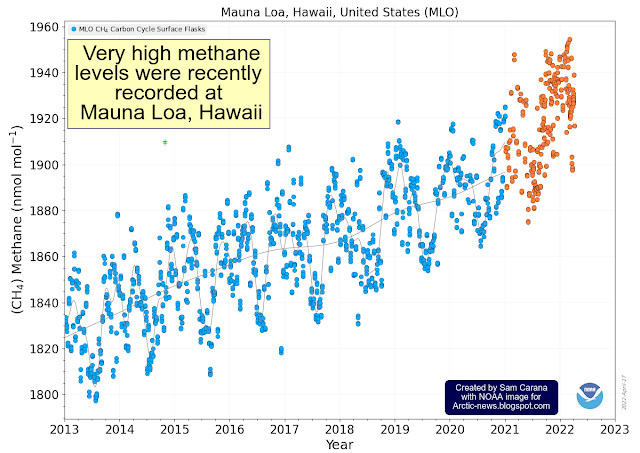
The image below, from an earlier post, shows annual global mean methane with a trend added that points at a methane rise that could in 2028 represent a forcing of 780 ppm CO₂e (with a 1-year GWP of 200). 

In other words, the clouds tipping point at 1200 ppm CO₂e could be crossed in 2028 due to the forcing of methane and CO₂ alone, assuming that CO₂ concentration in 2028 will exceed 420 ppm. Moreover, this could happen even earlier, since there are further forcers, while further events and developments could additionally push up the temperature further, as discussed above. Furthermore, the NOAA data used in the above image are for marine surface measurements. More methane tends to accumulate at higher altitudes, as illustrated by the compilation image below. 


NOAA's globally averaged marine surface mean for April 2022 was 1909.9 ppb. The above image shows that, on September 4, 2022 am, the MetOp satellite recorded a mean methane concentration of 1904 ppb at 586 mb, which is close to sea level. At 293 mb, however, the MetOp satellite recorded a mean of 1977 ppb, while at 218 mb it recorded a peak of 2805 ppb. 

Such high methane levels could be caused by destabilization of methane hydrates at the seafloor of the Arctic Ocean, with large amounts of methane erupting (increasing 160 x in volume) and rising up at accelerating speed through the water column (since methane is lighter than water), concentrated in the form of plumes, which makes that less methane gets broken down in the water by microbes and in the air by hydroxyl, of which there is very little in the Arctic in the first place. Such a methane eruption entering the atmosphere in the form of a plume can be hard to detect as long as it still doesn't cover enough of the 12 km in diameter footprint to give a pixel the color associated with high methane levels. 


The above Copernicus image shows a forecast  for September 9, 2022 18 UTC, of methane at 500 hPa. 

In the video below, from this page, Guy McPherson addresses the question: Has the “Methane Bomb” Been Triggered?


Conclusion

The situation is dire and the right thing to do now is to help avoid or delay the worst from happening, through action as described in the Climate Plan


Links

• NSIDC - Frequently asked questions

• NASA Worldview

• NSIDC - sea ice concentration

• Nico Sun - CryosphereComputing

• NSIDC - sea ice extent

• More Frequent El Niño Events Predicted by 2040
Cutting-edge models predict that El Niño frequency will increase within 2 decades because of climate change, regardless of emissions mitigation efforts.

• Emergence of climate change in the tropical Pacific - by Yun Ying et al. 
https://www.nature.com/articles/s41558-022-01301-z

• Climate Reanalyzer

• Argo Float

• Monitoring of atmospheric composition using the thermal infrared IASI/MetOp sounder - by C. Clerbaux et al. 

• NOAA - MetOp satellite methane data 

• Copernicus methane forecasts

• Clouds feedback and tipping point

• NOAA - global methane

• NOAA - Sea surface temperature anomalies on the Northern Hemisphere 

• NOAA - Monthly Temperature Anomalies Versus El Niño

• NOAA - ENSO: Recent Evolution, Current Status and Predictions
https://www.cpc.ncep.noaa.gov/products/analysis_monitoring/lanina/enso_evolution-status-fcsts-web.pdf

• WMO predicts first “triple-dip” La Niña of the century


Wednesday, July 13, 2022

Human Extinction by 2025?

Most important metric

Kevin Trenberth et al. suggest in a recent article that Earth's energy imbalance, defined as the absorbed solar radiation minus the net outgoing longwave radiation, is arguably the most important metric related to climate change. Of the extra heat from Earth's energy imbalance, about 93% ends up in the ocean as increasing ocean heat content (see image below), 3% goes into melting ice, 4% goes into raising temperatures of land and melting permafrost, and less than 1% remains in the atmosphere. 


One could also argue that the most important metric related to climate change is the monthly mean surface temperatures on land, as illustrated by the image below that was created with a July 16, 2022 screenshot from NASA customized analysis plots and shows that the February 2016 (land only) anomaly from 1886-1915 was 2.94°C or 5.292°F. 


Land only anomalies are important. After all, most people live on land and humans will likely go extinct with a rise of 3°C above pre-industrial, as illustrated by the image below, from an analysis in earlier post.


Note that in the above plot, anomalies are measured versus 1886-1915, which isn't pre-industrial. The image raises questions as to what the temperature rise would look like when using a much earlier base, and how much temperatures could rise over the next few years.  

Potential for temperature rise on land

The image below shows land only surface temperature anomalies, similar to the above image but further adjusted by almost a degree to reflect a pre-industrial base, ocean air temperatures and higher polar anomalies, as discussed at the pre-industrial page.


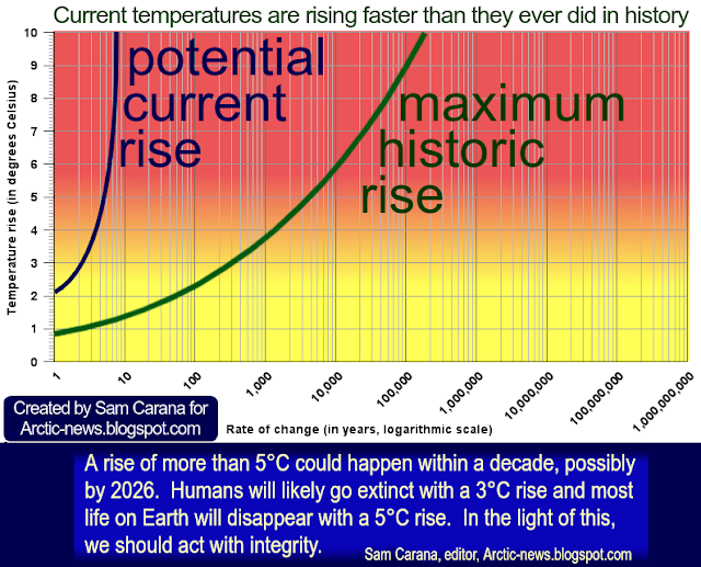
The image features two trends. The blue trend is based on January 1880-June 2022 land only data and shows the potential for 3°C to be crossed on land and to drive humans into extinction by 2025. The green trend is based on January 2010-June 2022 land only data and shows the potential for 5°C to be crossed on land by 2026, which will likely drive most life on land into extinction. 

A temperature rise of 3°C would likely stop all activities by humans, including their emissions, yet temperatures could keep rising.

Could
 temperatures keep rising?

In the video below, Guy McPherson discusses Abrupt, Irreversible Climate Change to Cause Planetary Extinction.


Concentrations of greenhouse gases in the atmosphere constitute yet another important metric related to climate change. Carbon dioxide at Mauna Loa in June 2022 was 420.99 ppm, a joint record high with May 2022, as illustrated by the above image. Methane and nitrous oxide concentrations are also at record high since 1750, as illustrated by the image on the right, from an earlier post

Greenhouse gas concentrations this high are likely to keep adding ocean heat for some time, causing further melting of sea ice, etc.

All these metrics are important, including Earth's energy imbalance, concentrations of greenhouse gases in the atmosphere, and monthly land only surface temperature anomalies.

Greenhouse gases remain in the atmosphere for many years, so even if emissions by people's activities stop now, concentrations of greenhouse gases that have a long lifetime are unlikely to fall much over the next few years, while there would be additional emissions (such as carbon monoxide) from decomposing biomass, forest fires and waste fires globally that would also make it hard for concentrations of shorter-lived methane to fall, as also discussed here.

We're also moving into a new El Niño, as illustrated by the image on the right. The difference between the top of El Niño and the bottom of La Niña could be more than half a degree Celsius, as the NOAA image below shows. The upcoming El Niño may well coincide with a peak in sunspots in 2025, further pushing up temperatures, as also discussed in the post Cataclysmic Alignment, which also mentions a recent study that warns that the combined impact of aerosols and nitrogen fertilizers can contribute much more strongly than previously thought to the formation of cirrus clouds that contribute to global warming. 


The resulting heatwaves and fires could trigger massive blackouts and, as civilization grinds to a halt, this could cause much of the sulfate masking effect to fall away almost instantly, resulting in further acceleration of the temperature rise. 

All this looks set to contribute to keep temperatures rising for years to come, with the danger of increasing ocean temperatures to the point where there would be massive eruptions of seafloor methane that contribute to the clouds tipping point at 1200 ppm CO₂e to be crossed, which in itself would push up temperatures by a further 8°C and cause rapid extinction of most life on Earth, as this 2019 analysis and this and this more recent analyses warn.

[ from earlier post ]

The clouds tipping point could be crossed as a result of seafloor methane releases. There is potential for such releases, given the rising ocean heat and the vast amounts of methane present in vulnerable sediments at the seafloor of the Arctic Ocean, as discussed in posts such as this one. If methane concentrations would increase in line with the trend in the above mage, i.e. methane reaching 780 ppm CO₂e by 2028 using a 1-year GWP of 200, this plus a concentration of carbon dioxide of 420.99 ppm as in the image further above would suffice to cause the clouds tipping point to be crossed. When adding further forcers, this could happen even earlier.

[ click on images to enlarge ]
Altogether, the global temperature could rise by more than 18°C above pre-industrial within a few years, as also discussed at the Extinction page. Even the longer-term outlook doesn't look promising. A 2020 analysis by Jorgen Randers et al. points out that, even if all greenhouse gas emissions by people could stop immediately and even if the temperature anomaly could fall to 0.5°C above pre-industrial, greenhouse gas levels would start rising again after 2150 and keep rising for centuries to come, while, as discussed in an earlier post, a 2016 analysis by Ganapolski et al. suggests that even moderate anthropogenic cumulative carbon dioxide emissions would cause an absence of the snow and ice cover in the next Milankovitch cycle, so there would be no buffer at the next peak in insolation, and temperatures would continue to rise, making the absence of snow and ice a permanent loss for millennia to come.

Conclusion

In an earlier post, the following question was also discussed: Could temperatures keep rising? This post concludes that surface temperatures on land could rise strongly over the next few years and drive humans into extinction as early as in 2025. Temperatures could continue to rise afterwards and drive most life on Earth into extinction soon thereafter, making it the more important to do the right thing now and help avoid the worst from happening, through comprehensive and effective action as described in the Climate Plan.

Our duty to support local people's courts that administer local feebates 

The disregard for science and democracy by those in power has now become so apparent and appalling that we, the people, must agree that the best way forward is to institute Local People's Courts in which randomly-chosen residents administer local feebates, as a superior form of democracy and decision-making.

Elections do allow people to participate in decisions regarding their own lives and future, but elections only give people a single choice every few years between representatives who then take decisions of importance for them. While this can be regarded as a shallow form of democracy, it is now sufficiently clear that elections effectively remove people's participation in such decisions and deteriorate the outlook and future for people and the environment locally and globally.

Residents should participate in decisions regarding their own lives and environment by supporting Local People's Courts that administer local feebates, with fees added to the sales price of polluting products and to rates on degraded land, and with revenue of fees used to fund support for improvements, such as through rebates on cleaner products sold locally or rebates on local rates on improved land. Local People's Courts can best ensure that choices regarding percentages and eligibility of fees and rebates are science-based, while feebates leave the choice as to what to buy or sell to individuals.

[ image from earlier post ]


Links

• A perspective on climate change from Earth's energy imbalance - by Kevin Trenberth et al. 
https://iopscience.iop.org/article/10.1088/2752-5295/ac6f74

• Another Record: Ocean Warming Continues through 2021 despite La Niña Conditions - by Lijing Cheng et al. 
https://link.springer.com/article/10.1007/s00376-022-1461-3

• Improved Quantification of the Rate of Ocean Warming - by Lijing Cheng et al. 
https://journals.ametsoc.org/view/journals/clim/35/14/JCLI-D-21-0895.1.xml

• NASA - GISS Surface Temperature Analysis 


• An earth system model shows self-sustained thawing of permafrost even if all man-made GHG emissions stop in 2020 - by Jorgen Randers et al.
https://www.nature.com/articles/s41598-020-75481-z

• Could temperatures keep rising?

• Critical insolation–CO2 relation for diagnosing past and future glacial inception - by Andrey Ganapolski et al. (2016)
https://www.nature.com/articles/nature16494

• NOAA - Trends in Atmospheric Carbon Dioxide - Mauna Loa, Hawaii 
https://gml.noaa.gov/ccgg/trends/graph.html

• Will COP26 in Glasgow deliver?
• Impact of interannual and multidecadal trends on methane-climate feedbacks and sensitivity - by Chin-Hsien Cheng et al.
https://www.nature.com/articles/s41467-022-31345-w

• NOAA - ENSO: Recent Evolution, Current Status and Predictions
https://www.cpc.ncep.noaa.gov/products/analysis_monitoring/lanina/enso_evolution-status-fcsts-web.pdf

• NOAA - Monthly Temperature Anomalies Versus El Niño

• Cataclysmic Alignment 
https://arctic-news.blogspot.com/2022/06/cataclysmic-alignment.html

• Sunspots
https://arctic-news.blogspot.com/p/sunspots.html

• Methane rise is accelerating

Wednesday, April 27, 2022

Carbon dioxide crosses 422 ppm

Carbon dioxide (CO₂) reached an average daily concentration of 422.06 ppm on April 26, 2022, at Mauna Loa, Hawaii.


Furthermore, very high methane (CH₄) concentrations were recorded recently at Mauna Loa, Hawaii, with surface flask readings appearing to be as high as 1955 ppb.  


Clouds tipping point

A methane concentration of 1955 ppb corresponds, at a Global Warming Potential (GWP) of 200, with a carbon dioxide equivalent (CO₂e) of 391 ppm. Together with the above daily average CO₂ concentration of 422.06 ppm this adds up to a joint CO₂e of 813.06 ppm, i.e. less than 387 ppm away from the clouds tipping point (at 1200 ppm CO₂e) that on its own could raise the global temperature by 8°C.

Such a 387 ppm CO₂e could be added almost immediately by a burst of seafloor methane less than the size of the methane that is currently in the atmosphere (about 5 Gt). There is plenty of potential for such an abrupt release, given the rising ocean heat and the vast amounts of methane present in vulnerable sediments at the seafloor of the Arctic Ocean, as discussed in posts such as this one.


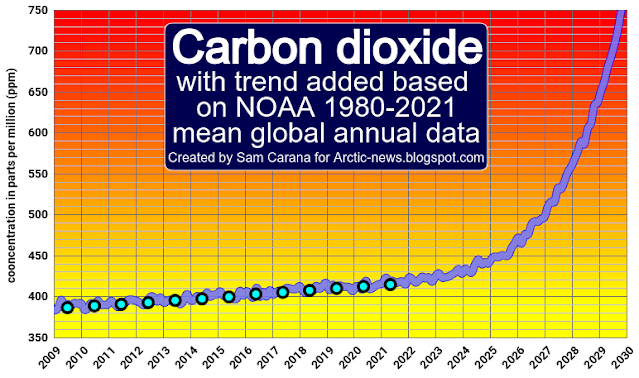
The 1200 ppm CO₂e clouds tipping point could also be crossed even without such an abrupt seafloor methane release. Carbon dioxide and methane levels are rising rapidly. The above image shows carbon dioxide concentration with a trend added, based on NOAA 1980-2021 mean global annual carbon dioxide data, illustrating how carbon dioxide concentration could cross 750 ppm by the end of the year 2029.

[ see also the importance of methane ]

The above image shows methane concentration with a trend added, based on NOAA 2008-2021 mean global annual methane data, illustrating how methane concentration could cross 4100 ppb by the end of the year 2029 and how methane's impact could cross 820 ppm CO₂e by the end of the year 2029.

As illustrated by the image below, 750 ppm carbon dioxide and 820 ppm CO₂e methane would together yield a joint CO₂e of 1570 ppm and thus would have already raised the global temperature by 8°C due to the clouds feedback much earlier than 2029, while the temperature rise would also have been driven up by the higher carbon dioxide and the methane concentrations. 


Furthermore, nitrous oxide is also rising and there are many further forcers, as discussed at the Extinction page. Altogether, there is the potential for a temperature rise of well over 18°C by 2026, as discussed in an earlier post.

Such high carbon dioxide concentrations could occur due to forest fires causing soils to burn (especially peat soils), which can also add vast amounts of methane to the atmosphere. 

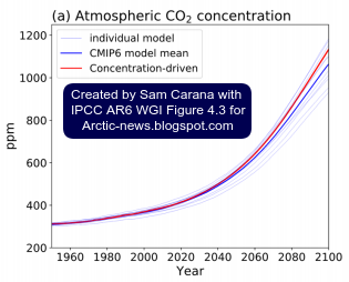
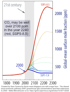
The IPCC does contemplate high carbon dioxide scenarios (see image right), but as discussed in an earlier post, does not mention the clouds tipping point.

High carbon dioxide scenarios typically stop at the year 2100 and rarely do concentrations reach higher than 1200 ppm.

In the image on the right, from a 2020 analysis by Malte Meinshausen et al., the SSP5-8.5 scenario is extended to the year 2300 and a carbon dioxide concentration of well over 2100 ppm is reached around 2240.

In conclusion, there is plenty of scientific consideration of the potential for high concentrations of carbon dioxide and methane to eventuate, but it is typically ignored or waved away as too distant in the future to worry about. 

In other words, what's lacking is analysis of abrupt catastrophic climate change.

Climate change danger assessment

The image below expands risk assessment beyond its typical definition as the product of the severity of impact and probability, by adding a third dimension: timescale.


Water in soil and atmosphere

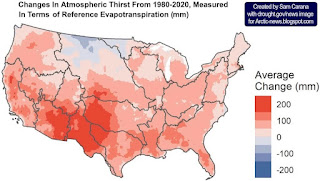
The image on the right, from a news release associated with a recent study, shows changes in atmospheric thirst, measured in terms of reference evapotranspiration from 1980-202 (in mm).

As temperatures rise due to people's emissions, more evaporation will take place over both land oceans, but not all water will return as precipitation, so more water vapor will stay in the air.

[ click on images to enlarge ]
The water-holding capacity of the atmosphere increases by about 7% for every 1°C (1.8°F) rise in temperature, in line with the Clausius–Clapeyron relation

In many cases, this means drier soils and vegetation, making vegetation more vulnerable to pests and diseases, and more prone to fire hazards. 

Water in the soil acts as a buffer, slowing down the temperature rise, so drier soil will heat up faster and further, causing land surface temperatures to rise even more and amplifying the impact of Urban heat island and Heat dome phenomena.

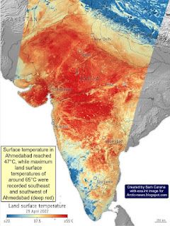
The image on the right, adapted from ESA, shows land surface temperatures as high as 65°C (149°F) in India on April 26, 2022. Note that land surface temperatures can be substantially higher than air temperatures. 

As temperatures rise, extreme weather events increase in frequency and intensity. The duration of extreme weather events can also increase, due to blocked weather patterns resulting from changes to the Jet Stream.

This contributes to shortages in food and water supplies. As long as glaciers are melting in the mountains, rivers will keep supplying some water, but the snow and ice cover is disappearing rapidly around the globe. 

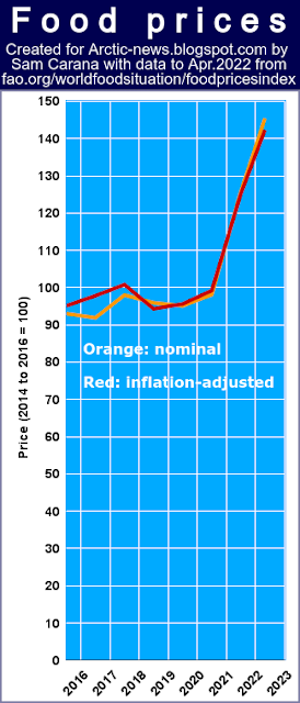
The image on the right shows that food prices have risen strongly over the past few years and extreme weather events resulting from the global temperature rise have strongly contributed to the price rise. 

Further contributing to this rise is the rising demand for fertilizers that are currently all too often produced with fossil fuel, as political will to produce food in better ways remains lacking. 

Heat stress

Another issue is humidity. The more water vapor there is in the air, the harder temperature peaks are to bear.

The human body can cool itself by sweating, which has a physiological limit that is often described as a 35°C wet-bulb temperature

A 2020 study (by Raymond et al.) warned that this limit could be regularly exceeded with a temperature rise of less than 2.5°C (compared to pre-industrial).

Meanwhile, recent research found that in practice the limit will typically be lower and depending on circumstances could be as low as a wet-bulb temperature of 25°C.

In the video below, Paul Beckwith discusses the danger of combined high heat and humidity. 


In the video below, Guy McPherson also discusses the danger of combined high heat and humidity. 


Extinction

A 2018 study (by Strona & Bradshaw) indicates that most life on Earth will disappear with a 5°C rise. Humans, who depend for their survival on many other species, will likely go extinct with a 3°C rise, as illustrated by the image below, from an earlier post.


Conclusion

This further highlights the imminence of the danger and adds further urgency to the call for immediate, comprehensive and effective action, as described in the Climate Plan.


Links

• NOAA - Global Monitoring Laboratory, Recent Daily Average CO₂ at Mauna Loa, Hawaii, U.S. 
• NOAA - Global Monitoring Laboratory, Methane (surface flasks) at Mauna Loa, Hawaii, U.S. 
• The Importance of Methane
https://arctic-news.blogspot.com/p/the-importance-of-methane-in-climate.html

• Clouds feedback and tipping point
https://arctic-news.blogspot.com/p/clouds-feedback.html

• NOAA - Globally averaged marine surface annual mean carbon dioxide data
https://gml.noaa.gov/webdata/ccgg/trends/co2/co2_annmean_gl.txt

• NOAA - Globally averaged marine surface annual mean methane data
https://gml.noaa.gov/webdata/ccgg/trends/ch4/ch4_annmean_gl.txt

• NOAA - Mauna Loa CO2 weekly mean and historical comparisons
https://gml.noaa.gov/webdata/ccgg/trends/co2/co2_weekly_mlo.txt

• Methane rise is accelerating

• Runaway temperature rise by 2026?
• Extinction
https://arctic-news.blogspot.com/p/extinction.html

• Shortcomings of IPCC AR6 WGIII - Mitigation of Climate Change
https://arctic-news.blogspot.com/2022/04/shortcomings-of-ipcc-ar6-wgiii-mitigation-of-climate-change.html

• NOAA Mauna Loa CO₂ annual mean data
https://gml.noaa.gov/ccgg/trends/data.html

• NOAA globaly averaged marine surface annual mean methane data
https://gml.noaa.gov/ccgg/trends_ch4

• Is the IPCC creating false perceptions, again?
https://arctic-news.blogspot.com/2021/08/is-the-ipcc-creating-false-perceptions-again.html

• The shared socio-economic pathway (SSP) greenhouse gas concentrations and their extensions to 2500 - by Malte Meinshausen et al. 
https://gmd.copernicus.org/articles/13/3571/2020

• Clausius–Clapeyron relation

• Heat dome
https://en.wikipedia.org/wiki/Heat_dome

• ESA - Heatwave across India
https://www.esa.int/ESA_Multimedia/Images/2022/04/Heatwave_across_India

• Evaporative Demand Increase Across Lower 48 Means Less Water Supplies, Drier Vegetation, and Higher Fire Risk
https://www.drought.gov/news/evaporative-demand-increase-across-lower-48-means-less-water-supplies

• A Multidataset Assessment of Climatic Drivers and Uncertainties of Recent Trends in Evaporative Demand across the Continental United States - by Christine Albano et al.
https://journals.ametsoc.org/view/journals/hydr/23/4/JHM-D-21-0163.1.xml

• It could be unbearably hot in many places within a few years time
https://arctic-news.blogspot.com/2016/07/it-could-be-unbearably-hot-in-many-places-within-a-few-years-time.html

• The emergence of heat and humidity too severe for human tolerance - by Colin Raymond et al.
https://www.science.org/doi/10.1126/sciadv.aaw1838

• Evaluating the 35°C wet-bulb temperature adaptability threshold for young, healthy subjects (PSU HEAT Project) - by Daniel Vecellio et al.
https://pennstate.pure.elsevier.com/en/publications/evaluating-the-35c-wet-bulb-temperature-adaptability-threshold-fo

• Co-extinctions annihilate planetary life during extreme environmental change, by Giovanni Strona and Corey Bradshaw (2018)
https://www.nature.com/articles/s41598-018-35068-1

• Jet Stream
https://arctic-news.blogspot.com/p/jet-stream.html

• When Will We Die?
https://arctic-news.blogspot.com/2019/06/when-will-we-die.html

• Climate Plan
https://arctic-news.blogspot.com/p/climateplan.html


Saturday, February 5, 2022

When will humans go extinct?

In a recent paper, Guy McPherson, Beril Sirmacek and Ricardo Vinuesa discuss Environmental thresholds for mass-extinction events. Authors point at an image by Song et al. (2021) that shows how major mass extinctions over the past 541 million years (the Phanerozoic) are linked to temperature rises higher than 5.2°C and rates of change higher than 10°C/Myr.


Earlier, a 2018 study by Strona & Bradshaw found that at 5°C rise, most life on Earth will be extinct (see box below on the right, from an earlier post).
 
In the video below, authors Guy McPherson, Beril Sirmacek and Ricardo Vinuesa discuss their analysis 'Environmental thresholds for mass extinction events'.

Authors point out that, next to temperature rise and rates of change, there are further variables such as rates of deforestation, ocean acidification and spreading of toxic substances that can additionally contribute to cause species to disappear.

Accordingly,  many species are likely to go extinct at rises much lower than 5°C. 

Humans - who depend on many species - could go extinct with a 3°C rise, as the above-mentioned earlier post concluded.

This makes it even more critical to assess how much the temperature has already risen from pre-industrial. As illustrated by the image below, we may already be more than 2°C above pre-industrial and face a potentially huge temperature rise over the next few years.


Below, the video associated with the analysis Environmental thresholds for mass-extinction events.


The situation is dire and calls for comprehensive and effective action, as described in the Climate Plan.


Links

• Environmental thresholds for mass-extinction events - by Guy McPherson, Beril Sirmacek and Ricardo Vinuesa (2022)
https://arxiv.org/abs/2108.08933

• Thresholds of temperature change for mass extinctions - by Haijun Song et al. (2021)
https://www.nature.com/articles/s41467-021-25019-2

• Co-extinctions annihilate planetary life during extreme environmental change - by Giovanni Strona and Corey Bradshaw (2018)
https://www.ncbi.nlm.nih.gov/pmc/articles/PMC6233172

• When Will We Die?
https://arctic-news.blogspot.com/2019/06/when-will-we-die.html

• Pre-industrial
https://arctic-news.blogspot.com/p/pre-industrial.html

• Climate Plan
https://arctic-news.blogspot.com/p/climateplan.html

Thursday, August 26, 2021

Is the IPCC creating false perceptions, again?

IPCC AR6 Report

The Working Group I contribution to the Sixth Assessment Report (WG1 AR6) of the Intergovernmental Panel on Climate Change (IPCC) raises the question: Is the IPCC seeking to downplay the dire situation that we are in, again? 


Downplaying the temperature rise from pre-industrial

One of the first issues that comes up is the baseline. The IPCC uses 1850–1900 as a baseline, like it did before (in SR1.5). This is one out of many instances where the IPCC creates a perception that it would take many years before the 1.5°C threshold would be crossed. This 1850–1900 isn't pre-industrial. The Paris Agreement calls for pre-industrial as a base. 

The IPCC image on the right shows a 1.09°C rise from 1850–1900. This isn't the rise to the year 2020, but it is the rise to the period from 2011 to 2020. 

Instead, when taking the 2020 temperature rise and going back one century, NASA data show a 1.29°C rise from 1920, and this is a conservative figure, as 0.1°C can be added to translate NASA's sea surface temperatures into ocean air temperatures and another 0.1°C can be added for higher polar anomalies, which brings the temperature rise up to almost 1.5°C and this isn't the full rise from pre-industrial by a long shot.


Furthermore, the IPCC uses seasonally-biased data to "reconstruct" the temperature rise that took place prior to its baseline, making it look as if there was no rise before its baseline.

Instead, the rise from pre-industrial to 1920 could be as much as 0.3°C (1750 to 1920) + 0.2°C (1520 to 1750) + 0.29°C (3480 BC to 1520).

Adding up the rises for all these elements gives a total rise from pre-industrial to 2020 that could be as high as 1.29°C + 0.1°C + 0.1°C + 0.3°C + 0.2°C + 0.29°C = 2.28°C, as highlighted by above images and as further discussed at the pre-industrial page

In February 2016, the temperature
was 1.70°C higher than in 1900
(i.e. 1885-1914, the 30-year period
centered around the start of 1900)
Ignoring peak peril by averaging over long periods

The map on the right shows that the average global temperature was 1.70°C higher in February 2016 than around 1900 (i.e. 1885-1914). The map also shows local anomalies as high as 15.1°C and even higher peaks were reached on specific days. 

This raises questions as to how the thresholds set at the Paris Agreement should be measured, i.e. is a threshold deemed to be crossed when the anomaly from pre-industrial crosses the threshold for a month, or for a year, or for a decade? Wouldn't a long period effectively grant polluters a long grace period to keep polluting? 

When in doubt, wouldn't downplaying the danger violate the precautionary principle?  

When building a bridge, an engineer will calculate how much load it can handle by first looking at how many heavy trucks will be using the bridge at times of PEAK traffic, rather than to average the weight of all vehicles on the bridge over a 30-year period. Caption and image by Sam Carana from earlier post.

Downplaying the near-term temperature rise

The Paris Agreement calls for politicians to limit the temperature rise to well below 2°C from pre-industrial, while calling upon the IPCC to describe pathways to achieve this. 

Instead of pointing at the policies that can best be  adopted, the IPCC uses Shared Socioeconomic Pathways (SSPs), and the only two scenarios for which the rise remains well below 2°C are SSP1-1.9 and SSP1-2.6 (images right).

The position of methane is of vital importance in these scenarios. As a requirement for both the SSP1-1.9 and SSP1-2.6 scenarios, methane emissions would need to have fallen since the year 2015. Even for SSP2-4.5, for which 2°C does get crossed, methane emissions would need to fall.

So, have methane levels fallen since 2015?

The image on the right shows NOAA globally averaged marine surface monthly means up to the most recent one which is April 2021. The NOAA annual mean methane data are:
in 2015: 1834 ppb
in 2016: 1843 ppb
in 2017: 1850 ppb
in 2018: 1857 ppb
in 2019: 1866 ppb (most recent IPCC level)
in 2020: 1879 ppb

Note also that above NOAA data are for global mean marine surface readings. At higher altitudes, even higher levels show up. The combination image below illustrates this, showing that the MetOp-1 satellite recorded a mean global methane level of 1956 ppb at 293 mb on September 2, 2021, am (panel left). The image in the right panel shows that the same satellite recorded much lower mean global methane levels, i.e. of 1894 ppb, closer to sea level, i.e. at 586 mb, on September 5, 2021, pm, while peak methane levels were as high as 2738 ppb and much methane was showing up over the Arctic Ocean. 


Ominously, methane reached very high peak levels recently. The Metop-2 satellite recorded a peak methane level of 3422 ppb at 469 mb on October 3, 2021, pm.

The image on the right shows high recent monthly average methane levels recorded at Barrow, Alaska. While this may not be representative for global methane levels, it does constitute a frightening warning of what may eventuate.

Stronger methane releases from subsea permafrost can be expected, says a paper by Natalia Shakhova et al. A 1000-fold methane increase could occur, resulting in a rise of as much as 6°C within 80 years, with more to follow after that, according to a paper by Atsushi Obata et al.

Seafloor methane releases could be triggered by strong winds causing an influx of warm, salty water into the Arctic ocean (see this earlier post and this page). Since little hydroxyl is present in the atmosphere over the Arctic, it is much harder for this methane to get broken down.

Even relatively small methane releases could cause tremendous heating, if they reach the stratosphere. Methane rises from the Arctic Ocean concentrated in plumes, pushing away the aerosols and gases that slow down the rise of methane elsewhere, which enables methane erupting from the Arctic Ocean to rise straight up fast and reach the stratosphere. IPCC AR6 gives methane a lifetime of 11.8 years. IPCC TAR gave stratospheric methane a lifetime of 120 years, adding that less than 7% of methane did reach the stratosphere at the time. 


The MetOp-1 satellite recorded a mean global methane level of 1956 ppb on September 11, 2021 am, at 293 mb. This corresponds with an altitude of some 9 km, which is where the Stratosphere starts at the North Pole. The conversion table shows that the Tropopause, which separates the Troposphere from the Stratosphere, is lower over the North Pole (at about 9 km altitude) than over the Equator (17 km altitude). 

[ click on images to enlarge ]
Mind you, the IPCC report does include some frightening images, such as one with a temperature rise of up to 17.5°C by 2300 (Figure 4.40), and one with CO₂ levels approaching 1200 ppm around 2100, corresponding with a temperature rise of up to 8°C (Figure 4.3).

What the IPCC doesn't mention is that at 1200 ppm CO₂e the clouds tipping point would get crossed that results in an additional 8°C temperature rise. With a high rise in methane levels and the GWP for methane calculated over a short horizon, such a huge temperature rise could eventuate within a few years time.

[ from earlier post ]
The IPCC downplays the methane threat by simply excluding the potential for a high rise in methane levels, while using a 100-year GWP for methane and while also waving away the potential for strong methane releases from oceans to the atmosphere.

For a really high methane emissions scenario, the image on the right shows a trend that is based on NOAA 2006-2020 annual global mean marine surface methane data and that points at a mean of 3893 ppb getting crossed by the end of 2026, a level less than twice as high as the recent 1956 ppb mean methane level.

Such a high mean methane level by 2026 cannot be ruled out, given the rapid recent growth in mean annual methane levels and with double-digit growth sustained beyond 2020 to date. It is deceptive to assume that methane levels have fallen and will continue to fall, the more so since the IPCC doesn't point at the most effective policies to achieve reductions in methane emissions.

By how much would such a doubling of the methane level raise the total carbon dioxide equivalent (CO₂e) level for greenhouse gases? A methane level of 3893 ppb would translate into 583.95 ppm CO₂e (at a GWP for methane of 150 for a 9-year horizon) or 778.6 ppm CO₂e (at a GWP for methane of 200 for a 5-year horizon). 

The image on the right shows trends based on IPCC AR6 GWP values pointing at a GWP for methane of 150 for a 9-year horizon and pointing at an even higher GWP for a shorter horizon. A short horizon is quite appropriate given that the above trend points at the possibility of such a high level for methane getting reached by 2026. 

Even with less methane, when using a short horizon for the GWP of methane and adding the impact of further greenhouse gases (carbon dioxide, nitrous oxide, water vapor, etc.), the 1200 ppm CO₂e clouds tipping point could get crossed by 2026. 

As said, the IPCC AR6 uses SSPs to depict rises or falls for emissions. For methane, emissions would need to have fallen since 2015 for both the SSP1-1.9 and SSP1-2.6 scenarios. The same goes for nitrous oxide, as the top panel of the image on the right indicates (see also this version).

Instead, however, as the image in the bottom panel indicates, recent nitrous oxide concentrations appear to follow a polynomial (blue) trend, rather than a linear (green) trend. In other words, growth in nitrous oxide releases is also accelerating.

Without implementation of effective policies, emissions cannot be expected to fall. Moreover, emission reductions alone will be insufficient to avoid a possibly sharp rise in temperature over the next few years. Sadly, the IPCC fails to outline pathways to improve the situation. 

Given that humans will likely go extinct with a 3°C rise, and a 5°C rise will likely end most life on Earth, the IPCC could have given a little more warning that a huge temperature rise may happen over the next few years.

Natural variability acts as a catalyst in this case. Within a few years time, sunspots will be reaching the peak of their cycle, and they are looking stronger than forecast.

An upcoming El Niño could raise surface temperatures significantly. The image below indicates that the difference between the top of El Niño and the bottom of La Niña could be more than half a degree Celsius. 


The image on the right indicates that the current La Niña is forecast to end early 2022. As temperatures keep rising, ever more frequent strong El Niño events are likely to occur, as confirmed by a recent study. Authors also confirm concerns that this IPCC report has downplayed the threat that a super El Nino event could occur soon.

Another large contribution to the upcoming temperature rise is the falling away of the cooling provided by sulphur that is currently co-emitted by industries such as coal-fired power plants, shipping and smelters. 

As cleaner alternatives become more economic, and as calls for cleaner air become stronger, this could result in a strong temperature rise soon, as discussed at the aerosols page

As illustrated by the bar on the right, there are many further elements that could dramatically push up the temperature soon. Altogether, the rise from pre-industrial could increase to more than 18°C by 2026

Decline of Arctic snow and ice can result in huge albedo losses, loss of latent heat buffer, jet stream changes, more and more extreme weather events, and more. Slowing down of the Atlantic meridional overturning circulation (AMOC) and increasing ocean stratification can result in less heat getting transferred from the atmosphere to the depths of the ocean, as also described at this page.

One of the largest threats is seafloor methane and despite repeated warning from some of the best experts in the field, the IPCC simply waves away this threat. This and other elements in the bar have been discussed in detail in many earlier posts such as this one and on the extinction page

Given these huge threats, how could the IPCC give the impression that there was a “carbon budget” to divide? The IPCC downplays the size, speed and ferocity of the temperature rise in many ways. What motivates the IPCC do this? One reason could be that the IPCC seeks to create the perception that there was such a “carbon budget” left to be divided among polluters, so they could comfortably keep adding further pollution for another decade or more. 

Sam Carana, restating a 2013 quote:
[ from the Quotes page ]

“There is no carbon budget to divide between polluters, instead there is just a huge debt of CO₂ to be removed from the atmosphere and the oceans. Comprehensive and effective action must be taken to combat run-away warming.”

It should have been obvious by now that there is no “carbon budget”. Instead, there's only a huge and very dangerous carbon debt. There is no room for trade-offs or offsets, and terms such as negative emissions are simply inappropriate. All efforts should be made to cut emissions, including ending current subsidies for fossil fuel and livestock, while carbon could and should additionally be removed from the atmosphere and oceans. And even then, it's questionable whether any species, let alone humans, will be able to survive the coming decade, so additional action will need to be taken as well. 

[ see the extinction page ]

Excluding the most appropriate policy tools, while instead advocating polluting pathways  

The IPCC creates a perception that pollution could continue for decades to come, by downplaying the temperature rise and by downplaying the threat of a huge rise within years, while promoting the idea that there was a “carbon budget” to be divided among polluters that would enable polluters to keep polluting for decades to come. Again, the IPCC has failed to do what the Paris Agreement calls for, i.e. for the IPCC to specify the pathways that will give the world a better future, specifically the policies that are needed to facilitate a better future. 

In the video below, Guy McPherson also discusses the report. 


Conclusions

This IPCC report should be returned to be rewritten, to instead focus on the best policies to facilitate the necessary changes. The scientific evidence in favor of what needs to be done is overwhelming, from all kinds of perspectives, while it's also simply the right thing to do. Most effective are feebates, i.e. imposing fees on polluting products while using the revenues to support rebates on better alternatives, and feebates are especially effective when implemented locally. Studies on the effectiveness of feebates were made available as early as 2005 and feebates have been discussed by the IMF, the OECD and the UN, and have been implemented in various ways, e.g. in the Clean Car Programme in New Zealand. The situation is dire and calls for the most comprehensive and effective action, as described at the Climate Plan


Links

• IPCC special report on the impacts of global warming of 1.5 °C above pre-industrial levels and related global greenhouse gas emission pathways (SR1.5)
https://report.ipcc.ch/sr15/

• Paris Agreement, adopted 2015
https://unfccc.int/sites/default/files/resource/docs/2015/cop21/eng/l09r01.pdf
https://arctic-news.blogspot.com/2015/12/paris-agreement.html

• Seasonal origin of the thermal maxima at the Holocene and the last interglacial - by Samantha Bova et al. (2021)
https://www.nature.com/articles/s41586-020-03155-x

• Changing El Niño–Southern Oscillation in a warming climate - by Wenju Cai et al. https://www.nature.com/articles/s43017-021-00199-z

• IPCC report may have underplayed risk of freak El Nino and La Nina events 
https://www.smh.com.au/environment/climate-change/ipcc-report-may-have-underplayed-risk-of-freak-el-ninos-and-la-ninas-20210820-p58klm.html

• IMF: Chapter 1. What Is the Best Policy Instrument for Reducing CO2 Emissions?, in: Fiscal Policy to Mitigate Climate Change - by Ruud de Mooij et al. (2012) 

• OECD: Are environmental tax policies beneficial? Learning from programme evaluation studies 

• UN: Policies and Legal Options to Promote the Energy Efficiency of Private Motor Vehicles 

• Feebates: An effective regulatory instrument for cost-constrained environmental policy - by  Kenneth Johnson 
https://www.sciencedirect.com/science/article/abs/pii/S0301421505002776

• NZ Ministry of Transport: Vehicle Purchase Feebate Scheme

• Clean Car Programme in New Zealand

• How much warming have humans caused?
https://arctic-news.blogspot.com/2016/05/how-much-warming-have-humans-caused.html

• A Temperature Rise Of More Than 18 Degrees Celsius By 2026?
https://arctic-news.blogspot.com/2021/06/could-temperatures-keep-rising.html

• Overshoot or Omnicide?
https://arctic-news.blogspot.com/2021/03/overshoot-or-omnicide.html

• Climate Plan
https://arctic-news.blogspot.com/p/climateplan.html
• Pre-industrial
https://arctic-news.blogspot.com/p/pre-industrial.html 

• Feebates
https://arctic-news.blogspot.com/p/feebates.html

• Quotes
https://arctic-news.blogspot.com/p/quotes.html

• Feedbacks
https://arctic-news.blogspot.com/p/feedbacks.html

• Extinction
https://arctic-news.blogspot.com/p/extinction.html
• Latent Heat
https://arctic-news.blogspot.com/p/latent-heat.html
• Aerosols
https://arctic-news.blogspot.com/p/aerosols.html 
• Can we weather the Danger Zone?
https://arctic-news.blogspot.com/2018/07/can-we-weather-the-danger-zone.html

• How much warmer is it now?
https://arctic-news.blogspot.com/2018/04/how-much-warmer-is-it-now.html

• When will we die?
https://arctic-news.blogspot.com/2019/06/when-will-we-die.html

• Most Important Message Ever
https://arctic-news.blogspot.com/2019/07/most-important-message-ever.html

• Methane levels threaten to skyrocket
https://arctic-news.blogspot.com/2014/09/methane-levels-threaten-to-skyrocket.html

• Just do NOT tell them the monster exists
https://arctic-news.blogspot.com/2013/10/just-do-not-tell-them-the-monster-exists.html

• 100% clean, renewable energy is cheaper
https://arctic-news.blogspot.com/2018/02/100-clean-renewable-energy-is-cheaper.html

• Negative-CO2-emissions ocean thermal energy conversion
https://www.sciencedirect.com/science/article/pii/S136403211830532X

• 'Electrogeochemistry' captures carbon, produces fuel, offsets ocean acidification
https://arctic-news.blogspot.com/2018/06/electrogeochemistry-captures-carbon-produces-fuel-offsets-ocean-acidification.html

• Olivine weathering to capture CO2 and counter climate change
https://arctic-news.blogspot.com/2016/07/olivine-weathering-to-capture-co2-and-counter-climate-change.html

• Biochar group at facebook
https://www.facebook.com/groups/biochar

• IPCC seeks to downplay global warming
https://arctic-news.blogspot.com/2018/02/ipcc-seeks-to-downplay-global-warming.html

• Blue Ocean Event
https://arctic-news.blogspot.com/2018/09/blue-ocean-event.html

• What Does Runaway Warming Look Like?
https://arctic-news.blogspot.com/2018/10/what-does-runaway-warming-look-like.html

• Ten Dangers of Global Warming
https://arctic-news.blogspot.com/p/ten-dangers-of-global-warming.html

• AGU poster, AGU Fall Meeting 2011
https://arctic-news.blogspot.com/p/agu-poster.html