Monday, February 23, 2026

The 2026 El Nino

Arctic sea ice extent

Arctic sea ice extent was second lowest for the time of year on February 23, 2026, as we're moving from a La Niña that is suppressing temperatures to an El Niño that is elevating temperatures. 

[ click on images to enlarge ]
The above image is adapted from the Japanese National Institute of Polar Research and shows Arctic sea ice extent from the start of the year through early May. 

As illustrated by the image below, Arctic sea ice extent was 1.32 million km² lower than 1981-2010 on February 23, 2026 (black), the second lowest anomaly on record for the time of year and a deviation from 1981-2010 of -2.89σ. 
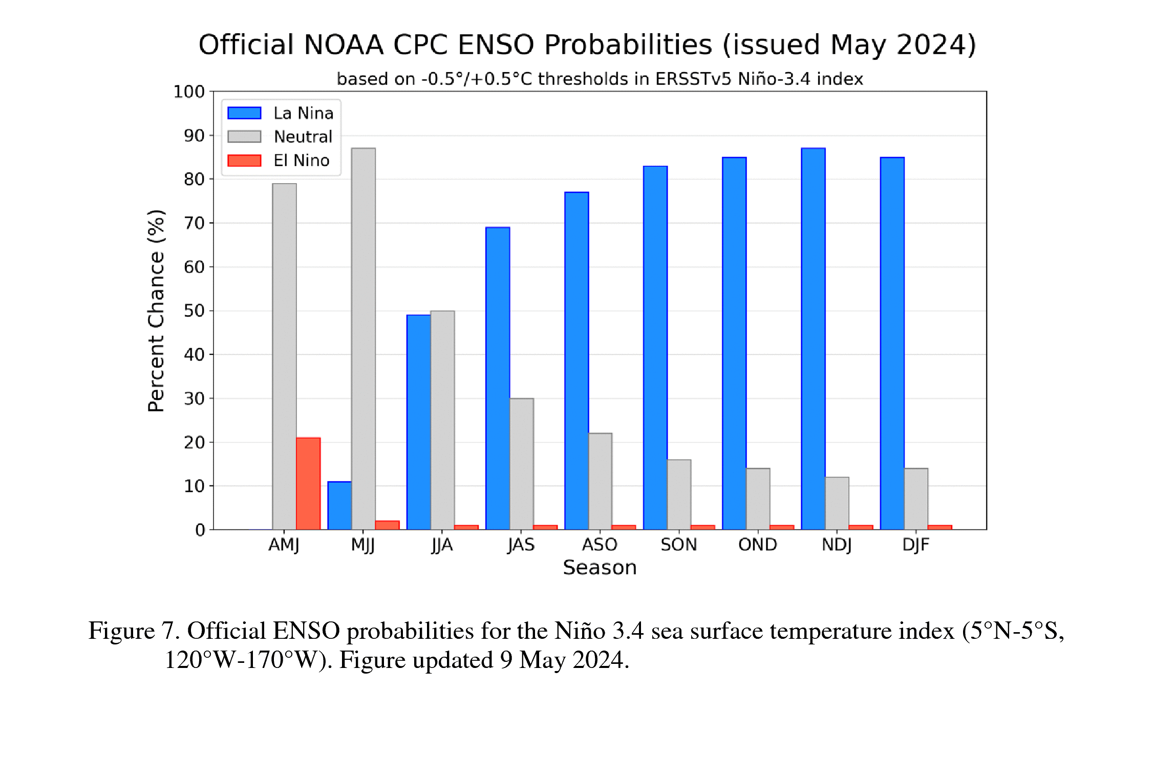
El Niño outlook ]
The image on the right is adapted from NOAA. The image shows Niño-3.4 region temperature anomalies and forecasts, indicating that El Niño will emerge in the course of 2026. See this earlier post for more on El Niño. 

Importantly, we're moving from a La Niña to an El Niño. The above image illustrates the impact of El Niño. The year 2016 was a strong El Niño year and Arctic sea ice extent started to decline strongly in the course of 2016 and extent remained low in 20017 and 2018. The El Niño that started to develop in 2023 contributed to the very low sea ice extent in early 2025, while sea ice extent was also lowest on record for the day during early parts of 2026. The blue line is the 2012 extent, which would turn into a record low later that year, a record that still stands today. 

[ CO₂ concentration on Feb 22, 2026 ]
What happened in 2012? Let's first look into greenhouse gas concentrations, which are high in the Arctic and causing Arctic temperatures to rise strongly.

As illustrated by the image on the right, surface concentration of carbon dioxide (CO₂) was as high as 526 ppm on February 22, 2026. The image also shows that CO₂ concentrations are high across the Arctic.

As illustrated by the image below, methane concentrations were as high as 2498 ppb on February 19, 2026. Methane tends to be higher closer to the North Pole, while methane is particularly high at this altitude, unlike CO₂ that has its highest concentrations close to the surface.

High Arctic concentrations of greenhouse gases are causing Arctic temperatures to rise strongly, contributing to decline in Arctic ice and snow cover, which causes loss of surface albedo (reflectivity), a self-amplifying feedback loop that further speeds up the temperature rise in the Arctic. 

The strong rise of Arctic temperatures narrows the temperature difference between the Equator and the Arctic, which slows down the speed at which hot air flows from the Equator to the Arctic. This slowdown can hugely distort the Jet Stream and can also contribute to a slowdown of ocean currents such as the Atlantic Meridional Overturning Circulation (AMOC), which - together with ocean stratification - can contribute to more ocean heat accumulating at the surface and to less lower clouds (albedo loss).

[ Storm over Arctic Ocean, August 2012 ]
Distortion of the Jet Stream in turn results in more extreme weather such as heatwaves, storms and fires. Fires produce soot that can settle down on the snow and ice cover and darken the surface (albedo loss). Storms can bring huge amounts of warm air into the Arctic. Furthermore, storms can churn sea ice into smaller pieces.

Early August 2012, a storm hit the Arctic Ocean, as illustrated by the image on the right. Smaller pieces of ice melt more rapidly, since more parts become exposed to ocean heat, in contrast to a large flat and solid layer of ice that is also less susceptible to wind. 

Pieces of ice that are lighter and smaller will more easily stand out above the water and capture the wind like the sails of yachts. Storms can push these smaller pieces more easily together, decreasing sea ice extent (albedo loss). 

Storms can also temporarily speed up currents that are moving pieces of sea ice, with the potential to move pieces all the way out of the Arctic Ocean, where they will melt away rapidly. 

Furthermore, storms can cause deeper vertical mixing of the sea water column, causing more heat to penetrate the seabed and resulting in destabilization of hydrates contained in sediments and eruption of huge amounts of methane from hydrates and from free gas held underneath the hydrates. 

Latent heat buffer loss - as sea ice, permafrost and glaciers disappear

Latent heat is energy associated with a phase change, such as the energy consumed when ice turns into water. During a phase change, the temperature remains constant. As long as there is ice, additional heat will be absorbed by the process of ice turning into water, so the temperature doesn't rise at the surface.
The amount of energy absorbed by melting ice is as much as it takes to heat an equivalent mass of water from zero to 80°C.

The image below, from an earlier post, shows monthly Arctic sea ice volume in the past 25 years. Markers show April (blue) and September (red) volume, corresponding with the year's maximum and minimum. In 2025, Arctic sea ice reached a record low maximum volume as well as a record low minimum volume.

As illustrated by the above image, Arctic sea ice volume in April 2025 was very low, so while relatively little melting took place between April 2025 and September 2025, a record low Arctic sea ice volume was still reached in September 2025. The above image shows Arctic sea ice volume through mid December 2025, with an analysis of the strength of the melting between April (annual maximum) and September (annual minimum). If the trend in annual maxima (blue circles) continues, Arctic sea ice in 2026 looks set to reach an even lower volume in April 2026. The difference between strong melting (magenta) and little melting (green) is 3000 km³, so if strong melting will take place from April 2026, this may well cause a Blue Ocean Event to occur later in 2026. A Blue Ocean Event could be said to occur when only 1000 km³ or less Arctic sea ice volume remains.

There is a huge danger that seafloor methane and methane from thawing terrestrial permafrost will add strongly and abruptly to the temperature rise, as discussed in many earlier posts such as this one and as illustrated by the screenshot below.
 
Warmer water flowing into the Arctic Ocean causes Arctic sea ice to lose thickness and thus volume, diminishing its capacity to act as a buffer that consumes ocean heat entering the Arctic Ocean from the North Atlantic. This means that - as sea ice thickness decreases - a lot of incoming ocean heat can no longer be consumed by melting the sea ice from below, and the heat will therefore contribute to higher temperatures of the water of the Arctic Ocean. The danger of this is described in the screenshot below. 
[ screenshot from earlier post ]
The image below shows that Arctic sea ice volume was at a record daily low on February 24, 2026. 

The image below shows a temperature anomaly forecast for November 2026, adapted from tropicaltidbits.com, with anomalies at the top end of the scale (13°C) showing up over most of the Arctic Ocean.


The danger is that a strong 2026 El Niño could trigger a cascade of feedbacks, kicking in with increasing ferocity, as follows:

• a strong 2026 El Niño could trigger a cascade of feedbacks, including:
• a Blue Ocean Event (minimal Arctic sea ice), resulting in huge loss of albedo,
• with crossing of the latent heat tipping point (loss of ice buffer), resulting in
• seafloor CH₄ hydrates destabilization and eruption of vast amounts of CH₄, and
• submarine and terrestrial permafrost thawing, resulting in even more emissions,
• and further Jet Stream distortion, causing even more extreme weather events,
• resulting in forest fires, initially in Siberia, Alaska and Canada, and also in
• droughts and fires in global peatlands and in tropical rainforests, causing
• rapid melting and thaw of mountaintop snow and ice, initially causing flooding,
• followed by droughts, fires, water shortages, famine, heatwaves, starvation,
• resulting in massive biodiversity loss, while infrastructure collapses, and
• the Greenland Ice Sheet and parts of the Antarctic Ice Sheet collapse, causing
• massive flooding of coastal areas, next to a huge rise in temperature,
• while more water vapor in the air causes the temperature rise to speed up further.

[ image from earlier post, also discussed on facebook ]

Climate Emergency Declaration

The situation is dire and unacceptably dangerous, and the precautionary principle necessitates rapid, comprehensive and effective action to reduce the damage and to improve the outlook, where needed in combination with a Climate Emergency Declaration, as described in posts such as in this 2022 post and this 2025 post, and as discussed in the Climate Plan group.


Links

• Japanese National Institute of Polar Research
https://ads.nipr.ac.jp/vishop

• NSIDC - Sea Ice Extent


Wednesday, February 4, 2026

Horrific temperature anomalies forecast over Arctic Ocean

Antarctic sea ice

The combination image below shows Antarctic sea ice thickness and concentration by the University of Bremen (left and center) and concentration by the National Snow and Ice Data Center (right) on February 17, 2026. The NSIDC image also shows the median Antarctic sea ice edge 1981-2010 highlighted in orange. 


Loss of Antarctic sea ice can result in strong loss of global albedo, due to the size of Antarctic sea ice and its proximity to the Equator.

Arctic sea ice


Arctic sea ice volume is at a record low for the time of year, as it has been for well over a year. The above image shows Arctic sea ice volume through February 18, 2026. 

Until now, Arctic sea ice volume for each day in 2026 has been lower than on comparable days for any previous year on record. The 2026 curve (black) is moving down, steeper than it did in 2024 (dark blue), even though an El Niño started early 2024 and continued until early 2025 (light blue). Arctic temperatures are terrifying and some temperature forecasts are horrendous (images below). Arctic temperatures have been rising, despite the move from an El Niño into the current La Niña over the past few years. Making the outlook even more dire, an El Niño is on the way.

The next El Niño

[ click on images to enlarge ]
Moving from the bottom of a La Niña to the peak of a strong El Niño alone can make a difference of more than 0.5°C, as discussed in an earlier post.

The images on the right and below are adapted from NOAA. The image on the right shows Niño-3.4 region temperature anomalies and forecasts. The image below shows that La Niña conditions have been present for most periods (18 out of 19) dating back to the May-June-July 2024 period. 


[ click on images to enlarge ]
The image on the right, adapted from NOAA, shows ENSO (El Niño-Southern Oscillation) probabilities for the Niño3.4 region (5°N-5°S,120°W-170°W) relative sea surface temperature index, with El Niño (red bar) emerging in the course of 2026. 

The combination image below, adapted from ECMWF, shows ENSO anomalies and forecasts for developments through February 2027 in Niño3.4 (left panel) and in Niño1+2 (right panel), indicating that the next El Niño will emerge and strengthen in the course of 2026. 


The combination image below, adapted from ECMWF, shows anomalies and forecasts through August 2026 in the Niño3 region (left panel) and the Niño1+2 region (right panel).


IPCC keeps downplaying Arctic temperature anomaly

The image below shows a horrendous temperature anomaly forecast, adapted from tropicaltidbits.com, valid for November 2026, with anomalies at the top end of the scale (13°C) showing up over most of the Arctic Ocean.


Sadly, the IPCC keeps downplaying the dangers and it does so in many ways. One way the full wrath of temperature rise is all too often masked is by using a too recent base from which the temperature rise is calculated, and then pretending that it was pre-industrial. Pre-historic obviously and by definition refers to times before the Industrial Revolution started, yet the IPCC seeks to downplay the dangers of crossing the Paris Agreement thresholds by using a more recent base, adding that it "approximates" pre-industrial, as if that would excuse the downplaying. Obviously, a higher historic rise comes with stronger feedbacks, e.g. more water vapor in the atmosphere. 

Then, there's the masking of the acceleration in the temperature rise. As illustrated by the Eliot Jacobson image below, which uses a 3-year running mean, the temperature has meanwhile crossed the 1.5°C threshold and reached 1.53°C even when using an 1850-1900 base, while there clearly is acceleration in the temperature rise.


Temperature anomalies have long been high in the Arctic. The image below shows rising annual Arctic temperature anomalies versus 1951-1980, with a peak occurring in 2016, which was a strong El Niño year, while temperatures have been rising over the past few years despite the move from an El Niño into the current La Niña. 


The image below shows the ERA5 January 2026 temperature anomaly versus 1951-1980, hitting the Arctic particularly hard. 


The image below shows the NASA January 2026 temperature anomaly versus 1951-1980, with the highest anomalies showing up over the Arctic, due to sea ice loss and increasingly extreme weather events resulting from distortion of the Jet Stream, which also contributed to low temperatures in parts of the U.S. and Russia. Feedbacks in the Arctic and the horrendous rise of Arctic temperatures is all too often masked by a focus on long-term global averages. 


The IPCC also seeks to downplay the dangers by manipulating the rise to come, e.g. by using linear trends. The image below shows NASA Land-Only temperature anomalies with respect to 1880-1890 (not pre-industrial) from 2022 through January 2026. The 1.5°C threshold has been crossed for all months since 2022 (black squares connected by black lines). The Lowess 3-year smoothing trend (red line) indicates that the 2°C threshold was crossed since 2022 and that 3°C may get crossed soon on land (where most people live), i.e. in 2029 if this trend continues (dashed extension).


The extension in the above image is a linear extension, but acceleration implies that alternative trends are more appropriate, such as polynomial trends. The image below shows 15 years of NASA temperature anomalies (land-only) compared to 1880-1920 with a quartic trend added that points at the 3°C threshold getting crossed in 2027.

The trend in the above image points at 3°C getting crossed and this 3°C is an important threshold. Humans are likely to go extinct with a 3°C rise, so the canvas in the above image is limited to  3°C. For a rise beyond 3°C, see the image below and the Extinction page and the image below. 

The inset with the pink/white canvas on the image below shows ERA5 global surface air temperature daily anomalies in °C versus 1991-2020 through February 11, 2026, with a polynomial trend added highlighting temperature variations in line with seasons, El Niño/La Niña, feedbacks, etc. The background image with the yellow canvas shows the same data and added trend on a larger canvas, with the trend pointing at a rise of 10°C in January 2027. 

[ click on images to enlarge, this image is also discussed on facebook ]


The Methane Menace


As Paul Beckwith discusses in the above video, there have long been calls for action on methane, which can strongly reduce the temperatures rise, due to its high Global Warming Potential (GWP). 

[ from earlier post ]
Conversely, methane can also strongly contribute to a huge rise in temperature. Both the SSP1-1.9 and SSP1-2.6 scenarios required methane emissions to have fallen since 2015. Even for SSP2-4.5, in which 2°C does get crossed, methane emissions would need to fall. After record growth in methane concentration in 2021, there was a bit of a slowdown in growth in the following years. However, growth in methane concentration has picked up pace again recently, as illustrated by the image below. 


The magenta-colored trend in the image below points at methane more than doubling by 2043. 

The above text and images describe and depict horrendous dangers, and the IPCC has yet to respond. Methane is only one of the contributors to what could be a horrific rise in temperature in the Arctic. 


Averaging the problems away

As the EPA animation on the right illustrates, a relatively small rise in average temperature can result in a lot more hot and extremely hot weather.

The three images underneath, from the IPCC, show the effect on extreme temperatures when (a) the mean temperature increases, (b) the variance increases, and (c) when both the mean and variance increase for a normal distribution of temperature.

Another way used to downplay the dangers is by averaging out peak impact, i.e. the most destructive impact. Averaging out peaks can be done by looking at large areas with a low resolution. As an example, land-only temperatures are rising faster than ocean temperatures. Since most people live on land, it's crucial to report the full temperature peaks on land, rather than the global average.

Yet another way used to downplay the dangers is by averaging the temperature rise out over long periods of time. How can the thresholds set at the Paris Agreement best be measured? Is a threshold deemed to be crossed when the anomaly from pre-industrial crosses the threshold for a month, or for a year, or for a decade?

Averaging out over a long period can be used to downplay the dangers in efforts to effectively grant polluters a long grace period during which they can continue to pollute. 

Uncertainty is often pointed at as an excuse to downplay the dangers, but even in case there is uncertainty, downplaying the dangers constitutes a violation of the crucial precautionary principle, as illustrated by the cartoon below.

An engineer building a bridge will calculate the load it must handle by looking at how many heavy trucks could be on the bridge simultaneously (PEAK traffic), rather than by averaging the weight of all vehicles crossing the bridge over 30 years.
Caption and image by Sam Carana, image is from earlier post.
Will life soon disappear?

[ from earlier post ]
The image on the right uses content from a study by Christina Schädel et al, which concludes that permafrost fires and thaw will release 63 Gt C for each degree Celsius rise in temperature from a 389-691 Gt pool of permafrost carbon.

That 63 Gt C would translate into 231 Gt CO₂ if only CO₂ gets released. By comparison, the total annual human emissions are now about 55 Gt CO₂e and NOAA calculates that the atmosphere has changed from 1750 to 2024 by 539 CO₂e due to people's greenhouse gas emissions.

Importantly, some of the carbon will be released in the form of methane and CO₂e is much higher for releases in the form of methane than for carbon dioxide, especially when a high multiplier is used to calculate methane's CO₂e. Even worse, releases from submarine permafrost would come mostly in the form of methane.

The danger is even more menacing when looking at how fast temperatures are rising in the Arctic and when including more feedbacks, i.e. not only the impact of permafrost fires and permafrost thaw, but also the impact of destabilizing sediments at the seafloor of the Arctic Ocean resulting in eruptions of huge amounts of methane, on top of the impact of albedo loss and loss of the latent heat buffer of declining sea ice and permafrost. 

The image below, by Eliot Jacobson, shows a 36-running average for Earth's albedo through December 2025.


As discussed above, the next El Niño may take off from a temperature 0.5°C higher than where El Niño developed in 2023. The image below, by Leon Simons, shows Earth's Energy Imbalance through December 2025 when it reached +1.4 W/m², as discussed on facebook.


As discussed, drawing linear trends can be used to downplay the danger and to mask recent or near-future acceleration that may also strengthen over the years. Moreover, crossing tripping points can result in huge abrupt changes. A recent study warns about States and financial bodies using modelling that ignores shocks from extreme weather and climate tipping points.

Warnings are further illustrated by the image below that features a gradually accelerating decline in biodiversity (red line) and infrastructure growth over time followed by imminent and abrupt infrastructure decline (grey line). The image warns that a false focus can cause imminent or ongoing collapse to be ignored.

[ click on images to enlarge, image is discussed on facebook ]
Ultimately, economic projections fail because they focus on money, global GDP, and similar constructs, ignoring the damage occurring to the soil, water, atmosphere and the very conditions that sustain life. Increasingly unlivable conditions result from a failure to correct this false focus, or rather from a refusal to accept that what's really important is disappearing—indeed life itself is disappearing before our own eyes.

In the video below, Guy McPherson discusses problems forests have in adapting to rising temperatures, illustrating the dangers.


Indeed, temperatures are rising too fast for forests to adapt by moving to higher latitudes. It takes centuries for tree populations to adapt—far too slow to keep pace with today’s rapidly warming. Merely planting trees may not help much if the soil lacks ectomycorrhizal fungi, a recent study points out. Also, adding biochar to the soil may help, but there currently isn't much government support, support that should preferably come in the form of local feebates.


Climate Emergency Declaration

The situation is dire and unacceptably dangerous, and the precautionary principle necessitates rapid, comprehensive and effective action to reduce the damage and to improve the outlook, where needed in combination with a Climate Emergency Declaration, as described in posts such as in this 2022 post and this 2025 post, and as discussed in the Climate Plan group.


Links

• NSIDC - Sea Ice Today
https://nsidc.org/sea-ice-today

• University of Bremen - sea ice concentration and thickness
https://seaice.uni-bremen.de/start
• Danish Meteorological Institute - Arctic sea ice volume and thickness
https://ocean.dmi.dk/arctic/icethickness/thk.uk.php

• Tropicaltidbits.com
https://www.tropicaltidbits.com
image discussed on facebook at:
https://www.facebook.com/groups/arcticnews/posts/10163809174829679


• NOAA - ENSO Alert System Status (pdf)

• NOAA - ENSO Alert System Status

• NOAA - Relative Oceanic Niño Index (RONI): Historical El Niño / La Niña episodes
https://www.cpc.ncep.noaa.gov/products/analysis_monitoring/enso/roni
discussed on facebook at:
https://www.facebook.com/groups/arcticnews/posts/10163817526189679

• ECMWF (European Centre for Medium-Range Weather Forecasts) - Niño Plumes
https://charts.ecmwf.int/products/seasonal_system5_nino_annual_plumes
discussed on facebook at:
https://www.facebook.com/groups/arcticnews/permalink/10163819996829679
set 2:
https://charts.ecmwf.int/products/seasonal_system5_nino_plumes
discussed on Facebook at: 
https://www.facebook.com/groups/arcticnews/?multi_permalinks=10163853533389679

• NASA - Goddard Institute for Space Studies (GISS) Surface Temperature Analysis

• When Will We Die?

• Extinction
https://arctic-news.blogspot.com/p/extinction.html

• Copernicus ERA5 data
https://pulse.climate.copernicus.eu

• Coupled, decoupled, and abrupt responses of vegetation to climate across timescales - by David Fastovich et al.
https://www.science.org/doi/10.1126/science.adr6700
discussed on facebook at:
https://www.facebook.com/groups/arcticnews/posts/10163832954534679

• Climate mismatches with ectomycorrhizal fungi contribute to migration lag in North American tree range shifts - by Michael Van Nuland et al.
https://www.pnas.org/doi/10.1073/pnas.2308811121
discussed on facebook at:
https://www.facebook.com/groups/arcticnews/posts/10163832955574679

• Science Snippets: Linking Plants with Soil - video by Guy McPherson
https://www.youtube.com/watch?v=6TNxF9o2aTk

• Biochar - group on facebook

Sunday, February 1, 2026

Is SSP5-8.5 the worst-case scenario?

SSP5-8.5

SSP5-8.5 is one of a number of Shared Socioeconomic Pathways (SSP). It is a scenario in which radiative forcing would be 8.5 W/m⁻² in 2100. The image on the right shows the IPCC projection of the temperature rise in 2081–2100 relative to 1850–1900 corresponding with a SPP5-8.5 scenario (from IPCC AR6 WG11 SPM).

The image below, created by Peter Carter, Climate Emergency Institute, shows the WMO's averaged 2025 global temperature increase of 1.44°C on top of IPCC AR6 WG1 Figure 4.02 (a), illustrating that the WMO rise of 1.44°C for 2025 is spot on the SSP5-8.5 projection (in dark red).

SSP5-8.5 is often said to be a "worst-case" scenario, but as illustrated by the image below, current temperatures are on track or even exceeding SSP5-8.5 projections, given that the rise in 2024 was 1.55°C and 2025 resembled a La Niña year. So, has the IPCC been downplaying the danger? It sure makes one wonder whether SSP5-8.5 is the worst-case scenario. Indeed, Business As Usual (BAU) may turn out to be even worse, so let's have a closer look at what the outlook for some of the worst-case scenarios could be. 


A further image by Peter Carter is added below. 

How much could temperatures rise?

The image below, adapted from ClimateReanalyzer, shows the Coupled Model Intercomparison Project Phase 6 (CMIP6) for the SSP5-8.5 scenario pointing at a temperature rise of 1.661°C in February 2025, of 4.388°C in February 2083 and of 5.163°C in February 2100, when using a 1901-2000 base (temperatures will be higher when a genuinely pre-industrial base is used).

SSP5-8.5

The map below shows the CMIP6 SSP5-8.5 rise versus 1881-1920 in February 2100. The map shows that the temperature rise in areas on land (where most people live) could be as much as 8°C higher in Feb 2100 in the SSP585 model.


The map warns that temperatures over large parts of the Arctic may be as much as 20°C higher than 1881-1920 in February 2100. This would suggest that by 2100 the snow and ice cover in the Arctic will have declined dramatically and that huge amounts of greenhouse gases will likely have been released from the seafloor of the Arctic Ocean and from thawing terrestrial permafrost, with huge albedo changes as well as loss of the latent heat buffer, further accelerating the temperature rise over the years. There are further contributors to a rapid and potentially huge temperature rise, so the SSP5-8.5 model may severely underestimate the temperature rise. Indeed, the SSP5-8.5 model may not be the worst-case scenario.

CMIP6 SSP5-8.5 can be used to project temperature rises beyond 2100, as illustrated by the image below, from an earlier post and from a 2016 paper by Brian O'Neill et al.


[ from earlier post, click on images to enlarge ]
In the above analysis, CO₂ emissions keep rising in CMIP6 SSP5-8.5 to about 35 GtC in 2100, to fall gradually after 2100 (a), while atmospheric CO₂ concentrations keep rising and remain at levels higher than 2000 ppm beyond 2250 (b), while radiative forcing (RF) rises to and remains at 12.5 W/m⁻² (c) and global mean temperature change rises to 8°C in 2300 (d).

Equilibrium climate sensitivity (ECS) can be used to convert RF into °C temperature change. ECS in IPCC AR6 is 3, i.e. lower than in CMIP models. A study led by James Hansen concludes the IPCC ECS is too low and suggests to use 1.2°C per W/m⁻², which in a 8.5 W/m⁻² scenario would correspond with a 10.2°C temperature anomaly in 2100. Hansen et al. add that equilibrium global warming for today’s GHG amount is 10°C, which is reduced to 8°C by today’s human-made aerosols.

A 2020 analysis by Jorgen Randers et al. (image above on the right) points out that, even if all greenhouse gas emissions by people could stop immediately and even if the temperature anomaly could fall to 0.5°C above pre-industrial, greenhouse gas levels would start rising again after 2150 and keep rising for centuries to come.

The image on the right uses content from a study by Christina Schädel et al, which concludes that permafrost fires and thaw will release 63 Gt C for each degree Celsius rise in temperature from a 389-691 Gt pool of permafrost carbon.

That 63 Gt C would translate into 231 Gt CO₂ if only CO₂ gets released. By comparison, the total annual human emissions are now about 55 Gt CO₂e and NOAA calculates that the atmosphere has changed from 1750 to 2024 by 539 CO₂e due to people's greenhouse gas emissions.

Importantly, some of the carbon will be released in the form of methane and CO₂e is much higher for releases in the form of methane than for carbon dioxide, especially when a high multiplier is used to calculate methane's CO₂e. Even worse, releases from submarine permafrost would come mostly in the form of methane.

The danger is even more menacing when looking at how fast temperatures are rising in the Arctic and when including more feedbacks, i.e. not only the impact of permafrost fires and permafrost thaw, but also the impact of destabilizing sediments at the seafloor of the Arctic Ocean resulting in eruptions of huge amounts of methane, on top of the impact of albedo loss and loss of the latent heat buffer of declining sea ice and permafrost.

How fast could temperatures rise?

Next to the size of the temperature change, the rate of change is also important. Large changes did take place in prehistoric times, but they typically did take a long time to evolve. The current temperature rise looks set to be huge and also looks set to be rising at accelerating speed, dwarfing anything seen in previous extinction events. The image below, from an earlier post, shows extinction rates and temperature changes for the five major extinction events (grey vertical lines).


The image and quote below also featured in an earlier post by Andrew Glikson

“The paleoclimate record shouts to us that, far from being self-stabilizing, the Earth's climate
system is an ornery beast which overreacts even to small nudges” (Wally Broecker)

[ from an earlier post ]
The image below further illustrates that temperatures may currently be rising much faster than they ever did in history.

[ from earlier post ]
Contributors to a potentially huge temperature rise

[ see the Extinction page ]
The bar-chart on the right conceptually dates back to 2016, when analysis of contributions concluded they could add up to a potentially huge rise in temperature in the near future. The bar-chart includes an 8°C rise when CO₂e levels cross 1200 ppm (CO₂ emissions peak at 130Gt before 2100 and concentrations stay above 2000 ppm from 2350 in the O'Neil analysis, while methane and N₂O emissions keep rising beyond 2100 in RCP8.5).

The image below uses NASA Land-only temperature anomalies versus 1880-1920, illustrating that temperature could rise more rapidly than SSP5-8.5 suggests. The image illustrates that the 1.5°C threshold was crossed for temperatures on land since 2015, when politicians pledged (at the Paris Agreement) to take efforts to prevent a rise of more than 1.5°C from pre-industrial from occurring. 

Note that this 1880-1920 base is not pre-industrial; temperature anomalies can be higher when using a genuinely pre-industrial base. 

The image below has a polynomial trend added that points at 3°C getting crossed on land in early 2027. 

As discussed, crossing 3°C on land is important, since most people live on land and there are indications that such a rise will cause many species (including humans) to go extinct.

Meanwhile, the 3-year running average for the mean rate of atmospheric CO₂ growth through January 2026 broke 8.00 ppm per 3 years, reaching a new record high growth rate of 8.06 ppm per 3 years, as illustrated by the Eliot Jacobson image below. 


Below are 14 contributors to a potentially huge temperature rise:

1. High and rising greenhouse gas concentrations
2. Earth Energy Imbalance rapid and accelerating rise
3. Rapid and accelerating decline in Earth Albedo
- Sea ice decline
- Snow and ice cover on land decline
- The aerosol masking effect getting reduced
- Lower clouds reflectivity decline
4. Further feedback kicking in with accelerating ferocity
- Water vapor feedback
- Ocean stratification, acidification and hypoxia (dead zones)
- Polar amplification of the temperature rise
Jet Stream distortion and more extreme weather events
- Sea currents such as AMOC and SMOC slowing down
- Decline in the capacity of oceans and land to take up CO₂ and heat
5. Thinning of sea ice resulting in loss of the ability to consume incoming ocean heat
6. More fuel getting burned worldwide
7. Worldwide rise in agricultural emissions
8. Depletion of soil moisture and water from lakes, rivers and aquifers
9. Deforestation, loss of soil carbon and associated emissions
- Forest fires increase
- Trees becoming more vulnerable to droughts, fires, pests and diseases
- More trees cut and burned to create pasture, for construction and energy use
- Increase in ozone due to storms and lightning
10. Loss of wildlife and biodiversity
11. Pollution of water and soil 
- Oil spills on sea, infrastructure collapse on land 
- Pesticides, agricultural chemicals, etc. 
- Plastic and PFAS contamination
- Flooding and fires in urban areas (waste, toxic substances from warehouses, etc.)
- Pollution from military activities
12. Politicians hardly take environmental and climate action
13. Many media focus on selling consumables instead of on climate action
14. Meanwhile, a new El Niño may emerge in the course of 2026

While each of these points is alarming in itself, they can also amplify each other and together they can cause a dramatic and rapid temperature rise, as discussed in a recent post and as illustrated and supported by the rapidly rising polynomial trend in the image below, which is based on many years of historic data and which adds further weight to important warnings.

[ Image from earlier post, also discussed on facebook  ]

When could humans go extinct?

As the likeliness of a huge and accelerating temperature rise, the severity of its impact, and the ubiquity and the imminence with which it will strike all become more apparent and manifest—the more sobering it is to realize that a mere 3°C rise will likely suffice to cause human extinction.

A 2018 study (by Strona & Bradshaw) indicates that most life on Earth will disappear with a 5°C rise. What does this mean for humans?

Terrestrial vertebrates are more in danger than many other species, since they depend on numerous other species for food. Humans are terrestrial vertebrates and humans are also large warm-blooded mammals with high metabolic rates, thus requiring more habitat. It also takes a long time for humans to reach maturity. Additionally, humans have become addicted to processed food, fossil fuels, plastic, etc. Furthermore, humans require large amounts of fresh water, including for sweating when temperatures rise. A 3°C rise may therefore suffice to cause humans to disappear, as illustrated by the image below.

[ from earlier post ]

Climate Emergency Declaration

The situation is dire and unacceptably dangerous, and the precautionary principle necessitates rapid, comprehensive and effective action to reduce the damage and to improve the outlook, where needed in combination with a Climate Emergency Declaration, as described in posts such as in this 2022 post and this 2025 post, and as discussed in the Climate Plan group.


Links

• Climate Emergency Institute
https://www.climateemergencyinstitute.com
image discussed on facebook at:
https://www.facebook.com/groups/arcticnews/posts/10163795386309679
https://www.facebook.com/groups/arcticnews/posts/10163807449809679

• WMO confirms 2025 was one of warmest years on record
https://wmo.int/news/media-centre/wmo-confirms-2025-was-one-of-warmest-years-record

• WMO confirms 2024 as warmest year on record at about 1.55°C above pre-industrial level
https://wmo.int/news/media-centre/wmo-confirms-2024-warmest-year-record-about-155degc-above-pre-industrial-level

• IPCC AR6 WG1 Figure 4.2 (a)
https://www.ipcc.ch/report/ar6/wg1/figures/chapter-4/figure-4-2

• Understanding Shared Socio-economic Pathways (SSPs) 
https://climatedata.ca/resource/understanding-shared-socio-economic-pathways-ssps

• CMIP6 and Shared Socio-economic Pathways overview 
https://climate-scenarios.canada.ca/?page=cmip6-overview-notes

• Climate Reanalyzer
https://climatereanalyzer.org

• The Scenario Model Intercomparison Project (ScenarioMIP) for CMIP6 - by Brian O'Neill et al. (2016)
https://gmd.copernicus.org/articles/9/3461/2016

• Is CMIP6 SSP585 the worst-case scenario? (2024 post)

• Greenhouse gas rising

• Permafrost and wildfire carbon emissions indicate need for additional action to keep Paris Agreement temperature goals within reach - by Christina Schädel et al. 

• The climate change runaway chain reaction-like process - by Andrew Glikson 
Amplifying feedbacks leading to accelerated planetary temperatures also discussed on facebook at: 
https://www.facebook.com/SamCarana/posts/10165533175460161

• Pre-industrial
https://arctic-news.blogspot.com/p/pre-industrial.html

• When Will We Die?
https://arctic-news.blogspot.com/2019/06/when-will-we-die.html

• Extinction
https://arctic-news.blogspot.com/p/extinction.html

• The threat of seafloor methane eruptions
https://arctic-news.blogspot.com/2025/11/the-threat-of-seafloor-methane-eruptions.html

• Feedbacks in the Arctic
https://arctic-news.blogspot.com/p/feedbacks.html

• Water Vapor Feedback
https://arctic-news.blogspot.com/2024/09/water-vapor-feedback.html

• Jet Stream
https://arctic-news.blogspot.com/p/jet-stream.html

• Endangerment Finding in danger?
https://arctic-news.blogspot.com/2025/04/endangerment-finding-in-danger.html

• Transforming Society
https://arctic-news.blogspot.com/2022/10/transforming-society.html

• Climate Plan
https://arctic-news.blogspot.com/p/climateplan.html

• Climate Emergency Declaration
https://arctic-news.blogspot.com/p/climate-emergency-declaration.html