Above image shows NOAA Land+Ocean monthly temperature anomalies from the 20th century average. A trend has been added, based on the Jan.1880-Jan.2020 data. The trend shows that data in the early 1900s were some 0.28°C below the 20th century average.
Adjustment
When using a 1750 baseline, the data need to be adjusted even more than that 0.28°C, since it was even colder in 1750. The total baseline adjustment may well be 0.58°C, as discussed in an earlier post. Furthermore, ocean data in above image are sea surface temperatures. To reflect air temperatures, a further 0.1°C adjustment is applied. Finally, an extra 0.1°C adjustment is applied to reflect higher polar temperatures (as opposed to leaving out missing data). Altogether, this adds up to a 0.78°C adjustment, which implies that the temperature in January 2020 was 1.92°C above pre-industrial.
Which trend is most applicable?
How much and how fast could temperatures keep rising? That question looks even more important than this 0.78°C adjustment. Indeed, the trend added to even the unadjusted data (in above image) points at temperatures crossing 2°C average by 2026.
The image below shows a blue trend, similar to the trend in above image. In the image below, this blue trend points at temperatures crossing 3°C above pre-industrial by 2026.
As discussed in an earlier post, a 3°C temperature rise may well drive humans into extinction, while the rise could continue to exterminate all life on Earth.
As the image shows, the January 2020 anomaly is well above the blue trend. As discussed in an earlier post, a 2020 El Niño could be the catalyst to trigger feedbacks, including huge methane releases from the Arctic Ocean seafloor. While these feedbacks are already active in many ways, a 2020 El Niño could make them start kicking in much more strongly.
A short-term trend (in red) has therefore been added as well, to illustrate El Niño/La Niña variability and to highlight this danger. Ominously, the January 2020 anomaly is above this red trend as well. This is even more the case when the same analysis is done with NASA data, which produces similar results while the January 2020 adjusted temperature anomaly gets even higher, i.e. 1.96°C above pre-industrial.
The situation is dire and calls for immediate, comprehensive and effective action, as described in the Climate Plan.
Above image depicts how humans could go extinct within years. The image was created with NASA LOTI 1880-Dec.2019 data, 0.78°C adjusted to reflect ocean air temperatures (as opposed to sea surface temperatures), to reflect higher polar temperature anomalies (as opposed to leaving out 'missing' data) and to reflect a 1750 baseline (as opposed to a 1951-1980 baseline), with two trends added. Blue: a long-term trend based on Jan.1880-Dec.2019 data. Red: a short-term trend, based on Jan.2009-Dec.2019 data, to illustrate El Niño/La Niña variability and how El Niño could be the catalyst to trigger huge methane releases from the Arctic Ocean. This updates an earlier post with more detail on how the image was created.
The image below shows El Niño/La Niña variability going back to 1950, added to the NOAA monthly temperature anomaly.
Ocean heat is increasing rapidly, especially on the Northern Hemisphere, as illustrated by the NOAA image below, showing the rise from 1980 through 2019.
The image underneath uses the same data and has a trend added pointing at a 1.5°C anomaly from the 20th century average by the year 2026.
As discussed in an earlier point, there is a tipping point at 1°C above the 20th century average, i.e. there are indications that a rise of 1°C will result in most of the sea ice underneath the surface to disappear. This sea ice used to consume the inflow of warm, salty water from the Atlantic Ocean and the Pacific Ocean. So, while there may still be sea ice left at the surface, the latent heat buffer will be gone.
[ click on images to enlarge ]
Loss of the latent heat buffer speeds up heating of the Arctic Ocean, with the danger that huge amounts of methane will be released from the seafloor. The image below illustrates the danger, showing that peak methane levels as high as 2670 parts per billion (ppb) were recorded by the MetOp-1 satellite on January 2, 2020 pm at 469 mb.
Most worryingly, above image shows a large almost-solidly magenta-colored area blanketing the East Siberian Arctic Shelf (ESAS), with magenta indicating levels above 1950 ppb. Such satellite measurements indicate that large amounts of methane are erupting from the seafloor of the Arctic Ocean.
Above image shows that, a few years ago, methane was accumulating most strongly at an altitude corresponding to a pressure of some 400 mb. More recently, methane has been accumulating most strongly at higher altitudes, corresponding to a pressure of just under 300 mb, which is the upper limit of the troposphere over the North Pole. Methane tends to follow the Tropopause, i.e. at higher altitudes methane will be present in higher concentrations closer to the Equator, where the troposphere extends further into space, as discussed in an earlier post.
The NOAA graph below indicates that methane levels are growing at over 10 parts per billion per year, and this may actually underestimate global methane concentrations. The graph uses land-based measurements taken at sea level that can miss methane rising from the seafloor, especially from the seafloor of the Arctic Ocean, since there are few measuring stations in the Arctic in the first place. Land-based measurements can additionally overlook methane that is moving along the Tropopause from the Arctic toward the Equator.
Ominously, the image below shows high methane levels at Barrow, Alaska, at the end of January 2020.
Rising CO₂ levels are also worrying. A daily average CO₂ level of 415.79 ppm was recorded by NOAA at Mauna Loa, Hawaii, on January 21, 2020, a level that is unprecedented for millions of years. Since an annual peak is typically reached in May, we can expect even higher levels over the coming months.
It's not just at Mauna Loa that such high CO₂ readings were recorded recently. The image below shows CO₂ levels recorded recent;y at Barrow, Alaska.
Fires in Australia have contributed to these high CO₂ levels. The image below shows smoke plumes from fires in Australia on January 4, 2020.
Such fires can generate huge amounts of smoke, with smoke rising up high in the atmosphere and entering the stratosphere, while circumnavigating Earth. The ferocity of these fires is also shown in the NASA video below.
In the video below, Guy McPherson gives examples of species that went extinct rapidly.
Meanwhile, the Bulletin of the Atomic Scientists has moved the Doomsday Clock closer to Midnight, to 100 seconds to Midnight, adding that Civilization-ending nuclear war—whether started by design, blunder, or simple miscommunication—is a genuine possibility. Climate change that could devastate the planet is undeniably happening. And for a variety of reasons that include a corrupted and manipulated media environment, democratic governments and other institutions that should be working to address these threats have failed to rise to the challenge. Faced with a daunting threat landscape and a new willingness of political leaders to reject the negotiations and institutions that can protect civilization over the long term, the Bulletin of the Atomic Scientists Science and Security Board moved the Doomsday Clock 20 seconds closer to midnight—closer to apocalypse than ever.
The image below, created with thebulletin.org content and data from 1991 to 2020, has a linear trend added that points at Midnight by 2022.
The situation is dire and calls for immediate, comprehensive and effective action, as described in the Climate Plan.
Above image depicts how humans could go extinct as early as 2020. The image was created with NASA LOTI 1880-Nov.2019 data, 0.78°C adjusted to reflect ocean air temperatures (as opposed to sea surface temperatures), to reflect higher polar temperature anomalies (as opposed to leaving out 'missing' data) and to reflect a 1750 baseline (as opposed to a 1951-1980 baseline), with two trends added. Blue: a long-term trend based on Jan.1880-Nov.2019 data. Red: a short-term trend, based on Jan.2009-Nov.2019 data, to illustrate El Niño/La Niña variability and how El Niño could be the catalyst to trigger huge methane releases from the Arctic Ocean.
How was above image created? Let's first look at the baseline. The NASA default baseline is 1951-1980. The added trend in the image below shows early 1900s data to be well below this 1951-1980 baseline. In this analysis, a 0.28°C adjustment was therefore used to reflect this, and to reflect a 1750 baseline, a further 0.3°C was used, adding up to a 0.58°C baseline adjustment.
Furthermore, the NASA Land+Ocean temperature index (LOTI) uses sea surface temperatures, but ocean air temperatures seem more appropriate, which adds a further 0.1°C adjustment. Also, when comparing current temperatures with preindustrial ones, it's hard to find data for the polar areas. Treating these data as 'missing' would leave important heating out of the picture. After all, the polar areas are heating up much faster than the rest of the world, and especially so in the Arctic region. Therefore, a further 0.1°C adjustment was used to reflect higher polar temperature anomalies, resulting in the above-mentioned 0.78°C adjustment.
Finally, the red trend illustrates El Niño/La Niña variability. As discussed in a recent post, an El Niño is forecast for 2020 and this could be the catalyst to trigger huge methane releases from the Arctic Ocean.
The image below shows El Niño/La Niña variability going back to 1950, added to the NOAA monthly temperature anomaly.
As said, the Arctic region is heating up much faster than the rest of the world. There are several reasons why this is the case. Decline of the sea ice makes that less sunlight gets reflected back into space and that more sunlight is reaching the Arctic Ocean. This also causes more water vapor and clouds to appear over the Arctic Ocean. Furthermore, Arctic sea ice has lost most of the thicker multi-year ice that used to extend meters below the surface, consuming huge amounts of ocean heat entering the Arctic Ocean along ocean currents from the North Atlantic and the North Pacific oceans.
Above-mentioned feedbacks (albedo changes and more water vapor and clouds) contribute to higher temperatures in the Arctic. Furthermore, as the temperature difference between the North Pole and the Equator narrows, the jet stream changes, which can lead to further Arctic heating, i.e. higher temperatures of the atmosphere over the Arctic Ocean and over land around the Arctic Ocean, which in turn causes higher temperatures of the water flowing into the Arctic Ocean from rivers.
Furthermore, jet stream changes can also cause additional heating of parts of the Pacific Ocean and the Atlantic Ocean.
[ click on images to enlarge ]
Above image shows that sea surface temperature anomalies off the East Coast of North America as high as 13.6°C or 24.4°F were recorded on December 18, 2019.
Ocean currents can bring huge amounts of heat into the Arctic Ocean, and this can be amplified due to cyclones speeding up the inflow of water from the Atlantic Ocean and the Pacific Ocean into the Arctic Ocean.
As above image shows, the temperature rise of the oceans on the Northern Hemisphere is accelerating. This constitutes a critical tipping point, i.e. there are indications that a rise of 1°C will result in most of the sea ice underneath the surface to disappear. This sea ice used to consume the inflow of warm, salty water from the Atlantic Ocean and the Pacific Ocean. So, while there may still be sea ice left at the surface, since low air temperatures will cause freezing of surface water, the latent heat buffer has gone.
As long as there is sea ice, this will keep absorbing heat as it melts, so the temperature will not rise at the sea surface. The amount of energy absorbed by melting ice is as much as it takes to heat an equivalent mass of water from zero to 80°C.
The danger is that, as Arctic Ocean heating accelerates further, hot water will reach sediments at the Arctic Ocean seafloor and trigger massive methane eruptions, resulting in a huge abrupt global temperature rise. As discussed in an earlier post, a 3°C will likely suffice to cause extinction of humans.
The precautionary principle calls for appropriate action when dangerous situations threaten to develop. How can we assess such danger? Risk is a combination of probability that something will eventuate and severity of the consequences. Regarding the risk, there is growing certainty that climate change is an existential threat, as discussed in a recent post. There's a third dimension, i.e. timescale. Imminence alone could make that a danger needs to be acted upon immediately, comprehensively and effectively. While questions may remain regarding probability, severity and timescale of the dangers associated with climate change, the precautionary principle should prevail and this should prompt for action, i.e. comprehensive and effective action to reduce damage is imperative and must be taken as soon as possible.
The image below gives a visual illustration of the danger.
Polynomial trendlines can point at imminent danger by showing that acceleration could eventuate in the near future, e.g. due to feedbacks. Polynomial trendlines can highlight such acceleration and thus warn about dangers that could otherwise be overlooked. This can make polynomial trendlines very valuable in climate change analysis. In the image below, the green linear trend and the blue polynomial trend are long-term trends (based on Jan.1880-Nov.2019 data), smoothing El Niño/La Niña variability, but the blue polynomial trend better highlights the recent temperature rise than the green linear trend does. The red short-term trend (based on Jan.2009-Nov.2019 data) has the highest R² (0.994) and highlights how El Niño could be the catalyst for huge methane eruptions from the Arctic Ocean, triggering a huge global temperature rise soon.
The image below, from an earlier post, explains the speed at which warming elements can strike, i.e. the rise could for a large part occur within years and in some cases within days and even immediately.
As the image below shows, peak methane levels as high as 2737 parts per billion (ppb) were recorded by the MetOp-2 satellite in the afternoon of December 20th, 2019, at 469 mb. Ominously, a large part of the atmosphere over the East Siberian Arctic Shelf (ESAS) is colored solid magenta, indicating methane levels above 1950 ppb.
The situation is dire and calls for immediate, comprehensive and effective action, as described in the Climate Plan.
The United Nations Environment Programme (UNEP) just released its annual Emissions Gap Report, warning that even if all current unconditional commitments under the Paris Agreement are implemented, temperatures are expected to rise by 3.2°C, bringing even wider-ranging and more destructive climate impacts.
The report adds that a continuation of current policies would lead to a global mean temperature rise of 3.5°C by 2100 (range of 3.4–3.9°C, 66% probability) and concludes that current policies will clearly not keep the temperature rise below 3°C and that temperatures may rise by much more than that.
Indeed, the rise in greenhouse gas levels appears to be accelerating, despite pledges made under the Paris Agreement to holding the increase in the global average temperature to well below 2°C above pre-industrial levels and pursuing efforts to limit the temperature increase to 1.5°C above pre-industrial levels.
The World Meteorological Organization (WMO) recently reported carbon dioxide (CO₂) concentrations for 2018 of 407.8 ppm (parts per million), as illustrated by the image on the right. The WMO adds that CO₂ levels, as well as methane and nitrous oxide levels, had all surged by higher amounts than during the past decade.
In energy, fossil fuel consumption for heating and transport increased. While renewables grew strongly in 2018, an even larger part of the growth in electricity was generated by fossil fuel, particularly by coal and natural gas.
As the image below shows, a trend based on NOAA March 1958 through October 2019 monthly mean CO₂ data at Mauna Loa points at CO₂ levels crossing the 415 ppm mark in 2020, when an El Niño is forecast to come, as discussed in an earlier post.
The added trend in the image points at CO₂ levels crossing 1200 ppm before the end of the century, triggering the cloud feedback tipping point that by itself could push up global temperatures by 8°C, within a few years. Importantly, the clouds feedback starts at 1200 ppm CO₂-equivalent. Besides a CO₂ rise, further elements could contribute to the 1200 ppm CO₂e tipping point getting reached, such as albedo changes due to disappearing Arctic sea ice and seafloor methane releases from a rapidly-warming Arctic Ocean.
In conclusion, a huge temperature rise could eventuate much earlier than by the end of the century. The image below illustrates the potential for a rise of 18°C or 32.4°F by 2026.
As discussed in a recent post, a 2020 El Niño could be the catalyst triggering huge methane releases from the Arctic Ocean seafloor starting in 2020 and resulting in such a 18°C (or 32.4°F) temperature rise within a few years time. To put this into perspective, an earlier post concluded that humans will likely go extinct at a 3°C rise, as such an abrupt rise will make habitat for humans (and many other species) disappear.
In the video below, John Davis describes some of the extreme weather events that he experienced recently. “Disasters like this are man-made now”, John says, “they're not natural disasters. This is caused by climate change.”
Meanwhile, a recent study found that the consensus among research scientists on anthropogenic global warming has grown to 100%, based on a review of 11,602 peer-reviewed articles on “climate change” and “global warming” published in the first 7 months of 2019.
This further confirms the probability or likelihood that emissions by people are causing global warming, from a likely danger to certain danger. Furthermore, as discussed in many earlier posts, there are two additional dimensions to the danger of climate change; the severity of the impact makes it not merely a catastrophic danger, it is an existential threat; finally, regarding timescale, the danger is not just near, the danger is imminent and in many respects we're already too late.
Above image expresses this visually, with the red area depicting where we are now. There were readability problems with the text on the sides of the cube, reason why a version without text and the color on the sides was posted in an earlier post.
The situation is dire and calls for comprehensive and effective action, as described in the Climate Plan.
On November 16, 2019, there was little sea ice between Greenland and Svalbard. For reference, the image below has been added, showing coastlines for the same area.
The image on the right shows that the average air temperature (2 m) on November 15, 2019, was 4°C higher over the Arctic than during 1979-2000.
Ocean heat is rising up from the Arctic Ocean, while a wavy jet stream enables cold air to leave the Arctic and descend over North America and Eurasia. On November 13, 2019, it was warmer in Alaska than in Alabama.
The image below shows temperatures north of 80°N. The red line on the image shows the 2019 daily mean temperature up to November 16, 2019. The temperature is now well above the 1958-2002 mean (green line). The image also shows the freezing point of fresh water (273.15K, 0°C or 32°F, blue line).
The freezing point for salt water is lower, at around -2°C, or 28.4°F, or 271.2°K. In other words, a rise in the salt content of the water alone can make ice melt, i.e. even when the temperature of the water doesn't rise.
The image below shows that Arctic sea ice volume has been at record low levels for the time of year for some time.
As the image below shows, Arctic sea ice extent in the Chukchi Sea is currently very low.
[ image by Zack Labe, uploaded November 13, 2019 ]
Oceans are absorbing more than 90% of global heating, as illustrated by the image below.
Arctic sea ice used to absorb 0.8% of global heating (in 1993 to 2003). Ocean heat keeps flowing into the Arctic Ocean, carried by ocean currents, as illustrated by the image below.
As peak heat arrives in the Arctic Ocean, it melts sea ice from below. In Summer 2019, a critical tipping point was crossed; ocean heat could no longer find further sea ice to melt, as the thick sea ice that hangs underneath the surface had disappeared. A thin layer of sea ice at the surface was all that remained, as air temperatures remained low enough to prevent it from melting from above.
This indicates that the buffer has gone that has until now been consuming ocean heat as part of the melting process. As long as there is sea ice in the water, this sea ice will keep absorbing heat as it melts, so the temperature will not rise at the sea surface. The amount of energy absorbed by melting ice is as much as it takes to heat an equivalent mass of water from zero to 80°C.
The images above and below shows very high sea surface temperature anomalies on the Northern Hemisphere for October 2015 and October 2019. In both cases, anomalies of 1.09°C or 1.96°F above the 20th century average were recorded.
The October 2015 anomaly occurred under El Niño conditions, whereas the equally-high anomaly in October 2019 occurred under El Niño/La Niña-neutral conditions, while another El Niño is likely to come in 2020. In other words, the threat is that even more ocean heat is likely to arrive in the Arctic Ocean in 2020.
The danger is particularly high in October, as Arctic sea ice starts growing in extent at the end of September, thus sealing off the water, meaning that less ocean heat will be able to escape to the atmosphere. This increases the danger that hot water will reach sediments at the Arctic Ocean seafloor and trigger massive methane eruptions.
Concentrations of carbon dioxide (CO₂, 407.8 ppm), methane (CH₄, 1869 ppb) and nitrous oxide (N₂O, 331.1 ppb) in 2018 surged by higher amounts than during the past decade, the WMO said in a recent news release and as illustrated by the image on the right, which shows that CH₄, CO₂ and N₂O levels in the atmosphere in 2018 were, respectively, 259%, 147% and 123% of their pre-industrial (before 1750) levels.
“There is no sign of a slowdown, let alone a decline, in greenhouse gases concentration in the atmosphere despite all the commitments under the Paris Agreement on Climate Change,” said WMO Secretary-General Petteri Taalas.
“It is worth recalling that the last time the Earth experienced a comparable concentration of CO2 was 3-5 million years ago. Back then, the temperature was 2-3°C warmer, sea level was 10-20 meters higher than now,” said Mr Taalas.
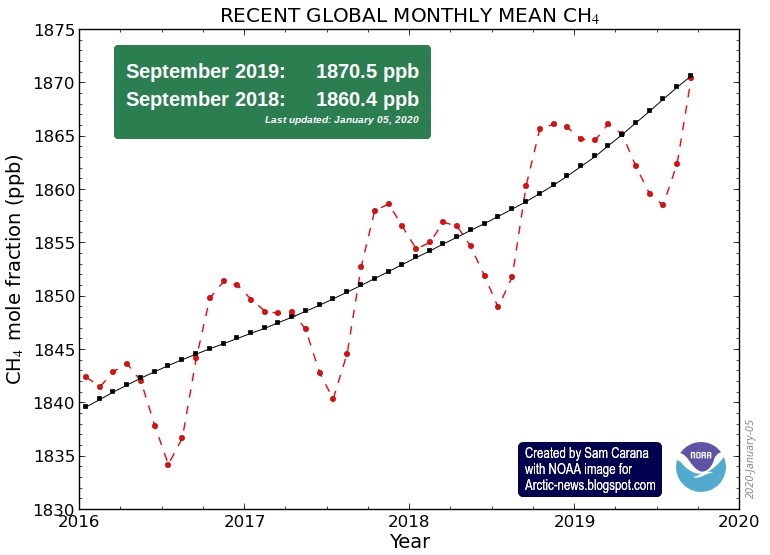
Global methane levels are very high. Mean global methane levels were as high as 1914 parts per billion on September 3, 2019, as discussed in a recent post. Peak methane levels as high as 2961 parts per billion were recorded by the MetOp-2 satellite on October 24, 2019, in the afternoon at 469 mb.
The situation is dire and calls for comprehensive and effective action, as described in the Climate Plan.
Above image shows a blue long-term trend, based on NASA LOTI 1880-Oct.2019 data, 0.78°C adjusted to reflect ocean air temperatures (as opposed to sea surface temperatures), to reflect a higher polar anomaly (as opposed to leaving out 'missing' data) and to reflect a 1750 baseline (as opposed to a 1951-1980 baseline).
The image also shows a red short-term trend, based on NASA LOTI 2012-Oct.2019 data, similarly adjusted and added to illustrate El Niño/La Niña variability and how El Niño could be the catalyst to trigger huge methane releases from the Arctic Ocean seafloor starting in 2020 and resulting in an 18°C (or 32.4°F) temperature rise within a few years time.
To put such a temperature rise in perspective, humans will likely go extinct with a 3°C rise, while most if not all life on Earth will go extinct at 5°C rise, as discussed in an earlier post.
The image below, from a recent study, indicates that El Niño is likely to come in 2020.
An international team of scientists are forecasting an El Niño for 2020. "The probability of 'El Niño' coming in 2020 is around 80%", says Hans Joachim Schellnhuber, Director Emeritus of the Potsdam Institute for Climate Impact Research.
Above image shows NOAA's monthly global temperature anomaly from the 20th century average, colored by the El Niño - Southern Oscillation (ENSO) phenomenon.
A recent study found that El Niño‐Southern Oscillation (ENSO) variability over the last five decades is ~25% stronger than during the preindustrial.
As the NASA map below shows, heating in October 2019 was particularly pronounced over the Arctic Ocean.
Note that the above NASA map shows anomalies from a 1951-1980 baseline.
As the image below shows, just the existing carbon dioxide and methane, plus seafloor methane releases, would suffice to trigger the clouds feedback tipping point to be crossed that by itself could push up global temperatures by 8°C, within a few years.
As described in this post and in an earlier post, a rapid temperature rise could result from a combination of elements, including albedo changes, loss of sulfate cooling, and methane released from destabilizing hydrates contained in sediments at the seafloor of oceans.


