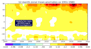
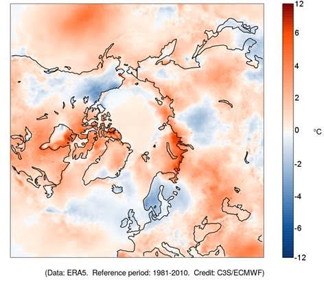
The image below shows that high temperature in 2020 hit Siberia and the Arctic Ocean.
In above images, the temperature anomaly is compared to 1951-1980, NASA's default baseline. When using an earlier baseline, the data need to be adjusted. The image below shows a trendline pointing at an 0.31°C adjustment for a 1900 baseline.
Additional adjustment is needed when using a 1750 baseline, while it also makes sense to add further adjustment for higher polar anomalies and for air temperatures over oceans, rather than sea surface water temperatures. In total, a 0.78°C adjustment seems appropriate, as has been applied before, such as in this analysis. For the year 2020, this translates in a temperature rise of 1.8029°C versus the year 1750.
Three trends: blue, purple and red
Will the global temperature rise to 3°C above 1750 by 2026? The blue trend below is based on 1880-2020 NASA Land+Ocean data and adjusted by 0.78°C to reflect a 1750 baseline, ocean air temperatures and higher polar anomalies, and it crosses a 3°C rise in 2026.
The trend shows a temperature for 2020 that is slightly higher than indicated by the data. This is in line with the fact that we're currently in a La Niña period and that we're also at a low point in the sunspot cycle, as discussed in an earlier post. The blue trend also shows that the 1.5°C treshold was already crossed even before the Paris Agreement was accepted.
The second (purple) trend is based on a shorter period, i.e. 2006-2020 NASA land+ocean (LOTI) data, again adjusted by 0.78°C to reflect a 1750 baseline, ocean air temperatures and higher polar anomalies. The trend approaches 10°C above 1750 by 2026. The trend is based on 15 years of data, making it span a 30-year period centered around end 2020 when extended into the future for a similar 15 year period. The trend approaches 10°C above 1750 in 2026.
The trend is displayed on the backdrop of an image from an earlier post, showing how a 10°C rise could eventuate by 2026 when adding up the impact of warming elements and their interaction.
The stacked bars are somewhat higher than the trend. Keep in mind that the stacked bars are for the month February, when anomalies can be significantly higher than the annual average.
 |
| Temperature rise for February 2016 versus 1900. |
Later analyses such as this one also added a further 0.2°C to the temperature rise, to reflect ocean air temperatures (rather than water temperatures) and higher polar anomalies (note the grey areas on the image in the right).
Anyway, the image shows two types of analysis on top of each other, one analysis based on trend analysis and another analysis based on a model using high values for the various warming elements. The stacked-bar analysis actually doesn't reflect the worst-case scenario, an even faster rise is illustrated by the next trend, the red line.
The third (red) trend suggests that we may have crossed the 2°C treshold in the year 2020. The trend is based on a recent period (2009-2020) of the NASA land+ocean data, again adjusted by 0.78°C to reflect a 1750 baseline, ocean air temperatures and higher polar anomalies.
Where do we go from here?
Of the three trends, the red trend is based on the shortest period, and it does indicate that we have aready crossed the 2°C treshold and we could be facing an even steeper temperature rise over the next few years.
We're in a La Niña period and we're also at a low point in the sunspot cycle. This suppresses the temperature somewhat, so the 2020 temperature should actually be adjusted upward to compensate for such variables. Importantly, while such variables do show up more when basing trends on shorter periods, the data have not be adjusted for this in this case, so the situation could actually be even worse.
At a 3°C rise, humans will likely go extinct, while most life on Earth will disappear with a 5°C rise, and as the temperature keeps rising, oceans will evaporate and Earth will go the same way as Venus, a 2019 analysis warned.
There are many potential causes behind the acceleration of the temperature rise, such as the fact that the strongest impact of carbon dioxide is felt ten years after emission, so we are yet to experience the full wrath of the carbon dioxide emitted over the past decade. However, this doesn't explain why 2020 turned out to be the hottest year on record, as opposed to - say - 2019, given that in 2020 carbon dioxide emissions were 7% lower than in 2019.
Above image shows that on December 17, 2020, at 10:00 UTC, sulfate aerosols (SO₄) were as high as 6.396 τ at the green circle. Wind on the image is measured at 850 hPa.
Could the land sink be decreasing? A recent study shows that the mean temperature of the warmest quarter (3-month period) passed the thermal maximum for photosynthesis during the past decade. At higher temperatures, respiration rates continue to rise in contrast to sharply declining rates of photosynthesis. Under business-as-usual emissions, this divergence elicits a near halving of the land sink strength by as early as 2040. While this is a frightening prospect, it still doesn't explain why 2020 turned out to be the hottest year on record.
Oceans are taking up less heat, thus leaving more heat in the atmosphere. The danger is illustrated by the image below.
The white band around -60° (South) indicates that the Southern Ocean has not yet caught up with global warming, featuring low-level clouds that reflect sunlight back into space. Over time, the low clouds will decrease, which will allow more sunlight to be absorbed by Earth and give the world additional warming. A recent study finds that, after this 'pattern effect' is accounted for, committed global warming at present-day forcing rises by 0.7°C. While this is very worrying, it still doesn't explain why 2020 turned out to be the hottest year on record.
Ocean stratification contributes to further surface warming, concludes another recent study:
"The stronger ocean warming within upper layers versus deep water has caused an increase of ocean stratification in the past half century. With increased stratification, heat from climate warming less effectively penetrates into the deep ocean, which contributes to further surface warming. It also reduces the capability of the ocean to store carbon, exacerbating global surface warming. Furthermore, climate warming prevents the vertical exchanges of nutrients and oxygen, thus impacting the food supply of whole marine ecosystems."
"By uptaking ~90% of anthropogenic heat and ~30% of the carbon emissions, the ocean buffers global warming. [The] ocean has already absorbed an immense amount of heat, and will continue to absorb excess energy in the Earth’s system until atmospheric carbon levels are significantly lowered. In other words, the excess heat already in the ocean, and heat likely to enter the ocean in the coming years, will continue to affect weather patterns, sea level, and ocean biota for some time, even under zero carbon emission conditions."
![[ click on images to enlarge ]](https://blogger.googleusercontent.com/img/b/R29vZ2xl/AVvXsEjBULCiq_2Euddl4zoTQ29dVdWCHG5ubjXQ3e8BMvWAbzOr8KIa8vFDh93RkPCtxgr0tpVNjvH5lTvVVQ-6u8Bbww3gXVitUgmhcvvg8cpujuD_fhE9Tqt8nLvJ3UjYZtEntWhyphenhyphenTPhhpCs/w640-h272/August-2020-NH-OTA-narrow.png) |
| [ from an earlier post ] |
While methane initially is very potent in heating up the atmosphere, it is generally broken down relatively quickly, but in the atmosphere over the Arctic, there is very little hydroxyl to break down the methane.
This danger is getting little public attention. The NOAA image on the right shows the globally-averaged, monthly mean atmospheric methane abundance derived from measurements from marine surface sites. Measurements that are taken at sea level do not reflect methane very well that is rising up from the seafloor of the Arctic Ocean, especially where the methane rises up high in plumes.
Most of the high (magenta-colored) levels of methane are located over oceans and a lot of them over the Arctic Ocean.
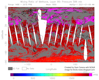
The next image on the right shows the situation closer to sea level, at 586 mb, where even less of the high levels of methane show up over land, indicating that the methane originated from the seafloor.
as is the case in much of the Arctic Ocean.
Because methane is so much lighter than water, large methane releases from the seafloor will form larger bubbles that merge and stick together, developing more thrust as they rise through the water.
Because of this thrust, methane plumes will keep rising rapidly after entering the atmosphere, and the plumes will more easily push away aerosols and gases that slow down the rise in the air of methane elsewhere, such as where methane is emitted by cows.
Such sudden and very high peaks can hardly be caused by agriculture or wetlands, but instead they are likely caused by destabilization of methane hydrates in sediments at the seafloor.
Further contributing to the danger is the fact that little hydroxyl is present in the atmosphere over the Arctic, so it is much harder for this methane to get broken down in the air over the Arctic, compared to methane emissions elsewhere.
Finally, the edge of the stratosphere is much lower over the Arctic, as discussed in an earlier post.
All this makes that methane that is erupting from the seafloor of the Arctic Ocean is more prone to accumulate in the stratosphere. Once methane is in the stratosphere, it's unlikely that it will come back into the troposphere.
The IPCC AR5 (2013) gave methane a lifetime of 12.4 years. The IPCC TAR (2001) gave stratospheric methane a lifetime of 120 years, adding that less than 7% of methane did reach the stratosphere at the time. According to IPCC AR5, of the methane that gets broken down by hydroxyl in the atmosphere, some 8.5% got broken down in the stratosphere.
The situation is dire and calls for immediate, comprehensive and effective action as described in the Climate Plan.
In the video below, Paul Beckwith discusses the situation:
For another perspective, Guy McPherson discusses the situation in the video below, Edge of Extinction: Maybe I’m Wrong.
Links
• Climate Plan
https://arctic-news.blogspot.com/p/climateplan.html
• NASA Global Land-Ocean Temperature Index
https://data.giss.nasa.gov/gistemp
• What are El Niño and La Niña?
https://oceanservice.noaa.gov/facts/ninonina.html
• Multivariate El Niño/Southern Oscillation (ENSO) Index Version 2 (MEI.v2)
https://psl.noaa.gov/enso/mei
• Temperatures keep rising
https://arctic-news.blogspot.com/2020/12/temperatures-keep-rising.html
• There is no time to lose
https://arctic-news.blogspot.com/2020/11/there-is-no-time-to-lose.html
• Possible climate transitions from breakup of stratocumulus decks under greenhouse warming, by Tapio Schneider et al. (2019)
https://www.nature.com/articles/s41561-019-0310-1
• A rise of 18°C or 32.4°F by 2026?
• Most Important Message Ever
https://arctic-news.blogspot.com/2019/07/most-important-message-ever.html
• 2°C crossed
https://arctic-news.blogspot.com/2020/03/2c-crossed.html
• Crossing the Paris Agreement thresholds
https://arctic-news.blogspot.com/p/crossing.html
• Global Warming Acceleration - by James Hansen and Makiko Sato
http://www.columbia.edu/~jeh1/mailings/2020/20201214_GlobalWarmingAcceleration.pdf
• Paying for emissions we’ve already released
https://www.llnl.gov/news/paying-emissions-weve-already-released
https://link.springer.com/article/10.1007/s00376-021-0447-x
• How close are we to the temperature tipping point of the terrestrial biosphere? - by Katharyn Duffy et al.
https://advances.sciencemag.org/content/7/3/eaay1052
• NOAA - Trends in Atmospheric Methane
https://www.esrl.noaa.gov/gmd/ccgg/trends_ch4
• COVID-19 lockdown causes unprecedented drop in global CO2 emissions in 2020 - Gobal Carbon Project
• Global Average Temperatures in 2020 Reached a RECORD HIGH of 1.55 C above PreIndustrial in 1750 - by Paul Beckwith
https://www.youtube.com/watch?v=O0lgTAEUYyA
• Edge of Extinction: Maybe I’m Wrong - by Guy McPherson
https://guymcpherson.com/2021/01/edge-of-extinction-maybe-im-wrong
• Extinction
https://arctic-news.blogspot.com/p/extinction.html


