
This analysis by Sam Carana of the temperature rise since pre-industrial shows that the 1.5°C threshold was already crossed at the time the Paris Agreement was reached in 2015 and that the 2°C threshold was crossed in February 2020.
Baseline
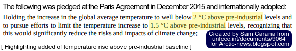
In order to assess how much temperatures have risen, a baseline needed. The baseline is the reference to a period or moment in time from where temperatures have risen. The Paris Agreement uses pre-industrial as baseline.
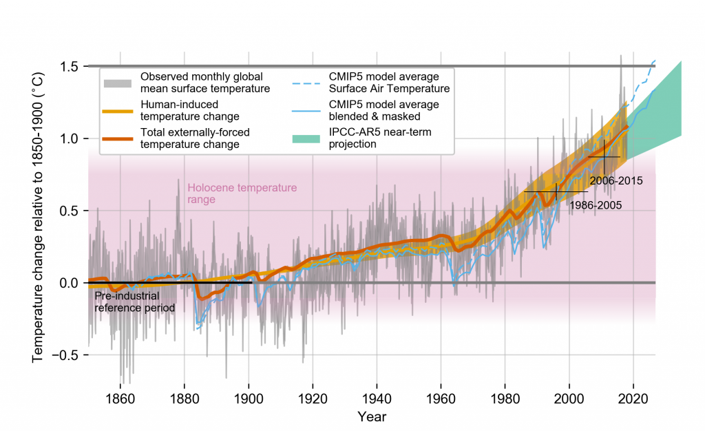
The IPCC, in its 2018 Special Report Global warming of 1.5°C, uses 1850–1900 as baseline, as illustrated by the image below.

However, the Industrial Revolution is commonly agreed to have started in the year 1750.
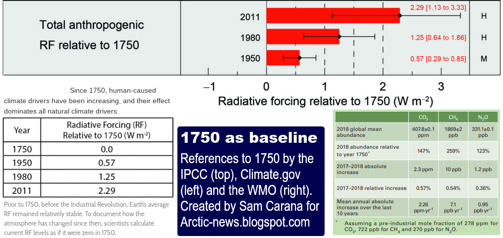
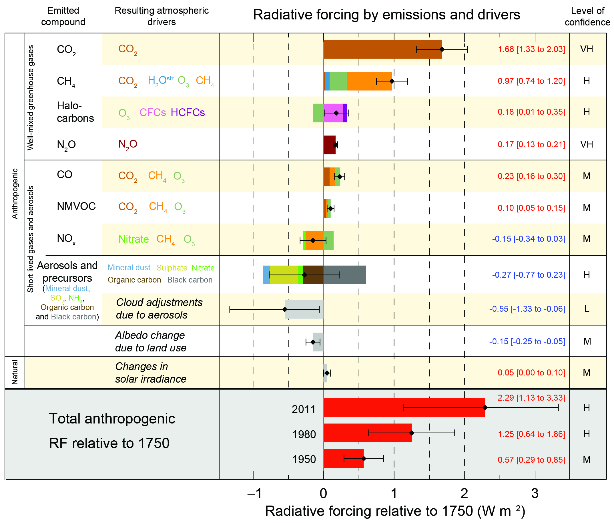
Above image shows that the World Meteorological Organization (WMO) provides annual reports, in its Greenhouse Gas Bulletin, of greenhouse gas levels such as carbon dioxide and methane relative to year 1750. The IPCC Assessment Reports show human-caused radiative forcing by emissions and drivers relative to 1750, based on such figures. Similarly, the U.S. government uses 1750 as the year when the Industrial Revolution started and when humans started to warm the climate.
There are many examples that support the use of the year 1750 as baseline for preindustrial and there are many further arguments in favor of using the year 1750 as baseline, rather than 1850–1900.
This analysis assesses how much the temperature would have risen when taking 1750 as baseline.
Adjusting data to a 1900 baseline
NASA data show that the temperature anomaly in February 2020 was 1.26°C above NASA's default 1951–1980 baseline. When using a different baseline, the data will need to be adjusted. It's good to avoid distortion due to short-term variability such as caused by volcanic activity, sunspots and El Niño events. A polynomial trend can smooth out such variability and a polynomial trend can additionally be a powerful tool to calculate how much adjustment is needed, as the images below show

Above image features a polynomial trend based on the 1880 to February 2020 NASA data. As said, NASA uses a 1951-1980 baseline, i.e. the data are anomalies from 1951–1980. The trend points at a temperature that was 0.28°C lower in the year 1900 than in 1951–1980.
In other words, when using 1900 as the baseline (instead of 1951–1980), it makes sense to adjust data by 0.28°C, as in the image below.

There are different ways to calculate how much adjustment is needed. The image below shows that the difference between February 2020 versus 1951-1980 and February 2020 versus 1885-1915 is 0.28°C.

The image below uses another way to calculate how much adjustment is needed. The difference between 1951-1980 and the 30-year period centered around January 1, 1900, is 0.28°C.

Adjusting data to a 1750 baseline
Further adjustment would be needed when using a 1750 baseline. As said, a polynomial trend can smooth out short-term variability, so it can indicate what the climate was around that time.
The global temperature in 1951–1980 was 14°C (or 57.2°F). Above trend points at a temperature of 13.72°C (or 56.7°F) in 1900. Human activities did already cause substantial warming before 1900. There may have been some 0.3°C warming between 1750 and 1900, as discussed in an earlier post. This translates in a temperature of 13.42°C (or 56.16°F) in the year 1750.
 |
| [ from an earlier post ] |
Ocean temperatures
There are reasons to assume that the temperature may have risen even more than that.
 |
| [ from earlier post ] |
 |
| [ from earlier post ] |
Instead of using sea surface water temperatures, it makes sense to use air temperature above the water of the oceans.
On land, what is referred to as the surface temperature is not the temperature of the surface (the soil or rock under people's feet). No, surface temperature is typically measured in the air 2 meters above the surface. After all, the air just above the ground is the space where people are present.
When using air temperatures over oceans, instead of sea surface temperatures, current temperatures could be some 0.1°C higher, as a 2018 study concludes.
Air temperatures over oceans are higher, as illustrated by the image on the right, from a 2019 study, which shows the difference between using surface air temperature globally (black line), versus when sea surface temperature are used for oceans (dark blue line) and in case of incomplete coverage (light blue line).
Polar anomalies
To assess the rise of Arctic temperatures over the years can be challenging. The temperature of the Arctic Ocean may have risen a lot over the years, but this rise may be missed when only taking measurements of the sea ice on top of the water. Areas covered by sea ice in the past may also have turned into open waters over the years.
 There may be little data available on how strong temperature rise was in the Arctic, especially when going back to 1750.
This is illustrated by the image on the right, where the grey areas signify missing data.
A lack of data can lead to the polar rise getting omitted and be replaced by, e.g., estimates that are based on global averages.

Temperatures have risen more in the Arctic than in the rest of the world, so it's important that especially Arctic temperatures are included in the global temperature rise.
Compensating for omissions by using higher polar anomalies thus may make sense.
For more on this, also see this 2019 study that concludes that missing data have been responsible for an underestimation of global warming by 0.1°C.
In other words, incorporation of the full polar temperature rise can mean that the global temperature rise requires an adjustment of some 0.1°C.
Total rise from pre-industrial
How much has the temperature risen from pre-industrial? Adding up the above adjustments, the total adjustment is 0.78°C. NASA data show that the February temperature anomaly was 1.26°C above 1951–1980. Accordingly, the February temperature anomaly was 2.04°C above pre-industrial. So, we did cross 2°C for the month February 2020.
Furthermore, long-term and short-term temperature trends that are based on the NASA data and have been adjusted as described above, have crossed 2°C above pre-industrial, indicating that both the thresholds (1.5°C and 2°C) that politicians at the Paris Agreement pledged would not be crossed, have now been crossed.
Discussion
Was the February 2020 perhaps a peak? Is there any indication that temperatures could soon come down to below the 2°C above pre-industrial threshold again? What if we dramatically cut carbon emissions?
- Cutting carbon emissions
Cutting carbon emissions may not stop temperatures from rising, as this 2011 article suggests. Moreover, there appears to be little political ambition to make dramatic cuts in emissions. Maximum warming occurs about one decade after a carbon dioxide emission, so the full warming wrath of the carbon dioxide emissions over the past ten years is still to come, as discussed at the extinction page.
- Changes in sunlight
 Short-term variations in solar irradiance show that we're currently in a minimum, as illustrated by the image on the right. The new SC25 sunspot cycle may start soon or may already have started, and could reach a peak in about 2024, according to a livescience article.
 In other words, changes in sunspots did not contribute to a peak in the February 2020 temperature anomaly and changes in sunlight can instead be expected to contribute somewhat to a potentially huge temperature rise over the next few years.
- El Niño
 The February 2016 anomaly was a peak that occurred during an El Niño event. In February 2020, that was not the case, as conditions were El Niño neutral, according to NOOA (image right).
 In other words, there is no reason to assume that the February 2020 anomaly was a peak caused by El Niño. Moreover, a strong El Niño could develop later in 2020 which could be the catalyst to trigger albedo changes and further feedbacks resulting in a huge temperature rise within years.
- Aerosols
What about aerosols, more specifically, a decline in aerosols emitted by power plants, smelters and transport? It may well be that a decline in industrial activity contributed to the high February 2020 temperature anomaly and a huge further rise in temperature could result from the falling away of the aerosol masking effect, as discussed in an earlier post, and this rise looks set to increase.
- Feedbacks
Furthermore, as feedbacks start to kick in more strongly, a huge temperature rise could eventuate soon, as also discussed an earlier post.
Conclusion
In conclusion, rather than to expect that temperatures will soon come down below the 2°C above pre-industrial threshold again, the temperature rise looks set to continue, as discussed in a recent post.
The situation is dire and calls for immediate, comprehensive and effective action, as described in the Climate Plan.
Links
• 2°C crossed
https://arctic-news.blogspot.com/2020/03/2c-crossed.html
• What is the Paris Agreement?
https://unfccc.int/process-and-meetings/the-paris-agreement/what-is-the-paris-agreement
https://unfccc.int/documents/9064
• Paris Agreement (English text)
http://unfccc.int/files/essential_background/convention/application/pdf/english_paris_agreement.pdf
https://unfccc.int/resource/docs/2015/cop21/eng/l09r01.pdf
https://unfccc.int/sites/default/files/resource/docs/2015/cop21/eng/l09r01.pdf
• Paris Agreement (adoption)
https://undocs.org/en/FCCC/CP/2015/10/Add.1
• Paris Agreement
https://arctic-news.blogspot.com/2015/12/paris-agreement.html
• World Meteorological Organization (WMO) Greenhouse Gas Bulletin
https://public.wmo.int/en/resources/library/wmo-greenhouse-gas-bulletin
• Intergovernmental Panel on Climate Change (IPCC) Special Report on Global warming of 1.5°C (October 2018)
https://www.ipcc.ch/sr15/
https://www.ipcc.ch/site/assets/uploads/sites/2/2019/01/figure-1.2-1024x626.png
• IPCC Climate Change 2013, AR5, Workgroup 1, Summary-for-policymakers
https://www.ipcc.ch/site/assets/uploads/2018/02/FigSPM-05.jpg
• Climate Forcing
https://www.climate.gov/maps-data/primer/climate-forcing
• Interpretations of the Paris climate target - by Schurer et al.
https://www.nature.com/articles/s41561-018-0086-8
• Estimating and tracking the remaining carbon budget for stringent climate targets - by Joeri Rogelj et al.
https://www.nature.com/articles/s41586-019-1368-z
• Geographical Distribution of Thermometers Gives the Appearance of Lower Historical Global Warming - by Benestad et al.
https://agupubs.onlinelibrary.wiley.com/doi/full/10.1029/2019GL083474
• NASA GISS Surface Temperature Analysis (v4)
https://data.giss.nasa.gov/gistemp/maps/index_v4.html
• How much warmer is it now?
https://arctic-news.blogspot.com/2018/04/how-much-warmer-is-it-now.html
• 2016 well above 1.5°C
https://arctic-news.blogspot.com/2017/01/2016-well-above-1.5c.html
• How Much Warming Have Humans Caused?
https://arctic-news.blogspot.com/2016/05/how-much-warming-have-humans-caused.html
• Extinction Alert
https://arctic-news.blogspot.com/2019/02/extinction-alert.html
• Most Important Message Ever
http://arctic-news.blogspot.com/2019/07/most-important-message-ever.html
• Arctic Ocean February 2020
https://arctic-news.blogspot.com/2020/02/arctic-ocean-february-2020.html
• Ten Dangers of Global Warming
https://arctic-news.blogspot.com/p/ten-dangers-of-global-warming.html
• Feedbacks in the Arctic
https://arctic-news.blogspot.com/p/feedbacks.html
• NOAA El Niño/Southern Oscillation (ENSO) Diagnostic Discussion
https://www.cpc.ncep.noaa.gov/products/analysis_monitoring/enso_advisory/ensodisc.html
• IPCC seeks to downplay global warming
https://arctic-news.blogspot.com/2018/02/ipcc-seeks-to-downplay-global-warming.html
• IPCC keeps feeding the addiction
https://arctic-news.blogspot.com/2018/10/ipcc-keeps-feeding-the-addiction.html
• IPCC Report Climate Change and Land
• IPCC Report Ocean and Cryosphere in a Changing Climate
• World Meteorological Organiztion (WMO) Statement on the State of the Global Climate in 2019
https://library.wmo.int/doc_num.php?explnum_id=10211
• What would happen to the climate if we stopped emitting greenhouse gases today?
http://theconversation.com/what-would-happen-to-the-climate-if-we-stopped-emitting-greenhouse-gases-today-35011
• Extinction
https://arctic-news.blogspot.com/p/extinction.html
• What Is the Sun's Role in Climate Change?
https://climate.nasa.gov/blog/2910/what-is-the-suns-role-in-climate-change/
• First New Sunspots in 40 Days Herald Coming Solar Cycle
https://www.livescience.com/new-sunspot-solar-cycle-begins.html
• 2020 El Nino could start 18°C temperature rise
https://arctic-news.blogspot.com/2019/11/2020-el-nino-could-start-18-degree-temperature-rise.html
• Aerosols
https://arctic-news.blogspot.com/p/aerosols.html
• Climate Plan
https://arctic-news.blogspot.com/p/climateplan.html
• How much warmer is it now?
https://arctic-news.blogspot.com/2018/04/how-much-warmer-is-it-now.html
• 2016 well above 1.5°C
https://arctic-news.blogspot.com/2017/01/2016-well-above-1.5c.html
• How Much Warming Have Humans Caused?
https://arctic-news.blogspot.com/2016/05/how-much-warming-have-humans-caused.html
• Extinction Alert
https://arctic-news.blogspot.com/2019/02/extinction-alert.html
• Most Important Message Ever
http://arctic-news.blogspot.com/2019/07/most-important-message-ever.html
• Arctic Ocean February 2020
https://arctic-news.blogspot.com/2020/02/arctic-ocean-february-2020.html
• Ten Dangers of Global Warming
https://arctic-news.blogspot.com/p/ten-dangers-of-global-warming.html
• Feedbacks in the Arctic
https://arctic-news.blogspot.com/p/feedbacks.html
• NOAA El Niño/Southern Oscillation (ENSO) Diagnostic Discussion
https://www.cpc.ncep.noaa.gov/products/analysis_monitoring/enso_advisory/ensodisc.html
• IPCC seeks to downplay global warming
https://arctic-news.blogspot.com/2018/02/ipcc-seeks-to-downplay-global-warming.html
• IPCC keeps feeding the addiction
https://arctic-news.blogspot.com/2018/10/ipcc-keeps-feeding-the-addiction.html
• IPCC Report Climate Change and Land
• World Meteorological Organiztion (WMO) Statement on the State of the Global Climate in 2019
https://library.wmo.int/doc_num.php?explnum_id=10211
• What would happen to the climate if we stopped emitting greenhouse gases today?
http://theconversation.com/what-would-happen-to-the-climate-if-we-stopped-emitting-greenhouse-gases-today-35011
• Extinction
https://arctic-news.blogspot.com/p/extinction.html
• What Is the Sun's Role in Climate Change?
https://climate.nasa.gov/blog/2910/what-is-the-suns-role-in-climate-change/
• First New Sunspots in 40 Days Herald Coming Solar Cycle
https://www.livescience.com/new-sunspot-solar-cycle-begins.html
• 2020 El Nino could start 18°C temperature rise
https://arctic-news.blogspot.com/2019/11/2020-el-nino-could-start-18-degree-temperature-rise.html
• Aerosols
https://arctic-news.blogspot.com/p/aerosols.html
• Climate Plan
https://arctic-news.blogspot.com/p/climateplan.html