Greenhouse gas concentrations
The image below shows hourly (red circles) and daily (yellow circles) averaged carbon dioxide (CO₂) values from Mauna Loa, Hawaii, over 31 days. The highest daily average CO₂ concentration on record, 431.95 ppm, was recorded at Mauna Loa, Hawaii, on March 28, 2026 (third yellow circle from the right). In bold on the image are recent daily averages, since March 24, 2026.

CO₂ average daily concentrations were at a record high of 431.95 parts per million (ppm), at Mauna Loa, Hawaii, on March 28, 2026. The image below shows daily (green circles), weekly (red lines) and monthly (blue lines) averages for the last year. The weekly average for the week beginning on March 22, 2026 was 430.93 ppm (red line top right).

The image below shows daily average CO₂ concentration at Mauna Loa, Hawaii since 2020. The highest daily average CO₂ concentration on record, 431.95 ppm, was recorded at Mauna Loa, Hawaii, on March 28, 2026.

Concentrations of carbon dioxide haven't been this high for millions of years, as confirmed by recent analysis led by Sarah Shackleton and Julia Marks-Peterson. Their analysis finds that, while the average temperature of the ocean has decreased by 2 to 2.5°C over the past 3 million years, average atmospheric carbon dioxide levels have likely remained below 300 parts per million over this time. Methane levels have also remained relatively stable. This makes the recent daily concentration of 431.95 ppm at Mauna Loa and the high recent methane levels (see image below) even more threatening and it means that, in addition to the key role of heat-trapping greenhouse gases, there were important contributions from other components of the climate system such as Earth’s reflectivity, variations in vegetation and/or ice cover and ocean circulation.
 |
| [ click on images to enlarge ] |
The above combination image shows methane levels as high as 2240 parts per billion (ppb) close to sea level (left panel, 1000 mb) and as high as 2541 ppb at a slightly higher altitude (right panel, 840 mb) recorded by the NOAA 21 satellite on March 11, 2026 AM. The combination image below shows methane levels as high as 231 ppb at 1000 mb (left panel) and as high as 2576 ppb at 399.1 mb (right panel) recorded by the NOAA 20 satellite on March 11, 2026 PM.

Together, these combination images support the suggestion that a burst of methane did enter the atmosphere at a location over the ocean, resulting in very high methane levels in the morning slightly above sea level and even higher methane levels higher up in the atmosphere later that day.
Sea surface temperature
The image below shows world (60°S–60°N, 0–360°E) sea surface temperatures from NOAA OISST V2.1. The sea surface temperature was 21.15°C on March 27, 2026, a record high temperature for the time of year and a +0.75°C anomaly compared to 1982-2010. The sea surface temperature has risen by 0.46°C since the start of 2026.

Furthermore, changes in salinity and ocean currents, together with ocean stratification, ocean oxygen depletion and sea ice loss can result in oceans changing from heat sinks into heat sources, resulting in more heat remaining in the air and getting transferred to the air, as discussed in earlier post such as this one and as discussed in this analysis, also discussed here.
Earth Albedo
The image below, adapted from an image by Eliot Jacobson, shows now much the Earth Albedo (reflectivity) has fallen from February 23 through January 2026.

Arctic sea ice
One of the contributors to albedo loss is Arctic sea ice loss. The image below, adapted from NSIDC, shows that on March 25, 2026, the Arctic sea ice extent was 14.011 million km², the lowest extent on record for the time of year.

The image below, adapted from ads.nipr.ac.jp, shows that Arctic sea ice extent was 13.37 million km² on March 27, 2026, the lowest sea ice extent on record for the time of year.

The situation is very dangerous, since we're moving out of a La Niña (which is suppressing the temperature) into an El Niño (which will be elevating the temperature).
The danger is that a Blue Ocean Event will occur in 2026 if Arctic sea ice continues to be low and if melting from April 2026 onward will be strong. A Blue Ocean Event can be said to occur when virtually no sea ice remains to keep consuming ocean heat that is entering the Arctic Ocean mainly from the Atlantic Ocean. Virtually no sea ice could be 1 million km² or less in sea ice extent, but it could also be measured in area, as illustrated by the image below.
The image below shows that the Arctic sea ice area was the lowest on record on March 25, 2026. Arctic sea ice area was 13.43 million km² on March 25, 2012, and area was 12.31 million km² on March 25, 2026, i.e. a difference of 1.12 million km² and the same difference as there was on March 20, 2026. Arctic sea ice area was 2.24 million km² on September 12, 2012, so with this difference persisting, Arctic sea ice area would be 1.12 million km² in September 2026, or very close to a Blue Ocean Event.


There are compound impacts such as that the temperature will rise faster on land in the Northern Hemisphere, and even faster during heatwaves in large cities where they are affected by the Urban Heat Island effect. Moreover, the 1880-1920 base is not pre-industrial, the outlook may be even more dire when using a genuinely pre-industrial base.
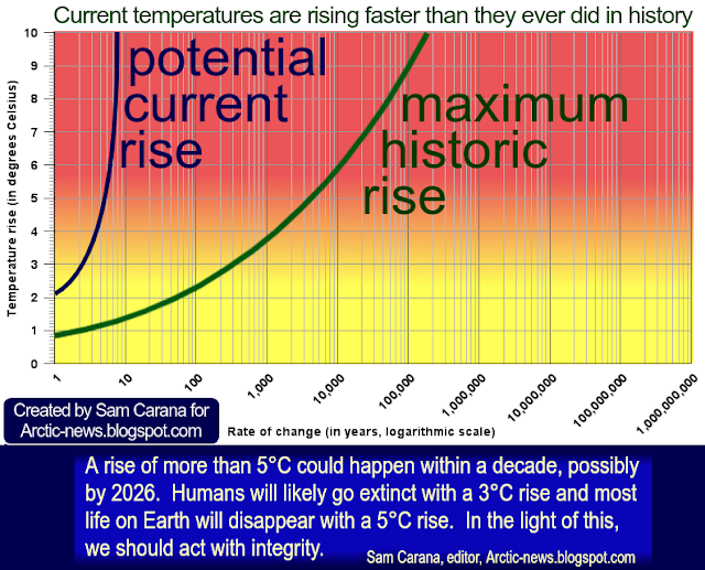
The danger is that the temperature will not merely "overshoot" the 3°C threshold, but that the temperature will continue to rise, especially on land in the Northern Hemisphere, and accelerate over the Arctic. Given the severity, ubiquity and imminence of the danger, one would think that highlighting the danger will prompt people into taking effective climate action, but the outlook is that the temperature will continue to rise for at least a few years, hence the choice of the trend and the canvas, which in the above image is limited to 3°C and until 2028, respectively 2029 (as also discussed on facebook here).
Polynomial trends such as the one in the above image can highlight warnings about dangers that are discussed in this post and in earlier posts, in particular warnings that a strong El Niño is on the way which could cause a strong rise in temperature in the course of 2026 and trigger further acceleration of the temperature rise.
Indeed, the rise resulting from a strong El Niño would come on top of a temperature rise that is already accelerating due to high concentrations of greenhouse gases, while deforestation and numerous feedbacks are kicking in with greater ferocity, and while the temperature rise is amplified in the Arctic (see image below, from earlier post), which could lead to a Blue Ocean Event soon, further speeding up the temperature rise and resulting in loss of permafrost, eruption of methane from the seafloor of the Arctic Ocean, further loss of lower clouds, etc.

The above image, from an earlier post, shows that the 2025 Arctic temperature was 3.431°C higher than in 1951-1980. The only year on record that had an anomaly higher than 2025 was 2016, when there was a super El Niño.
Climate Emergency Declaration
The situation is dire and unacceptably dangerous, and the precautionary principle necessitates rapid, comprehensive and effective action to reduce the damage and to improve the outlook, where needed in combination with a Climate Emergency Declaration, as described in posts such as in this 2022 post and this 2025 post, and as discussed in the Climate Plan group.

• NOAA - Office of satellite and product operations - HEAP NUCAPS
• NSIDC - Sea Ice Extent
https://nsidc.org/sea-ice-today/sea-ice-tools/charctic-interactive-sea-ice-graph
• Kevin Pluck - sea ice visuals
https://seaice.visuals.earth
• Danish Meteorological Institute - Arctic sea ice volume and thickness
https://ocean.dmi.dk/arctic/icethickness/thk.uk.php
• Blue Ocean Event
https://arctic-news.blogspot.com/p/blue-ocean-event.html
• Moderate global warming does not rule out extreme global climate outcomes - by Emanuele Bevacqua et al.
https://www.nature.com/articles/s41586-026-10237-9
The image below shows that the Arctic sea ice area was the lowest on record on March 25, 2026. Arctic sea ice area was 13.43 million km² on March 25, 2012, and area was 12.31 million km² on March 25, 2026, i.e. a difference of 1.12 million km² and the same difference as there was on March 20, 2026. Arctic sea ice area was 2.24 million km² on September 12, 2012, so with this difference persisting, Arctic sea ice area would be 1.12 million km² in September 2026, or very close to a Blue Ocean Event.

The danger that a Blue Ocean Event will occur in September 2026 is further illustrated by the image below. The image, from an earlier post, which shows Arctic sea ice volume in the past 25 years. Markers show April (blue) and September (red) volume, corresponding with the year's maximum and minimum. In 2025, Arctic sea ice reached a record low maximum volume, as well as a record low minimum volume.

As illustrated by the above image, adapted from dmi.dk, Arctic sea ice volume was very low in April 2025, so while relatively little melting took place from April 2025 to September 2025, a record low Arctic sea ice volume was still reached in September 2025. The above image shows Arctic sea ice volume through mid February 2026, with an analysis of the strength of the melting between April (annual maximum) and September (annual minimum) by means of the bars colored magenta (strong melting) and green (little melting).
If the downward trend in annual maxima (blue circles) continues, Arctic sea ice looks set to reach an even lower maximum volume in April 2026. The difference between strong melting (magenta) and little melting (green) is 3000 km³, so if strong melting will take place from April 2026, this may well cause a Blue Ocean Event to occur later in 2026. A Blue Ocean Event could also be said to occur when only 1000 km³ or less Arctic sea ice volume remains. The image below, adapted from dmi.dk, shows that Arctic sea ice volume was at a record low for the time of year on March 31, 2026.

As illustrated by the above image, adapted from dmi.dk, Arctic sea ice volume was very low in April 2025, so while relatively little melting took place from April 2025 to September 2025, a record low Arctic sea ice volume was still reached in September 2025. The above image shows Arctic sea ice volume through mid February 2026, with an analysis of the strength of the melting between April (annual maximum) and September (annual minimum) by means of the bars colored magenta (strong melting) and green (little melting).

Could the N.H land-only temperature rise by more than 3°C in 2027?
The image below, adapted from Copernicus, shows that the global surface air temperature was 14.31°C on March 26, 2026, the highest temperature on record for the time of year.

Could the temperature rise by more than 3°C soon? The upcoming El Niño could trigger a rapid and steep rise in temperature on land in the Northern Hemisphere, as illustrated by the combination image below that uses land-only data in the top panel and Northern Hemisphere data in the bottom panel. While the image shows NASA data from 2011 until 2028 (top panel, land-only) and data from 2011 until 2029 (bottom panel, N.H), the trends are calculated using annual data from 2010 through 2025. The quartic trends point at the temperature crossing 3°C in the Northern Hemisphere in early 2028 (bottom), and on land-only in early 2027.

There are compound impacts such as that the temperature will rise faster on land in the Northern Hemisphere, and even faster during heatwaves in large cities where they are affected by the Urban Heat Island effect. Moreover, the 1880-1920 base is not pre-industrial, the outlook may be even more dire when using a genuinely pre-industrial base.
Note also that the above are annual average temperature anomalies, i.e. the average for higher and lower anomalies during the year. A recent study shows that extreme global climate outcomes may occur even under moderate 2°C warming for several sectors. For droughts in global key breadbasket regions, precipitation extremes over highly populated areas and fire weather extremes across forests, global climatic impact-drivers at 2°C of global warming may turn out to be much more extreme than model-averaged projections at 3°C or 4°C warming. Indeed, the peaks are more critical than the averages.
Recent research finds that, while fully frozen permafrost can be considered both to function as a seal preventing subsurface gases being released, and to prevent the creation of new CO₂ and CH₄, gas permeability increases by about 25–100 times during thawing, with most permeability change occurring in the −5°C to −1°C range, indicating that the protective gas seal previously provided by permafrost will be lost as permafrost thaws.
Recent research finds that, while fully frozen permafrost can be considered both to function as a seal preventing subsurface gases being released, and to prevent the creation of new CO₂ and CH₄, gas permeability increases by about 25–100 times during thawing, with most permeability change occurring in the −5°C to −1°C range, indicating that the protective gas seal previously provided by permafrost will be lost as permafrost thaws.
The danger is that the temperature will not merely "overshoot" the 3°C threshold, but that the temperature will continue to rise, especially on land in the Northern Hemisphere, and accelerate over the Arctic. Given the severity, ubiquity and imminence of the danger, one would think that highlighting the danger will prompt people into taking effective climate action, but the outlook is that the temperature will continue to rise for at least a few years, hence the choice of the trend and the canvas, which in the above image is limited to 3°C and until 2028, respectively 2029 (as also discussed on facebook here).
Polynomial trends such as the one in the above image can highlight warnings about dangers that are discussed in this post and in earlier posts, in particular warnings that a strong El Niño is on the way which could cause a strong rise in temperature in the course of 2026 and trigger further acceleration of the temperature rise.
Indeed, the rise resulting from a strong El Niño would come on top of a temperature rise that is already accelerating due to high concentrations of greenhouse gases, while deforestation and numerous feedbacks are kicking in with greater ferocity, and while the temperature rise is amplified in the Arctic (see image below, from earlier post), which could lead to a Blue Ocean Event soon, further speeding up the temperature rise and resulting in loss of permafrost, eruption of methane from the seafloor of the Arctic Ocean, further loss of lower clouds, etc.

The above image, from an earlier post, shows that the 2025 Arctic temperature was 3.431°C higher than in 1951-1980. The only year on record that had an anomaly higher than 2025 was 2016, when there was a super El Niño.
Climate Emergency Declaration
The situation is dire and unacceptably dangerous, and the precautionary principle necessitates rapid, comprehensive and effective action to reduce the damage and to improve the outlook, where needed in combination with a Climate Emergency Declaration, as described in posts such as in this 2022 post and this 2025 post, and as discussed in the Climate Plan group.

Links
• NOAA - Global Monitoring Laboratory - Carbon Cycle Greenhouse Gases - Mauna Loa, Hawaii
https://gml.noaa.gov/ccgg/trends/mlo.html
• NOAA - Global Monitoring Laboratory - data viewer - Mauna Loa, Hawaii
• NOAA - Global Monitoring Laboratory - Carbon Cycle Greenhouse Gases - Mauna Loa, Hawaii
https://gml.noaa.gov/ccgg/trends/mlo.html
• NOAA - Global Monitoring Laboratory - data viewer - Mauna Loa, Hawaii
• NOAA - Office of satellite and product operations - HEAP NUCAPS
• Broadly stable atmospheric CO2 and CH4 levels over the past 3 million years - by Julia Marks-Peterson et al.
https://www.nature.com/articles/s41586-025-10032-y
andhttps://www.nature.com/articles/s41586-025-10032-y
• Global ocean heat content over the past 3 million years - by Sarah Shackleton et al.
• Earth Albedo - by Eliot Jacobson
• NASA - GISS Surface Temperature Analysis - custom plots
https://data.giss.nasa.gov/gistemp/graphs_v4/customize.html
quartic trend analysis was discussed earlier on facebook at:
quartic trend analysis was discussed earlier on facebook at:
• NSIDC - Sea Ice Extent
https://nsidc.org/sea-ice-today/sea-ice-tools/charctic-interactive-sea-ice-graph
• Kevin Pluck - sea ice visuals
https://seaice.visuals.earth
• Danish Meteorological Institute - Arctic sea ice volume and thickness
https://ocean.dmi.dk/arctic/icethickness/thk.uk.php
• Copernicus
https://arctic-news.blogspot.com/p/blue-ocean-event.html
• Moderate global warming does not rule out extreme global climate outcomes - by Emanuele Bevacqua et al.
https://www.nature.com/articles/s41586-026-10237-9
discussed on facebook at:
https://www.facebook.com/groups/arcticnews/posts/10164067383004679
• Measurement of Gas Fraction and Gas Permeability of Thawing Permafrost Caused by Climate Change - by Paul Glover et al.
https://agupubs.onlinelibrary.wiley.com/doi/10.1029/2025EF007232
https://www.facebook.com/groups/arcticnews/posts/10164067383004679
• Measurement of Gas Fraction and Gas Permeability of Thawing Permafrost Caused by Climate Change - by Paul Glover et al.
https://agupubs.onlinelibrary.wiley.com/doi/10.1029/2025EF007232
discussed on facebook at:
https://www.facebook.com/groups/arcticnews/posts/10164067092539679
• The threat of seafloor methane eruptions
https://arctic-news.blogspot.com/2025/11/the-threat-of-seafloor-methane-eruptions.html
• The 2026 El Nino - update March 2026
https://arctic-news.blogspot.com/2026/03/the-2026-el-nino-update-march-2026.html
• Transforming Society
https://arctic-news.blogspot.com/2022/10/transforming-society.html
• Climate Plan
https://arctic-news.blogspot.com/p/climateplan.html
• Climate Emergency Declaration
https://arctic-news.blogspot.com/p/climate-emergency-declaration.html


