Thursday, July 11, 2013

Arctic melt hits food security in bitter taste of life on a hotter planet

by David Spratt
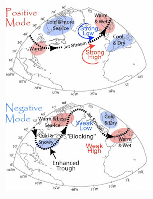
Arctic melt has pushed the Jet Stream into a more
meandering, S-shape pattern, dragging 
down and
stalling cold and wet conditions 
over Europe

A wet summer and autumn, followed by a cold winter and spring, in the UK and Ireland have hit wheat and potato production and cattle feed, a foretaste of how climate change can affect food security, even in the developed economies.

And the culprit in this drama is rapid Arctic melting, which has destabilised the Jet Steam and brought extreme weather – unusual cold, heavy snowfall, record rain and hot spells — to much of northern Europe and North America, and record heat to the Arctic. Following Superstorm Sandy’s battering of the US north-east coast in 2012, flooding in June across central Europe was the worst in 400 years.

Rapid Arctic melting – sea-ice volume in September 2012 was down by four-fifths compared to the summer average 30 years ago – has help change the Jet Stream, the river of high altitude air that works to separates Arctic weather from that of northern Europe, Russia and Canada, and which governs much northern hemisphere weather.

The ice loss has added to ocean and atmospheric heat, pushing the Jet Stream into a more meandering, S-shape pattern, dragging down and stalling cold and wet conditions over Europe, and bringing record heat to the Arctic, as was dramatically experienced in Alaska last month.

Professor Jennifer Francis, of Rutgers Institute of Coastal and Marine Science, says the Arctic-driven changes to the Jet Stream allows “the cold air from the Arctic to plunge much further south. The pattern can be slow to change because the [southern] wave of the jet stream is getting bigger… so whatever weather you have now is going to stick around”.

In March, new research found that “the severe loss of summertime Arctic sea ice — attributed to greenhouse warming — appears to enhance Northern Hemisphere jet stream meandering, intensify Arctic air mass invasions toward middle latitudes, and increase the frequency of atmospheric blocking events like the one that steered Hurricane Sandy west into the densely populated New York City area”.

And a recent study by Liu et al found that “the recent decline of Arctic sea ice has played a critical role in the recent cold and snowy winters” across the northern hemisphere.

Last September, Francis warned that 2012′s record sea ice melt could lead to a cold winter in the UK and northern Europe. And so it turned out, with farmers copping the consequences:

WET SUMMER AND AUTUMN: Six out of the last seven summers in the UK (since the record-smashing Arctic melt of 2007) have seen below-average temperatures and sunshine, and above-average rainfall. 2012 was the UK’s second wettest year on record, with autumn rain almost 50% higher than long-term average. In Ireland, twice the average amount of rainfall was recorded in many parts of the country during the three summer months of 2012. People across the UK and Ireland will readily tell you that “We haven’t had a summer in four or five years”, and unusually, for them, complain of “bitter” and “terrible” winters, with temperatures dropping as low as –18C in Northern Ireland.

COLD WINTER AND SPRING: “It’s been the longest winter on record in this country. Not since the records began 70 years ago has there been a March as cold as this year’s. It’s been followed by the coldest April in 25 years in some areas of the country,” reported the Irish Examiner on 9 May 2013. The Irish spring in 2103 was coldest in 62 years across most of country, and dull and windy. Spring in the UK this year was the coldest in 50 years.

BAD COMBINATION: This combination of events has wrecked farmer’s schedules. Less growth in a dull 2012 summer – combined with water-logged crops and pastures in autumn – reduced yields, and some crops had to be left in the ground. The spring 2013 growing season, including for apples and pears as well as pasture, started up to six weeks late due to the cold, dull conditions. And waterlogged fields meant that across Ireland cattle were still being kept in their winter sheds in the first week of June, ostensibly a summer month. The consequences – whilst mild compared to climate-change impacts on vulnerable communities in the developing world from the African Sahel to Asia’s changing monsoons – show how easily the security of food production can be disrupted:

WHEAT: In the UK, a wet autumn, hard winter and cold spring has resulted in one of the smallest wheat harvests in a generation, 30% below normal. Britain, generality the third biggest wheat grower in the EU, will be a net importer for the first time in 11 years. Charlotte Garbutt, a senior analyst at the industry-financed Agriculture and Horticulture Development Board says: “Normally we export around 2.5m tonnes of wheat but this year we expect to have to import 2.5m tonnes.” The latest analysis from the UK Department for the Environment, Food and Rural Affairs says total farming income decreased by £737million in 2012 to £4.7bn, as farmers faced both crop losses and higher feed costs.

STOCK LOSSES: Late snowstorms across England, Sotland, Wales and Ireland March 2013, with drifts of up to 5 metres, killed an estimated 40,000 newborn lambs. In ireland’s west, one-quarter more animals died in the first three months of 2013 compared to 2012, with some vets trained to look for suicidal behaviour in farmers.

POTATO SHORTAGE: A wet autumn and poor season in 2012 prevented many crops being harvested in Ireland. Supermarket price-squeezing has also driven some farmers out of the industry, together resulting in reduced yields of at least 30 per cent in 2012. By spring 2013, potato prices had almost tripled in many parts of Ireland, with supplies exhausted and a reliance on imports from central Europe.

Limavady farmer, James Wray, told UTV News that said the changing weather in recent weeks had forced the price up: “This year has been a terrible growing season with loads of crops lost and loads of crops not harvested and any crops that have been harvested have produced low yields. There just isn’t any potatoes left in the country, there are no farmers with potatoes left, so whatever potatoes are about, are very, very expensive. If you go to any of the major supermarkets most of their potatoes are coming in from Europe just to bridge the gap.”

Potato shortages have a particular cultural resonance in Ireland as a consequence of the Irish potato famine of the mid-nineteenth century, which killed a million people and forced another million to emigrate.

FEED SHORTAGE: In the last week of May (the final week of spring), farmers in Ireland’s west were queuing for hay and silage imports from England, France and Netherland as their winter feed became exhausted and a lack of pasture growth in spring due to cold and overcast conditions, and wet fields, prevented cattle from being moved from their winter sheds. More than 13000 tonnes of feed was imported, but even so farmer Enda Stenson said local farmers “have neither money nor fodder”. Many had sold down their herds to be able to buy feed for the remainder.

BEES IN TROUBLE: Bad weather and disease is also threatening honey production, with some beekeepers expecting to produce no honey as bees have been unable to mate and hives are decimated. And bees play a crucial role in pollinating many crops.

Jim Donohoe, of the Federation of Irish Beekeepers’ Associations, told the Irish Independent that the problem was weather related: “We’ve had bad summers before, but because of the wind, rain and lack of sunshine, we’ve had serious problems with colonies wanting to swarm, but the queens being unable to mate with drones which refused to fly because there wasn’t calm conditions. This year, we had a delayed winter where bees couldn’t fly. The flowers were delayed coming out, and that crucial period meant bees died from old age. All of this combines to about 50pc of colonies being lost. If we don’t get milder weather, the losses will be closer to 75pc.

These stories may seem trivial compared to the devastating impact of climate change on global food security and prices, and their political consequences. Writing on Egypt’s new political turmoil, Nafeez Ahmed notes that:

“Food price hikes have coincided with devastating climate change impacts in the form of extreme weather in key food-basket regions. Since 2010, we have seen droughts and heat-waves in the US, Russia, and China, leading to a dramatic fall in wheat yields, on which Egypt is heavily dependent. The subsequent doubling of global wheat prices – from $157/metric tonne in June 2010 to $326/metric tonne in February 2011 – directly affected millions of Egyptians, who already spend about 40% of their income on food. That helped trigger the events that led to the fall of Hosni Mubarak in 2011, but the same configuration of factors is worsening.”

And Lester Brown, head of the Earth Policy Institute in Washington, has warned that grain harvests are already shrinking as US, India and China come close to ‘peak water’. He says that 18 countries, together containing half the world’s people, are now over-pumping their underground water tables to the point – known as “peak water” – where they are not replenishing and where harvests are getting smaller each year.

Together these stories paint a compelling picture of the threat to food security from climate change, not just in the Middle East, Asia and Africa, but in the heart of the developed world too.


David Spratt studied at Australian National University.
David co-authored the book Climate Code Red (2008).  

David frequently posts at the Climate Code Red website.
Above article was first posted at Reneweconomy.com.au


Related

- Polar jet stream appears hugely deformed - by Sam Carana, December 20, 2012
http://arctic-news.blogspot.com/2012/12/polar-jet-stream-appears-hugely-deformed.html

- The Threat of Wildfires in the North - by Sam Carana, June 27, 2013

Wednesday, July 10, 2013

Wildfires even more damaging

Wildfires cause even more damage than many climate models assume. Much has been written about the threat that wildfires pose to people's safety and health, to crop yields, and the quality of soils and forests.

In addition, wildfires pose a huge threat in terms of climate change, not only due to the impact of emissions on the atmosphere, but there's also the impact of particles (soot, dust and volatile organic compounds) settling down on snow and ice, speeding up their demise through albedo changes. This contributes to the rapid decline of the sea ice and snow cover in the Arctic, a decline that has been hugely underestimated in many climate models.

Furthermore, global warming and accelerated warming in the Arctic cause extreme weather conditions in many places, an impact that is again underestimated in many climate models.

A team of scientists from Los Alamos and Michigan Technological University, led by Swarup China, points out that continued global warming will make conditions for wildfires worse, as was already noted in earlier studies, such as this 2006 study. They also point at the conclusion of a recent study that more biomass burning will lead to more ozone, less OH, and a nonlinear increase of methane's lifetime.

Mixing and classification of soot particles. Field-emission
scanning electron microscope images of four different
categories of soot particles: (a) embedded, (b) partly coated,
(c) bare and (d) with inclusions. Approximately 50% of the
ambient soot particles are embedded, 34% are partly coated
and 12% have inclusions. Only 4% of the particles are bare
soot (not coated or very thinly coated). Scale bars, 500 nm.
Right, spherical tar balls dominate in the emissions.
The scientists recently completed an analysis of particles from the Las Conchas fire that started June 26, 2011, and was the largest fire in New Mexico's history at the time, burning 245 square miles. One of the scientists, Manvendra Dubey, said

 “Most climate assessment models treat fire emissions as a mixture of pure soot and organic carbon aerosols that offset the respective warming and cooling effects of one another on climate. However Las Conchas results show that tar balls exceed soot by a factor of 10 and the soot gets coated by organics in fire emissions, each resulting in more of a warming effect than is currently assumed.”
“Tar balls can absorb sunlight at shorter blue and ultraviolet wavelengths (also called brown carbon due to the color) and can cause substantial warming,” he said. “Furthermore, organic coatings on soot act like lenses that focus sunlight, amplifying the absorption and warming by soot by a factor of 2 or more. This has a huge impact on how they should be treated in computer models.”

Finally, many climate models ignore the threat of large, abrupt methane releases in the Arctic. As discussed in many earlier posts at Arctic-news blog, accelerated warming in the Arctic threatens to spiral out of control as methane levels rise over the Arctic, causing destabilization of methane hydrates and further methane releases, escalating into runaway global warming. 

Monday, July 8, 2013

Climate change fighting town savaged by runaway oil train

by Paul Beckwith

Early in the morning on Saturday July 6th, 2013 five locomotives and 73 tank cars carrying crude oil were parked about 12.5 km uphill (track distance) from the small idyllic Quebec town of Lac-Mégantic about 210 km east of Montreal. Apparently, the sole train engineer had finished his shift and left the train (locomotives running) a few hours earlier to get some sleep in the town; the train sat unmanned awaiting the arrival of the next engineer. Something went horribly wrong; the tank cars uncoupled from the locomotives and started rolling downhill and gathering speed as they headed towards the small town.

Map 1 (from http://www.bbc.co.uk/news/world-us-canada-23221939 ) shows the town location within the province of Quebec in Canada and the general route of the oil train near the town. North is upward for all of the following maps.

Map 1

Map 2 below shows a satellite image from Google Earth of the town and nearby lake.  The red vertical line is for scale, with a length representing a 15 km distance.

Map 2
Map 3 shows a closer-up view of the town. The dark pathway is the route of the train tracks crossing the town from west-north-west to the south-east. This Google Earth image is several years old, and rail cars can be seen at the time this image was obtained beyond the track curve towards the south-east. The train track forks into a northward and southward curving line where it crosses a major road.

Map 3
Map 4 shows an even closer view of the region. The yellow line of length 0.2 km indicates the scale. Buildings within the red zone that I outlined by freehand were leveled as the train jumped the track near the fork and plowed along the orange path. I marked red dots on the individual structures within the red zone of destruction, and counted about 40 buildings. Most of these buildings were completely leveled, with the exception of a few near the perimeter of the red zone that were severely damaged.

Map 4
Map 5 indicates the general location where the train was parked and uncoupled from the 5 locomotives, in the town of Nantes, for the shift change. This Google Earth image from 2012 has an elevation of 519 m above mean sea level on the tracks at the location where some train cars are seen in this older image. This location has the highest elevation and drops off to either side along the tracks as determined from Google Earth elevations.

Map 5
Thus, from Google Earth the elevation of Nantes is determined to be roughly 519 meters, while that of the derailment zone in Lac-Mégantic is 399 meters. From simple physics, the potential energy of the train at Nantes (PE = mgh; m=mass, g=9.81 m/s2, h= height) was converted to kinetic energy at the derailment site (KE=0.5mv2). Solving for the speed of the train the mass cancels out giving v = sqrt(2*g*h) giving a value of 48.5 m/s (175 km/hr = 109 mph) which was clearly enough to cause the derailment if correct. This speed is an upper limit value, assuming no rolling resistance or air resistance or tank car braking. The actual number is certainly somewhat lower, but the amount is difficult to calculate exactly but we will estimate it. Assuming constant acceleration of the train down the hill, the time to reach the town after starting from rest at the top of the hill is given by t = 2x/v (x=length of track between locations = 12.5 km, v = speed at bottom of hill) gives a rolling time of 515 seconds (8 minutes, 35 seconds). The average acceleration along the track path down the hill is a=v/t=0.09417 m/s2 (or about 0.96% of the acceleration due to gravity). Again, this is for the no friction case, modifications for friction will be estimated shortly.

Map 6 shows the route connecting Nantes to Lac-Mégantic. The rail distance is roughly 12.5 km as measured on Google Earth and indicated by the yellow lines (connecting the red point tie dots along the track), and the vertical height change is 120 meters along this path down to the derailment site. The runaway train successfully negotiated two very sharp curves. The first is at Laval-Nord (elevation 457 m, height drop from Nantes of 62 m) giving a calculated speed of 34.9 m/s (126 km/hr), a derailment here would have taken the train into forests. The second sharp curve is 0.38 km north of the lake (elevation 431 m, height drop 88 m) with a calculated speed of 41.6 m/s (150 km/hr). Failure to negotiate the second curve would have been a derailment into the forests, and would have likely spilled crude oil that would drain into the lake.

Map 6
Map 7 from this link (map http://www.cbc.ca/news/interactives/before-after/lac-megantic/ba.html, north is down on this map) is a sliding before-and-after image that shows the buildings that were destroyed in the derailment and explosions. The after-image is also shown below. One can count 44 pancaked tank cars piled up alongside one another. The train came from the west (right side on this image which has north pointing downward) and the lead cars traveled a distance of at least 200 meters after leaving the rails. It is unclear where the other 30 or so tank cars are, presumably they still along the track behind the derailed cars (to the right on the image below).

Map 7
Some background history/information on the town can be found in this linked article: (http://www.ctvnews.ca/canada/lac-megantic-history-of-a-picturesque-quebec-forestry-town-1.1357424 ).
Quoting from this article:
“According to the (town) website, it was one of 52 municipalities in Quebec to receive a "Four Blossoms" rating from the provincial organization "Les Fleurons du Quebec," which rewards municipalities for attractive greenery. It was also ranked among the first eight municipalities in Quebec to earn a "Carbon responsible" attestation, for climate-change measures, from the Enviro-access consulting company.”

Awards won by Lac-Mégantic
for climate-change measures
This award winning, climate change fighting town had no chance against the runaway oil train; which is an incredibly sad irony. Unfortunately, the train successfully negotiated two very sharp curves at speeds of 34.9 m/s and 41.6 m/s prior to entering the town of Lac-Mégantic. Derailment on either of these curves would have spared the town. In the town it derailed at roughly 48.5 m/s on a much more gradual turn crossing near or at a major road. As mentioned earlier, these speeds are upper limit speeds assuming no rolling resistance or air resistance and an on-track acceleration calculated from the basic physics of constant acceleration to be 0.96% of gravity. What is the effect of friction? If we assume a 20% reduction due to friction (rolling + aerodynamic + tank car braking) then acceleration is reduced to 0.07534 m/s2, rolling time is increased to 576 seconds, and derailment speed is reduced to 43.4 m/s (156 km/hr or 97 mph).

Still this is an incredibly fast speed that is hard to believe. Is this ridiculous? Re-examine the images (Map 7) above of the wreck zone, and observe that for more than half the train to completely derail and pancake (>44 tank cars) required an extremely high derailment speed. Going even one step further, let us now assume that there was even more friction, for example from more hydraulic braking action on the individual tank cars, such that the total frictional acceleration reduction was reduced by 50% to 0.0478 m/s2. Rolling time and derailment speed would respectively now become 723 seconds and 34.6 m/s (125 km/hr or 78 mph). I doubt this is fast enough to cause the level of pancaking and derailment distance observed, so my guess on the derailment speed would be between the two previous numbers. The train “black-box” should come out with accurate numbers after it is analyzed.

Given that train tank car transport of crude oil has increased by 28,000% in the last 5 years (http://www.huffingtonpost.ca/2013/07/07/lac-megantic-explosion-oil_n_3558647.html ) without a corresponding increase in safety inspections (and even cost cutting reductions) it is virtually certain that the frequency of accidents will increase. Pipelines are no answer to transporting oil, given that we are undergoing abrupt climate change. In fact, increases in the frequency, severity, and geographical regions of extreme weather events due to jet stream behavior completely changing due to rapid climate change is also greatly increasing the risk of oil transport by rail and pipeline from flooding, drought, heat waves, and extremely large temperature swings over short periods of time. In fact all infrastructure is being severely compromised by extreme weather. As the people in Calgary, Toronto, India, Europe, and many other places around the world are discovering first hand.


Paul Beckwith is a part-time professor with the laboratory for paleoclimatology and climatology, department of geography, University of Ottawa. He teaches second year climatology/meteorology. His PhD research topic is “Abrupt climate change in the past and present.” He holds an M.Sc. in laser physics and a B.Eng. in engineering physics and reached the rank of chess master in a previous life.

Saturday, July 6, 2013

Wildfires in Canada affect the Arctic

created by Sam Carana with screenshot from wunderground.com
Wildfires can cause a lot of emissions. Obviously, when wood burns, carbon dioxide is emitted into the atmosphere. Wildfires also cause further emissions, such as methane, soot and carbon monoxide. A large part of such emissions can be broken relatively quickly down by hydroxyl, but when large emissions take place, this can take a while. In other words, the lifetime of gases such as methane is extended, particularly in the Arctic where hydroxyl levels are already very low to start with.

Furthermore, the soot that is emitted by such wildfires can settle down on snow and ice, changing its albedo and thus contributing to the demise of the snow and ice cover. As the image shows, soot can be blown high up into the Arctic, depending on the direction of the wind.

Wildfires in Canada and Alaska have now been raging for quite some time. The above image dates back to late last month. Today's images can be quite similar, as illustrated by the two images below.

created by Sam Carana with screenshot from wunderground.com
Smoke from wildfires can travel over quite long distances, as also evidenced by these NASA satellite images showing wildfire smoke crossing the Atlantic Ocean. The relation between wildfire smoke and methane concentrations is further illustrated by the image below.

methane levels July 5, 2013, over 1950 ppb in yellow in 6 layers from 718-840 mb
created by Sam Carana with methanetracker.org - sea ice data by SSMIS
Below, a similar image showing methane on the afternoon of July 6, 2013.

methane levels July 6, 2013, over 1950 ppb in yellow, 7 layers from 469-586 mb
created by Sam Carana with methanetracker.org - sea ice data by SSMIS
Below, a screenshot created with methanetracker, showing some methane still persisting on July 8, 2013.  On the right, the methane originating from the Quebec wildfires appears to have moved farther over the Atlantic Ocean, due to the Coriolis effect. The image also shows some worryingly high methane concentrations in spots above the Arctic sea ice. The spots north of Alaska were also examined in the video at Cruising for methane.

methane levels on the morning of July 8, 2013, over 1950 ppb in yellow, 10 layers from 545 to 742 mb
created by Sam Carana with methanetracker.org
Below, a NASA satellite picture showing wildfires in Manitoba, Canada, captured by Terra satellite on June 29, 2013.

NASA image courtesy Jeff Schmaltz, MODIS Rapid Response Team
In conclusion, while carbon pollution gets a lot of attention, the Arctic is also strongly affected by other emissions that can result from wildfires.

Cruising for methane


Cruising for methane with Sam Carana, a video at youtube.com/watch?v=3l6PtWf4i9w

Sunday, June 30, 2013

Cyclonic Activity persists in Arctic


Above image, edited from Naval Research Laboratory, shows that a large area has developed at the center of the Arctic Ocean with very thin ice, at some places down to virtually zero, i.e. open water.

This development is to a large extent caused by persistent cyclonic activity in the Arctic. The Arctic is warming up faster than anywhere else, and this is reducing the temperature difference between the Arctic and lower latitudes. As a result, the polar vortex and jet stream get distorted, resulting in extreme weather. This is graphically illustrated by the animation below, from the California Regional Weather Server.

Thursday, June 27, 2013

The Threat of Wildfires in the North

NASA/NOAA image based on Suomi NPP satellite data from April 2012 to April 2013, with grid added
A new map has been issued by NOAA/NASA. The map shows that most vegetation grows in two bands, i.e. the Tropical Band (between latitudes 15°N and 15°S) and the Northern Band in between 45°N and 75°N, i.e. in North America, Europe and Siberia. On above image, the map is roughly overlayed with a grid to indicate latitude and longitude co-ordinates.


Vegetation in the Northern Band extends beyond the Arctic Circle (latitude 66° 33′ 44″ or 66.5622°, in blue on above image from Arcticsystem.no) into the Arctic, covering sparsely-populated areas such in Siberia, Alaska and the northern parts of Canada and Scandinavia. Further into the Arctic, there are huge areas with bush and shrubland that have taken thousands of years to develop, and once burnt, it can take a long time for vegetation to return, due to the short growing season and harsh conditions in the Arctic.


Above map with soil carbon content further shows that the top 100 cm of soil in the northern circumpolar region furthermore contains huge amounts of carbon.

May 16 2013 Drought 90 days Arctic
Global warming increases the risk of wildfires. This is especially applicable to the Arctic, where temperatures have been rising faster than anywhere else on Earth. Anomalies can be very high in specific cases, as illustrated by the temperature map below. High temperatures and drought combine to increase the threat of wildfires (see above image showing drought severity).

June 25, 2013 from Wunderground.com - Moscow broke its more than 100-year-old record for the hottest June 27
Zyryanka, Siberia, recently recorded a high of 37.4°C (99.3°F), against normal high temperatures of 20°C to 21°C for this time of year. Heat wave conditions were also recorded in Alaska recently, with temperatures as high as 96°F (36°C).

On June 19, 2013, NASA captured this image of smoke from wildfires burning in western Alaska. The smoke was moving west over Norton Sound. (The center of the image is roughly 163° West and 62° North.) Red outlines indicate hot spots with unusually warm surface temperatures associated with fire. NASA image by Jeff Schmaltz, LANCE/EOSDIS Rapid Response. Caption by Adam Voiland. - also see this post with NASA satellite image of Alaska.
Siberian wildfires June 21, from RobertScribbler 
from methanetracker.org

Wildfires raged in Russia in 2010. Flames ravaged 1.25 million hectares (4,826 mi²) of land including 2,092 hectares of peat moor.

Damage from the fires is estimated to be $15 billion, in a report in the Guardian.

Cost of fire-fighting efforts and agricultural losses alone are estimated at over $2bn, reports Munich Re, adding that Moscow's inhabitants suffered under a dense cloud of smoke which enveloped the city. In addition to toxic gases, it also contained considerable amounts of particulate matter. Mortality increased significantly: the number of deaths in July and August was 56,000 higher than in the same months in 2009. 


[From: Abrupt Local Warming, May 16, 2012]

Wildfires in the North threaten to cause large emissions of greenhouse gases and soot, which can settle on snow and ice in the Arctic and the Himalayan Plateau, with the resulting albedo changes causing a lot more sunlight to be absorbed, instead of reflected as was the case earlier. This in turn adds to the problem. Additionally, rising temperatures in the Arctic threaten to cause release of huge amounts of methane from sediments below the Arctic Ocean. This situation threatens to escalate into runway global warming in a matter of years, as illustrated by the image below.

How much will temperatures rise?
In conclusion, the risk is unacceptable and calls for a comprehensive and effective action plan that executes multiple lines of action in parallel, such as the 3-part Climate Action Plan below. Part 1 calls for a sustainable economy, i.e. dramatic reductions of pollutants on land, in oceans and in the atmosphere. Part 2 calls for heat management. Part 3 calls for methane management and further measures.


The Climate Action Plan set out in above diagram can be initiated immediately in any country, without the need for an international agreement to be reached first. This can avoid delays associated with complicated negotiations and on-going verification of implementation and progress in other nations.

In nations with both federal and state governments, such as the United States of America, the Climate Action Plan could be implemented as follows:
  • The President directs federal departments and agencies to reduce their emissions for each type of pollutant annually by a set percentage, say, CO2 and CH4 by 10%, and HFCs, N2O and soot by higher percentages.
  • The President demands states to each make the same cuts. 
  • The President directs the federal Environmental Protection Agency (EPA) to monitor implementation of states and to act step in where a state looks set to fail to miss one or more targets, by imposing (federal) fees on applicable polluting products sold in the respective state, with revenues used for federal benefits.
Such federal benefits could include building interstate High-Speed Rail tracks, adaptation and conservation measures, management of national parks, R&D into batteries, ways to vegetate deserts and other land use measurements, all at the discretion of the EPA. The fees can be roughly calculated as the average of fees that other states impose in successful efforts to meet their targets.

This way, the decision how to reduce targets is largely delegated to state level, while states can similarly delegate decisions to local communities. While feebates, preferably implemented locally, are recommended as the most effective way to reach targets, each state and even each local community can largely decide how to implement things, provided that each of the targets are reached.

Similar targets could be adopted elsewhere in the world, and each nation could similarly delegate responsibilities to local communities. Additionally, it makes sense to agree internationally to impose extra fees on international commercial aviation, with revenues used to develop ways to cool the Arctic.

- Climate Plan