The linear nature of global warming projections by the IPCC (2014) Assessment Report (AR5) (Figure 1) appears to take little account of stadial cooling events, such as have followed peak temperature rises in previous interglacial stages. The linear trends appear to take only limited account of amplifying positive feedback effects of the warming from land and ocean. A number of factors cast doubt on IPCC climate change projections to 2100 AD and 2300 AD, including:
The flow of large volumes of cold ice melt water into the oceans, leading to stadial cooling effects, such as in the North Atlantic (Rahmstorf et al 2015; Glikson, 2019) and around Antarctica (Bonselaer et al., 2018).
Paleoclimate observations indicate that during the Pleistocene glacial-interglacial cycles, at least for the 800,000 years, every time temperatures reached a peak a sharp cooling followed (Cortese et al. 2007).
Figure 1 (a) IPCC average surface temperature change to 2100 relative to 1986-2005 IPCC AR5; (b) IPCC average surface temperature change to 2300 relative to 1986-2005 IPCC AR5
However, global temperature measurements for 2015-2020 indicate accelerated warming due to both the greenhouse effect reinforced by a solar radiation maximum (Hansen and Sato 2020) (Figure 2).
Figure 2. Accelerated Global Warming reinforced by both greenhouse
The weakening of the northern Jet stream, due to polar warming and thus reduced longitudinal temperature contrasts, allows penetration of warm air masses into the polar region and consequent fires (Figure 3). The clash between tropical and polar air and water masses (Figure 3A) leads to regional storminess and contrasting climate change trajectories in different parts of the Earth, in particular along land-ocean boundaries and island chains.
The weakening of the jet stream and migration of climate zones constitute manifestations of an evolving Earth’s energy imbalance¹, namely a decrease in reflection of solar radiation from Earth to space and thereby global warming. Earth retained 0.6 Watt/m² during 2005-2010 and 0.87 Watt/m² during 2010-2020 (Hansen and Sato 2020), primarily due to a rise in greenhouse gases but also due to a solar radiation peak. During 2015-2020 global warming rates exceeded the 1970-2015 warming rate of 0.18°C/per decade, a deviation greater than climate variability. Hansen and Sato (2020) conclude the accelerated warming is caused by an increasing global climate forcing, specifically by the role of atmospheric aerosols.
Figure 3A. Undulating and weakening jet stream and the polar vortex and penetration of warm air, inducing Arctic warming and fires. B. Satellite images of Wildfires ravaging parts of the Arctic, with areas of Siberia, Alaska, Greenland and Canada engulfed in flames and smoke. While wildfires are common at this time of year, record- breaking summer temperatures and strong winds have made 2020 fires particularly bad.
Bronselaer et al., 2018 modelled a meltwater-induced cooling of the southern hemisphere toward the end 21st century by as low as -1.5°C (Figure 4A). Hansen et al. 2016 estimated the time frame of 21st century stadial cooling event as dependent on the rates of ice melt (Figure 4B), reaching near global extent toward the end of the century (Figure 4C).
Figure 4 A. 2080–2100 meltwater-induced sea-air temperature anomalies relative to the standard RCP8.5 ensemble (Bronselaer et al., 2018). Hatching indicates where the anomalies are not significant at the 95% level; B. Negative temperature anomalies through the 21st-22nd centuries signifying stadial cooling intervals (Hansen et al., 2016); C. A model of Global warming for 2096, where cold ice melt water occupies large parts of the North Atlantic and circum-Antarctica, raises sea level by about 5 meters and decreases global temperature by -0.33°C (Hansen et al., 2016).
The consequences for future climate change trends include:
Further expansion of the tropical climate zones and a polar-ward shift of intermediate climate zones, leading to encroachment of subtropical deserts over fertile Mediterranean zones.
Spates of regional to continent-scale fires, including in Brazil, Siberia, California, around the Mediterranean, Australia.
A weakened undulating jet stream (Figure 3) allowing penetration of and clashes between warm and cold air and water masses, with ensuing storms.
In Australia the prolonged drought, low vegetation moisture, high temperatures and warm winds emanating from the northern Indian Ocean and from the inland, rendering large parts of the continent tinder dry and creating severe fire weather subject to ignition by lightning.
The delayed melting of the large ice sheets due to hysteresis², would be followed by sea level rise to Pliocene levels, ~25 meters above pre-industrial levels, once sea level reaches equilibrium with temperature of 2 to 3 degrees Celsius or higher, changing the geography of the continents.
It would follow from these considerations that succeeding periods of peak temperatures, extensive melting of the ice sheets, flow of ice melt into the oceans and thereby stadial cooling would lead to clashes between tropical fronts and cooling masses of air, producing storminess, in particular along continental margins and island chains. The modelled time frame of these developments (Figure 4B) may be cyclical, or may extend further in time and place as long as the ice sheets continue to breakdown.
¹ Earth's energy imbalance is the difference between the amount of solar energy absorbed by Earth and the amount of energy the planet radiates to space as heat. If the imbalance is positive, more energy coming in than going out, we can expect Earth to become warmer in the future — but cooler if the imbalance is negative.
² Hysteresis is the dependence of the state of a system on its history. For example the melting of an ice sheet may occur slowly depending on its previous state.
The IPCC has issued another special report: The Ocean and Cryosphere in a Changing Climate.
How much carbon is there in the Arctic?
[ click on images to enlarge ]
How much carbon is present in the northern circumpolar permafrost region (map)?
According to the report, there is 1460 to 1600 billions of tons of carbon (GtC¹) present in the soil on land. The report also mentions that there is additional carbon present on shallow Arctic sea shelves, but the report doesn't add figures.
Natalia Shakhova et al. once estimated the accumulated methane potential for the Eastern Siberian Arctic Shelf alone to be about 500 Gt of organic carbon, with an additional amount in hydrates of about 1000 Gt and a further amount of methane in free gas of about 700 Gt. Back in 2008, Natalia Shakhova et al. considered release of up to 50 Gt of predicted amount of hydrate storage as highly possible for abrupt release at any time.
Note ¹: 1 billion ton of carbon = 1 GtC = 1.33 Gt of CH₄ (methane) and 1 GtC = 3.67 Gt of CO₂ (carbon dioxide)
How much of these vast amounts could be released to the atmosphere?
The IPCC report projects permafrost near the surface (top 3–4 m) to decrease in area by up to 89% by 2100 under a high emissions scenario (RCP8.5), leading to cumulative release of tens to hundreds of billions of tons of carbon in the form of carbon dioxide and methane to the atmosphere by 2100.
The report fails to warn that, as the Arctic Ocean keeps heating up, huge seafloor methane eruptions could be triggered, and that this could happen within years, as discussed at the extinction page. Abrupt release of 10 Gt of methane would triple the amount of methane in the atmosphere, resulting in huge heating, while it would also trigger the clouds feedback tipping point to be crossed that in itself could push global temperatures up by 8°C within a few years, as earlier discussed in this post and this post.
Sea ice
The report notes that between 1979 and 2018, the areal proportion of multi-year Arctic sea ice at least five years old has declined by approximately 90%. The report refers to a study by Pistone that concludes that the additional heating due to complete Arctic sea ice loss would hasten global warming by an estimated 25 years. Below is a NASA video showing the melting away of the multi-year sea ice over the years.
The image below shows the difference in Arctic sea ice extent between the years, from an earlier post.
The report concludes that Antarctic sea ice extent overall has had no statistically significant trend. At the same time, the report notes that the Southern Ocean's share of the total heat gain in the upper 2000 m global ocean increased to 45–62% between 2005 and 2017. Below is an image illustrating the difference in Antarctic sea ice extent between the years.
The image below shows how much global sea ice extent has decreased over the past few years.
Sea ice decline makes that less sunlight gets reflected back into space and more heat gets absorbed by the ocean. The report also mentions latent heat changes and increased water vapor and increased cloudiness over the Arctic Ocean. Furthermore, as the temperature difference between the North Pole and the Equator narrows, the Jet Stream changes, which makes it more likely that a large influx of hot, salty water can enter the Arctic Ocean. While the IPCC acknowledges that permafrost thaw could release large amount of greenhouse gases, it fails to warn people about the potential for a huge, abrupt temperature rise as a result of the combined impact of warming elements, such as the one illustrated by the image below.
Meanwhile, the MetOp-1 satellite recorded a mean global methane level as high as 1914 parts per billion, on September 30, 2019, pm at 293 mb.
In the report launch press conference video below, IPCC authors respond to the question “May we have already passed the tipping point of abrupt and irreversible change and not knowing it yet?”
Valerie Masson-Delmotte, co-chair of WG1: “I would like to speak about irreversible change in this report. Irreversible means changes that will not be possible to be avoided on timescales of centuries, and climate change is already irreversible, due to the heat uptake in the ocean. We can't go back whatever we do with our emissions. Climate change is already irreversible.”
The situation is dire and calls for comprehensive and effective action, as described in the Climate Plan.
The IPCC has just issued a special report Climate Change and Land, on climate change, desertification, land degradation, sustainable land management, food security, and greenhouse gas fluxes in terrestrial ecosystems. In its new report 'Climate Change and Land', the IPCC finds that vegan is the best diet to reduce emissions. Sadly, it is yet another missed opportunity to show some integrity.
[ click on image to enlarge ]
Indeed, little or nothing will change as long as the IPCC keeps downplaying the dire situation we're in.
As an example, the IPCC Report uses a very low value of 28 as Global Warming Potential (GWP) for methane, which is totally inappropriate and unacceptable given the rapidity at which the biosphere is deteriorating, given the accelerating pace at which extreme weather events are striking the land all around the world, and given the grim prospects for people worldwide in the absence of rapid and radical change.
The report finds that agriculture, forestry and other land use activities accounted for around 13% of carbon dioxide, 44% of methane, and 82% of nitrous oxide emissions from human activities globally during 2007-2016, representing 23% of total net anthropogenic emissions of greenhouse gases. If emissions associated with pre- and post-production activities in the global food system are included, the emissions could be as high as 37% of total net anthropogenic greenhouse gas emissions.
The Report adds an image showing that annual methane emissions from agriculture had reached some 4Gt CO₂eq in 2016. The IPCC notes that this 4Gt for methane's CO₂-eq is based on a GWP for methane of 28 over 100 years and without climate-carbon feedbacks, taken from its Fifth Assessment Report (AR5), published in 2014.
As said, the Report calculates that net greenhouse gas emissions from agriculture, forestry, and other land use were 23% of people's 2007-2016 emissions when using a GWP of 28 for methane. When using a GWP of 150, that share rises to 31%, as illustrated by the image on the right.
Instead of calculating methane's GWP over 100 years, a very short horizon is appropriate. Moreover, research published in 2016 and 2018 had already found methane to be more potent than IPCC's GWP for methane in AR5, as discussed in a recent post.
When using an appropriate GWP, the percentage of greenhouse gases coming from agriculture (in particular livestock products) increases dramatically, thus rightly highlighting the urgency for governments to act, e.g. by implementing local feebates, such as fees on livestock products and nitrogen fertilizers with revenues used to support soil supplements containing biochar, as recommended in a recent post.
Furthermore, the IPCC should have pointed the finger at the cartel of looters comprising fuel, meat, chemical and pharmaceutical industries and fuel-powered vehicle manufacturers and utilities that finances corrupt politicians and that goes hand in glove with a military-industrial complex that feeds on manufacturing conflict over resources that are the very cause of the wrath of pollution.
The situation is dire and calls for comprehensive and effective action, as described in the Climate Plan.
The IPCC just released its report Global Warming of 1.5°C. Things aren't looking good and instead of providing good advice and guidance, the IPCC bends over backward in efforts to keep feeding the addiction.
The Paris Agreement constitutes a joint commitment by all nations of the world to keep the temperature rise below 1.5°C. The IPCC should have honored this commitment by explaining that the situation is dire and by pointing at action to be taken to improve the situation.
Instead, the IPCC bends over backward to make it look as if temperatures were lower than they really are, in an effort to make it look as if there were carbon budgets to be divided, and polluters should be allowed to keep polluting until those budgets had run out. This is like saying that drug junkies who cause damage and are deeply in debt, should be handed over more OPM (other people's money, in this case the future of all people and other species).
In reality, there is no carbon budget to be divided, there is just a huge carbon debt to be repaid. The urgency and imperative to act is such that progress in one area cannot make up for delays elsewhere. The best policies should be implemented immediately, and everywhere across the world.
Use of terms such as trade-offs, net-outcomes, off-sets, carbon budgets and negative emissions is misguided and highly misleading. Policies based on giving and trading in permits to pollute are less effective than local feebates, i.e. policies that impose fees on sales of polluting products and then use the revenues to support rebates on the better alternatives sold locally.
Here are twelve instances where the IPCC is misleading:
Changing the baseline set at the Paris Agreement
The Paris Agreement is clear that pre-industrial is to be used as baseline. The IPCC defines pre-industrial as the multi-century period prior to the onset of large-scale industrial activity around 1750, andthen proceeds to use as baseline 1850-1900, a period when the Industrial Revolution had long started. This compromises the entire Paris Agreement and thus the integrity of us all. Temperatures in 1900 may well have been 0.3°C higher than pre-industrial, as depicted in above image in the light blue block. Add up the impact of further warming elements and it may well be that people have caused around 2°C of warming already and that we're facing warming of more than 10°C by 2026.
Misleading calculations and wording
The IPCC suggests that warming caused by people is 1.0°C (±0.2°C), likely to reach 1.5°C between 2030 and 2052. To reach these numbers, the IPCC used misleading calculations in efforts to downplay how dangerous the situation is, as discussed further below. As an example of misleading wording, the IPCC says it has high confidence that 1.5°C won't be reached until 2030 if warming continues to increase at the current rate of 0.2°C per decade. Sure, if warming was 1.0°C and if the temperature rise was indeed increasing by 0.2°C per decade and if that rise would continue at 0.2°C per decade, yes, then it would take 25 years for warming to reach 1.5°C. But the reality is that warming is already far more than 1.0°C and that it is accelerating. That makes it misleading to associate high confidence with the suggestion that warming will not reach 1.5°C until 2030. The suggestion of a straight line (linear trend) is misleading in the first place, since warming is accelerating. The suggestion of a straight line is even more misleading when making projections into the future and when qualifications such as high confidence are added.
Ignoring the importance of peaks
Daily and monthly peaks are obviously higher than annual averages, and it's those high peaks that kill, making it disrespectful toward past and future victims of extreme weather events to average that away. The image on the right shows that in February 2016, it was on average 1.70°C warmer than in 1900 (1885-1914 i.e. a 30-year period centered around 1900), while the higher latitudes North had anomalies of up to 15.1°C. The IPCC failed to warn people, who mostly live on land on the Northern Hemisphere, how high anomalies were in February 2016. Conservatively, the magenta block at the top of the bar in above image shows a rise of 1.62°C for February 2016. Note that this is the rise from 1900, i.e. before adding 0.3°C for the rise before 1900, and before adding further adjustments as discussed below.
Cherry-picking the baseline period
The image on the right shows that, for a baseline of a 30-year period around the year 1900, the temperature rise to 2016-2017 was 1.25°C. When adding a further 0.3°C rise for the rise before 1900, warming was well above 1.5°C in 2016-2017. Yet, while first defining pre-industrial as the multi-century period prior to the onset of large-scale industrial activity around 1750, the IPCC then uses 1850-1900 as baseline, a period when it was relatively warm, i.e. warmer than in 1750 and warmer also than in 1900. It was warmer over 1850-1900 due to increasing livestock numbers and forests clearing, while huge amounts of wood were burned, all contributing to large emissions of black carbon, brown carbon, methane, CO, etc., which caused additional warming during this period. So, this period was relatively warm. There was little impact yet of the sulfur aerosols that started coming with burning fossil fuel from 1900. Choosing this period enabled the IPCC to beef up the temperature for its baseline and then draw trends that looks flatter than they would have been if drawn from pre-industrial, to suggest that global warming was only 1°C and that 1.5°C would not be reached until somewhere between 2030 and 2052.
Changing the data
The U.K. Met Office's HadCRUT dataset goes back to 1850. The IPCC used this dataset, but actually changed the data, by averaging the data with datasets that showed a similar rise for the years after 1900, but that showed higher warming for 1880-1900. This enabled the IPCC to further beef up the average temperature for the period 1850-1900 and then draw a linear trend from 1850-1900 that looks even flatter.
Cherry-picking the type of data
To further support its suggestions, the IPCC uses water surface data for ocean temperature, but uses air data for temperatures over land. When selecting datasets with more consistency and using air temperatures globally, the temperature rise is 0.1°C higher.
Not using new techniques to estimate values for missing data
The IPCC chooses not to use new techniques to estimate temperatures where data are missing. Less data are available for the Arctic, and this is precisely where temperatures have risen much faster than in the rest of the world. When values for missing data are included, the temperature rise is another 0.1°C higher.
Leaving out 2016
The IPCC says the Special Report is an assessment of the relevant
state of knowledge, based on the scientific and technical
literature available and accepted for publication up to
15 May 2018. Yet, the IPCC says that global warming is currently increasing at 0.2°C per decade, as if the high temperatures in 2016 didn't occur. To arrive at 0.2°C, the IPCC used the period of 2006-2015 and used data from a specific dataset, and then rounded down the value. By contrast, NASA data show a rate of increase of 0.3°C over 2006-2015, 0.4°C over 2007-2016 and 0.4°C over 2008-2017. Failure to properly address acceleration of future warming is further discussed in the point below.
Failure to properly address dangerous developments
The IPCC fails to point out that carbon dioxide reaches a maximum in warming the atmosphere some 10 years after emission, which means that the full wrath of global warming due to the very high emissions of carbon dioxide over the past decade is yet to come. While temperatures could rise very rapidly over the coming decade, the IPCC keeps talking about carbon budgets, without properly addressing tipping points such as the decline of the snow and ice cover that will result in huge albedo losses, jet stream changes, more and more extreme weather events, and more. The IPCC fails to point out the danger of destabilization of sediments containing methane in the form of hydrates and free gas. Furthermore, the IPCC fails to properly address the aerosol warming that will occur as sulfur emissions decrease and other aerosols increase such as black carbon, brown carbon, etc. The IPCC fails to mention the water vapor feedback, i.e. the increase of water vapor in the atmosphere that will occur as a result of these developments. Since water vapor itself is a potent greenhouse gas, this will speed up the temperature rise even further. These developments could lead to a potential global temperature rise (from 1750) of more than 10°C by 2026, as illustrated in the image at the top.
There is no carbon budget left
Instead of pointing at the dangers, as it should have done, the IPCC makes it look as if there was a remaining carbon budget that should be divided among polluters, as if they should continue polluting the world. The IPCC creates this illusion by interpreting the thresholds set at the Paris Agreement as averages over a 30-year period, while ignoring the acceleration of the temperature rise. It should be obvious that there is no such budget. Instead, there's only a huge and very dangerous carbon debt. There is no room for trade-offs or offsets, and terms such as negative emissions are also inappropriate. All efforts should be made to cut emissions, including ending current subsidies for fossil fuel and livestock, while at the same time great effort should be taken to remove carbon from the atmosphere and oceans. And even then, it's questionable whether any humans will be able to survive the coming decade, which will be critically dangerous for all species on Earth.
Suggesting polluting pathways
The pathways suggested by the IPCC keep fossil fuel in the picture for many years, while highlighting non-solutions such as BECCS. The IPCC makes it look as if coal-fired power plants could continue to operate, by burning more biomass and capturing carbon. The IPCC makes it look as if transport could continue to use internal combustion engines, by burning more biofuel. Instead, clean & renewable energy has many benefits, including that it's more economic, so air capture powered by such facilities would make more sense than BECCS. Furthermore, electric vehicles should be supported now, rather than in the year 2050. It makes sense to stop fossil fuel subsidies, and to support better diets, to plant more vegetation and to support ways to add carbon and nutrients to soils and oceans, such as with biochar and ground rocks. Many technologies have been proposed, e.g. refrigerators and freezers are now made that do not use gases for cooling. The IPCC should not have used pathways that are wrong in the first place. Instead, the IPCC should have pointed at the policies that can best facilitate the necessary transitions, because the scientific evidence is overwhelming and it's the right thing to do.
Not pointing at the best and much-needed policy tools
The IPCC report fails to point out that imposing fees on polluting products is the most effective policy instrument, the more so when the revenues are used to support rebates on better alternatives supplied locally.
The situation is dire and calls for comprehensive and effective action, as described at the Climate Plan.
Prof. Peter Wadhams and Stuart Scott discuss the IPCC Global Warming of 1.5ºC report
Extended version of above video
Paul Beckwith on baseline, methane and more
Stuart Scott talks with Prof. Peter Wadhams on Arctic sea ice
Magnificent work by Stefanie Steven
[ budget ]
Proper analysis would have pointed at what the best action is to improve the situation.
However, the IPCC does not do that. Instead, the IPCC keeps stating that there was a carbon budget to be divided and consumed, while advocating non-solutions such as BECCS and while hiding the full extent of how threatening the situation is.
A quick word count of the IPCC report Global Warming of 1.5°C (SPM) shows paragraphs full of words such as budget (1st image right) and of non-solutions such as BECCS (2nd image right).
[ BECCS ]
At the same time, it fails to mention biochar, meat or local feebates. It fails to mention the huge threat of feedbacks and tipping points such as methane hydrates and Arctic sea ice, instead making it look as if all that could only pose potential problems over longer timescales.
This is indicative of how much the IPCC is part of the problem and part and parcel of the wilful destruction of life itself that is taking place so obviously all around us.
The IPCC (Intergovernmental Panel on Climate Change) might as well change its name to IPCD (Intergovernmental Panel on Climate Destruction).
It's not as if people weren't warned.
The danger was described back in 2007: Total Extinction.
The mechanism was depicted back in 2011: Runaway Global Warming.
And still, in 2018, the IPCC sadly keeps on feeding the addiction.
The IPCC appears to be strongly downplaying the amount of global warming that has already occurred and that looks set to eventuate over the next decade or so, according to a leaked draft of the IPCC 'Special Report on 1.5°C above pre-industrial'. The 'First Order Draft of the Summary for Policy Makers' estimates that the global mean temperature reached approximately 1°C above pre-industrial levels around 2017/2018.
Let's go over the numbers step by step, by following the image below line by line (click on the image to enlarge it).
NASA's data for the two most recent years for which data are available (2016/2017) show a warming of 0.95°C when using a baseline of 1951-1980 and a warming of 1.23°C when using a baseline of 1890-1910 (left map on image below). In other words, using this earlier baseline results in an additional 0.28°C rise. When using an even earlier baseline, i.e. 1750 or preindustrial, it could be 1.53°C warmer, as discussed in an earlier post.
In other words, merely changing the baseline to preindustrial, as agreed to at the Paris Agreement, can show that we're already above the 1.5°C guardrail that the Paris Agreement had pledged we should not cross.
There's more! As a recent publication points out, most methods that calculate the global temperature use sea surface temperatures. However, doesn't it make more sense to calculate the temperature of the air just above the sea surface? Measuring air temperature at the surface is done in the case of temperatures over land, where one doesn't measure the temperature of the soil or rocks when telling people how warm it is. Since air surface temperatures are slightly higher than sea surface temperatures, the result of looking at air surface temperatures across the globe would be a temperature that is approximately 0.1°C warmer. Furthermore, many areas in the Arctic may not have been adequately reflected in the global temperature, e.g. because insufficient data were available. Since the Arctic has been warming much faster than the rest of the world, inclusion of those areas would add another 0.1°C to the rise. Adding this to the above 1.53°C rise makes that it's already 1.73°C (or 3.11°F) warmer than preindustrial.
Another question is over what period measurements should be taken when assessing whether thresholds have been crossed. When focusing on temperatures during specific months, the rise could be much higher than the annual average. So, does it make more sense to look at a monthly peak rather than at a long-term average?
When building a bridge and when calculating what load the bridge should be able to handle, it makes sense to look at peak traffic and at times when a lot of heavy trucks happen to be on the bridge. That makes a lot more sense than only looking at the average weight of cars driving over the bridge during a period of - say - one, two or thirty years.
Accordingly, the right panel of the top image shows numbers for February 2016 when temperature anomalies were particularly high. When looking at this monthly anomaly, we are already 2.37°C (or 4.27°F) above preindustrial, i.e. well above the 2°C guardrail that the Paris Agreement had pledged we should definitely not cross.
Should the temperature rise be calculated using a longer period? The IPCC appears to have arrived at its temperature rise estimate by using an extrapolation or near term predictions of future warming so that the level of anthropogenic warming is reported for a 30 year period centered on today.
The image below, from an earlier post, shows global warming for a 30-year period centered on January 2018, using NASA 2003 to January 2018 LOTI anomalies from 1951-1980, adjusted by 0.59°C to cater for the rise from preindustrial to 1951-1980, and with a polynomial trend added.
If above trendline is adjusted by a further 0.2°C, by shifting to air temperatures instead of sea surface temperatures, and by better reflecting Arctic temperatures, then the trendline looks set to cross the 2°C guardrail in 2018. So, will Earth cross 2°C in 2018?
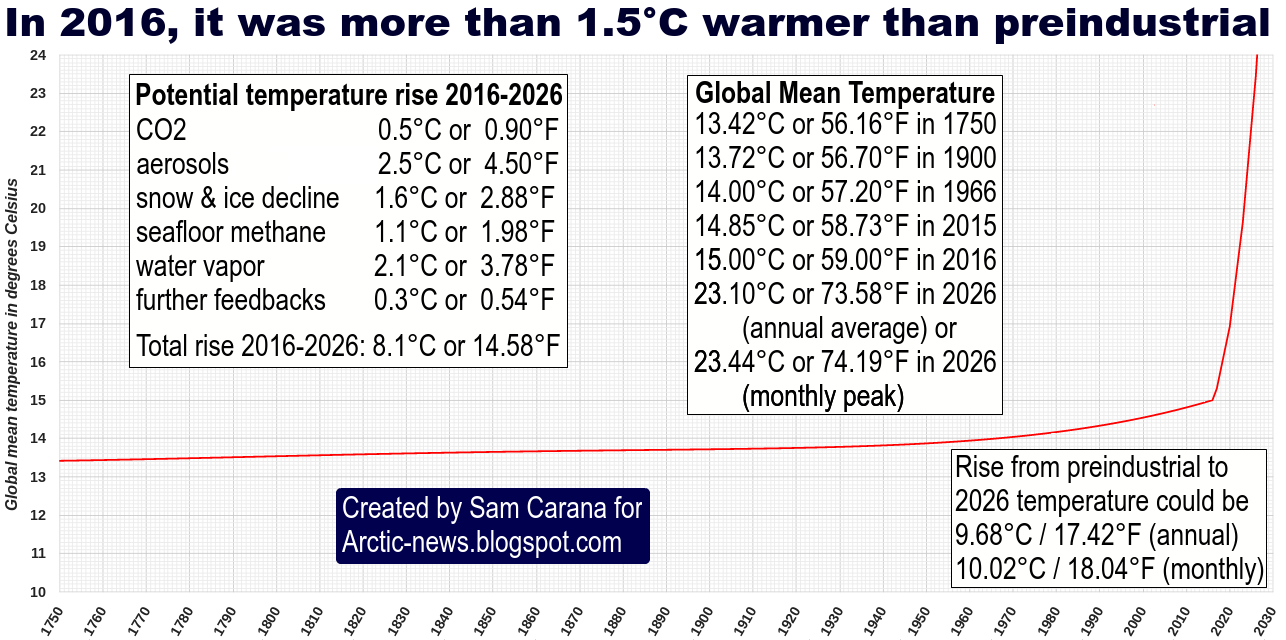
Above images illustrate the importance of what's going to happen next. The temperature rise up until now may well be dwarfed by what's yet to come and the outlook may well be even worse than what most fear will eventuate. The image below, from an earlier post, shows a steep rise from 2016 to 2026, due to the combined impact of the warming elements listed in the left box of the image below.
Meanwhile, the rise in carbon dioxide levels appears to be accelerating, as illustrated by the images below.
Indeed, despite pledges made at the Paris Agreement to limit the temperature increase to 1.5°C above pre-industrial, the rise in CO₂ since preindustrial, i.e. 1750, still appears to be accelerating.
On March 18, 2018, the sea surface temperature near Svalbard (at the green circle) was 16.7°C or 62.1°F, i.e. 14.7°C or 26.4°F warmer than the daily average during the years 1981-2011.
On March 30, 2018, methane levels as high as 2624 parts per billion were recorded.
On April 1, 2018, methane levels as high as 2744 parts per billion were recorded.
The situation is dire and calls for comprehensive and effective action, as described in the Climate Plan.
The graph below shows global warming for a 30-year period centered on January 2018, using NASA 2003 to January 2018 LOTI anomalies from 1951-1980, adjusted by 0.59°C to cater for the rise from preindustrial to 1951-1980, and with a polynomial trend added.
Above graph shows that the 1.5°C guardrail, set at the Paris Agreement, was crossed in 2016 and that a 10°C (18°F) warming could eventuate within a decade or so.
The variations in above temperature data are strongly influenced by El Niño/La Niña. We currently are in a La Niña period, during which surface temperatures are suppressed, whereas surface temperatures in 2016 were much above the trendline, due to El Niño.
The ECMWF forecast from 1 February 2018 on the right indicates that we're heading for another El Niño, i.e. surface temperatures will be rising strongly over the coming months.
The IPCC seeks to downplay the amount of global warming that has already occurred and that looks set to eventuate over the next decade or so. A leaked draft of the IPCC 'Special Report on 1.5°C above pre-industrial' (First Order Draft of SR1.5 SPM) estimates that the global mean temperature reached approximately 1°C above pre-industrial levels around 2017/2018. The IPCC appears to have arrived at this estimate using an extrapolation or near term predictions of future warming so that the level of anthropogenic warming is reported for a 30 year period centered on today.
This 1°C IPCC estimate looks quite incredible when calculating the temperature rise using NASA's data for the two most recent years for which data are available (2016/2017), which shows a warming of 0.95°C when using a baseline of 1951-1980 and a warming of 1.23°C when using a baseline of 1890-1910.
Indeed, the temperature rise differs depending on which baseline is used, and when using preindustrial as a baseline, i.e. the baseline agreed to at the Paris Agreement, indications are that temperatures have already risen by more than 1.5°C, as also discussed in an earlier post.
Furthermore, when using a 30-year period centered on January 2018, the current temperature will have to be calculated over the past 15 years and estimated for the next 15 years, i.e. up to the year 2033.
To arrive at a 1°C rise for the 30-year period, the IPCC must somehow assume that temperatures will magically fall dramatically over the next 15 years, whereas indications are that temperatures will instead rise dramatically over the next decade or so.
The image on the right shows that 10°C (18°F) warming from preindustrial could eventuate within one decade when taking into full account the warming that could result from the elements depicted in the stacked bar. Each of these warming elements is discussed in more detail at the extinction page.
The image below shows the rise from 1750 to 2030, in surface temperatures (land+ocean), rather than in anomalies.
The situation is dire and calls for comprehensive and effective action, as described in the Climate Plan.
Have we gone mad? A new report released today explains why contemporary climate change policy-making should be characterised as increasingly delusional.
As the deadline approaches for submissions to the Australian government's climate targets process, there is a flurry of submissions and reports from advocacy groups and the Climate Change Authority.
Most of these reports are based on the twin propositions that two degrees Celsius (2°C) of global warming is an appropriate policy target, and that there is a significant carbon budget and an amount of "burnable carbon" for this target, and hence a scientifically-based escalating ladder of emission-reduction targets stretching to mid-century and beyond.
A survey of the relevant scientific literature by David Spratt, "Recount: It's time to 'Do the math' again", published today by Breakthrough concludes that the evidence does not support either of these propositions.
The catastrophic and irreversible consequences of 2°C of warming demand a strong risk-management approach, with a low rate of failure. We should not take risks with the climate that we would not take with civil infrastructure.
There is no carbon budget available if 2°C is considered a cap or upper boundary as per the Copenhagen Accord, rather than a hit-or-miss target which can be significantly exceeded; or if a low risk of exceeding 2°C is required; or if positive feedbacks such as permafrost and other carbon store losses are taken into account.
Effective policy making can only be based on recognising that climate change is already dangerous, and we have no carbon budget left to divide up. Big tipping-point events irreversible on human time scales such as in West Antarctica and large-scale positive feedbacks are already occurring at less than 1°C of warming. It is clear that 2°C of climate warming is not a safe cap.
In reality, 2°C is the boundary between dangerous and very dangerous climate change and 1°C warmer than human civilisation has ever experienced.
In the lead up to the forthcoming Paris talks, policy makers through their willful neglect of the evidence are in effect normalising a 2.5–3°C global warming target.
This evidence in "Recount: It's time to 'Do the math' again" demonstrates that action is necessary at a faster pace than most policy makers conceive is possible.
Earlier this month, the Intergovernmental Panel on Climate Change (IPCC) released its 5th Assessment Report (AR5), stating that: "Surface temperature is projected to rise over the 21st century under all assessed emission scenarios. It is very likely that heat waves will occur more often and last longer, and that extreme precipitation events will become more intense and frequent in many regions. The ocean will continue to warm and acidify, and global mean sea level to rise. Many aspects of climate change and associated impacts will continue for centuries, even if anthropogenic emissions of greenhouse gases are stopped. The risks of abrupt or irreversible changes increase as the magnitude of the warming increases."
That does sound scary. So, what would happen if the IPCC's projections are too conservative? Could humans, together with many other species, go extinct within the next few decades? What are the risks that this could eventuate? Below follows an assessment using graphics by Sam Carana.
1. Ocean Heat
Below is what the IPCC says:
Below is a graph produced by Sam Carana, based on NOAA data. For more background, see this earlier post.
2. Sea level Rise
The image below shows what the IPCC says.
If ocean heat will continue to rise as pictured in the image by Sam Carana, then thermal expansion alone will cause more sea level rise than foreseen by the IPCC. Furthermore, extensive melting on Antarctica and Greenland can result in additional sea level rise. Below is a sea level rise graph produced by Sam Carana, based on NASA/GSFCs data, as discussed in this earlier post.
3. Arctic Sea Ice
The image below shows what the IPCC says.
If ocean heat will continues to rise as pictured in the image by Sam Carana, then Arctic sea ice will disappear much earlier than anticipated by the IPCC. An exponential trendline based on sea ice volume observations shows that sea ice looks set to disappear in 2019, while disappearance in 2015 is within the margins of a 5% confidence interval, reflecting natural variability.
A linear trend would be inappropriate, given the growing impact of feedbacks that can each be expected to reinforce sea ice decline, while there can also be interaction between these feedbacks, further accelerating sea ice decline. Albedo change is one such feedback, but there are numerous other ones, such as storms that have more chance to grow stronger as the area with open water increases.
In conclusion, an exponential trendline is more appropriate than a linear trendline, as also illustrated by above comparison, which shows that a linear trendline has 9 years fall outside its 95% confidence ionterval, versus 4 years for an exponential trendline, as discussed at the FAQ page.
Rapid decline of the snow and ice cover on the Northern Hemisphere is furthermore supported by rapidly rising surface temperatures over the Arctic, as well as greater intensity of heatwaves. Below is what the IPCC says on this.
Before further discussing surface temperatures, let's look into one of the feedbacks that could hugely increase temperatures, methane.
4. Methane
The IPCC appears to underestimate of the amount of methane that is contained in sediments under the Arctic Ocean and prone to be released as temperatures rise, as discussed in this earlier post and at this page. In an absurd articulation of contradictionary logic, the IPCC writes on the one hand that there is little consensus on the likelihood of abrupt changes over the 21st century, while on the other hand the IPPC declares with 'high confidence' that it is very unlikely that methane from clathrates will undergo catastrophic release during the 21st century, as discussed in this earlier post.
The image below, based on data from the IPCC and the World Metereological Organization (WMO), with an added observation from a NOAA MetOp satellite image, illustrates the recent rise of methane levels and the threat that methane levels will continue to rise rapidly.
When looked at from a longer range of years, above image fits in the black square on the image below.
As ocean heat keeps increasing and warming in the Arctic keeps accelerating due to feedbacks such as Arctic sea ice decline, huge methane eruptions from the seafloor of the Arctic Ocean threaten to push up methane levels even further. The image below shows exponential rise based on data of East Siberian Arctic Shelf (ESAS) releases alone, as discussed in an earlier post.
Non-linear rise is supported by the fact that methane's lifetime increases as more methane enters the atmosphere.
5. Surface Temperatures
The IPCC expects that, worst case, global average temperature could rise by 13 degrees Celsius by 2300, as illustrated by the image below.
The situation could be much worse than foreseen by the IPCC, due to the non-linear way feedbacks can hugely increase temperature rises.
The threat is that such rapid temperature rises will appear at first in hotspots over the Arctic and eventually around the globe, while also resulting in huge temperature swings that could result in depletion of supply of food and fresh water, as further illustrated by the above image, from an earlier post, and the image below, from another earlier post.
The situation is dire and calls for comprehensive and effective action, as described in the Climate Plan.