Saturday, February 15, 2014

Extreme weather strikes around the globe - update

As the weather gets more extreme, disaster strikes around the globe. The Guardian reports three people killed as storms continue to batter southern UK. The Vancouver Sun reports that a U.S. Northeast snowstorm kills 25. And the Sacramento Bee reports Six dead and 1,000 injured in fresh Japan snow storm.

What is the story behind these extreme weather events? The image below tells the story. The Arctic has been much warmer than it used to be, due to numerous feedbacks that accelerate warming in the Arctic. This reduces the temperature differential between the Arctic and lower latitudes, which changes the Jet Stream and Polar Vortex, in turn making the weather at many places ever more extreme.

 earlier forecasts by cci-reanalyzer.org
Above image illustrates the situation, showing an Arctic Ocean that is warmer than the higher latitudes of the Asian and North American continents.

Arctic sea ice has meanwhile reached record lows, as illustrated by the image below.


The situation can be expected to get even worse. The image below shows sea ice extent, as measured by the NSIDC, which is one day ahead compared to above image.


Below, two regular contributors to the Arctic-news blog comment on the situation.

Monday, February 10, 2014

Extreme weather strikes around the globe

  Editorial note: this post has meanwhile been updated as
Extreme weather strikes around the globe update.


As the weather gets more extreme, disaster strikes around the globe.

Here's a snapsnot from today's news. In London, the BBC reports, flooded homes along the River Thames are being evacuated and thousands more are at risk. In Japan, reports Reuters, eleven people died, more than a thousand were injured and tens of thousands lost power when the worst snowstorm in decades hit Tokyo and areas around the Japanese capital before heading north to blanket the tsunami-hit Pacific coast. Many countries in the Middle East were hit by snow. The BBC reports that heavy snow in northern Iran has left around 480,000 homes without power and some towns and villages cut off.

What is causing these extreme weather events? The image below tells the story. While at times it has been cold at many places around the world, when averaged over the past 30 days, temperatures around the globe have actually been several degrees higher than they used to be. The Arctic has been hit hardest, with anomalies as high as 21°C over this 30 day period. This affects the Jet Stream and Polar Vortex, which in turn is making the weather ever more extreme.


The situation is further illustrated by the cci-reanalyzer.org forecasts below.


And while the sea ice didn't look too bad at the start of the year, growth has meanwhile stopped, as illustrated by the image below.


Added below are two videos by Paul Beckwith, further discussing the situation.


Editor's note: Reanalysis of temperature anomaly Jan 12 - Feb 10, 2014.
Meanwhile, I've added another image (above), created with NOAA's reanalysis, which compares temperatures to a larger dataset, and the colors look a lot different, so NOAA may indeed have mixed the colors up somewhat in the initial image, as Albert suggested at the Facebook discussion (click on image below).

Anyway, the point made in the post remains, i.e. that as global warming continues, warming in the Arctic accelerates more rapidly than at lower latitudes, which weakens the polar vortex and jet stream in a self-reinforcing feedback that causes the Arctic to warm up even further compared with lower latitudes.

As said, the situation calls for comprehensive and effective action, as discussed at the Climate Plan blog.

Sunday, February 9, 2014

High methane readings over Greenland

High methane readings have been recorded over Greenland since the start of February 2014. The image below shows methane readings of 1950 ppb and higher in yellow on February 9, 2014.


The animation below shows that high methane readings (1950+ ppb in yellow) have been showing up over Greenland since the start of February 2014.

[ Note: this animation is a 3.28 MB file that may take some time to fully load ]
What could have caused these high methane readings? The persistence with which the methane shows up over Greenland indicates that it did indeed originate from Greenland.

The above animation also illustrates that high methane readings show up every other image. The IASI readings come from a satellite that is orbiting the poles twice daily, with a 12-hour interval, so the satellite passes the North Pole twice every day. This makes that the images follow a day-versus night pattern, indicating that the high methane readings follow a circadian rhythm, suggesting a pattern that is in line with temperature differences between day and night.

There often is a difference in methane readings between day and night, but rarely is it as distinct as is currently the case over Greenland. And indeed, more is currently happening to temperatures over Greenland than mere differences in temperature between day and night.

As discussed in earlier posts such as this one, the once-common temperature difference between the Arctic and lower latitudes has been shattered, and this is weakening the Jet Stream and the Polar Vortex, in turn making it easier for cold air to flow down to lower latitudes and for warmer air to enter the Arctic. As a result, temperatures over Greenland can go from one extreme to another and back, as illustrated by the image with selected cci-reanalyzer.org forecasts below.

[ click on image to enlarge ]
Above image shows that, in some areas over Greenland, temperature anomalies may go down as low as as minus 20 degrees Celsius one day, then climb as high as 20 degrees Celsius a few days laters, to hit temperature anomalies as low as minus 20 degrees Celsius again some days later. These are swings of 40 degrees Celsius that can hit an area over the course of a few days. 

This could explain the methane over Greenland. Methane is present in the Greenland ice sheet in the form of hydrates and free gas. These huge temperature swings are causing the ice to expand and contract, thus causing difference in pressure as well as temperature. The combined shock of wide pressure and temperature differences is causing movement and fractures in the ice allowing methane to rise to the surface and enter the atmosphere.

The image below puts things in perspective, comparing methane over Greenland with methane over the Arctic Ocean.


Above image shows that the amounts of methane over Greenland are huge, while methane is still being released from the seafloor of the Arctic Ocean, in particular along the faultline that runs from the north of Greenland to the Laptev Sea. 

Few people seem to have anticipated these methane releases from the mountains of Greenland. Even worse, similar processes could be going at times on Antarctica, the Himalayas and the Qinghai-Tibet Plateau. I warned about this danger, e.g. in the May 2013 post Is Global Warming breaking up the Integrity of the Permafrost?. The danger that methane will be released in large (and growing) quantities from hydrates and free gas contained in the ice over mountains appears to have been ignored by the IPCC, which puts more weight on my estimate that methane release from hydrates currently amounts to 99 Tg annually, vastly more than the most recent IPCC estimates of 6 Tg per year. 

Without action on climate change, these methane releases threaten to rise even further and cause runaway global warming. This calls for comprehensive and effective action as discussed at the Climate Plan blog

Saturday, February 8, 2014

CO2 growth highest on record

Despite many promises, global emissions of carbon dioxide (CO2) continue to grow.

NOAA figures show that 2013 CO2 level growth was the highest ever recorded, i.e. 2.95 ppm.

The EPA expects U.S. 2013 energy-related CO2 emissions to be 2% higher than in 2012.

The UC San Diego image below shows CO2 levels in the atmosphere over the past two years.

Back in September 2013, John Davies warned: The world is probably at the start of a Runaway Greenhouse Event which will end most human life on Earth before 2040. This will occur because of a massive and rapid increase in the carbon dioxide concentration in the air which has just accelerated significantly. The increasing Greenhouse Gas concentration, the gases which cause Global Warming, will very soon cause a rapid warming of the global climate and a chaotic climate.

The post featured a graph with a 4th-order polynomial trendline pointing at some 7.5 ppm CO2 annual growth by 2040. While many welcomed the warning contained in the graph, some argued against using higher-order polynomial trendlines. So, for those who don't feel comfortable with a 4th-order polynomial trendline, the graph below adds both a linear trendline and a 3rd-order polynomial trendline.


The 3rd-order polynomial trendline, based on the recent data, points at CO2 annual growth of some 7 ppm by 2040, justifying the warning sounded by the 2013 graph.

And what do the recent data say, when a 4th-order polynomial trendline is applied? As the image below shows, they show an even steeper rise, reaching 7 ppm growth per year as early as 2030.


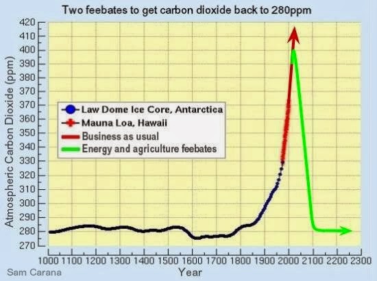
As many posts at this blog have warned, rapid growth in greenhouse gases and numerous feedbacks are threatening to push Earth into runaway global warming. This calls for comprehensive and effective action to - among other things - reduce atmospheric CO2 levels back to 280 ppm, as illustrated by the image below and as further discussed at the Climate Plan blog.