Showing posts with label warming. Show all posts

Saturday, October 13, 2018

IPCC keeps feeding the addiction


The IPCC just released its report Global Warming of 1.5°C. Things aren't looking good and instead of providing good advice and guidance, the IPCC bends over backward in efforts to keep feeding the addiction.

The Paris Agreement constitutes a joint commitment by all nations of the world to keep the temperature rise below 1.5°C. The IPCC should have honored this commitment by explaining that the situation is dire and by pointing at action to be taken to improve the situation.

Instead, the IPCC bends over backward to make it look as if temperatures were lower than they really are, in an effort to make it look as if there were carbon budgets to be divided, and polluters should be allowed to keep polluting until those budgets had run out. This is like saying that drug junkies who cause damage and are deeply in debt, should be handed over more OPM (other people's money, in this case the future of all people and other species).

In reality, there is no carbon budget to be divided, there is just a huge carbon debt to be repaid. The urgency and imperative to act is such that progress in one area cannot make up for delays elsewhere. The best policies should be implemented immediately, and everywhere across the world.

Use of terms such as trade-offs, net-outcomes, off-sets, carbon budgets and negative emissions is misguided and highly misleading. Policies based on giving and trading in permits to pollute are less effective than local feebates, i.e. policies that impose fees on sales of polluting products and then use the revenues to support rebates on the better alternatives sold locally.

Here are twelve instances where the IPCC is misleading:
  1. Changing the baseline set at the Paris Agreement
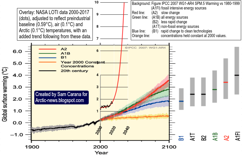
    The Paris Agreement is clear that pre-industrial is to be used as baseline. The IPCC defines pre-industrial as the multi-century period prior to the onset of large-scale industrial activity around 1750, and then proceeds to use as baseline 1850-1900, a period when the Industrial Revolution had long started. This compromises the entire Paris Agreement and thus the integrity of us all. Temperatures in 1900 may well have been 0.3°C higher than pre-industrial, as depicted in above image in the light blue block. Add up the impact of further warming elements and it may well be that people have caused around 2°C of warming already and that we're facing warming of more than 10°C by 2026.

  2. Misleading calculations and wording
    The IPCC suggests that warming caused by people is 1.0°C (±0.2°C), likely to reach 1.5°C between 2030 and 2052. To reach these numbers, the IPCC used misleading calculations in efforts to downplay how dangerous the situation is, as discussed further below. As an example of misleading wording, the IPCC says it has high confidence that 1.5°C won't be reached until 2030 if warming continues to increase at the current rate of 0.2°C per decade. Sure, if warming was 1.0°C and if the temperature rise was indeed increasing by 0.2°C per decade and if that rise would continue at 0.2°C per decade, yes, then it would take 25 years for warming to reach 1.5°C. But the reality is that warming is already far more than 1.0°C and that it is accelerating. That makes it misleading to associate high confidence with the suggestion that warming will not reach 1.5°C until 2030. The suggestion of a straight line (linear trend) is misleading in the first place, since warming is accelerating. The suggestion of a straight line is even more misleading when making projections into the future and when qualifications such as high confidence are added.

  3. Ignoring the importance of peaks
    Daily and monthly peaks are obviously higher than annual averages, and it's those high peaks that kill, making it disrespectful toward past and future victims of extreme weather events to average that away. The image on the right shows that in February 2016, it was on average 1.70°C warmer than in 1900 (1885-1914 i.e. a 30-year period centered around 1900), while the higher latitudes North had anomalies of up to 15.1°C. The IPCC failed to warn people, who mostly live on land on the Northern Hemisphere, how high anomalies were in February 2016. Conservatively, the magenta block at the top of the bar in above image shows a rise of 1.62°C for February 2016. Note that this is the rise from 1900, i.e. before adding 0.3°C for the rise before 1900, and before adding further adjustments as discussed below.

  4. Cherry-picking the baseline period
    The image on the right shows that, for a baseline of a 30-year period around the year 1900, the temperature rise to 2016-2017 was 1.25°C. When adding a further 0.3°C rise for the rise before 1900, warming was well above 1.5°C in 2016-2017. Yet, while first defining pre-industrial as the multi-century period prior to the onset of large-scale industrial activity around 1750, the IPCC then uses 1850-1900 as baseline, a period when it was relatively warm, i.e. warmer than in 1750 and warmer also than in 1900. It was warmer over 1850-1900 due to increasing livestock numbers and forests clearing, while huge amounts of wood were burned, all contributing to large emissions of black carbon, brown carbon, methane, CO, etc., which caused additional warming during this period. So, this period was relatively warm. There was little impact yet of the sulfur aerosols that started coming with burning fossil fuel from 1900. Choosing this period enabled the IPCC to beef up the temperature for its baseline and then draw trends that looks flatter than they would have been if drawn from pre-industrial, to suggest that global warming was only 1°C and that 1.5°C would not be reached until somewhere between 2030 and 2052.

  5. Changing the data
    The U.K. Met Office's HadCRUT dataset goes back to 1850. The IPCC used this dataset, but actually changed the data, by averaging the data with datasets that showed a similar rise for the years after 1900, but that showed higher warming for 1880-1900. This enabled the IPCC to further beef up the average temperature for the period 1850-1900 and then draw a linear trend from 1850-1900 that looks even flatter.

  6. Cherry-picking the type of data
    To further support its suggestions, the IPCC uses water surface data for ocean temperature, but uses air data for temperatures over land. When selecting datasets with more consistency and using air temperatures globally, the temperature rise is 0.1°C higher.

  7. Not using new techniques to estimate values for missing data
    The IPCC chooses not to use new techniques to estimate temperatures where data are missing. Less data are available for the Arctic, and this is precisely where temperatures have risen much faster than in the rest of the world. When values for missing data are included, the temperature rise is another 0.1°C higher.

  8. Leaving out 2016
    The IPCC says the Special Report is an assessment of the relevant state of knowledge, based on the scientific and technical literature available and accepted for publication up to 15 May 2018. Yet, the IPCC says that global warming is currently increasing at 0.2°C per decade, as if the high temperatures in 2016 didn't occur. To arrive at 0.2°C, the IPCC used the period of 2006-2015 and used data from a specific dataset, and then rounded down the value. By contrast, NASA data show a rate of increase of 0.3°C over 2006-2015, 0.4°C over 2007-2016 and 0.4°C over 2008-2017. Failure to properly address acceleration of future warming is further discussed in the point below. 

  9. Failure to properly address dangerous developments
    The IPCC fails to point out that carbon dioxide reaches a maximum in warming the atmosphere some 10 years after emission, which means that the full wrath of global warming due to the very high emissions of carbon dioxide over the past decade is yet to come. While temperatures could rise very rapidly over the coming decade, the IPCC keeps talking about carbon budgets, without properly addressing tipping points such as the decline of the snow and ice cover that will result in huge albedo losses, jet stream changes, more and more extreme weather events, and more. The IPCC fails to point out the danger of destabilization of sediments containing methane in the form of hydrates and free gas. Furthermore, the IPCC fails to properly address the aerosol warming that will occur as sulfur emissions decrease and other aerosols increase such as black carbon, brown carbon, etc. The IPCC fails to mention the water vapor feedback, i.e. the increase of water vapor in the atmosphere that will occur as a result of these developments. Since water vapor itself is a potent greenhouse gas, this will speed up the temperature rise even further. These developments could lead to a potential global temperature rise (from 1750) of more than 10°C by 2026, as illustrated in the image at the top.

  10. There is no carbon budget left
    Instead of pointing at the dangers, as it should have done, the IPCC makes it look as if there was a remaining carbon budget that should be divided among polluters, as if they should continue polluting the world. The IPCC creates this illusion by interpreting the thresholds set at the Paris Agreement as averages over a 30-year period, while ignoring the acceleration of the temperature rise. It should be obvious that there is no such budget. Instead, there's only a huge and very dangerous carbon debt. There is no room for trade-offs or offsets, and terms such as negative emissions are also inappropriate. All efforts should be made to cut emissions, including ending current subsidies for fossil fuel and livestock, while at the same time great effort should be taken to remove carbon from the atmosphere and oceans. And even then, it's questionable whether any humans will be able to survive the coming decade, which will be critically dangerous for all species on Earth.

  11. Suggesting polluting pathways
    The pathways suggested by the IPCC keep fossil fuel in the picture for many years, while highlighting non-solutions such as BECCS. The IPCC makes it look as if coal-fired power plants could continue to operate, by burning more biomass and capturing carbon. The IPCC makes it look as if transport could continue to use internal combustion engines, by burning more biofuel. Instead, clean & renewable energy has many benefits, including that it's more economic, so air capture powered by such facilities would make more sense than BECCS. Furthermore, electric vehicles should be supported now, rather than in the year 2050. It makes sense to stop fossil fuel subsidies, and to support better diets, to plant more vegetation and to support ways to add carbon and nutrients to soils and oceans, such as with biochar and ground rocks. Many technologies have been proposed, e.g. refrigerators and freezers are now made that do not use gases for cooling. The IPCC should not have used pathways that are wrong in the first place. Instead, the IPCC should have pointed at the policies that can best facilitate the necessary transitions, because the scientific evidence is overwhelming and it's the right thing to do.

  12. Not pointing at the best and much-needed policy tools
    The IPCC report fails to point out that imposing fees on polluting products is the most effective policy instrument, the more so when the revenues are used to support rebates on better alternatives supplied locally.
The situation is dire and calls for comprehensive and effective action, as described at the Climate Plan.

Prof. Peter Wadhams and Stuart Scott discuss the IPCC Global Warming of 1.5ºC report

Extended version of above video

Paul Beckwith on baseline, methane and more

Stuart Scott talks with Prof. Peter Wadhams on Arctic sea ice

Magnificent work by Stefanie Steven

[ budget ]
Proper analysis would have pointed at what the best action is to improve the situation.

However, the IPCC does not do that. Instead, the IPCC keeps stating that there was a carbon budget to be divided and consumed, while advocating non-solutions such as BECCS and while hiding the full extent of how threatening the situation is.

A quick word count of the IPCC report Global Warming of 1.5°C (SPM) shows paragraphs full of words such as budget (1st image right) and of non-solutions such as BECCS (2nd image right).

[ BECCS ]
At the same time, it fails to mention biochar, meat or local feebates. It fails to mention the huge threat of feedbacks and tipping points such as methane hydrates and Arctic sea ice, instead making it look as if all that could only pose potential problems over longer timescales.

This is indicative of how much the IPCC is part of the problem and part and parcel of the wilful destruction of life itself that is taking place so obviously all around us.

The IPCC (Intergovernmental Panel on Climate Change) might as well change its name to IPCD (Intergovernmental Panel on Climate Destruction).


It's not as if people weren't warned.
The danger was described back in 2007: Total Extinction.
The mechanism was depicted back in 2011: Runaway Global Warming.
And still, in 2018, the IPCC sadly keeps on feeding the addiction.


Links

• IPCC special report Global Warming of 1.5°C
https://report.ipcc.ch/sr15/

• Paris Agreement
https://arctic-news.blogspot.com/2015/12/paris-agreement.html
http://unfccc.int/documentation/documents/advanced_search/items/6911.php?priref=600008831
https://unfccc.int/resource/docs/2015/cop21/eng/l09r01.pdf

• How much warming have humans caused?
https://arctic-news.blogspot.com/2016/05/how-much-warming-have-humans-caused.html

• Climate Plan
https://arctic-news.blogspot.com/p/climateplan.html

• Feedbacks
https://arctic-news.blogspot.com/p/feedbacks.html

• Extinction
https://arctic-news.blogspot.com/p/extinction.html

• Can we weather the Danger Zone?
https://arctic-news.blogspot.com/2018/07/can-we-weather-the-danger-zone.html

• How much warmer is it now?
https://arctic-news.blogspot.com/2018/04/how-much-warmer-is-it-now.html

• 100% clean, renewable energy is cheaper
https://arctic-news.blogspot.com/2018/02/100-clean-renewable-energy-is-cheaper.html

• Fridges and freezers that don't use gases
https://www.facebook.com/groups/geoengineering/permalink/1794122703977728

• Negative-CO2-emissions ocean thermal energy conversion
https://www.sciencedirect.com/science/article/pii/S136403211830532X

• 'Electrogeochemistry' captures carbon, produces fuel, offsets ocean acidification
https://arctic-news.blogspot.com/2018/06/electrogeochemistry-captures-carbon-produces-fuel-offsets-ocean-acidification.html

• Olivine weathering to capture CO2 and counter climate change
https://arctic-news.blogspot.com/2016/07/olivine-weathering-to-capture-co2-and-counter-climate-change.html

• Biochar group at facebook
https://www.facebook.com/groups/biochar

• Aerosols
https://arctic-news.blogspot.com/p/aerosols.html

• IPCC seeks to downplay global warming
https://arctic-news.blogspot.com/2018/02/ipcc-seeks-to-downplay-global-warming.html

• Blue Ocean Event
https://arctic-news.blogspot.com/2018/09/blue-ocean-event.html

• What Does Runaway Warming Look Like?
https://arctic-news.blogspot.com/2018/10/what-does-runaway-warming-look-like.html

• Ten Dangers of Global Warming
https://arctic-news.blogspot.com/p/ten-dangers-of-global-warming.html

• AGU poster, AGU Fall Meeting 2011
https://arctic-news.blogspot.com/p/agu-poster.html


Monday, October 8, 2018

What Does Runaway Warming Look Like?

The forcing caused by the rapid rise in the levels of greenhouse gases is far out of line with current temperatures. A 10°C higher temperature is more in line with these levels, as illustrated by the image below.


Carbon dioxide levels have been above 400 ppm for years. Methane levels above 1900 ppb were recorded in September 2018. Such high levels are more in line with a 10°C higher temperature, as illustrated by the above graph based on 420,000 years of ice core data from Vostok, Antarctica, research station.

How fast could such a 10°C temperature rise eventuate? The image below gives an idea.


Such runaway warming would first of all and most prominently become manifest in the Arctic. In many ways, such a rise is already underway, as the remainder of this post will show.

High Arctic Temperatures

Why are Arctic temperatures currently so high for the time of year?


As warmer water enters the Arctic Ocean from the Atlantic and Pacific Oceans, there is no thick sea ice left to consume this heat. Some of this heat will escape from the Arctic Ocean to the atmosphere, as illustrated by above dmi.dk  image showing very high temperatures for the time of the year over the Arctic (higher than 80°C latitude).


Above dmi.dk image shows that Arctic temperatures are increasingly getting higher during Winter in the Northern Hemisphere.


Similarly, above NASA image shows that Arctic temperatures are increasingly getting higher during Winter in the Northern Hemisphere.


As the Arctic warms up faster than the rest of the world, the Jet Stream is becoming more wavy, allowing more hot air to move into the Arctic, while at the same time allowing more cold air to move south.

Above image shows that the air over the Beaufort Sea was as warm as 12.8°C or 55°F (circle, at 850 mb) on October 2, 2018. The image also illustrates that a warmer world comes with increasingly stronger cyclonic winds.


The images above and below shows that on October 2 and 7, 2018, the sea surface in the Bering Strait was as much as 6°C or 10.7°F, respectively 6.4°C or 11.6°F warmer than 1981-2011 (at the green circle).


As temperatures on the continent are coming down in line with the change in seasons, the air temperature difference is increasing between - on the one hand - the air over continents on the Northern Hemisphere and - on the one hand - air over oceans on the Northern Hemisphere. This growing difference is speeding up winds accordingly, which in turn can also speed up the influx of water into the Arctic Ocean.

[ The Buffer has gone, feedback #14 on the Feedbacks page ]
Start of freezing period

Here's the danger. In October, Arctic sea ice is widening its extent, in line with the change of seasons. This means that less heat can escape from the Arctic Ocean to the atmosphere. Sealed off from the atmosphere by sea ice, greater mixing of heat in the water will occur down to the seafloor of the Arctic Ocean, while there is little or no ice buffer left to consume an influx of heat from the Atlantic and Pacific Oceans, increasing the danger that warm water will reach the seafloor of the Arctic Ocean and destabilize methane hydrates. 

Rising salt content of Arctic Ocean

It's not just the influx of heat that is the problem. There's also the salt. Ice will stay frozen and will not melt in freshwater until the temperature reaches 0°C (or 32°F). Ice in saltwater on the other hand will already have melted away at -2°C (or 28.4°F).

The animation of the right shows salty water rapidly flowing through the Bering Strait.

With the change of seasons, there is less rain over the Arctic Ocean. The sea ice also seals the water of the Arctic Ocean off from precipitation, so no more fresh water will be added to the Arctic Ocean due to rain falling or snow melting on the water.

In October, temperatures on land around the Arctic Ocean will have fallen below freezing point, so less fresh water will flow from glaciers and rivers into the Arctic Ocean. At that time of year, melting of sea ice has also stopped, so fresh water from melting sea ice is no longer added to the Arctic Ocean either.

Pingos and conduits. Hovland et al. (2006)
So, the Arctic Ocean is receiving less freshwater, while the influx of water from the Atlantic and Pacific Oceans is very salty. This higher salt content of the water makes it easier for ice to melt at the seafloor of the Arctic Ocean. Saltier warm water is causing ice in cracks and passages in sediments at the seafloor of the Arctic Ocean to melt, allowing methane contained in the sediment to escape.

[ click on images to enlarge ]
The image on the right, from a study by Hovland et al., shows that hydrates can exist at the end of conduits in the sediment, formed when methane did escape from such hydrates in the past. Heat can travel down such conduits relatively fast, warming up the hydrates and destabilizing them in the process, which can result in huge abrupt releases of methane.

Heat can penetrate cracks and conduits in the seafloor, destabilizing methane held in hydrates and in the form of free gas in the sediments.

Methane

peak methane levels as high as 2859 ppb
On October 2 and 7, 2018, peak methane levels were as high as 2838 ppb, respectively 2859 ppb, as the images on the right shows. Methane levels over the Beaufort Sea have been high for some time, and have remained high at very high altitudes.

The threat is that a number of tipping points are going to be crossed, including the buffer of latent heat, loss of albedo as Arctic sea ice disappears, methane releases from the seafloor and rapid melting of permafrost on land and associated decomposition of soils, resulting in additional greenhouse gases (CO₂, CH₄, N₂O and water vapor) entering the Arctic atmosphere, in a vicious self-reinforcing cycle of runaway warming.

A 10°C rise in temperature by 2026?


Above image shows how a 10°C or 18°F temperature rise from preindustrial could eventuate by 2026 (from earlier post).

The situation is dire and calls for comprehensive and effective action, as described at the Climate Plan.


Links

• Temperature Rise
https://arctic-news.blogspot.com/2017/08/temperature-rise.html

• Mean Methane Levels reach 1800 ppb
https://arctic-news.blogspot.com/2013/06/mean-methane-levels-reach-1800-ppb.html

• Why are methane levels over the Arctic Ocean high from October to March?
https://arctic-news.blogspot.com/2015/01/why-are-methane-levels-over-the-arctic-ocean-high-from-october-to-march.html

• Blue Ocean Event
https://arctic-news.blogspot.com/2018/09/blue-ocean-event.html

• Feedbacks
https://arctic-news.blogspot.com/p/feedbacks.html

• The Threat
https://arctic-news.blogspot.com/p/threat.html

• Extinction
https://arctic-news.blogspot.com/p/extinction.html

• Aerosols
https://arctic-news.blogspot.com/p/aerosols.html

• How extreme will it get?
https://arctic-news.blogspot.com/2012/07/how-extreme-will-it-get.html

• Climate Plan
https://arctic-news.blogspot.com/p/climateplan.html


Monday, September 24, 2018

Looking the climate abyss in the eye!


Growth of CO₂ in the atmosphere is accelerating. The image shows the growth rate in parts per million (ppm), based on annual Mauna Loa data (1959-2017), with a 4th-order polynomial trend added.

While no data are yet available for the year 2018, the trend on above image points at 2.65 ppm. The image below shows the level for the most recent week, which is 2.53 ppm above the corresponding week a year ago.


Carl Rasmussen calculates that the de-seasonalised growth rate has now (at the middle of 2018) reached ±2.3 ppm/y. Carl adds: "the rate of growth is itself growing, [it is] the highest growth rate ever seen in modern timesThis is not just a 'business as usual' scenario, it is worse than that, we're actually moving backward, becoming more and more unsustainable with every year. This shows unequivocally that the efforts undertaken so-far to limit green house gases such as carbon dioxide are woefully inadequate."


Even more alarming is the growth in methane.

Peak methane levels were as high as 3.37 ppm on August 31, 2018, an ominous warning of the threat of destabilization of methane hydrates at the seafloor of the Arctic Ocean.

Mean global methane levels were as high as 1.91 ppm on the morning of September 20, 2018, at 293 millibar.

This is a level unprecedented in human history and it far exceeds the WMO-data-based trend (added on the right of above image).

Temperatures look set for a steep rise within years, as we now are fully in the danger zone.

Meanwhile, the IPCC seeks to downplay the amount of global warming that has already occurred and that looks set to eventuate over the next decade or so.

The image on the right shows the full extent of the climate abyss that we’re facing.

Have a look at the Extinction page for more details on the full extent of the threat.

How many people and species will survive the coming temperature rise? We don’t know.

The best we can do is to support climate action, i.e. action that starts immediately, and that is transformative, comprehensive and effective, as described in the Climate Plan.

Have a look at the lines of action depicted in the image below.


Links

• Blue Ocean Event
https://arctic-news.blogspot.com/2018/09/blue-ocean-event.html

• Can we weather the Danger Zone?
https://arctic-news.blogspot.com/2018/07/can-we-weather-the-danger-zone.html

• How much warmer is it now?
https://arctic-news.blogspot.com/2018/04/how-much-warmer-is-it-now.html

• 100% clean, renewable energy is cheaper
https://arctic-news.blogspot.com/2018/02/100-clean-renewable-energy-is-cheaper.html

• Feedbacks
https://arctic-news.blogspot.com/p/feedbacks.html

• How much warming have humans caused?
https://arctic-news.blogspot.com/2016/05/how-much-warming-have-humans-caused.html

• IPCC seeks to downplay global warming
https://arctic-news.blogspot.com/2018/02/ipcc-seeks-to-downplay-global-warming.html

• The Threat
https://arctic-news.blogspot.com/p/threat.html

• Extinction
https://arctic-news.blogspot.com/p/extinction.html

• Aerosols
https://arctic-news.blogspot.com/p/aerosols.html

• How extreme will it get?
https://arctic-news.blogspot.com/2012/07/how-extreme-will-it-get.html

• Climate Plan
https://arctic-news.blogspot.com/p/climateplan.html


Friday, August 3, 2018

Peaks Matter

Heat stress

When calculating how much warmer we can expect it to get, climate models typically use linear projections based on temperature averages, such as annual global average temperatures, daily temperatures that are averages between day and night, etc. Sadly, this downplays the danger, as average temperatures are unlikely to kill people. When lives are at stake, peaks matter!

Where are temperatures rising most?


Temperatures are rising most strongly in the Arctic. Above map shows a rise of as much as 5.7°C or 10.26°F in Arctic.

Ocean heat on the move toward Arctic Ocean

The image below shows that the sea surface was 22°C or 71.6°F on August 13, 2018, at 77.958°N, 5.545°E (near Svalbard), i.e. 6.9°C or 12.4°F warmer than 47 days earlier and 16.4°C or 29.5°F warmer than it was during 1981-2011.


Local maximum temperatures can be good indicators for the maximum heat stress that can be expected in the area.


As illustrated by above image, the sea surface near Svalbard was 22°C or 71.6°F at the green circle on August 13, 2018, i.e. 16.4°C or 29.5°F warmer than 1981-2011.

This high sea surface temperature is an indicator of the temperature of the water below the surface, which in turn is an indicator of the amount of ocean heat that is entering the Arctic Ocean from the Atlantic Ocean.

Ocean heat is carried by the Gulf Stream from the North American coast toward the Arctic Ocean, as illustrated by the images below and on the right.

Warming of the Arctic Ocean comes with a number of feedbacks that accelerate this warming, such as albedo changes that take place as the Arctic snow and ice cover declines, and methane that is released from sediments containing methane in the form of hydrates and free gas.


The situation could get worse rapidly. As an example, with a decrease in cooling aerosols, which are concentrated in the Northern Hemisphere, the North Atlantic looks set to absorb more heat. A recent study calculated that the North Atlantic’s share of the uptake could increase from 6% to about 27%.

As another example, a recent study concludes: Existing models currently attribute about 20% of the permafrost carbon feedback this century to methane, with the rest due to carbon dioxide from terrestrial soils. By including thermokarst lakes, methane becomes the dominant driver, responsible for 70% to 80% of permafrost carbon-caused warming this century. Adding thermokarst methane to the models makes the feedback’s effect similar to that of land-use change, which is the second-largest source of manmade warming.

High methane levels warn about seafloor methane releases

The image on the right illustrates the danger, showing high methane levels at Barrow, Alaska, in July 2018.

When making projections of heat stress, it is important to look at all potential warming elements, including albedo changes, changes to jet streams and sea currents, higher levels of methane, high levels of water vapor, etc.

Methane is a potent greenhouse gas, causing huge warming immediately after entering the atmosphere, while this warming will be felt most strongly where the methane was released. Methane can therefore contribute strongly to local temperature peaks.

On August 6, 2018, mean global methane levels were as high as 1896 ppb. On August 8, 2018, they were as high as 1898 ppb.

Importantly, peak levels on the afternoon of August 6, 2018, were as high as 3046 ppb, as illustrated by the image on the right. The likely origin of those high levels is the Arctic Ocean, which should act as a stark warning of things to come.

Further contributors to heat stress

Next to temperature, humidity is of vital importance. A combination of high temperatures and high humidity is devastating.

A recent study shows that the risk of deadly heat waves is significantly increased because of intensive irrigation in specific regions. The study points at a relatively dry but highly fertile region, known as the North China Plain — a region whose role in that country is comparable to that of the Midwest in the U.S. That increased vulnerability to heat arises because the irrigation exposes more water to evaporation, leading to higher humidity in the air than would otherwise be present and exacerbating the physiological stresses of the temperature.

The image below shows a forecast of perceived temperatures in China on August 7, 2018.


The green circle highlights an area that is forecast to score high on the 'Misery Index' and that is centered around a location on the coast of Poyang Lake, which is connected to the Yangtze River. Temperatures there are forecast to be as high as 36.4°C or 97.4°F. At first glance, this may not look very high, but a relative humidity 68% is forecast to make it feel like 54.1°C or 129.3°F. This translates into a wet-bulb temperature of 31.03°C or 87.86°F.

The image on the right shows relative humidity. Also note the cyclones lined up on the Pacific Ocean. Cyclones can increase humidity, making conditions worse.
The high sea surface temperature anomalies that are common in the West Pacific (image right)  contribute to warmer air and stronger cyclones carrying more moisture toward Asia, as discussed in this facebook thread which also features the next image on the right, showing that cyclone Soulik is forecast to cause waves as high as 18.54 m or 60.8 ft near Japan on August 20, 2018.

If humidity kept rising, a temperature of 36.4°C at a relative humidity of 91% would result in a wet-bulb temperature of 35°C. No amount of sweating, even in the shade and in front of strong winds or a fan, can cool the body under such conditions, and it would be lethal in a matter of hours in the absence of air conditioning or cold water.

There are further factors that can contribute to make specific areas virtually uninhabitable. The urban heat effect is such a factor. El Niño is another one. Land-only temperature anomalies are higher than anomalies that are averaged for land and oceans. As temperatures keep rising, heat waves can be expected to intensify, while their duration can be extended due to jet stream blocking.

The situation is dire and calls for comprehensive and effective action as described in the Climate Plan.


Below, Paul Beckwith warns that parts of the world 'will soon be rendered uninhabitable'.


Video: Unrelenting Heat, Humidity Will Soon Make Regions UNINHABITABLE

Paul Beckwith: "How hot can it actually get? What is in store for us? When you combine the heat domes sitting over many countries with high humidity, many areas around the planet will soon reach the deadly 35°C (95°F) 100% humidity (wet bulb temperature) or equivalent situation whereby a perfectly healthy person outside, in a well ventilated area, in the shade will die from the heat in 6 hours."

Video: Most Mammals Endure Heat Waves Better Than Humans

"Most people, like the very young, the elderly, and the rest of us won’t last anywhere as long, at even lower temperatures. I discuss the latest peer-reviewed science on how parts of high-risk regions in the North China Plains, Middle East, and South Asia will soon be rendered uninhabitable by combined heat and humidity."

Video: Uninhabitable Regions with Extreme Heat and Humidity


Also watch this video, in which Guy McPherson talks about the way aerosols currently mask the full wrath of global warming.

Video: Edge of Extinction: Rate Matters

Above video is also incorporated in the video below.

Video: McPherson's Paradox

and for the bigger picture, also watch the video below.

Video: Responding to Abrupt Climate Change with Guy R. McPherson


Links

• It could be unbearably hot in many places within a few years time
https://arctic-news.blogspot.com/2016/07/it-could-be-unbearably-hot-in-many-places-within-a-few-years-time.html

• Feedbacks
https://arctic-news.blogspot.com/p/feedbacks.html

• Latent Heat
https://arctic-news.blogspot.com/p/latent-heat.html

• How much warming have humans caused?
https://arctic-news.blogspot.com/2016/05/how-much-warming-have-humans-caused.html

• The Threat
https://arctic-news.blogspot.com/p/threat.html

• Extinction
https://arctic-news.blogspot.com/p/extinction.html

• Climate Plan
https://arctic-news.blogspot.com/p/climateplan.html


Friday, July 13, 2018

Disappearance of Arctic Sea Ice

The image on the right shows sea surface temperatures on July 6 for the years 2014 to 2018 at a location near Svalbard (at 77.958°N, 5.545°E), with an exponential trend added based on the data.

The combination image below shows sea surface temperatures on July 6 for each of these years, with the location highlighted by a green circle:
2014:  -0.8°C or 30.6°F
2015:   6.2°C or 43.2°F
2016:   8.3°C or 47.0°F
2017: 14.4°C or 57.9°F
2018: 16.6°C or 61.9°F

The situation reflects the rapid decline of Arctic sea ice over the years and constitutes a stark warning of imminent sea ice collapse and its consequences for the world at large.

[ click on images to enlarge ]
The image on the right shows the sea surface temperature on July 18, 2018, at that location. It was as warm as 17.2°C or 63°F near Svalbard. This compares to a sea surface temperature of 5°C or 41.1°F in 1981-2011 at that location (at the green circle). For more background on the warm water near Svalbard, also see the earlier post Accelerating Warming of the Arctic Ocean.

The images illustrate why sea ice has fallen dramatically in volume, especially so where sea currents push warm water from the Atlantic Ocean underneath the sea ice.

The decline of Arctic sea ice volume over the years is illustrated by the Jim Pettit graph below.

As the Wipneus image below shows, Arctic sea ice volume on July 9, 2018, was at a record low for the time of the year.


The animation on the right shows a fall in volume of some 1 meter over most of the sea ice, over the period from June 21 through July 12, 2018, with a further eight days of forecasts added.

The animation illustrates the huge amount of melting taking place from underneath, due to an inflow of heat from the Atlantic Ocean and the Pacific Ocean, and from warm water from rivers that end in the Arctic Ocean. Meanwhile, sea ice extent doesn't fall very much at all.

When only looking at sea ice extent, the dramatic fall in sea ice volume may be overlooked.

Complete disappearance of Arctic sea ice in September 2018 is within the margins of a trend based on yearly annual minimum volume, as illustrated by the image on the right.

Latent heat can make such disappearance come abruptly and - for people who only look at changes in extent - rather unexpectedly.

Latent heat is energy associated with a phase change, such as the energy absorbed by solid ice when it changes into water (melting). During a phase change, the temperature remains constant.

Sea ice acts as a buffer that absorbs heat, while keeping the temperature at zero degrees Celsius. As long as there is sea ice in the water, this sea ice will keep absorbing heat, so the temperature doesn't rise at the sea surface.

The amount of energy absorbed by melting ice is as much as it takes to heat an equivalent mass of water from zero to 80°C.


Oceans take up over 90% of global warming, as illustrated by the image below. Ocean currents make that huge amounts of this heat keep entering the Arctic Ocean from the Pacific Ocean and the Atlantic Ocean.


Once the sea ice is gone, further ocean heat must go elsewhere, i.e. it will typically raise the temperature of the water. The atmosphere will also warm up faster. More evaporation will also occur once the sea ice is gone, which will cool the sea surface and warm up the atmosphere (technically know as latent heat of vaporization).

As temperatures in the Arctic are rising faster than at the Equator, the Jet Stream will change, making it easier for warm air to enter the Arctic. More clouds will form over the Arctic, which will reflect more sunlight into space, but which will also make that less outward IR radiation can escape into space over the Arctic, with a net warming effect.

Meanwhile, El Niño is getting stronger, as illustrated by above image on the right. A warmer Arctic comes with stronger heat waves, forest fires and associated emissions, and rapid warming of water in rivers that end in the Arctic Ocean, all of which will further warm up the Arctic Ocean. Forest fires have already been burning strongly in Siberia over the past few months and methane recently reached levels as high as 2817 ppb (on July 8, 2018, pm).

One huge danger is that, as the buffer disappears that until now has consumed huge amounts of ocean heat, and the Arctic Ocean keeps warming, further heat will reach methane hydrates at the seafloor of the Arctic Ocean, causing them to get destabilized and release methane.

[ The Buffer has gone, feedback #14 on the Feedbacks page ]
Additionally, disappearance of the sea ice will come with albedo changes that mean that a lot more sunlight will be absorbed, instead of getting reflected back into space as occurred previously.


Similar albedo changes are likely to take place over land in the Arctic soon thereafter. Adding up all warming elements associated with disappearance of the sea ice can result in an additional global warming of several degrees Celsius.

The situation is dire and calls for comprehensive and effective action, as described in the Climate Plan.


Links

• Can we weather the Danger Zone?
https://arctic-news.blogspot.com/2018/07/can-we-weather-the-danger-zone.html

• How much warmer is it now?
https://arctic-news.blogspot.com/2018/04/how-much-warmer-is-it-now.html

• Accelerating Warming of the Arctic Ocean
https://arctic-news.blogspot.com/2016/12/accelerating-warming-of-the-arctic-ocean.html

• High Temperatures Over Arctic Ocean In June 2018
https://arctic-news.blogspot.com/2018/06/high-temperatures-over-arctic-ocean-in-june-2018.html

• Feedbacks
https://arctic-news.blogspot.com/p/feedbacks.html

• Latent Heat
https://arctic-news.blogspot.com/p/latent-heat.html

• How much warming have humans caused?
https://arctic-news.blogspot.com/2016/05/how-much-warming-have-humans-caused.html

• The Threat
https://arctic-news.blogspot.com/p/threat.html

• Extinction
https://arctic-news.blogspot.com/p/extinction.html

• Climate Plan
https://arctic-news.blogspot.com/p/climateplan.html