Showing posts with label global. Show all posts

Tuesday, March 19, 2019

Stronger Extinction Alert

The February 2019 temperature is in line with an earlier analysis that 2019 could be 1.85°C above preindustrial and that a rapid temperature rise may take place over the next few years, as illustrated by the image on the right.

Let's walk through the steps once more.

Baseline adjustment

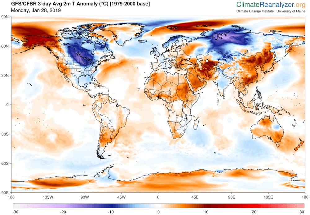
The combination image below shows that the February 2019 temperature was 0.93°C above a 1951-1980 baseline (left) and 1.21°C above a 1885-1915 baseline (right), a difference of 0.28°C.

In other words, when using a baseline that is centered around 1900, the data should be adjusted by 0.28°C. In the image below, the gold graph uses 1951-1980 as baseline and two linear trend are added, one using data starting in 1880 (gold) and one using data starting in 1900 (blue).


Both linear trends are out of line with the recent temperature rise, the gold trend even more so than the blue trend, illustrating that starting a linear trend from an earlier year can make an analysis worse.

As said, if we want to use a baseline that is centered around 1900, the data should be adjusted by 0.28°C, and this is what the green graph does. A 4th-order polynomial trend is added that lines up perfectly with zero at the year 1900.

Further adjustment is needed for a 1750 baseline, which better reflects preindustrial as in the Paris Agreement. As discussed in an earlier post, this could result in an additional adjustment of 0.3°C.

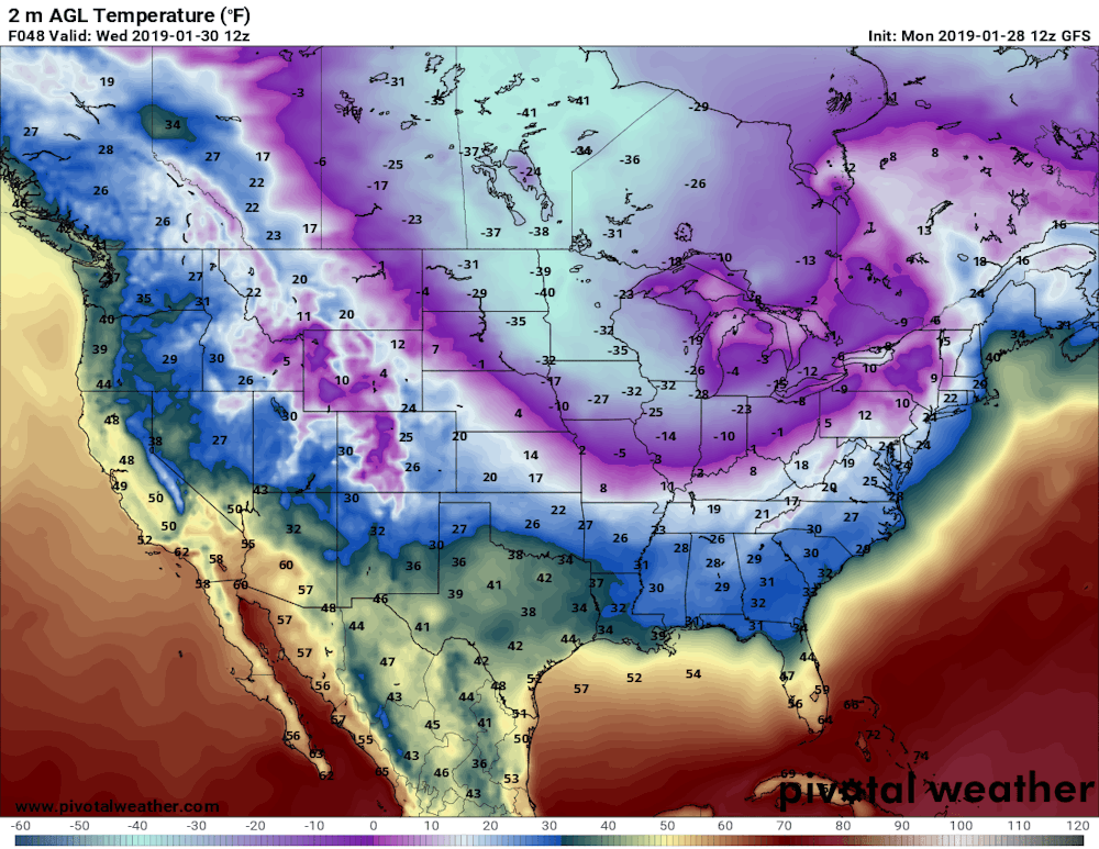
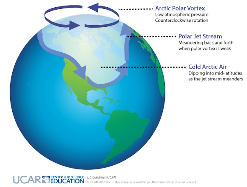
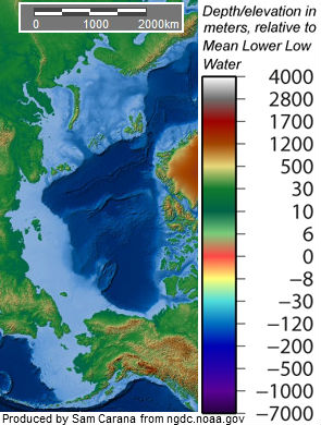
Higher Arctic temperature

Furthermore, have another look at above maps. Much of the extreme anomalies are in line with changes to the Jet Stream, as also illustrated by the insert. More cold air escaping the Arctic and more warm air entering the Arctic are both speeding up Arctic warming. In the map on the right, much of the Arctic is left grey, since no data are available for the Arctic around 1900, but the Arctic should not be left out of the picture and adding a further 0.1°C adjustment seems appropriate to better include the Arctic.

Air temperature over oceans

Finally, the NASA temperatures for oceans are the surface temperatures of the water, but it makes more sense to use air temperatures close to the water, which likely adds a further 0.1°C. This adds up a total adjustment of 0.78°C as applied in the red graph, which also has an 8th-order polynomial trend added.

Which trendline works best?

How appropriate is it to apply an 8th-order polynomial trend to climate data? Have another look at above graphs and consider that in the gold graph, R²=0.687 for the gold linear trend (1880-Feb 2019 data) and R²=0.752 for blue linear trend (1900-Feb 2019 data), while in the green graph, R²=0.812 for the dark green 4th-order polynomial trend, and in the red graph, R²=0.828 for the pink 8th-order polynomial trend. In other words, the pink trend better follows the ups and downs of the data than the lower-order polynomial trend, and it does so much better than the linear trends that both are clearly unrealistic in an analysis of warming acceleration.

Selecting the axes

Is warming accelerating? Trend analysis that uses data going back many years can only be part of the picture; it's also important to anticipate changes that loom in the near future. When taking the many feedbacks, tipping points and further warming elements more fully into account, warming could accelerate even more strongly than depicted in the red trend in the graph at the top.

In the 'Extinction Alert' graph at the top,  the vertical axis is cut off at 5°C, since life on Earth will already have disappeared by then (see box on the right), but when looking at near-term human extinction, 3°C will likely suffice.

How soon could 3°C warming be reached? The 'Extreme Alert' image below looks at data over the past decade, and a fifth-order polynomial trend (red) shows how warming could cross 3°C as early as next year.


How could such a scenario eventuate?

In such a rapid warming scenario:
  1. a stronger-than-expected El Niño would contribute to
  2. early demise of the Arctic sea ice, i.e. latent heat tipping point + 
  3. associated loss of sea ice albedo, 
  4. destabilization of seafloor methane hydrates, causing eruption of vast amounts of methane that further speed up Arctic warming and cause 
  5. terrestrial permafrost to melt as well, resulting in even more emissions, 
  6. while the Jet Stream gets even more deformed, resulting in more extreme weather events
  7. causing forest fires, at first in Siberia and Canada and
  8. eventually also in the peat fields and tropical rain forests of the Amazon, in Africa and South-east Asia, resulting in 
  9. rapid melting on the Himalayas, temporarily causing huge flooding, 
  10. followed by drought, famine, heat waves and mass starvation, and
  11. collapse of the Greenland Ice Sheet.

Even when adding a rather inappropriate linear trend (as done in the 'Extreme Alert' image, in blue),  warming still looks set to cross 2°C by 2026 in the Extreme Alert image, but as the chart below shows, there could be a rise of as much as 18°C by 2026.

[ from an earlier post ]
The situation is dire and calls for comprehensive and effective action, as described at the Climate Plan.


links

• Co-extinctions annihilate planetary life during extreme environmental change, by Giovanni Strona and Corey Bradshaw (2018)
https://www.nature.com/articles/s41598-018-35068-1

• How much warming have humans caused?
https://arctic-news.blogspot.com/2016/05/how-much-warming-have-humans-caused.html

• Extinction
https://arctic-news.blogspot.com/p/extinction.html

• A rise of 18°C or 32.4°F by 2026?
https://arctic-news.blogspot.com/2019/02/a-rise-of-18c-or-324f-by-2026.html

• Climate Plan
https://arctic-news.blogspot.com/p/climateplan.html


Tuesday, March 12, 2019

Accelerating Rise In Greenhouse Gas Levels

Carbon dioxide

The rise in the levels of carbon dioxide (CO₂) in the atmosphere continues to accelerate. Over the past 31 days, CO₂ levels at Mauna Loa, Hawaii, have been above 410 ppm, while on March 3, 2019, some average hourly readings exceeded 415 ppm. The levels recorded in the year up until now weren't expected to occur until April/May 2019, as illustrated by the image below.


How much could carbon dioxide levels grow over the next decade?

An earlier Met Office forecast expects annual average CO₂ levels at Mauna Loa to be 2.75 ppm higher in 2019 than in 2018. Looking at above levels, growth could be even stronger than that.

The image below shows NOAA 1959-2018 CO₂ growth data (black) with above Met Office forecast added for 2019 (brown). The growth figures for 2018 and 2019 are spot on a trend that is added in line with an earlier analysis.
[ from an earlier post ]
Strong CO₂ growth could occur over the next few years, due to releases from increased burning of fossil fuel and biomass, more forest fires and melting permafrost, and the added impact of stronger El Niño events and less uptake of carbon dioxide by oceans and ecosystems. An earlier analysis concludes that CO₂ growth could raise temperatures by 0.5°C or 0.9°F by 2026.

Methane

Levels of methane (CH₄) are also rising at accelerating pace, as illustrated by the image below.
[ from an earlier post ]
Above graph shows July 1983 through October 2018 monthly global methane means at sea level, with added trend. Higher methane means can occur at higher altitudes than at sea level, as illustrated by the image below that shows the highest mean methane levels recorded by the MetOp satellites on March 10 for the years 2013 to 2019 at selected altitudes.

[ click on images to enlarge ]
Global methane levels in March are at a seasonal low. The highest global means occur in September. On September 3, 2018, global methane means as high as 1905 ppb were recorded at 307 mb, an altitude at which some of the strongest growth in methane has occurred, as discussed in earlier posts such as this one.

The MetOp satellites have some difficulty measuring methane at lower altitudes. Above NPP satellite image shows high methane levels across the Arctic Ocean close to sea level, with mean levels of 1842 ppb recorded at 1000 mb, i.e. surface level. This indicates that high methane levels do occur as a result of releases from the Arctic Ocean. The above-mentioned analysis concludes that seafloor methane releases alone could raise the global temperature by 1.1°C or 1.98°F by 2026. Growth in methane releases elsewhere, e.g. due to permafrost melt and forest fires, could further raise methane levels and thus temperatures.


Above image shows that peak methane levels were as high as 2947 ppb on March 7, 2019. The image also shows worryingly high methane levels over Antarctica, as also discussed earlier, in a 2013 post.

Nitrous Oxide

Growth in nitrous oxide (N₂O) is not often discussed, yet it's very important both because of the high global warming potential and long lifetime of N₂O, and because of the ozone depletion it causes in the stratosphere. The image below shows mean levels of N₂O of 320 ppb, with peaks reaching levels as high as 345.2 ppb at 1000 mb (sea level) on March 10, 2019.


Above image also shows high levels of nitrous oxide over the Arctic Ocean. Levels of greenhouse gases in the atmosphere are generally higher in the Arctic than in the rest of the world, which contributes to the accelerating warming of the Arctic.

[ from an earlier post ]
Accelerating Rise In Greenhouse Gas Levels

The image on the right shows that CH₄, CO₂ and N₂O levels in the atmosphere are, respectively, 257%, 146% and 122% their 1750 levels, according to IPCC and WMO data.

In summary, greenhouse gases in the atmosphere are rising at accelerating pace, and this spells bad news, the more so since, next to CH₄, CO₂ and N₂O, there are additional warming elements that can further speed up the temperature rise, such as black carbon, or soot, water vapor, loss of Arctic sea ice, etc.

How much could the global temperature rise? The above-mentioned analysis concludes that a temperature rise of 18°C or 32.4°F could eventuate by 2026, while life on Earth will already have disappeared with a 5°C or 9°F temperature rise.

The situation is dire and calls for comprehensive and effective action as described in the Climate Plan and as also discussed in this recent post.


Links

• CO₂ levels reach another record high
https://arctic-news.blogspot.com/2019/02/co2-levels-reach-another-record-high.html

• As El Niño sets in, will global biodiversity collapse in 2019?
https://arctic-news.blogspot.com/2018/11/as-el-nino-sets-in-will-global-biodiversity-collapse-in-2019.html

• A rise of 18°C or 32.4°F by 2026?
https://arctic-news.blogspot.com/2019/02/a-rise-of-18c-or-324f-by-2026.html

• Care for the Ozone Layer
https://arctic-news.blogspot.com/2019/01/care-for-the-ozone-layer.html

• Methane hydrates (2013)
https://methane-hydrates.blogspot.com/2013/04/methane-hydrates.html

• Climate Plan
https://arctic-news.blogspot.com/p/climateplan.html

• Extinction
https://arctic-news.blogspot.com/p/extinction.html


Sunday, February 17, 2019

Global New Deal


What are your ideas for a Global New Deal? Discuss the points below!

• 100% clean, renewable energy ASAP
• support vegan-organic food
• support reforestation/afforestation
• support clean building material
• support solid state cooling
• ban single-use plastic
• turn biowaste into biochar
• enhance mineral weathering
• brighten marine clouds
• more (discuss it, see below!)

Thursday, February 14, 2019

Dictator knocking at the door

Dictator knocking at the door
For more than a decade, I've been calling for polluting emissions to be cut by 80% by 2020. Yes, I know, it's almost 2020 now and growth in greenhouse gas levels is accelerating. We're running out of time to make the necessary changes.

There's a dictator knocking at the door. The dictator is saying that he will stop emissions. He plans to do so by taking entire cities by storm. He is not going to ask you for permission first, he is not out to negotiate and he does not plan to take any prisoners.

The Dictator is called Climate Change

That dictator is not a person, but he does have a name. That dictator is called Climate Change and he is real.

For some time, he has been knocking at your door louder and louder. He plans to come in now. He has already entered your life and he is out to destroy the world as you know it.

He plans to keep the lights switched off and stop the pumps working that now make water come out of your taps. He plans to ruin the roads used by delivery trucks that now keep the shelves in the shops stocked.

Action is needed urgently. If you keep waiting until the year 2020, before starting to reduce your emissions, the dictator will do it for you. He will stop some emissions, but the pollution will not stop and the temperature will not come down.

Temperature rise

Why will temperatures not come down? Some emissions contain sulfates that have until now hidden the full wrath of global warming. As these sulfates fall out of the air, there will be severe additional warming.

By how much could temperatures rise? How fast? Temperatures could rise by as much as 10°C or 15°F in a matter of years, due to a combination of warming elements as depicted in the image on the right.

Pollution

Pollution will not stop either. As fires, storms and flooding keep destroying entire cities, more pollution will occur and more toxic materials will be left behind. As society comes to a stop, nobody will come to clean things up. Nuclear power plants may melt down without anyone even showing up to make an effort to cool the spent fuel rods.

Extinction

The dictator plans to close everything down and, without action, there will be even more pollution and even higher temperatures, with even more firestorms raging through forests and with heatwaves, cold-snaps and storms getting stronger and more extreme. People will have no food, water or medicine, while diseases go rampant and gangs and warlords loot and devastate the few liveable areas left.

We cannot afford to wait any longer with taking action. The dictator is knocking at the door right now and he's got one foot in the door already.

The video below, Countdown to Extinction, is a visualization of near-term human extinction by Ken Avidor.


The situation is dire and only comprehensive, effective and radical action right now can make a difference.


Thursday, February 7, 2019

Extinction Alert


Above image confirms an earlier analysis that it was 1.73°C (or 3.11°F) warmer than preindustrial in 2018. The image also shows that it could become 1.85°C (or 3.33°F) warmer in 2019.

This according to the non-linear trend (red line) that follows from the data and also follows the data better than the blue linear trend, which also follows from the data, but is out of line with the recent temperature rise.


Data are adjusted for a number of reasons. The first reason is a baseline issue. At the Paris Agreement, nations pledged to ensure that the temperature rise would not cross 1.5°C above preindustrial. Accordingly, data should reflect a 1750 baseline. The default baseline for the NASA Land+Ocean Temperature index (L-OTI) is 1951-1980. The above image features two maps, one showing the 2018 temperature rise compared to 1951-1980 (left) and another map showing the 2018 temperature rise compared to 1885-1915 (right). The difference is 0.25°C. In other words, using 1900 as a baseline would require a 0.25°C adjustment.


That figure of 0.25°C is conservative, firstly because 2018 was a La Niña year. Furthermore, as above image illustrates, the period from 1900 to 1920 was almost 0.3°C below 1951-1980. Anyway, this conservative figure of 0.25°C is used in this analysis. Additional adjustment of the data is needed, in order to reflect a 1750 baseline. The total baseline adjustment could add up to as much as 0.55°C, as discussed in an earlier post.

Furthermore, the large grey area in the Arctic on above map on the right reflects a lack of measurements in the Arctic that go back to 1900. Simply excluding those data would downplay the temperature rise, since temperatures have been rising faster in the Arctic than in the rest of the world. An additional adjustment of 0.1°C therefore seems appropriate.

Finally, NASA L-OTI data are for air temperatures over land and for sea surface water temperatures for oceans. To get an idea how much the temperature of the atmosphere has risen close to the surface, it makes more sense to use air surface temperature over oceans, rather than sea surface water temperatures, resulting in another additional adjustment of 0.1°C.

The total adjustment adds up to 0.75°C, resulting in the graph below.


The final step in this analysis is a projection into the future. In the image at the top, the trend is extended to the year 2033, but the vertical axis doesn't go beyond 5°C warming. Why 5°C? A recent study looked at plant temperature tolerances and concluded that extinction will already occur far earlier than when upper tolerance levels were reached for individual species, since "loss of one species can make more species disappear (a process known as ‘co-extinction’), and possibly bring entire systems to an unexpected, sudden regime shift, or even total collapse. There was a small group of species with large tolerance limits and remarkable resistance to environmental change, but even they could not survive co-extinctions. In fact, their extinction was abrupt and happened far from their tolerance limits and close to global biodiversity collapse at around 5°C of heating."

Importantly, the image at the top doesn't even depict the worst-case scenario, in the sense that the non-linear trend merely follows from the data, i.e. it doesn't take into account tipping points such as abrupt disappearance of the Arctic sea ice or sudden eruptions of methane from the seafloor of the Arctic Ocean.

A rapid 5°C rise could occur if an influx of warm salty water triggered methane eruptions from the seafloor of the Arctic Ocean. Combined with snow and ice loss, it could rapidly raise temperatures by 1.5°C, which increases water vapor. If cloud feedback is strongly positive, water vapor feedback can lead to 3.5 times as much warming, so these warming elements alone could cause 5°C warming within years. And then, of course, there are further warming elements.


The situation is dire and calls for comprehensive and effective action, as described in the Climate Plan.


Links

• Co-extinctions annihilate planetary life during extreme environmental change, by Giovanni Strona and Corey Bradshaw (2018)
https://www.nature.com/articles/s41598-018-35068-1

• National Aeronautics and Space Administration (NASA), Goddard Institute for Space Studies (GISS), Surface Temperature Analysis, Land+Ocean Temperature index (L-OTI)
https://data.giss.nasa.gov/gistemp

• As El Niño sets in, will global biodiversity collapse in 2019?https://arctic-news.blogspot.com/2018/11/as-el-nino-sets-in-will-global-biodiversity-collapse-in-2019.html

• How much warmer is it now?
https://arctic-news.blogspot.com/2018/04/how-much-warmer-is-it-now.html

• How much warming have humans caused?
https://arctic-news.blogspot.com/2016/05/how-much-warming-have-humans-caused.html

• IPCC seeks to downplay global warming
https://arctic-news.blogspot.com/2018/02/ipcc-seeks-to-downplay-global-warming.html

• Climate Plan
https://arctic-news.blogspot.com/p/climateplan.html

• Extinction
https://arctic-news.blogspot.com/p/extinction.html


Saturday, February 2, 2019

Global Warming is destroying our Liveable Climate

Global Warming is destroying our Liveable Climate. To illustrate what's going on, have a look at the images below, showing low temperatures in Africa at 32°N latitude and high temperatures near Svalbard at about 78°N latitude.

2018 image
2019 image

Surface air temperatures near Svalbard were as high as 5.2°C or 41.4°F near Svalbard on February 3, 2019. At the same time, it was as cold as -3.5°C or 25.6°F in Africa.

The contrast was even more profound on February 4, 2018, when at those same spots it was as cold as -10°C or 13.9°F in Africa, while at the same time it was as warm as 5.8 or 42.4°F near Svalbard.

How is this possible?

As the Arctic warms up faster than the rest of the world, the temperature difference between the North Pole and the Equator narrows, making the jet stream wavier, thus enabling cold air from the Arctic to descend further south, as illustrated by the image on the right, showing instantaneous wind power density at 250 hPa (jet stream) on February 4, 2018.
[ NOAA Climate.gov cartoon by Emily Greenhalgh ]

Furthermore, as oceans get warmer, the temperature difference between land and oceans increases in Winter. This larger temperature difference results in stronger winds that can carry more warm, moist air inland, e.g. into the U.S., as illustrated by the cartoon on the right.

As the jet stream becomes wavier, this also enables more heat to enter the Arctic.

On December 8, 2018, the sea surface temperature near Svalbard was 18.2°C or 32.7°F warmer than 1981-2011. On January 23, 2019, sea surface temperatures at that spot were as high as 18.3°C or 64.9°F, as illustrated by the image on the right, from an earlier post.

A warmer sea surface can cause winds to grow dramatically stronger, and they can push warm, moist air into the Arctic, while they can also speed up sea currents that carry warm, salty water into the Arctic Ocean.

As warmer water keeps flowing into the Arctic Ocean and as air temperatures in the Arctic are now starting to rise on the back of a strengthening El Niño, fears for a Blue Ocean Event are rising.

Rivers can also carry huge amounts of warm water from North America and Siberia into the Arctic Ocean, as these areas are getting hit by ever stronger heatwaves that are hitting the Arctic earlier in the year.

With Arctic sea ice at a low, it won't be able to act as a buffer to absorb heat for long, with the danger that an influx of warm, salty water will reach the seafloor and trigger methane eruptions.

Ominously, the image below shows peak methane levels as high as 2764 ppb on February 2, 2019.


The situation is dire and calls for comprehensive and effective action, as described in the Climate Plan.

See also Dave Borlace's video below:


Links

• How frigid polar vortex blasts are connected to global warming, by Jennifer Francis
https://arctic-news.blogspot.com/2019/02/how-frigid-polar-vortex-blasts-are-connected-to-global-warming.html

• Are record snowstorms proof that global warming isn’t happening?
https://www.climate.gov/news-features/climate-qa/are-record-snowstorms-proof-global-warming-isn%E2%80%99t-happening

• Accelerating growth of carbon dioxide in the atmosphere
https://arctic-news.blogspot.com/2019/01/accelerating-growth-of-carbon-dioxide-in-the-atmosphere.html

• Dangerous situation in Arctic
https://arctic-news.blogspot.com/2018/11/dangerous-situation-in-arctic.html

• Blue Ocean Event
https://arctic-news.blogspot.com/2018/09/blue-ocean-event.html

• Climate Plan
https://arctic-news.blogspot.com/p/climateplan.html

• Extinction
https://arctic-news.blogspot.com/p/extinction.html


Friday, February 1, 2019

How frigid polar vortex blasts are connected to global warming

by Jennifer Francis, Rutgers University

File 20190128 39344 1rjndrb.jpg?ixlib=rb 1.1
Bundled up against the cold in downtown Chicago, Sunday, Jan. 27, 2019.
AP Photo/Nam Y. Huh

A record-breaking cold wave is sending literal shivers down the spines of millions of Americans. Temperatures across the upper Midwest are forecast to fall an astonishing 50 degrees Fahrenheit (28 degrees Celsius) below normal this week – as low as 35 degrees below zero. Pile a gusty wind on top, and the air will feel like -60 F.


Predicted near-surface air temperatures (F) for Wednesday morning, Jan. 30, 2019. Forecast by NOAA’s Global Forecast System model. Pivotal Weather, CC BY-ND
This cold is nothing to sneeze at. The National Weather Service is warning of brutal, life-threatening conditions. Frostbite will strike fast on any exposed skin. At the same time, the North Pole is facing a heat wave with temperatures approaching the freezing point – about 25 degrees Fahrenheit (14 C) above normal.


Predicted near-surface air temperature differences (C) from normal, relative to 1981-2010.
Pivotal Weather, CC BY-ND
What is causing this topsy-turvy pattern? You guessed it: the polar vortex.

In the past several years, thanks to previous cold waves, the polar vortex has become entrenched in our everyday vocabulary and served as a butt of jokes for late-night TV hosts and politicians. But what is it really? Is it escaping from its usual Arctic haunts more often? And a question that looms large in my work: How does global warming fit into the story?


Jimmy Fallon examines the pros and cons of the polar vortex.

Rivers of air

Actually, there are two polar vortices in the Northern Hemisphere, stacked on top of each other. The lower one is usually and more accurately called the jet stream. It’s a meandering river of strong westerly winds around the Northern Hemisphere, about seven miles above Earth’s surface, near the height where jets fly.

The jet stream exists all year, and is responsible for creating and steering the high- and low-pressure systems that bring us our day-to-day weather: storms and blue skies, warm and cold spells. Way above the jet stream, around 30 miles above the Earth, is the stratospheric polar vortex. This river of wind also rings the North Pole, but only forms during winter, and is usually fairly circular.


Dark arrows indicate rotation of the polar vortex in the Arctic; light arrows indicate the location of the polar jet stream when meanders form and cold, Arctic air dips down to mid-latitudes. L.S. Gardiner/UCAR, CC BY-ND
Both of these wind features exist because of the large temperature difference between the cold Arctic and warmer areas farther south, known as the mid-latitudes. Uneven heating creates pressure differences, and air flows from high-pressure to low-pressure areas, creating winds. The spinning Earth then turns winds to the right in the northern hemisphere, creating these belts of westerlies.

Why cold air plunges south

Greenhouse gas emissions from human activities have warmed the globe by about 1.8 degrees Fahrenheit (1 C) over the past 50 years. However, the Arctic has warmed more than twice as much. Amplified Arctic warming is due mainly to dramatic melting of ice and snow in recent decades, which exposes darker ocean and land surfaces that absorb a lot more of the sun’s heat.

Because of rapid Arctic warming, the north/south temperature difference has diminished. This reduces pressure differences between the Arctic and mid-latitudes, weakening jet stream winds. And just as slow-moving rivers typically take a winding route, a slower-flowing jet stream tends to meander.

Large north/south undulations in the jet stream generate wave energy in the atmosphere. If they are wavy and persistent enough, the energy can travel upward and disrupt the stratospheric polar vortex. Sometimes this upper vortex becomes so distorted that it splits into two or more swirling eddies.

These “daughter” vortices tend to wander southward, bringing their very cold air with them and leaving behind a warmer-than-normal Arctic. One of these eddies will sit over North America this week, delivering bone-chilling temperatures to much of the nation.

Deep freezes in a warming world

Splits in the stratospheric polar vortex do happen naturally, but should we expect to see them more often thanks to climate change and rapid Arctic warming? It is possible that these cold intrusions could become a more regular winter story. This is a hot research topic and is by no means settled, but a handful of studies offer compelling evidence that the stratospheric polar vortex is changing, and that this trend can explain bouts of unusually cold winter weather.

Undoubtedly this new polar vortex attack will unleash fresh claims that global warming is a hoax. But this ridiculous notion can be quickly dispelled with a look at predicted temperature departures around the globe for early this week. The lobe of cold air over North America is far outweighed by areas elsewhere in the United States and worldwide that are warmer than normal.


Predicted daily mean, near-surface temperature (C) differences from normal (relative to 1979-2000) for Jan. 28-30, 2019. Data from NOAA’s Global Forecast System model.
Climate Reanalyzer, Climate Change Institute, University of Maine., CC BY-ND
Symptoms of a changing climate are not always obvious or easy to understand, but their causes and future behaviors are increasingly coming into focus. And it’s clear that at times, coping with global warming means arming ourselves with extra scarfs, mittens and long underwear.

Jennifer Francis, Visiting Professor, Rutgers University

This article is republished from The Conversation under a Creative Commons license. Read the original article.


Monday, November 26, 2018

Dangerous situation in Arctic

In the North Pacific, the flow of warmer water is clearly visible (see images right, green circle left).

In the North Atlantic, huge amounts of heat are moving into the Arctic Ocean (green circle right).

At some spots, heat that is traveling underneath the sea surface comes to the surface (green circle at the top).

Most warming caused by people's emissions goes into oceans, especially into the top layer of oceans.

Furthermore, warmer air and warmer sea surfaces can cause winds to grow dramatically stronger. As the Arctic is warming much faster than the rest of the world, the narrowing difference between the temperatures at the North Pole and the Equator is decreasing the speed at which winds circumnavigate Earth; at the same time, the amount of heat that is moving north can grow dramatically, both due to winds and sea currents, and cyclones can further accelerate this.

The danger is that an influx of warm salty water will reach the seafloor and trigger methane eruptions.

The situation is especially critical in many parts of the Arctic Ocean where the water is very shallow. Some 75% of the East Siberian Arctic Shelf (ESAS) is shallower than 50 m (see maps on the right).
[ warm water from the Atlantic Ocean is
increasingly invading the Arctic Ocean ]


The danger here is huge, for numerous reasons, incl.:

• shallow waters can warm up very rapidly in case of an influx of warm water;

• these shallow seas are now covered by ice, so the heat cannot escape to the atmosphere;

• sea ice is very thin, so the sea ice won't act as a buffer to absorb the heat;

• methane rising through shallow waters will pass through the water column and enter the atmosphere more quickly;

• in shallow waters, large abrupt releases will more quickly deplete the oxygen in the water, making it harder for microbes to break down the methane;

• hydroxyl levels over the Arctic are very low, which means that it takes much longer for methane over the Arctic to get broken down.

The four videos below provide a good introduction into the various issues and illustrate how dangerous the situation is in the Arctic.

Each video is part of a talk between Dave Borlace and Peter Wadhams.

Part 1 discusses albedo change in the Arctic and associated changes such as jet stream changes.


Part 2 discusses the threat of huge methane releases in the Arctic.


Part 3 discusses the thermohaline circulation and methods that could improve the situation such as carbon removal and Ocean Mechanical thermal Energy Conversion (OMTEC).


Part 4 discusses sea level rise and fires.


The situation is dire and calls for comprehensive and effective action, as described at the Climate Plan, i.e. multiple lines of action implemented in parallel and locally where possible.


Links

• As El Niño sets in, will global biodiversity collapse in 2019?
https://arctic-news.blogspot.com/2018/11/as-el-nino-sets-in-will-global-biodiversity-collapse-in-2019.html

• Doomsday by 2021?
https://arctic-news.blogspot.com/2018/11/doomsday-by-2021.html

• Climate Plan
https://arctic-news.blogspot.com/p/climateplan.html

• Feedbacks
https://arctic-news.blogspot.com/p/feedbacks.html

• Extinction
https://arctic-news.blogspot.com/p/extinction.html

• Seismic Events
https://arctic-news.blogspot.com/p/seismic-events.html

• Can we weather the Danger Zone?
https://arctic-news.blogspot.com/2018/07/can-we-weather-the-danger-zone.html

• How much warmer is it now?
https://arctic-news.blogspot.com/2018/04/how-much-warmer-is-it-now.html

• What Does Runaway Warming Look Like?
https://arctic-news.blogspot.com/2018/10/what-does-runaway-warming-look-like.html

• Peaks Matter
https://arctic-news.blogspot.com/2018/08/peaks-matter.html

• Warning of mass extinction of species, including humans, within one decade
https://arctic-news.blogspot.com/2017/02/warning-of-mass-extinction-of-species-including-humans-within-one-decade.html


Friday, November 16, 2018

As El Niño sets in, will global biodiversity collapse in 2019?

Global biodiversity collapse
[ Will global biodiversity collapse in 2019? ]

recent study created a dataset of plant temperature tolerances with a median upper tolerance limit of 23.7°C.

This temperature is about 10°C higher than the temperature in the year 1750.
Only during times of mass extinctions were temperatures that high, such as during the PETM, 55.5 million years ago, and the Permian–Triassic extinction event, 252 million years ago, also know as the Great Dying when some 95% of species known from fossils went extinct.

[ image from: How much warmer is it now? ]
The study concludes that extinction will already occur far earlier than when upper tolerance levels are reached, as "loss of one species can make more species disappear (a process known as ‘co-extinction’), and possibly bring entire systems to an unexpected, sudden regime shift, or even total collapse."

There was a small group of species with large tolerance limits and remarkable resistance to environmental change, but even they could not survive co-extinctions. In fact, their extinction was abrupt and happened far from their tolerance limits and close to global biodiversity collapse at around 5°C of heating.

[ El Niño sets in ]
In the top image on the right, monthly NASA Land+Ocean temperature data 2017-October 2018 are adjusted, and a polynomial trend is added, showing how a 5°C rise in temperature could occur very rapidly, i.e. by September 2019.

The second image on the right is from an earlier post that contains more background on the adjustment of NASA data and the need for a polynomial trend.

A strong abrupt rise in temperature could be caused by an influx of warm salty water into the Arctic Ocean, as this can trigger large eruptions of methane from its seafloor, as discussed in earlier posts such as this one and as further discussed below.

As El Niño sets in, the odds that such rapid warming will threaten to cause global biodiversity collapse are rising.

Earthquakes triggering methane releases


An additional danger is that large methane releases from the seafloor of the Arctic Ocean will be triggered by earthquakes.

The danger is that isostatic rebound will trigger earthquakes in the Arctic Ocean that this in turn will destabilize methane hydrates, as discussed in more detail at this page.

Seismic shocks can travel over long distances along fault lines and destabilize methane hydrates in other locations.

Above image shows that on November 9, 2018, an earthquake with a magnitude of 6.8 on the Richter scale occurred on the fault line between Greenland and Norway.

This area is not used to be hit by large earthquakes. No larger earthquake has occurred in this area for more than 100 years.

Subsequent earthquakes did occur nearby, on November 12, 13 and 15, respectively measuring M4.3, M4.6 and M5.2 on the Richter scale, which also are very large earthquakes to hit this area.

Ominously, high levels of methane showed up on November 21, 2018, over the Greenland Sea (top image on the right).

Earlier, high levels of methane had been recorded over the Arctic Ocean. Note that this fault line runs across the Arctic Ocean toward the Laptev Sea.

Methane levels as high as 2787 ppb were recorded on November 15, 2018 (second image on the right).

On November 17, 2018, methane levels as high as 2847 ppb were recorded (third image on the right).

On November 20, 2018, methane levels as high as 2827 ppb were recorded (fourth image on the right).

The images show large methane levels over the East Siberian Arctic Shelf, the submarine permafrost north of Eastern Siberia.

In a 2008 paper, Dr. Natalia Shakhova et al. concluded that release of up to 50 Gt of methane from hydrates storage could occur at any time, an amount many times the methane that is now present in the atmosphere.

Additional emissions

Such a temperature rise would trigger many forest fires, releasing huge amounts of additional emissions, including carbon dioxide, methane and black carbon.

The image on the right shows carbon dioxide levels in California as high as 809 ppm on November 10, 2018 (at the green circle).

The next image on the right illustrates the jump in carbon dioxide levels in Mauna Loa, Hawaii, following the the fires in California.

“Levels of heat-trapping greenhouse gases in the atmosphere have reached another new record high,” the World Meteorological Organization (WMO) said in a recent news release. “There is no sign of a reversal in this trend, which is driving long-term climate change, sea level rise, ocean acidification and more extreme weather.”

“The science is clear. Without rapid cuts in CO₂ and other greenhouse gases, climate change will have increasingly destructive and irreversible impacts on life on Earth. The window of opportunity for action is almost closed,” said WMO Secretary-General Petteri Taalas.

“The last time the Earth experienced a comparable concentration of CO₂ was 3-5 million years ago, when the temperature was 2-3°C warmer and sea level was 10-20 meters higher than now,” said Mr Taalas.

“CO₂ remains in the atmosphere for hundreds of years and in the oceans for even longer. There is currently no magic wand to remove all the excess CO₂ from the atmosphere,” said WMO Deputy Secretary-General Elena Manaenkova.

In the associated video, Dr Oksana Tarasova added that “changes in carbon dioxide levels that we are observing now do not happen naturally. Such changes never ever happened in the history of this Planet.”

As the image on the right shows, CH₄, CO₂ and N₂O levels in the atmosphere are, respectively, 257%, 146% and 122% their 1750 levels.

How fast could 5°C warming happen? 

The U.S. Global Change Research Program has just released its Fourth National Climate Assessment. One of its key messages is that temperatures could rise by 5°C or more. The report adds that this could occur by the end of the century, but the report doesn't deny this could also occur much earlier. Indeed, one of its key findings is that some feedbacks and potential state shifts cannot be quantified; and some are probably still unknown.

What the report doesn't mention is that global biodiversity will have collapsed at 5°C of warming. Such a rise kills all plants on land and thus virtually all mammals (including humans), since they either directly or indirectly feed on plants.

A rapid 5°C rise could occur if an influx of warm salty water triggered methane eruptions from the seafloor of the Arctic Ocean. Combined with snow and ice loss, it could rapidly raise temperatures by 1.5°C, which increases water vapor. If cloud feedback is strongly positive, water vapor feedback can lead to 3.5 times as much warming, so these warming elements alone could cause 5°C warming within years. And then, of course, there are further warming elements.


The situation is dire and calls for comprehensive and effective action, as described at the Climate Plan, i.e. multiple lines of action implemented in parallel and locally where possible. Of course, as long as politicians remain reluctant to even consider pursuing efforts to reduce emissions, the world can be expected to remain in the Danger Zone for a long time to come.


Links

• Co-extinctions annihilate planetary life during extreme environmental change, by Giovanni Strona and Corey Bradshaw (2018)
https://www.nature.com/articles/s41598-018-35068-1

• Greenhouse gas levels in atmosphere reach new record, World Meteorological Organization (WMO)
https://public.wmo.int/en/media/press-release/greenhouse-gas-levels-atmosphere-reach-new-record

• WMO video - Press Conference: Greenhouse Gas Bulletin (Geneva, 22 November 2018)
http://webtv.un.org/watch/wmo-press-conference-greenhouse-gas-bulletin-geneva-22-november-2018/5970414543001/

• Fourth National Climate Assessment - U.S. Global Change Research Program
https://nca2018.globalchange.gov/

• Doomsday by 2021?
https://arctic-news.blogspot.com/2018/11/doomsday-by-2021.html

• Climate Plan
https://arctic-news.blogspot.com/p/climateplan.html

• Feedbacks
https://arctic-news.blogspot.com/p/feedbacks.html

• Extinction
https://arctic-news.blogspot.com/p/extinction.html

• Seismic Events
https://arctic-news.blogspot.com/p/seismic-events.html

• Can we weather the Danger Zone?
https://arctic-news.blogspot.com/2018/07/can-we-weather-the-danger-zone.html

• How much warmer is it now?
https://arctic-news.blogspot.com/2018/04/how-much-warmer-is-it-now.html

• What Does Runaway Warming Look Like?
https://arctic-news.blogspot.com/2018/10/what-does-runaway-warming-look-like.html

• Peaks Matter
https://arctic-news.blogspot.com/2018/08/peaks-matter.html

• Warning of mass extinction of species, including humans, within one decade
https://arctic-news.blogspot.com/2017/02/warning-of-mass-extinction-of-species-including-humans-within-one-decade.html