Showing posts with label Paris Agreement. Show all posts

Thursday, January 19, 2017

2016 well above 1.5°C

In December 2016, it was 6.58°C (11.84°F) warmer from latitude 83°N to the North Pole. In December 2016, the world as a whole was on average 0.82°C (1.47°F) warmer than in 1951-1980.


Temperatures are rising fast, and especially so over the Arctic Ocean. In February 2016, the world was 1.34°C (2.41°F) warmer than 1951-1980, while part of the Kara Sea was 11.3°C (20.34°F) warmer than 1951-1980, as the image on the right illustrates.

The 1951-1980 period is the default baseline used by NASA. When comparing the current temperature to years such as 1900 or 1750, the difference will be even larger, as illustrated by the image below.

In 2016, the global temperature was well above the 1.5°C (2.7°F) guardrail set by the Paris Agreement. This is illustrated by the different baselines used in image below (the use of different baselines was discussed in an earlier post), given that the Paris Agreement uses preindustrial levels as baseline.


[ click on images to enlarge ]
To some extent, the rise above 1.5°C was due to El Niño, as the trendline indicates, but the trend also indicates that temperatures will cross the 1.5°C mark in 2017 even if 2017 will be El Niño/La Niña-neutral.

Worryingly, another El Niño is actually forecast for 2017, as discussed in an earlier post.

Even more worrying is that rise of this trendline could well be too conservative.

Ocean temperatures are rising rapidly, as illustrated by the image on the right, and the rapid warming of the oceans is causing a dramatic fall in sea ice extent, as illustrated by the image below and as discussed in an earlier post.

The lack of sea ice spells trouble. Not only is snow and ice decline causing more sunlight to be absorbed (rather than getting reflected back into space as before), there are further feedbacks associated with this. As the temperature difference between the Arctic and the Equator decreases, changes are taking place to wind patterns that cause further acceleration of warming in the Arctic, as discussed in an earlier post. This in turn threatens to trigger huge amounts of methane to erupt abruptly from the seafloor.

Methane levels over the Arctic Ocean are much higher than over the rest of the world, as illustrated by the image below, showing the situation in the afternoon of January 17, 2017, with peaks reaching levels as high as 2406 ppb. Particularly worrying are the solid magenta-colored areas over the East Siberian Arctic Shelf, indicating methane levels above 1950 ppb.


When also taking into account further elements that could cause warming, a potential warming of 10°C (18°F) could eventuate by the year 2026, i.e. within about nine years from now, as discussed at the extinction page and as illustrated by the image below, from the Temperature page.


The situation is dire and calls for comprehensive and effective action, as described at the Climate Plan.


Links

• Climate Plan
http://arctic-news.blogspot.com/p/climateplan.html

• Extinction
http://arctic-news.blogspot.com/p/extinction.html

• Temperature
http://arctic-news.blogspot.com/p/temperature.html

• Accelerating Warming of the Arctic Ocean
http://arctic-news.blogspot.com/2016/12/accelerating-warming-of-the-arctic-ocean.html

• Global sea ice extent falling off chart
http://arctic-news.blogspot.com/2017/01/global-sea-ice-extent-falling-off-chart.html

• How much warming have humans caused?
http://arctic-news.blogspot.com/2016/05/how-much-warming-have-humans-caused.html


Monday, October 17, 2016

Pursuing efforts?

Late last year at the Paris Agreement, nations pledged to hold the global average temperature rise to well below 2°C above pre-industrial levels and to pursue efforts to limit the temperature rise to 1.5°C above pre-industrial levels. On 5 October 2016, the threshold for entry into force of the Paris Agreement was achieved. The Paris Agreement will formally enter into force on 4 November 2016.


Meanwhile, as illustrated by above image, temperatures have been more than 1.5°C above pre-industrial levels for nine out of the past twelve months. For the months February and March 2016, the anomaly was actually quite close to the 2°C guardrail, while for station-only measurements, warming for February and March 2016 was well over the 2°C guardrail from pre-industrial levels.

The monthly warming in above image was calculated by using the NASA Global Monthly Mean Surface Temperature Change data (Land+Ocean) from 1880 through to September 2016, while adding 0.28°C to cater for the rise from 1900 to 1951-1980, and additionally adding 0.3°C to cater for the rise from pre-industrial to 1900.

[ click on image to enlarge ]
The 0.28°C adjustment (to cater for the rise from 1900 to 1951-1980) is illustrated by above graph, which has a polynomial trend added to the NASA Global Monthly Mean Surface Temperature Change (Land+Ocean) data from January 1880 through to September 2016.

As said, the top image has a further 0.3°C added to cater for the rise from pre-industrial to 1900, as discussed in an earlier post.


Above image shows sea surface temperature anomalies on the Northern Hemisphere, with a polynomial trend pointing at a doubling of ocean warming within one decade. Warming of the sea surface on the Northern Hemisphere threatens to speed up Arctic sea ice loss, as the Gulf Stream pushes ever warmer water toward the Arctic Ocean.


In addition, warming of the air over the Arctic Ocean occurs faster than elsewhere on Earth, as illustrated by above image and by the animation on the right.

This further speeds up the demise of the snow and ice cover, as illustrated by the images below.

Arctic sea ice extent on October 20, 2016, was at a record low for the time of the year, at only 6.15 million square km, as measured by the National Institute of Polar Research in Japan.


The images below show Arctic sea ice extent as measured by NSIDC.org (left) and average Arctic sea ice extent (year to date, October 20, 2016), from a post by Torstein Viðdalr (right).

Average Arctic sea ice extent for the period October 22, 2015 to October 20, 2016 (blue line) was lower than it was for any other 365-day period since 1978, when satellites first started measuring sea ice extent.


The images below show Arctic sea ice thickness as measured by the National Institute of Polar Research in Japan (left) and as measured by the Naval Research Laboratory (right, new model).

[ click on image to enlarge ]

Albert Kallio comments (in italics):
ARCTIC OCEAN SEA ICE GROWTH STOPS DUE TO HEAT BARRIER
The rapid growth of the sea ice has stopped because during the summer the surrounding ocean accumulated so much heat that it cannot yet freeze. Whilst the central Arctic Ocean around the North Pole saw a very rapid freezing as its broken sea ice cover quickly fused together in cold, autumn darkness breaking new records, it now has suddenly hit the opposite: a new all time record low for sea ice area for this time of season. This is because the ocean is still too warm for water to freeze around edges of the Arctic Ocean leading to all-time record low ice area that fell below or is at least in par with year 2012 low (the last record low ice year).


The image below (Arctic on the left, Antarctic on the right) was created by Daniel Kieve.
Daniel Kieve comments (in italics):
Both Arctic and Antarctic sea ice are now at record low extent for this time of year according to NSIDC data, with the Arctic sea ice over 2 million square kilometres lower than the average extent for 20th October. The Antarctic sea ice is at 2 standard deviations below the (30 year) average. At this time of year it's usually a time of rapid ice growth in the Arctic but it's stalled due to the continuance of anomalously warm air in parts of the Arctic and in particular the record warmth in the oceans that is encroaching more and more into the Arctic. This means next Summer the Arctic ice is more vulnerable than ever to collapse as the insolation reaches its peak in June and July.

Demise of the snow and ice cover in the Arctic further accelerates warming of the Arctic Ocean in a number of ways. Decline of sea ice extent makes that less sunlight gets reflected back into space and instead gets absorbed by the Arctic Ocean. Similarly, the decline of the snow and ice cover on land in the Arctic makes that more sunlight gets absorbed on land, which in turn make that warmer water from rivers flows into the Arctic Ocean. For more feedbacks, see the feedbacks page.

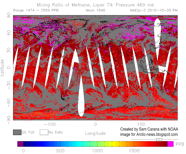
There's a growing danger is that further warming of the Arctic Ocean will trigger huge eruptions of methane from its seafloor. Ominously, on October 20, 2016, methane levels were as high as 2559 parts per billion, as illustrated by the image below, which also shows high methane levels over large parts of the Arctic Ocean.

The temperature rise resulting from such feedbacks has the potential to cause in mass extinctions (including humans) and destruction over the coming decade, as discussed at the extinction page.

The situation is dire and calls for comprehensive and effective action as described in the Climate Plan.


Links

 Climate Plan
http://arctic-news.blogspot.com/p/climateplan.html

 How Much Warming Have Humans Caused?
http://arctic-news.blogspot.com/2016/05/how-much-warming-have-humans-caused.html

 NASA GISS Surface Temperature Analysis (GISTEMP)
http://data.giss.nasa.gov/gistemp

 81 Parties have ratified of 197 Parties to the Convention
http://unfccc.int/paris_agreement/items/9485.php

 Paris Agreement
http://unfccc.int/resource/docs/2015/cop21/eng/10a01.pdf


Saturday, May 28, 2016

How Much Warming Have Humans Caused?

How much did temperatures rise since 1900?

Differences in baseline (reference period) can result in dramatic differences in temperature rise. The U.K. Met Office HadCRUT4 dataset typically presents temperature anomalies relative to a 1961-1990 baseline. NASA typically uses a 1951-1980 baseline, but the NASA website allows for different baselines to be selected. When selecting a 1961-1990 baseline, the temperature of the past period of six months was 1.05°C (1.89°F) higher than this baseline, as illustrated by the NASA map in the left panel of the image below. But when compared to 1890-1910, the temperature of the past period of six months was 1.48°C (or 2.664°F) higher, as illustrated by the NASA map in the right panel of the image below.


A polynomial trend can reduce variability such as caused by volcanoes and El Niño events. The graph below was created with the NASA L-OTI monthly mean global surface temperature anomaly, which has a 1951-1980 baseline, and then with 0.29°C added, which makes the anomaly 0°C in the year 1900 for the added polynomial trend.


This gives an idea of how much temperatures have risen since the year 1900, with a rise for both February and March 2016 showing up that was more than 1.5°C, as also illustrated by the image below. The trend further points at temperature anomalies that will be more than 1.5°C (from 1900) within a decade and more than 2°C soon thereafter.


Temperature Rise before 1900

To see by how much temperatures have risen compared to pre-industrial levels, we need to go back further than 1900. The graph below shows that carbon dioxide concentrations have gone up and down between levels of roughly 180 ppm and 280 ppm over the past 800,000 years. Recently, carbon dioxide levels reached a peak of well above 400 ppm (411 ppm peak hourly average on May 11, 2016).


The image below, from an earlier post, shows how in the past, over the past 420,000 years, temperatures have gone up and down within a window of approximately 10°C (18°F), in line with cycles in the Earth orbit (Milankovitch cycles). Levels of carbon dioxide and methane have gone up and down accordingly, with carbon dioxide moving between 180 ppm and 280 ppm and methane roughly between 300 ppb and 700 ppb.


Meanwhile, carbon dioxide concentrations have been as high as 411 ppm (as discussed further above), i.e. a 131 ppm rise on top of the historic maximum of 280 ppm. The rise in methane concentrations is even steeper, as discussed at the Methane page.

Has the rise in greenhouse gases due to emissions by humans set the scene for a temperature rise of some 10°C (18°F) above 1750 levels, and how rapidly could such a temperature rise eventuate? Could warming caused by humans result in a temperature rise of more than 10°C (18°F) within a decade?

In its First Assessment Report, the IPCC explains that temperatures have come down since the Holocene peak, i.e. the natural maximum of the most recent Milankovitch cycle (image right, top panel). As the bottom panel shows, temperatures have risen since the 1600s. There has been a rise from the year 1750 to the year 1900 and there has been a further rise from the year 1900 onward up to recent times (the dotted line indicates the temperature at the year 1900).

The graph on the right, created by Jos Hagelaars, shows that temperatures started rising some 20,000 years ago, reaching a peak some 7000 years ago (in the blue part of the graph). For more detail, also see the comic added at the end of this post.

The graph underneath, based on work by Marcott et al., focuses on this blue part of the graph, while using a 1961-1990 baseline. Temperatures reached a peak some 7000 years ago, and then came down to reach a low a few hundred years ago.

The peak and the bottom temperatures (highlighted in red on image on the right below) for that period suggest there was a fall of more than 0.7°C.


So, a few hundred years ago, temperatures were falling and they would have kept falling, in line with the Milankovitch cycles, had there been no warming caused by humans.

From that bottom point, temperatures first rose by about 0.4°C, overwhelming the downward trend that would otherwise have taken temperatures down further, and then there was an additional rise of at least 1.05°C, when using a baseline of 1961-1990, indicating that humans caused a total of at least 1.45°C warming.

Lewis & Maslin (2015) suggest that, because CO2 began to rise from a low point in 1610, that year could be taken as the start of the Anthropocene. The image on the right also shows that the year 1750 was a low point for CO2 levels and temperature, i.e. well below the baseline of 1961-1990.

The image below shows Northern Hemisphere temperature reconstructions by Moberg et al.


The image on the right is from BerkeleyEarth.org. The wider fluctuations back in time reflect volcanic activity and greater uncertainty, while a simple fit shows a temperature rise of 1.5°C in the past 250 years (1750-2000), of which about 0.9°C occurred in the past 50 years.

Humans have caused even more warming?

The situation looks to be even worse than what the above figures may suggest. Indeed, the bottom low point in the Marcott graph would have been even lower had there been no warming by humans.
The fact that humans did cause substantial warming between 1800 and 1900 is illustrated by the graph below, from a recent post by Michael Mann, who adds that some 0.3°C greenhouse warming had already taken place between the year 1800 and the year 1900.

Some 0.3C greenhouse warming had already taken place by 1900, and some 0.2C warming by 1870
Further studies suggest that humans also caused substantial warming well before 1800, as illustrated by the image on the right. While this study focuses on Europe, it does suggest a rise from 1600 to 1800.

Another example of warming caused by humans before 1800 is presented in research by Dull et al., which suggests that burning of Neotropical forests increased steadily in the Americas, peaking at a time when Europeans arrived in the late fifteenth century. By 1650, some 95% of the indigenous population had perished. Regrowth of forests led to carbon sequestration of some 2 to 5 Pg C, thereby contributing to a fall in atmospheric carbon dioxide recorded in Antarctic ice cores from about 1500 through 1750.

Since at least the fourth century A.D., coal has
been burned in China. W. F. Ruddiman further points in a 2007 paper at human emissions from burning biomass and irrigation, livestock and human waste, and the resulting climate system feedbacks. As illustrated by the image on the right, this had already caused substantial warming prior to the industrial revolution.

In conclusion, substantial warming took place before 1900, making that temperatures were higher than what they would have been had humans caused no warming. Greenhouse gases emitted by people held off a temperature fall that would otherwise have naturally occurred, and they caused a temperature rise on top of that.

Paris Agreement

NASA data suggest that it was 1.48°C (or 2.664°F) warmer than in 1890-1910 for the period from November 2015 to April 2016. Note again that this 1890-1910 baseline is much later than pre-industrial times. The Paris Agreement had pledged to limit the temperature rise to 1.5°C above pre-industrial levels. On land on the Northern Hemisphere, it was 1.99°C (or 3.582°F) warmer (right map of the image below).

[ Temperature anomalies for the period from November 2015 to April 2016, see also comments ]
The above images only account for a half-year period (November 2015 to April 2016), so they are only indicative for what the total rise will be for the year 2016. Nonetheless, when taking into account warming caused by people before 1900, the year 2016 looks set to hit or even exceed the guardrails that the Paris Agreement had pledged would not be crossed. The situation looks even worse when considering that temperatures measured in ice cores already included a substantial amount of warming due to humans even before the start of the Industrial Revolution.

February 2016 was 1.67°C (3°F) warmer than 1890-1910
Again, at the Paris Agreement nations pledged to hold the increase in the global average temperature to well below 2°C above pre-industrial levels and to pursue efforts to limit the temperature increase to 1.5°C above pre-industrial levels.

When looking at a single month, February 2016 was 1.67°C (3°F) warmer than 1890-1910 (see image right). When adding a mere 0.34°C to account for warming before 1900, total warming in February 2016 did exceed 2°C. Looking at it that way, the guardrails set in Paris in December 2015 were already crossed in February 2016.

Situation

So, what is the situation? On the one hand, there's the current observed temperature rise (∆O). This rise is typically calculated as the difference between the current temperature and the temperature at a given baseline.

However, this ∆O does not reflect the full impact of human emissions. Temperatures would have been lower had there been no emissions by humans. The full warming impact due to people's greenhouse gas emissions therefore is ∆E. This ∆E is higher than the often-used observed rise, since the baseline would have been lower without warming caused by humans, i.e. including the warming that was already caused before the year 1750.

At the same time, part of global warming caused by people is currently masked due the aerosol emissions (∆M). Such aerosol emissions result mainly from burning of fossil fuel and biomass. There's no doubt that such emissions should be reduced, but the fact remains that the current temperature rise may increase substantially, say, by half when the masking effect disappears.

Thus, the full (unmasked) current warming caused by humans is the sum of these two, i.e. ∆E + ∆M, and the sum could be well over 3°C.

In addition, there is a future temperature rise that's already baked into the cake (∆F). Some feedbacks are not yet very noticeable, since some changes take time to become more manifest, such as melting of sea ice and non-linear changes due to feedbacks that are only now starting to kick in. Furthermore, the full effect of CO2 emissions reaches its peak only a decade after emission, while even with the best efforts, humans are likely to still be causing additional emissions over the coming decade. All such factors could jointly result in a temperature rise greater than ∆E + ∆M together, i.e. ∆F could alone cause a temperature rise of more than 5°C within a decade.

In summary, total anthropogenic global warming warming (∆A) or all warming caused by humans (∆E + ∆M + ∆F) could be more than 10°C (18°F) within one decade, assuming that no geoengineering will take place within a decade.

[ image added later from this post, click on images to enlarge ]

The situation is dire and calls for comprehensive and effective action as described in the Climate Plan.

[ image from xkcd.com/1732 ]


Links

• Climate Plan
https://arctic-news.blogspot.com/p/climateplan.html

• Feedbacks
https://arctic-news.blogspot.com/p/feedbacks.html

• Extinction
https://arctic-news.blogspot.com/p/extinction.html

• Methane Erupting From East Siberian Arctic Shelf
https://arctic-news.blogspot.com/2014/11/methane-erupting-from-east-siberian-arctic-shelf.html

• Jos Hagelaars' graph, created with graphs by Shakun et al., Marcott et al. and more, is at:
https://ourchangingclimate.wordpress.com/2013/03/19/the-two-epochs-of-marcott/

• Global warming preceded by increasing carbon dioxide concentrations during the last deglaciation, by Shakun et al.
http://www.nature.com/nature/journal/v484/n7392/full/nature10915.html

• A Reconstruction of Regional and Global Temperature for the Past 11,300 Years, by Marcott et al.
http://science.sciencemag.org/content/339/6124/1198

• The Columbian Encounter and the Little Ice Age: Abrupt Land Use Change, Fire, and Greenhouse Forcing, by Dull et al., in:
https://www.sciencenews.org/article/columbus-arrival-linked-carbon-dioxide-drop

• Arctic Climate Records Melting
https://arctic-news.blogspot.com/2016/05/arctic-climate-records-melting.html

• 2500 Years of European Climate Variability and Human Susceptibility, Ulf Büntgen et al. (2011)
http://science.sciencemag.org/content/331/6017/578

• Paris Agreement
https://arctic-news.blogspot.com/2015/12/paris-agreement.html
http://unfccc.int/documentation/documents/advanced_search/items/6911.php?priref=600008831
https://unfccc.int/resource/docs/2015/cop21/eng/l09r01.pdf

• February Temperature
https://arctic-news.blogspot.com/2016/03/february-temperature.html

• Defining the Anthropocene, Lewis & Maslin (2015)
http://www.nature.com/nature/journal/v519/n7542/full/nature14258.html

• Highly variable Northern Hemisphere temperatures reconstructed from low- and high-resolution proxy data, Anders Moberg et al. (2005)
http://www.nature.com/nature/journal/v433/n7026/full/nature03265.html

• The early anthropogenic hypothesis: Challenges and responses, by W.F. Ruddiman (2007)
http://onlinelibrary.wiley.com/doi/10.1029/2006RG000207/abstract

• Berkeley Earth, Summary Of Findings
http://berkeleyearth.org/summary-of-findings

• Reconciling divergent trends and millennial variations in Holocene temperatures, by Marsicek et al. (2018)
https://www.nature.com/articles/nature25464

Reconciling divergent trends and millennial
variations in Holocene temperatures
Jeremiah Marsicek


Saturday, January 23, 2016

Why America should lead on climate

There are many reasons why America should take the lead in action on climate change.

It's fair and in everyone's interest that America takes the lead

It's fair that those who pollute most, do most to clean things up. America's current and historic emissions are huge, while a lot of what has been produced elsewhere is also consumed in America. Moreover, it's in everyone's interest if America takes the lead. That is confirmed by studies such as this one, showing that there are no technical or economic barriers against cleaning things up. Doing so has many benefits, including job and investment opportunities, and scope for exports. In order for American industries, such as car manufacture, to remain competitive with products from overseas, they must clean up their act. In addition, there are many health and the environmental benefits, while shifting to clean energy will remove perceived needs for America to send military forces across the world to protect global supply lines of fossil fuel.

Legal obligations to act

There are also legal obligations for America to act. Back in 2007, the Supreme Court ruled in Mass. v. EPA that the EPA must act on any air pollutant that endangers public health or welfare. The EPA subsequently found this to be the case for six greenhouse gases and took action, including by issuing plans to limit carbon emissions from power plants. More recently, the United States Court of Appeals for the DC Circuit ruled in favor of the EPA plans.
Furthermore, as Michael Burger points out, Section 115 of the Clean Air Act also authorizes the EPA to act on emissions that contribute to air pollution that endangers public health or welfare in other countries, the more so where the other countries provide the U.S. with reciprocal protections. At the Paris Agreement, such reciprocity was affirmed by some 190 nations (accounting for over 93% of current GHG emissions) pledging to hold the increase in the global average temperature to well below 2°C above pre-industrial levels and to pursue efforts to limit the temperature increase to 1.5°C above pre-industrial levels.

In other words, no new laws are needed and action can and should be taken now, as this blog has pointed out for years, e.g. in this 2014 post that featured the image below.


The threat of methane eruptions from the Arctic Ocean seafloor calls for urgent action

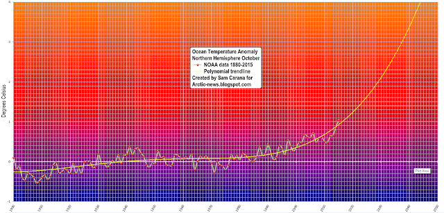
This blog has repeatedly pointed at another reason why especially America must act, and must do so rapidly, comprehensively and effectively. In October 2015, oceans reached record high temperatures, especially on the Northern Hemisphere, as illustrated by the image below.

Northern Hemisphere October ocean temperatures based on NOAA 1880-2015 data - plot area goes from 1900 to 2050 and from -1 to 4 degrees Celsius above baseline, i.e. compared to the period 1901-2000, the 20th century average.

Above image features a trendline showing that oceans on the Northern Hemisphere could, by the year 2043, be 4°C or 7.2°F warmer than the 20th century average. Increasingly, methane levels over the Arctic Ocean are showing strong increases from October onward, as huge amounts of ocean heat are reaching the seafloor of the Arctic Ocean from that month onward.

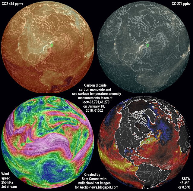
North America contributes strongly to accelerating warming of the Arctic Ocean. The Coriolis Effect makes that high levels of emissions originating from North America are extending over the Atlantic Ocean, and are warming up waters off the east coast of North America, as illustrated by the image below.

Top left: CO2 414 ppb green circle, up to 433 ppm in New Jersey. Top right: CO 274 ppb green circle, up to 890 ppb in New Jersey. Bottom left: Jet Stream 250 hPa. Bottom right: Sea surface temperature anomaly 8.5°C/15.3°F green circle.
2015 maximum nightly sea surface temperature anomaly
Carbon dioxide emissions are important, but also relevant are other emissions such as carbon monoxide that depletes hydroxyl, making it harder for methane to be oxidized.

As emissions keep rising, the Gulf Stream will carry ever warmer water into the Arctic Ocean, resulting in greater melting of the sea ice and associated albedo changes that in turn accelerate warming in the Arctic.

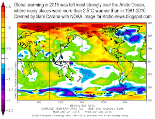
Surface temperature anomaly Jan 21, 2015 - Jan 20, 2016
 
This is further illustrated by the images on the right. The top image shows 2015 maximum nightly sea surface temperature anomalies, with anomalies of 5°C off the North American east coast as well as in the Arctic Ocean.

The second image on the right illustrate the extent at which warming in the Arctic Ocean is accelerating, compared to the rest of the world. The image also shows the cold freshwater lid over the North Atlantic.

Temperature anomaly forecast for January 28, 2016
 
As the temperature difference between the Arctic and the equator decreases, the jet stream gets more elongated, at times moving all across the Arctic Ocean. This is one of a multitude of feedbacks that contribute to accelerating warming of the Arctic Ocean. The result is illustrated by the third image on the right, showing strong warming over most of the Arctic Ocean, while at the same time some places on land at higher latitudes north are experiencing extremely cold conditions.

descending cold freshwater on January 25, 2016
Another one of such feedbacks is that warmer water off the coast of North America will result in stronger winds moving over the North Atlantic toward the Arctic Ocean. This can also speed up ocean currents, so it can result in more heat being carried toward the Arctic Ocean both in the atmosphere and the water.

Meltwater from glaciers and sea ice can descend along the edges of Greenland into the North Atlantic, forming a cold freshwater lid on the North Atlantic, where it accumulates at the surface over the years, as illustrated by the image on the right that points at a -4°C or -7.1°F anomaly compared to 1981-2011.

In addition, precipitation (rain, snow, hail, fog, etc.) can further contribute to expansion of this cold
freshwater lid over the North Atlantic, as illustrated by the images on the right.
cold freshwater lid over the North Atlantic

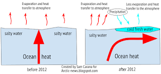
While this cold freshwater may constitute a barrier that slows the flow of warm water toward the Arctic Ocean at the surface, the danger is that it prevents heat transfer to the atmosphere from warm water flowing below the sea surface, with the net result of more heat arriving in the Arctic Ocean.

Furthermore, if this cold freshwater lid also prevents water from sinking deeper in the North Atlantic, this may also contribute to more warm water arriving in the Arctic ocean, as illustrated by the bottom image on the right.

Such feedbacks can dramatically accelerate warming of Arctic Ocean, resulting in heat destabilizing sediments that can contain huge amounts of methane.

In conclusion, America must take the lead in action on climate change. It's fair to do so, it will benefit everyone, there are legal obligations to do so and there is great urgency to act in the light of looming methane eruptions from the seafloor of the Arctic Ocean.

The situation is dire and calls for comprehensive and effective action, as described at the Climate Plan


In October 2015, oceans reached record high temperatures, especially on the Northern Hemisphere. The image features a...
Posted by Sam Carana on Saturday, January 23, 2016

Thursday, December 17, 2015

Paris Agreement

At the Paris Agreement, nations committed to strengthen the global response to the threat of climate change by holding the increase in the global average temperature to well below 2°C above pre-industrial levels and to pursue efforts to limit the temperature increase to 1.5°C above pre-industrial levels.


How much have temperatures risen already? As illustrated by above image, NASA data show that during the three-month period from September through November 2015, it was ~1°C warmer than it was in 1951-1980 (i.e the baseline).

A polynomial trend based on the data from 1880 to 2015 for these three months indicates that a temperature rise of 1.5°C compared to the baseline will be reached in the year 2024.

Let's go over the calculations. The trendline shows it was ~0.3°C colder in 1900 compared to the baseline. Together with the current ~1°C rise, that implies that since 1900 there's been a rise of 1.3°C compared to the baseline. This makes that another rise of 0.2°C by 2024, as pointed at by the trendline, would result in a joint rise in 2024 of 1.5°C compared to the baseline.


The situation is even more worse than this. The Paris Agreement seeks to avoid a temperature increase of 1.5°C above pre-industrial levels. When we include temperature rises from pre-industrial levels to the year 1900, it becomes evident that we have already surpassed a rise of 1.5°C since pre-industrial levels. This is illustrated by above image, earlier added at How much time is there left to act? (see notes there) and by the graph below, from a recent post by Michael Mann, who adds that ~0.3°C greenhouse warming had already taken place by the year 1900. 
~0.3C greenhouse warming had already taken place by 1900, and ~0.2C warming by 1870
Let's add things up again. A rise of ~0.3°C before 1900, a further rise of 0.3°C from 1900 to the baseline (1951-1980) and a further rise of ~1°C from the baseline to date, together that adds up to a rise of ~1.6°C from pre-industrial levels.

In other words, we have already surpassed a rise of 1.5°C from pre-industrial levels by 0.1°C.

The trendline indicates that a further rise of 0.5°C will take place by the year 2030, i.e. that without comprehensive and effective action, it will be 2°C warmer than pre-industrial levels before the year 2030.

Full wrath of emissions yet to come

The full wrath of global warming is yet to come and the situation is even more threatening than pictured above, for the following reasons:
  1. Half of global warming has until now been masked by aerosols, particularly sulfates that are emitted when some of the dirtiest fossil fuels are burnt, such as coal and bunker oil. As we make the necessary shift to clean energy, the masking effect that comes with those emissions will disappear. 
  2. As Ricke and Caldeira point out, the carbon dioxide that is released now will only reach its peak impact a decade from now. In other words, we are yet to experience the full wrath of the carbon dioxide emitted over the past decade. 
  3. The biggest threat comes from temperature peaks. People in some parts of the world will be hit  harder, especially during summer peaks, as discussed in the next section of this post. As temperatures rise, the intensity of such peaks will increase.
    The image on the right illustrates this with a forecast for December 25, 2015, showing extreme weather for North America, with temperatures as low as 30.6°F or -0.8°C in California and as high as 71.5°F or 22°C in North Carolina. 
  4. Feedbacks such as rapid albedo changes in the Arctic and large amounts of methane abruptly released from the Arctic Ocean seafloor could dramatically accelerate the temperature rise. Furthermore, water vapor will increase by 7% for every 1°C warming. Water vapor is one of the strongest greenhouse gases, so increasing water vapor will further contribute to a non-linear temperature rise. The resulting temperature rises threaten to be non-linear, as discussed in the final section of this post.  
Situation even worse for some

Such temperature rises will hit some people more than others. For people living on the Northern Hemisphere, the outlook is worse than for people on the Southern Hemisphere.

NOAA data show that the November global land and ocean temperature anomaly was 0.97°C, while the 3-month global land and ocean temperature anomaly was 0.96°C. The 12-month anomaly on November 2015 on land on the Northern Hemisphere (where most people live) was 1.39°C, as shown on the image below, while the trendline shows that for people living on the Northern Hemisphere, a 1.5°C rise compared to 1910-2000 could be reached as early as in 2017.


Similarly, the outlook is worse for people living in regions that are already now experiencing high temperatures during the summer peaks. As said, as temperatures rise, the intensity of such peaks will increase.

Feedbacks in the Arctic

The image below, from an earlier post, depicts the impact of feedbacks that are accelerating warming in the Arctic, based on NASA data up to November 2013, and their threat to cause runaway global warming. As the image shows, temperatures in the Arctic are rising faster than elsewhere in the world, but global warming threatens to catch up as feedbacks start to kick in more. The situation obviously has deteriorated further since this image was created in November 2013.
[ click on image at original post to enlarge ]
Above image, from an earlier post, depicts the impact of feedbacks that are accelerating warming in the Arctic, based on NASA data up to November 2013. The image shows that temperatures in the Arctic are rising faster than elsewhere in the world. Global warming threatens to catch up as feedbacks start to kick in more, triggering runaway global warming. The situation obviously has deteriorated further since this image was created in November 2013.

The image below shows sea surface temperature anomalies on the Northern Hemisphere in November.


The image below gives an indication of the high temperatures of the water beneath the sea surface. Anomalies as high as 10.3°C or 18.5°F were recorded off the east coast of North America (green circle on the left panel of the image below) on December 11, 2015, while on December 20, 2015, temperatures as high as 10.7°C or 51.3°F were recorded near Svalbard (green circle on the right panel of the image below), an anomaly of 9.3°C or 16.7°F.


This warm water is carried by the Gulf Stream into the Arctic Ocean, threatening to unleash huge amounts of methane from its seafloor. The image below illustrates the danger, showing huge amounts of methane over the Arctic Ocean on December 10, 2015.


Methane is released over the Arctic Ocean in large amounts, and this methane is moving toward the equator as it reaches high altitudes. The image below illustrates how methane is accumulating at higher altitudes.


Above image shows that methane is especially prominent at higher altitudes recently, having pushed up methane levels by an estimate average of 9 ppb or some 0.5%. Annual emissions from hydrates were estimated to amount to 99 Tg annually in a 2014 post (image below).


An additional 0.5% of methane represents an amount of some 25 Tg of methane. This comes on top of the 99 Tg of methane estimated in 2014 to be released from hydrates annually. 

The situation is dire and calls for comprehensive and effective action as described at the Climate Plan.


Links

• How Close Are We to 'Dangerous' Planetary Warming? By Michael Mann, December 24, 2015
http://www.huffingtonpost.com/michael-e-mann/how-close-are-we-to-dangerous-planetary-warming_b_8841534.html

• Maximum warming occurs about one decade after a carbon dioxide emission, by Katharine L Ricke and Ken Caldeira (2014)
http://iopscience.iop.org/1748-9326/9/12/124002/article

• How much time is there left to act?
http://arctic-news.blogspot.com/p/how-much-time-is-there-left-to-act.html

• Feedbacks in the Arctic
https://arctic-news.blogspot.com/p/feedbacks.html

• Climate Plan
https://arctic-news.blogspot.com/p/climateplan.html


During the three-month period from September through November 2015, it was 1°C warmer than it was in 1951-1980,...
Posted by Sam Carana on Wednesday, December 16, 2015