Thursday, January 14, 2016

Greenhouse gas levels and temperatures keep rising

At the Paris Agreement, nations pledged to cut emissions and avoid dangerous temperature rises. Yet, the rise in greenhouse gas levels and temperatures appears to be accelerating.

Record growth of carbon dioxide levels at Mauna Loa

Annual mean carbon dioxide level measured at Mauna Loa, Hawaii, grew by 3.17 ppm (parts per million) in 2015, a higher growth rate than in any year since the record started in 1959.


As above image shows, a polynomial trendline added to the data points at a carbon dioxide growth rate of 4 ppm by the year 2024 and 5 ppm by the year 2028. 

At the start of the Industrial Revolution, the carbon dioxide level in the atmosphere was about 280 ppm. On January 11, 2016, as above image shows, carbon dioxide level at Mauna Loa, Hawaii, was 402.1 ppm. That's some 143% times what the upper level of carbon dioxide was in pre-industrial times over at least the past 400,000 years, as the image further below illustrates.

At higher northern latitudes, carbon dioxide levels are higher than elsewhere on Earth, as illustrated by above image. These high greenhouse gases contribute to accelerated warming of the Arctic. 

Methane levels rising even faster than CO2 levels, especially over Arctic Ocean

Historically, methane levels have been moving up and down between a window of 300 and 700 ppb. In modern times, methane levels have been rising even more rapidly than carbon dioxide levels, as illustrated by the image below, from an earlier post.

As above image illustrates, the mean level of 1839 ppb that was reached on September 7, 2014, is some 263% of the ~700 ppb that historically was methane's upper level.

The image below, from an earlier post, shows the available World Meteorological Organisation (WMO) annual means, i.e. from 1984 through to 2014, with added polynomial trendline based on these data. The square marks a high mean 2015 level, from NOAA's MetOp-2 satellite images, and it is added for comparison, so it does not influence the trendline, yet it does illustrate the direction of rise of methane levels and the threat that global mean methane levels will double well before the year 2040.


Recently, some very high peak levels have been recorded, including a reading of 2745 ppb on January 2, 2016, and a reading of 2963 ppb on January 8, 2016, shown below.


These high readings illustrate the danger that, as warmer water reaches the seafloor of the Arctic Ocean, it will increasingly destabilize sediments that can contain huge amounts of methane in the form of free gas and hydrates. Images associated with these high readings show the presence of high methane levels over the Arctic Ocean, indicating that these high peaks originate from the Arctic ocean and that sediments at the seafloor of the Arctic Ocean are destabilizing. The danger is that these peaks will be followed up by even stronger abrupt releases from the seafloor of the Arctic Ocean, as water temperatures keep rising.

Rising temperatures

Global mean temperature in 2015 was 0.87°C (~1.6°F) higher than in 1951-1980. 

Above image shows NASA data with a polynomial trendline added that points at a 2015 temperature that is more than 1.1°C (~2.03°F) higher than it was in 1900.

The image on the right shows that it was 1.17°C warmer in 2015 than it was in the period 1890-1910.

Additionally, some 0.3°C warming had already taken place by the year 1900, as discussed in an earlier post.

Together, that makes that 2015 temperatures were 1.47°C above pre-industrial levels.

Furthermore, temperatures did rise steeply over the course of the year 2015.

By the end of the year 2015, the temperature rise was even stronger than the average for 2015 would indicate, as illustrated by the image on the right.

It is now 2016 and temperatures are still rising. In other words, it now is more than 1.5°C or 2.7°F warmer than in pre-industrial times. In conclusion, we have already crossed the 1.5°C guardrail that the Paris Agreement had pledged to try and limit global warming to. 

What is the prognosis for the temperature rise from here onward? The current El Niño is expected to continue well into 2016. Even if the El Niño slows down, it will by then likely have contributed to huge losses of snow and ice cover, including sea ice melt in the Arctic. The resulting albedo changes alone may well have an even stronger warming effect than the El Niño, while there are further feedbacks such as disruption of the jet stream and methane eruptions from the seafloor of the Arctic Ocean.

The image below shows that, when that same trendline featuring in above graph is extended into the future, it points at a 2°C or 3.6°F global temperature anomaly rise before the year 2030, a rise of about 4°C or 7.2°F by 2040, and a 10°C or 18°F rise before the year 2060. That would be a rise compared to the period 1951-1980, i.e. warming compared to pre-industrial levels would be even more severe.


Three points are important to help more fully grasp the predicament we are in:
  1. At higher latitudes of the Northern Hemisphere, temperatures are rising faster than globally, as illustrated by above image that shows that a 10°C rise could hit the Arctic by 2030. 
  2. Summer peaks will be even more devastating than annual averages. 
  3. The rise of temperatures on land will be steeper than the rise in the combined land-ocean temperatures, as illustrated by the image below that shows that a 3°C rise on land could occur well before the year 2030.  


Comprehensive and effective action needed

As greenhouse gases and temperatures keep rising, the heat will be felt earliest and most severely on land, during the northern summer and in the Arctic.

One big danger is that soil that was previously frozen will become exposed and will start releasing huge amounts of carbon, in the form of carbon dioxide or methane.

Furthermore, boreal forest, tundra and peat bogs are at risk of firestorms that will also come with huge amounts of emissions.

All this will make the rise in temperature speed up even more, with much of the soot from firestorms in Siberia settling on the Himalaya Tibetan plateau, melting the glaciers there and causing short-term flooding followed by rapid decrease of the flow of ten of Asia’s largest river systems that originate there, with more than a billion people’s livelihoods depending on the continued flow of this water.

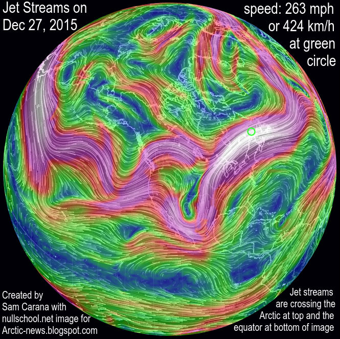
Again, the reason why temperatures look set to rise so abruptly and dramatically in the Arctic is feedbacks, as discussed as the feedbacks page. The biggest danger that comes with these rapidly rising temperatures in the Arctic is that large methane eruptions from the seafloor of the Arctic Ocean will further heat up the atmosphere, at first in hotspots over the Arctic, and eventually around the globe, while also causing huge temperature swings and extreme weather events, further contributing to increasing depletion of fresh water and food supply.

The situation is dire and calls for comprehensive and effective action, as described in the Climate Plan

Below is an image by Malcolm Light, which updates an image that appeared in an earlier post


Annual mean carbon dioxide level measured at Mauna Loa, Hawaii, grew by 3.17 ppm (parts per million) in 2015, a higher...
Posted by Sam Carana on Thursday, January 14, 2016

Tuesday, January 5, 2016

Arctic Sea Ice At Record Low

Arctic sea ice extent on January 4, 2016, was at a record low for the time of the year, as illustrated by the image below.


Arctic sea ice will typically reach its maximum extent in March. In 2015, sea ice extent was very low in March (see blue line in above image), and the outlook for this year is even more grim, as oceans get warmer and El Niño is still gaining in strength.

Below is a comparison of sea ice thickness (in m) on January 4th for the years 2012, 2015 and 2016.


Below is an update showing Arctic sea ice extent as on January 6, 2016, at the bottom left corner, marked with the red dot.


The situation is dire and calls for comprehensive and effective action as described at the Climate Plan.


Arctic sea ice extent on January 4, 2016, was at a record low for the time of the year. Arctic Sea Ice At Record Lowhttp://arctic-news.blogspot.com/2016/01/arctic-sea-ice-at-record-low.html
Posted by Sam Carana on Tuesday, January 5, 2016

Monday, December 28, 2015

2015 warmest year on record

1.1°C or 34.1°F at the North Pole
The year 2015 is shaping up to be the warmest year on record. In the media, a lot of attention has been given to the many floods, droughts, wildfires and heatwaves that have battered the world this year.

Sadly, though, little attention is given to the situation in the Arctic. The image on the right shows a forecast for December 30, 2015, with temperatures at the North Pole above freezing point, as further illustrated by the nullschool.net image below, showing a temperature forecast of 1.1°C or 34.1°F for the North Pole. Wind speed at the North Pole is forecast to be 105 mph or 168 km/h on December 30, 2015, and 133 mph or 215 km/h closer to Svalbard.


As the image below illustrates, very high temperatures are forecast to hit the Arctic Ocean on December 30, 2015.


Above image shows temperature anomalies at the highest end of the scale for most of the Arctic Ocean, with a temperature anomaly for the Arctic as a whole of 2.4°C or 4.32°F above what was common in 1979-2000. The situation isn't likely to improve soon. For January 3, 2016, the temperature in the Arctic is forecast to be as much as 4.56°C or 8.21°F warmer.

How is it possible for such high temperatures to occur over the Arctic Ocean? The image below shows how the year 2015 is shaping up in terms of temperature anomalies.


Global warming is felt most strongly in the Arctic as warming continues, as illustrated by above image and by the image on the right.

Warming in the Arctic is accelerating due to feedbacks. One of these feedbacks is the way the jet streams are changing. Changes in the jet streams are becoming more prominent as the Arctic is warming up more rapidly than the rest of the world.

jet streams
As the difference in temperature between the Arctic and the equator becomes smaller, the speed at which the jet stream circumnavigates the globe is decreasing and jet streams become more wavy.

Meanwhile, most of the extra heat caused by global warming goes into the oceans, and the Atlantic Ocean is warming up fast. At the same time, meltwater is accumulating at the surface of the North Atlantic, lowering sea surface temperatures there. With such large differences between high temperatures over North America and lower temperatures over the North Atlantic, the speed of the jet stream between those places can increase dramatically.

The result is that huge amounts of warm air are being pushed high into the Arctic. The image on the right shows the jet streams on December 27, 2015, when speeds as high as 263 mph or 424 km/h were reached at the location marked by the green circle. Also note the jet streams crossing the Arctic at the top of the image, while crossing the equator at the bottom of the image.

The image below shows sea surface temperature anomalies on the Northern Hemisphere in November.


For over a month now, storms over the North Atlantic have been pushing hot air high up into the Arctic. The video below uses surface wind content by Climate Reanalyzer (selected daily averages and sequences of forecasts) to cover the period from December 5, 2015, to January 8, 2016.


Best wishes for 2016
Above video stops at January 8, 2016, when two cyclones are visible, one in the North Atlantic and another one over the North Pacific, prompting me to create the image on the right.

What causes these storms to grow this strong? Waters keeps warming up dramatically off the east coast of North America. Emissions from North America tend to extend over these waters, due to the Coriolis effect, and this contributes to their extreme warming.

The image below shows carbon dioxide levels as high as 511 ppm over New York on November 5, 2015, and as high as 500 ppm over the water off the coast of coast of New Jersey on November 2, 2015. 


Emissions contribute to warmer waters - click to enlarge
The top panel of the image on the right shows that on December 11, 2015, carbon dioxide levels were as high as 474 ppm (parts per million, surface concentration) at the location marked by the green circle in New York.

The bottom panel of the image on the right shows that the water off the coast was warmer by as much as 10.3°C or 18.5°F at the location marked by the green circle on December 11, 2015.

The NASA video below shows carbon dioxide emissions over the year 2006.


It's not just CO2 off the North American coast that contributes to further warming of the Gulf Stream, many other emissions do so, including methane, CO, etc. Carbon monoxide (CO) is not a greenhouse gas, but it depletes hydroxyl, thus preventing oxidation of methane, a very potent greenhouse gas. The animation below shows a carbon monoxide level at green circle of 528 ppb on December 28, 2015, 0900z, while the sea surface temperature anomaly there was 15.8°F or 8.8°C on that day. 


Carbon monoxide reached much higher levels recently over land, as illustrated by the image below that shows a CO level of 2077 ppb in New York on January 6, 2016. 


These emissions heat up the Gulf Stream and make that ever warmer water is carried underneath the sea surface all the way into the Arctic Ocean, while little heat transfer occurs from ocean to atmosphere, due to the cold freshwater lid on the North Atlantic.


feedback #28 at the feedback page

The image on the right shows that it was warmer by as much as 9.6°C or 17.2°F near Svalbard on December 25, 2015, at the location marked by the green circle. The same anomalies were recorded on December 26, 2015, when the temperature of the water there was 11°C or 51.9 °F.

This gives an indication of how warm the water is that is being pushed underneath the sea surface into the Arctic Ocean.

Strong winds and high waves can cause more sea ice to be pushed along the edges of Greenland out of the Arctic Ocean, into the Atlantic ocean, expanding the cold freshwater lid on the North Atlantic, in a self-reinforcing feedback loop.

The image below shows the impact of these storms on sea ice speed and drift on December 31, 2015 (left) and a forecast for January 8, 2016 (right).


The danger is that, as warmer water reaches the seafloor of the Arctic Ocean, it will increasingly destabilize sediments that can contain huge amounts of methane in the form of free gas and hydrates.


Methane levels over the Arctic Ocean are already very high. Above image shows methane levels as high as 2745 ppb over the Arctic Ocean on January 2, 2016. High releases from the Arctic Ocean seafloor are pushing up methane levels higher in the atmosphere, as discussed in earlier posts such as this one.

So, while the extreme weather events that have occurred in the year 2015 are frightening, even more terrifying is the way the water of the Arctic Ocean is warming up. Sadly, this is rarely even discussed in the media. So, let's once more add the image below that should have been given more media attention.


The situation is dire and calls for comprehensive and effective action as described at the Climate Plan.


Thursday, December 17, 2015

Paris Agreement

At the Paris Agreement, nations committed to strengthen the global response to the threat of climate change by holding the increase in the global average temperature to well below 2°C above pre-industrial levels and to pursue efforts to limit the temperature increase to 1.5°C above pre-industrial levels.


How much have temperatures risen already? As illustrated by above image, NASA data show that during the three-month period from September through November 2015, it was ~1°C warmer than it was in 1951-1980 (i.e the baseline).

A polynomial trend based on the data from 1880 to 2015 for these three months indicates that a temperature rise of 1.5°C compared to the baseline will be reached in the year 2024.

Let's go over the calculations. The trendline shows it was ~0.3°C colder in 1900 compared to the baseline. Together with the current ~1°C rise, that implies that since 1900 there's been a rise of 1.3°C compared to the baseline. This makes that another rise of 0.2°C by 2024, as pointed at by the trendline, would result in a joint rise in 2024 of 1.5°C compared to the baseline.


The situation is even more worse than this. The Paris Agreement seeks to avoid a temperature increase of 1.5°C above pre-industrial levels. When we include temperature rises from pre-industrial levels to the year 1900, it becomes evident that we have already surpassed a rise of 1.5°C since pre-industrial levels. This is illustrated by above image, earlier added at How much time is there left to act? (see notes there) and by the graph below, from a recent post by Michael Mann, who adds that ~0.3°C greenhouse warming had already taken place by the year 1900. 
~0.3C greenhouse warming had already taken place by 1900, and ~0.2C warming by 1870
Let's add things up again. A rise of ~0.3°C before 1900, a further rise of 0.3°C from 1900 to the baseline (1951-1980) and a further rise of ~1°C from the baseline to date, together that adds up to a rise of ~1.6°C from pre-industrial levels.

In other words, we have already surpassed a rise of 1.5°C from pre-industrial levels by 0.1°C.

The trendline indicates that a further rise of 0.5°C will take place by the year 2030, i.e. that without comprehensive and effective action, it will be 2°C warmer than pre-industrial levels before the year 2030.

Full wrath of emissions yet to come

The full wrath of global warming is yet to come and the situation is even more threatening than pictured above, for the following reasons:
  1. Half of global warming has until now been masked by aerosols, particularly sulfates that are emitted when some of the dirtiest fossil fuels are burnt, such as coal and bunker oil. As we make the necessary shift to clean energy, the masking effect that comes with those emissions will disappear. 
  2. As Ricke and Caldeira point out, the carbon dioxide that is released now will only reach its peak impact a decade from now. In other words, we are yet to experience the full wrath of the carbon dioxide emitted over the past decade. 
  3. The biggest threat comes from temperature peaks. People in some parts of the world will be hit  harder, especially during summer peaks, as discussed in the next section of this post. As temperatures rise, the intensity of such peaks will increase.
    The image on the right illustrates this with a forecast for December 25, 2015, showing extreme weather for North America, with temperatures as low as 30.6°F or -0.8°C in California and as high as 71.5°F or 22°C in North Carolina. 
  4. Feedbacks such as rapid albedo changes in the Arctic and large amounts of methane abruptly released from the Arctic Ocean seafloor could dramatically accelerate the temperature rise. Furthermore, water vapor will increase by 7% for every 1°C warming. Water vapor is one of the strongest greenhouse gases, so increasing water vapor will further contribute to a non-linear temperature rise. The resulting temperature rises threaten to be non-linear, as discussed in the final section of this post.  
Situation even worse for some

Such temperature rises will hit some people more than others. For people living on the Northern Hemisphere, the outlook is worse than for people on the Southern Hemisphere.

NOAA data show that the November global land and ocean temperature anomaly was 0.97°C, while the 3-month global land and ocean temperature anomaly was 0.96°C. The 12-month anomaly on November 2015 on land on the Northern Hemisphere (where most people live) was 1.39°C, as shown on the image below, while the trendline shows that for people living on the Northern Hemisphere, a 1.5°C rise compared to 1910-2000 could be reached as early as in 2017.


Similarly, the outlook is worse for people living in regions that are already now experiencing high temperatures during the summer peaks. As said, as temperatures rise, the intensity of such peaks will increase.

Feedbacks in the Arctic

The image below, from an earlier post, depicts the impact of feedbacks that are accelerating warming in the Arctic, based on NASA data up to November 2013, and their threat to cause runaway global warming. As the image shows, temperatures in the Arctic are rising faster than elsewhere in the world, but global warming threatens to catch up as feedbacks start to kick in more. The situation obviously has deteriorated further since this image was created in November 2013.
[ click on image at original post to enlarge ]
Above image, from an earlier post, depicts the impact of feedbacks that are accelerating warming in the Arctic, based on NASA data up to November 2013. The image shows that temperatures in the Arctic are rising faster than elsewhere in the world. Global warming threatens to catch up as feedbacks start to kick in more, triggering runaway global warming. The situation obviously has deteriorated further since this image was created in November 2013.

The image below shows sea surface temperature anomalies on the Northern Hemisphere in November.


The image below gives an indication of the high temperatures of the water beneath the sea surface. Anomalies as high as 10.3°C or 18.5°F were recorded off the east coast of North America (green circle on the left panel of the image below) on December 11, 2015, while on December 20, 2015, temperatures as high as 10.7°C or 51.3°F were recorded near Svalbard (green circle on the right panel of the image below), an anomaly of 9.3°C or 16.7°F.


This warm water is carried by the Gulf Stream into the Arctic Ocean, threatening to unleash huge amounts of methane from its seafloor. The image below illustrates the danger, showing huge amounts of methane over the Arctic Ocean on December 10, 2015.


Methane is released over the Arctic Ocean in large amounts, and this methane is moving toward the equator as it reaches high altitudes. The image below illustrates how methane is accumulating at higher altitudes.


Above image shows that methane is especially prominent at higher altitudes recently, having pushed up methane levels by an estimate average of 9 ppb or some 0.5%. Annual emissions from hydrates were estimated to amount to 99 Tg annually in a 2014 post (image below).


An additional 0.5% of methane represents an amount of some 25 Tg of methane. This comes on top of the 99 Tg of methane estimated in 2014 to be released from hydrates annually. 

The situation is dire and calls for comprehensive and effective action as described at the Climate Plan.


Links

• How Close Are We to 'Dangerous' Planetary Warming? By Michael Mann, December 24, 2015
http://www.huffingtonpost.com/michael-e-mann/how-close-are-we-to-dangerous-planetary-warming_b_8841534.html

• Maximum warming occurs about one decade after a carbon dioxide emission, by Katharine L Ricke and Ken Caldeira (2014)
http://iopscience.iop.org/1748-9326/9/12/124002/article

• How much time is there left to act?
http://arctic-news.blogspot.com/p/how-much-time-is-there-left-to-act.html

• Feedbacks in the Arctic
https://arctic-news.blogspot.com/p/feedbacks.html

• Climate Plan
https://arctic-news.blogspot.com/p/climateplan.html


During the three-month period from September through November 2015, it was 1°C warmer than it was in 1951-1980,...
Posted by Sam Carana on Wednesday, December 16, 2015

Tuesday, December 8, 2015

Strong winds and High Waves hit Arctic Ocean


Strong winds and high waves are hitting the Arctic Ocean from both the Atlantic Ocean and the Pacific Ocean.

Above image shows waves as high as 12.36 m or 40.5 ft near Greenland on December 8, 2015.

The image on the right shows cyclonic winds with speeds as high as 142 km/h or 88 mph near Greenland on December 8, 2015.

The image further down on the right shows that waves as high as 14.04 m or 46.1 ft are forecast to hit the Aleutian Islands on December 13, 2015. Strong winds and high waves are forecast to subsequently keep moving in the direction of the Arctic Ocean.

The image below shows strong winds and high waves that are heading for Arctic Ocean, with waves as high as 17.18 m or 56.4 ft forecast to be moving toward the Arctic Ocean on December 13, 2015.

As warming continues, this situation can be expected to get worse, with extreme weather events hitting the Arctic Ocean with ever greater intensity.


The video below, created with Climate Reanalyzer images, shows strong winds over the period from December 5 to 15, 2015. The video illustrates how cyclonic winds are hitting the Arctic Ocean both from the Atlantic Ocean and the Pacific Ocean.


Such winds and waves can move a lot of warm water into the Arctic Ocean. There currently is only a very thin layer of sea ice present in the Bering Strait, which is prone to be broken up by strong waves. Moreover, warm water may move underneath the sea ice and cause warm water to mix down all the way to the seafloor, where it can destabilize sediments containing huge amounts of methane in the form of free gas and hydrates.

Furthermore, strong winds can dramatically speed up the currents that are moving sea ice out of the Arctic Ocean into the Atlantic Ocean. The Naval Research Laboratory animation below shows ice speed and drift, illustrating how strong winds are pushing huge amounts of sea ice out of the Arctic Ocean along the edge of Greenland into the Atlantic Ocean.


The Naval Research Laboratory animation below illustrates that the thicker sea ice has hardly grown recently, while large amounts of thick sea ice also get pushed out of the Arctic Ocean along the edge of Greenland into the Atlantic Ocean.


[ click on image to enlarge ]
The image on the right shows that, on December 11, 2015, sea surface temperature anomalies off the east coast of North America were as high as 18.1°F or 10.0°C compared to the daily average during years 1981-2011.

At the same time, the lid over the North Atlantic is expanding, due to heavy melting of glaciers and due to the large amounts of sea ice that are getting pushed out of the Arctic Ocean by strong winds. Expansion of the freshwater lid over the North Atlantic is cooling the sea surface of North Atlantic and is making the atmosphere over the North Atlantic cooler than it would be without this lid, as it makes that less heat gets transferred from ocean to atmosphere, as discussed in earlier posts such as this one.

The result is a widening difference in atmospheric temperature between the area off the east coast of North America and the North Atlantic. This widening difference causes stronger winds to flow to the North Atlantic, in turn causing more sea ice to be moved out the the Arctic Ocean and further speeding up this feedback (#28 at the feedbacks page).


The end result is that, due to this loss of sea ice occurring now, the sea ice will be in a very bad shape when the melting season starts again next year. Furthermore, this expanding lid on the North Atlantic will prevent heat transfer from ocean to atmosphere, resulting in warmer water arriving in the Arctic Ocean below the sea surface.

The situation is dire and calls for comprehensive and effective action as described in the Climate Plan.


Waves as high as 12.36 m or 40.5 ft near Greenland on December 8, 2015. From the post 'Strong winds and High Waves hit...
Posted by Sam Carana on Tuesday, December 8, 2015