Tuesday, June 18, 2013

Mean Methane Levels reach 1800 ppb

On May 9, the daily mean concentration of carbon dioxide in the atmosphere of Mauna Loa, Hawaii, surpassed 400 parts per million (ppm) for the first time since measurements began in 1958. This is 120 ppm higher than pre-industrial peak levels. This unfortunate milestone was widely reported in the media.

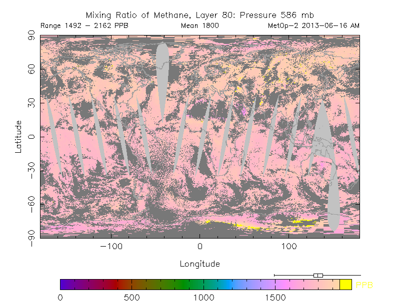
There's another milestone that looks even more threatening than the above one. On the morning of June 16, 2013, methane levels reached an average mean of 1800 parts per billion (ppb). This is more than 1100 ppb higher than levels reached in pre-industrial times (see graph further below).
NOAA image
Vostok ice core analysis shows that temperatures and levels of carbon dioxide and methane have all moved within narrow bands while remaining in sync with each other over the past 400,000 years. Carbon dioxide moved within a band with lower and upper boundaries of respectively 200 and 280 ppm. Methane moved within lower and upper boundaries of respectively 400 and 800 ppb.
Temperatures moved within lower and upper boundaries of respectively -8 and 2 degrees Celsius.

From a historic perspective, greenhouse gas levels have risen abruptly to unprecedented levels. While already at a historic peak, humans have caused emissions of additional greenhouse gases. There's no doubt that such greenhouse gas levels will lead to huge rises in temperatures. The question is how long it will take for temperatures to catch up and rise.


Below is another way of looking at the hockey stick. And of course, further emissions could be added as well, such as nitrous oxide and soot.


Large releases of methane must have taken place numerous times in history, as evidenced by numerous pockmarks, as large as 11 km (6.8 mi) wide.

Importantly, large methane releases in the past did not result in runaway global warming for a number of reasons:
  • methane release typically took place gradually over many years, each time allowing a large release of methane to be broken down naturally over the years before another one occurred. 
  • Where high levels of methane in the atmosphere persisted and caused a lot of heat to be trapped, this heat could still be coped with due to greater presence of ice acting as a buffer and consuming the heat before it could escalate into runaway temperature rises.
Wikipedia image
Veli Albert Kallio comments:

The problem with ice cores is that if there is too sudden methane surge, then the climate warms very rapidly. This then results the glacier surfaces melting away and the ice core begins to loose regressively surface data if there is too much methane in the air.

Because of this, there has been previous occurrences of high methane, and these were instrumental to bring the ice ages ice sheets to end (Euan Nisbet's Royal Society paper). The key to this is to look at some key anomalies and devise the right experiments to test the hypothesis for methane eruptions as the period to ice ages.

Thus, the current methane melting and 1800 ppm rise is nothing new except that there are no huge Pleistocene glaciers to cool the Arctic Ocean if methane goes to overdrive this time. In fact methane may have been many times higher than that but all surface ice kept melting away and staying regressive until cold water and ice from destabilised ice sheets stopped the supply of methane (it decays fast if supply is cut and temperatures fall back rapidly when seas rose).

The Laurentide Ice Sheet alone was equivalent of 25 Greenland Ice Sheets and the Weischelian and other sheets on top of that. So, the glaciers do not act the same way as fireman to extinguish methane. Runaway global warming is now possibility if the Arctic loses its methane holding capability due to warming.

Further discussion is invited on the following points:
  • The large carbon-12 emission anomalies in East Asian historical objects that are dateable by historical knowledge. Discussion about the explanations concocted and why methane emission from permafrost soils and sea beds must be the answer; 
  • the much overlooked fact that if there were ever very highly elevated concentrations of air in the Arctic, this would induce strong melting of glaciers which then lack those surface depositions where the air were most CH4 and CO2 laden. Even moderate levels of temperature rise damaged Larsen A, Larsen B, Petermann and Ellesmere glaciers. If huge runaway outgassing came out when Beringia flipped into soil warming, then methane came out really large amounts with CO2.
  • Discussion of the experiments how to compensate for the possible lack of "time" in methane elevated periods in the ice cores by alternative experiments to obtain daily, weekly, monthly and yearly emission rates of CH4 and CO2 from the Last Glacial Maximum to the Holocene Thermal Maximum (as daily, weekly, monthly, and yearly sampling of air).

Editor's update: Methane levels go up and down with the seasons, and differ by altitude. As above post shows, mean levels reached 1800 ppb in May 2013 at 586 mb, according to MetOp-2 data. Note that IPCC AR5 gives levels of 1798 ppb in 2010 and 1803 ppb in 2011, as further discussed in later posts such as this one. Also, see historic data as supplied by NOAA below.


Sunday, June 16, 2013

Arctic Sea Ice September 2013 Projections

What will the Arctic Sea Ice look like in September 2013?

Several projections for Arctic sea ice extent are being discussed at places such as ARCUS (Arctic Research Consortium of the United States) and the Arctic Sea Ice Blog. The image below, from ARCUS, shows various projections of September 2013 arctic sea extent (defined as the monthly average for September) with a median value of 4.1 million square kilometers, with quartiles of 3.8 and 4.4 million square kilometers.


Note that sea ice extent in the above projections is defined as area of ocean with at least 15% ice, in line with the way the NSIDC calculates extent. By contrast, the Danish Meteorological Institute includes areas with ice concentration higher than 30% to calculate ice extent.

Rather than looking at the projected average for September, one could also project the minimum value for September 2013. And rather than looking at sea ice extent, one could also look at sea ice area, which differs from sea ice extent as the NSIDC FAQ page describes:
A simplified way to think of extent versus area is to imagine a slice of Swiss cheese. Extent would be a measure of the edges of the slice of cheese and all of the space inside it. Area would be the measure of where there is cheese only, not including the holes. That is why if you compare extent and area in the same time period, extent is always bigger.


Above image shows Sam Carana's projected minimum area of 2 million square km for 2013, based on data by Cryosphere Today and on numerous factors, such as continued warming of the water underneath the ice, stronger cyclones, etc.
Roughly in line with above image, by Wipneus, Sam Carana's projection for Arctic sea ice minimum volume is 2,000 cubic km in September 2013.

Readers are invited to submit comments below with further projections.

Thursday, June 13, 2013

Arctic sea ice thickness falls by 2m in 21 days in some areas

For years, warnings have been raised about the dramatic decline of Arctic sea ice. Various posts at this blog have also analyzed the exponential nature of the decline in summer sea ice volume and the many feedbacks that fuel this decline. And for years, the conclusion has been that - without action - the sea ice looks set to disappear altogether within years.

Yet, many are still ignoring this warning, often with remarks such as "some of the ice is 5 meters thick; it would take decades for all that ice to melt!" Thick ice does indeed pile up along the northern coast of Greenland and Ellesmere Island, due to the way the ice drifts. This has lead some to argue that an S-shaped curve (sigmoid or gompertz trendline) was more appropriate, with the decline in sea ice volume slowing down as it approaches zero.

However, this argument doesn't seem make much sense, since such a S-shaped trendline would only apply to a relatively small area with very thick sea ice. Exponential curves would still remain the best fit to predict the decline of the sea ice in the Arctic Ocean at large.

Moreover, is it really more appropriate to say that summer sea ice looks set to virtually disappear within years, with just a tiny sliver of ice remaining north of Greenland and Ellesmere Island, instead of saying that the sea ice looks set to disappear altogether within years? How persistent will such a sliver really be?

One of the feedbacks of sea ice decline is that, as the decline progresses, cyclones can be expected to hit the remaining sea ice ever harder. How much damage can such cyclones and further feedbacks do? A previous post describes thin spots developing in the sea ice under the influence of a cyclone. The image below shows areas at the center of the Arctic Ocean (large circle) where thickness of the sea ice fell from 2 meters to 1 meters over a period of 21 days. Furthermore, the image below also shows that, over this period, 5m-thick ice was reduced to 3-meters thickness (top small circle), while 2m-thick ice was reduced to zero (bottom small circle).

2m falls in thickness in 21 days - click on image to enlarge
In conclusion, without action the Arctic sea ice looks set to continue to decline exponentially, while strong feedbacks such as cyclones developing when there is more open water, look set to add to the decline and cause the Arctic sea ice to disappear completely within years. For an overview of lines of action, see this post at the methane hydrates blog.

Thursday, June 6, 2013

Thin Spots developing in Arctic Sea Ice

From the start of 2013, Arctic sea ice extent has roughly followed the same path it did in 2012 when a historic record low was reached, as discussed in a previous post. At the moment, thinner spots are developing in the sea ice, as illustrated by the image below.


These thin spots are developing due to a combination of factors:
  • a cyclone over the Arctic
  • low North Hemisphere snow cover causing more sunlight to be absorbed, rather than reflected back into space
  • warm sea surface temperatures at edges of sea ice, as illustrated by the image below
  • ice thickness is very low, as illustrated by the image further below
NOAA image, click to enlarge
Arctic sea ice volume/extent ratio by Neven (click to enlarge image)
Below, a 30-day Naval Research Laboratory animation illustrating the development of the thinner spots.