High levels of biomass-burning aerosols show up over North America on the above June 7, 2023 06 UTC forecast by Copernicus.
The above satellite image shows the US East Coast, with New York blanketed in a veil of smoke on June 7, 2023.
High levels of carbon monoxide are visible over North America on the above map. Carbon monoxide is forecast to be as high as 8715 parts per billion in Quebec, Canada on June 8, 2023 (at 12:00 UTC, a few hours from now, at the green circle).
The map below shows the location for this measurement in Quebec, Canada on June 8, 2023 (at red marker).
The image below also shows wind at 250 hPa, i.e. the Jet Stream. The circular wind patterns indicate how deformed the Jet Stream is.
The image below, from an earlier post, further illustrates the extent of the deformation of the Jet Stream, showing the Jet Stream on June 6, 2023, with no less than 26 circular wind patterns (at 250 hPa) marked on the image, which also shows sea surface temperature anomalies. The Jet Stream is also crossing the Equator.
As an update, below is a forecast of biomass-burning aerosols for June 14, 2023.
A huge temperature rise threatens to unfold, as the already dire situation threatens to turn catastrophic due to the combined impact of a number of developments and feedbacks.
The image below uses ERA5 data, with two trends added. The blue trend, based on 1940-2022 data, points at 3°C rise by 2044. The purple trend, based on 2008-2022 data, better reflects variables such as El Niño and sunspots, and shows that this could trigger a rise of as much as 3°C by 2025, as further discussed below. Note that anomalies are from 1850-1900, which isn't pre-industrial.
The upcoming El Niño
Temperatures are currently suppressed as we're in the depth of a persistent La Niña event. It is rare for a La Niña event to last as long as the current one does, as illustrated by the NASA image below and discussed in this NASA post. The blue line added in the image highlights an increase in peak ONI (strong El Niños) over the years.
The above image was created using data up to September 2022. La Niña has since continued, as illustrated by the NOAA image on the right. NOAA adds that the dashed black line indicates that La Niña is expected to transition to ENSO-neutral during January-March 2023.
Chances are that we'll move into the next El Niño in the course of 2023. Moving from the bottom of a La Niña to the peak of a strong El Niño could make a difference of more than half a degree Celsius, as illustrated by the image below.
Joint impact of El Niño, sunspots and the volcano eruption near Tonga
[ click on image to enlarge ]
An analysis in an earlier post warns that the rise in sunspots from May 2020 to July 2025 could make quite a difference, as the upcoming El Niño looks set to coincide with a high number of sunspots.
The current cycle of sunspots is forecast to reach a maximum in July 2025. Recent observations are higher than expected, as illustrated by the images on the right, adapted from NOAA, confirming a study mentioned in the earlier post that warns that the peak of this cycle could rival the top few since records began, which would further increase the difference.
Observed values for December 2022 are already very close to or above the maximum values that NOAA predicts will be reached in July 2025. If this trend continues, the rise in sunspots forcing from May 2020 to July 2025 may well make a difference of more than 0.25°C, a recent analysis found.
A 2023 study calculates that the submarine volcano eruption near Tonga in January 2022, as also discussed at facebook, will have a warming effect of 0.12 Watts/m² over the next few years.
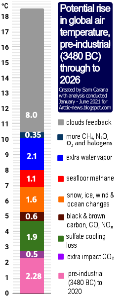
The joint impact of a strong El Niño, high sunspots and the volcano eruption near Tonga could make a difference of more than 0.87°C. This rise could trigger further developments and feedbacks that altogether could cause a temperature rise from pre-industrial of as much as 18.44°C by 2026, as illustrated by the image at the top and as discussed below.
As illustrated by the image below, temperature anomalies on land can be very high, especially during El Niño events. In February 2016, during a strong El Niño, the land-only monthly anomaly from 1880-1920 was 2.95°C. Note that anomalies are from 1880-1920, which isn't pre-industrial.
Further developments and feedbacks
A combination of further developments and feedbacks could cause a huge temperature rise. An example of this is the decline of the cryosphere, i.e. the global snow and ice cover.
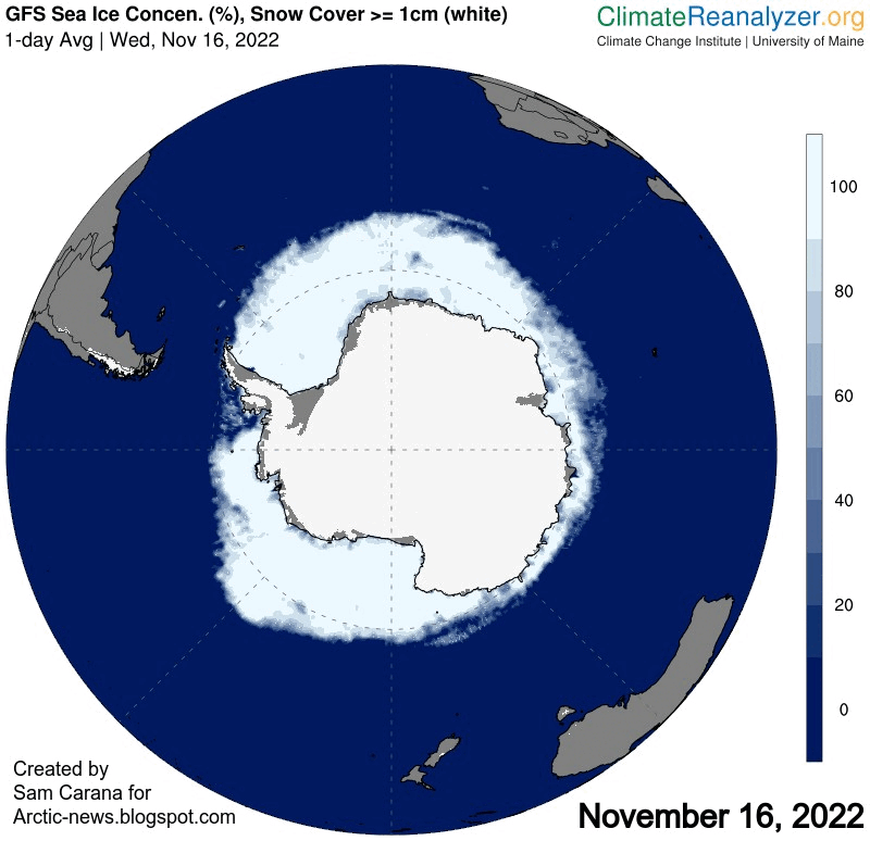
Antarctic sea ice extent is currently at a record low for the time of year (see image on the right, adapted from NSIDC).
Antarctic sea ice extent reached a record low on February 25, 2022, and Antarctic sea ice extent looks set to get even lower this year. The dangerous situation in Antarctica is discussed in more detail in a recent post.
The currently very rapid decline in sea ice concentration around Antarctica is also illustrated by the animation of Climate Reanalyzer images on the right, showing Antarctic sea ice on November 16, November 29, December 15, 2022 and January 4, 2023.
Studies in Alaska and Greenland have found that submarine and ambient melting is substantially higher than previously thought.
Global sea ice extent is also at a record low for the time of year, as illustrated by the image below that shows that global sea ice extent was 16.67 million km² on January 5, 2023.
[ click on images to enlarge ]
As illustrated by the image on the right, adapted from NSIDC, Arctic sea ice extent was second lowest for the time of year on January 6, 2023.
Loss of sea ice results in loss of albedo and loss of the latent heat buffer that - when present - consumes ocean heat as the sea ice melts. These combined losses could result in a large additional temperature rise, while there are further contributors to the temperature rise, such as thawing of terrestrial permafrost and associated changes such as deformation of the Jet Stream, additional ocean heat moving into the Arctic from the Atlantic Ocean and the Pacific Ocean, and methane eruptions from the seafloor of the Arctic Ocean.
A 2019 analysis concludes that the latent heat tipping point gets crossed when the sea surface temperature anomaly on the Northern Hemisphere gets higher than 1°C above 20th century's temperature and when there is little or no thick sea ice left.
The latent heat tipping point in the Arctic was crossed in 2020, while ocean heat has kept rising since, despite La Niña conditions, as illustrated by the images above and below.
Temperature anomalies were high over the Arctic Ocean in December 2022, as illustrated by the image below.
Ominously, methane levels are very high over the Arctic, as illustrated by the Copernicus image below and as discussed in section 16 of the methane page and at the Climate Alert group.
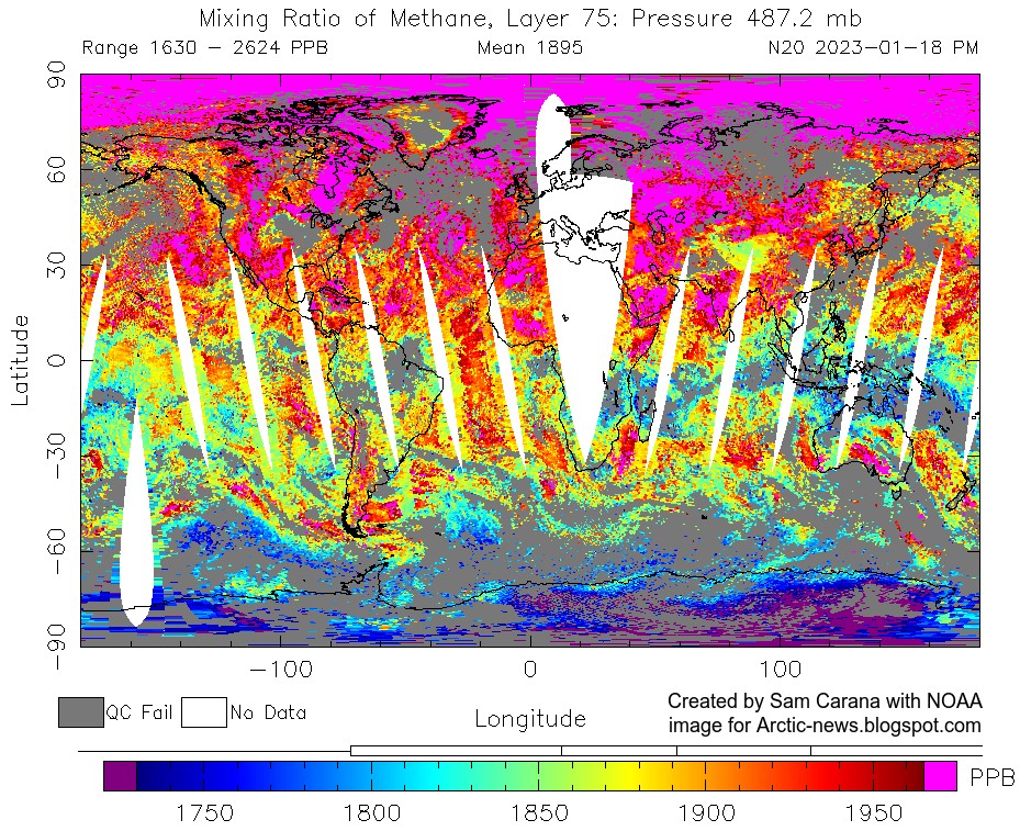
The image below shows methane recorded by the N20 satellite on January 18, 2023, pm at 487.2 mb reaching a peak of 2624 ppb.
The animation below is made with images recorded by the Metop-B satellite on Jan.6, 2023 PM, showing methane at the highest end of the scale (magenta color) first (at low altitude) becoming visible predominantly over oceans and at higher latitudes North, and then gradually becoming also visible more spread out over the globe at higher altitude, while reaching its highest mean (of 1925 ppb) and peak (of 2708 ppb) at 399 mb.
This indicates that methane is rising up from the Arctic Ocean, as also discussed at the methane page and at this post at facebook.
The image below is from tropicaltidbits.com and shows a forecast for September 2023 of the 2-meter temperature anomaly in degrees Celsius and based on 1984-2009 model climatology. The anomalies are forecast to be very high for the Arctic Ocean, as well as for the Southern Ocean around Antarctica, which spells bad news for sea ice at both hemispheres.
Similarly, the image below shows a forecast for October 2023.
There are many further developments and feedbacks that could additionally speed up the temperature rise, such as rising greenhouse gases (including water vapor), falling away of the aerosol masking effect, more biomass being burned for energy and an increase in forest and waste fires, as also discussed at the Aerosols page.
As an earlier post mentions, the upcoming temperature rise on land on the Northern Hemisphere could be so high that it will cause much traffic, transport and industrial activity to grind to a halt, resulting in a reduction in aerosols that are currently masking the full wrath of global warming.
The image below shows dust as high as 9.1887 τ, i.e. light at 550 nm as a measurement of aerosol optical thickness due to dust aerosols, on January 23, 2023 01:00 UTC (at the green circle).
A 2023 study concludes that the amount of atmospheric desert dust has increased globally by about 55% since the mid-1800s, resulting in a net masking effect of −0.2 ± 0.5 W m⁻² for dust aerosols alone, more than climate models previously thought.
As discussed in an earlier post, the IPCC in AR6 estimates the aerosol ERF to be −1.3 W m⁻², adding that there has been an increase in the estimated magnitude of the total aerosol ERF relative to AR5. In AR6, the IPCC estimate for liquid water path (LWP, i.e., the vertically integrated cloud water) adjustment is 0.2 W m⁻², but a recent analysis found a forcing from LWP adjustment of −0.76 W m⁻², which would mean that the IPCC estimate of −1.3 W m⁻² should be changed to -2.26 W m⁻². When using a sensitivity of 1°C per W m⁻², this translates into an impact of -2.26°C and that doesn't even include the above-mentioned extra impact of dust. Furthermore, the IPCC's total for aerosols includes a net positive impact for warming aerosols such as black carbon, so the impact of cooling aerosols alone (without warming aerosols) will be even more negative.
The image on the right, from the extinction page, includes a potential rise of 1.9°C by 2026 as the sulfate cooling effect falls away and of 0.6°C due to an increase in warming aerosols by 2026.
In the video below, Guy McPherson discusses our predicament.
Final conclusions and reflections
It's important to avoid using terminology that may cause confusion. The image below shows some terms that may cause confusion (left), and terms that could be considered to be used instead (right).
As an example, it's better to avoid terms such as 'overshoot' and target', as illustrated by the image below.
It's important to look at the bigger picture and recognize that these developments and feedbacks could jointly cause a temperature rise (from pre-industrial) of as much as 18.44°C by 2026, as discussed at the Extinction page. Also note that humans are likely to go extinct with a rise of 3°C, as illustrated by the image below, from an analysis discussed in an earlier post and underpinned by this post.
Earlier versions of the text in the image below were posted here and here.
The situation is dire and threatens to turn catastrophic soon. The right thing to do now is to help avoid or delay the worst from happening, through action as described in the Climate Plan.
The image on the right shows a forecast of very low temperatures over North America with a temperature of -40 °C / °F highlighted (green circle at center) for December 23, 2022 14:00 UTC.
As the image shows, temperatures over large parts of North America are forecast to be even lower than the temperature at the North Pole.
The combination image below illustrates this further, showing temperatures as low as -50.3°C or -58.6°F in Alaska on December 22, 2022 at 17:00 UTC, while at the same time the temperature at the North Pole was -13.6°C or 7.4°F.
The Jet Stream
The image below shows the Jet Stream (250 hPa) on December 13, 2022, stretched out vertically and reaching the North Pole as well as the South Pole, while sea surface temperature anomalies are as high as 11°C or 19.7°F from 1981-2011 at the green circle.
The Jet Stream used to circumnavigate the globe within a narrow band from West to East (due to the Coriolis Force), and it used to travel at relatively high speed, fuelled by the temperature difference between the tropics and the poles.
The Jet Stream used to circumnavigate the globe within a narrow band from West to East (due to the Coriolis Force), and it used to travel at relatively high speed, fuelled by the temperature difference between the tropics and the poles.
As the above image shows, the Pacific Ocean is currently cooler at the tropics and warmer further to the north (compared to 1981-2011), which narrows this temperature difference and in turn makes the Jet Stream wavier. Accordingly, the Jet Stream is going up high into the Arctic before descending deep down over North America.
[ click omn images to enlarge ]
The above image shows Rossby waves, from NOAA. When you see a wave traveling along the surface of water, there are peaks and troughs in the water height. The same happens in the atmosphere with a traveling Rossby wave – as the Rossby wave travels through the atmosphere, the peaks and troughs of the wave produce regions of high and low air pressure.
The image on the right shows air pressure at sea level on December 22, 2022. High sea surface temperatures make air rise, lowering air pressure at the surface to levels as low as 973 hPa over the Pacific. Conversely, a more wavy Jet Stream enables cooler air to flow from the Arctic to North America, raising air pressure at the surface to levels as high as 1056 hPa.
On December 22, 2022, the Jet Stream reached very high speeds over the Pacific, fuelled by high sea surface temperature anomalies. The image on the right shows the Jet Stream moving over the North Pacific at speeds as high as 437 km/h or 271 mph (with a Wind Power Density of 349.2 kW/m², at the green circle).
The Jet Stream then collides with higher air pressure and moves up into the Arctic, and subsequently descends deep down over North America, carrying along cold air from the Arctic. Deformation of the Jet Stream also results in the formation of circular wind patterns that further accelerate the speed of the Jet Stream.
The image on the right shows the Jet Stream moving over North America at speeds as high as 366 km/h or 227 mph (green circle). The image also shows high waves in the North Pacific.
La Niña / El Niño
The low sea surface temperature anomalies in the Pacific Ocean are in line with the current La Niña.
The fact that such extreme weather events occur while we're in the depth of a persistent La Niña is worrying. The next El Niño could push up temperatures further, which would hit the Arctic most strongly. This would further narrow the difference between temperatures at the Equator and the North Pole, thus making the Jet Stream more wavy, which also enables warm air to move into the Arctic, further accelerating feedbacks in the Arctic.
The image below, from NOAA, indicates that the next El Niño is likely to emerge soon. More about that in the next post.
Conclusion
The situation is dire and calls for immediate, comprehensive and effective action as described in the Climate Plan.
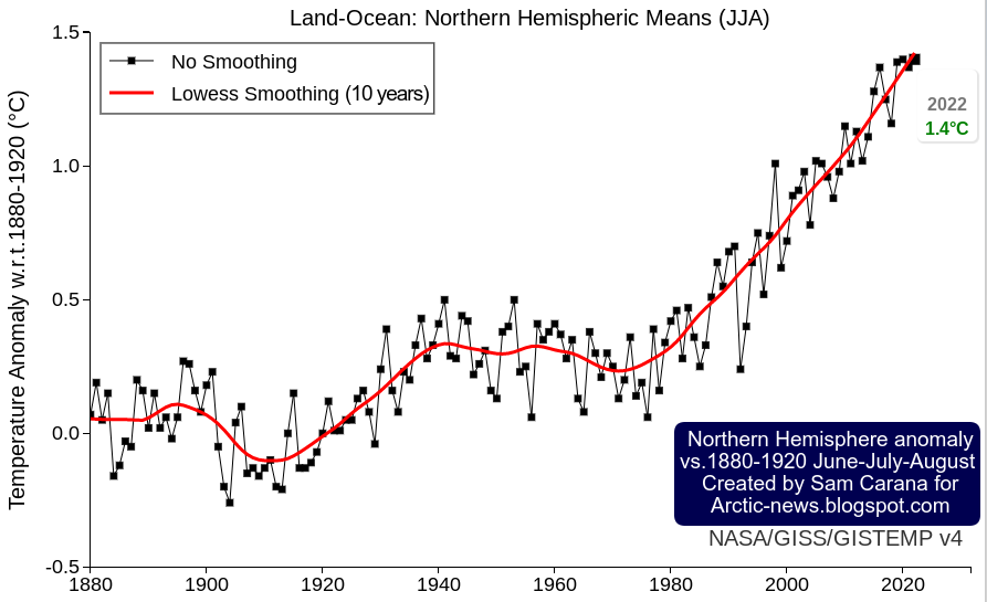
The Northern Hemisphere is where most people live. Furthermore, most people live on land. Let's first look at the temperature rise on the Northern Hemisphere.
The image below, created with a September 30, 2022 screenshot from NASA customized analysis plots, shows June-July-August temperature anomalies from 1880-1920 on the Northern Hemisphere with June-July-August 2022 highlighted with an anomaly of 1.4°C or 2.52°F, a record high in a tie with 2020.
Secondly, most people live on land. The image below shows the monthly mean global surface temperature anomaly on land. It is similarly created with a September 30, 2022 screenshot from NASA customized analysis plots and shows a peak anomaly from 1880-1920 of 2.95°C or 5.31°F (for February 2016, land only).
The year 2016 was an El Niño year. During an El Niño, temperatures are higher than usual. We are currently in the depths of a persistent La Niña, which suppresses temperatures. We look set to move into another El Niño within years.
In conclusion, the temperature rise on land on the Northern Hemisphere looks set to cross 3°C soon, the more so since we are also facing a peak in sunspots (by 2025), which may coincide with peak temperatures associated with the upcoming El Niño. Also keep in mind that the above temperature anomalies are measured from 1880-1920, so the temperature rise from pre-industrial is significantly higher than that.
There are further events and developments that could additionally speed up the temperature rise, as discussed at the extinction page. Humans are likely to go extinct with a rise of 3°C, as illustrated by the above image, from an analysis discussed in an earlier post.
Methane levels keep rising
The image below, from an earlier post, shows annual global mean methane with a trend added that points at a methane rise that could in 2028 represent a forcing of 780 ppm CO₂e (with a 1-year GWP of 200).
In other words, the clouds tipping point at 1200 ppm CO₂e could be crossed in 2028 due to the forcing of methane and CO₂ alone, assuming that CO₂ concentration in 2028 will exceed 420 ppm. Moreover, this could happen even earlier, since there are further forcers, while there also are further events and developments that could additionally speed up the temperature rise, as discussed in earlier posts such as this one. Furthermore, the NOAA data used in the above image rise are for marine surface measurements. Methane is accumulating at higher altitude, as illustrated by the compilation images below.
The top image of above compilation image shows that the MetOp-B (also known as MetOp-1) satellite recorded a mean methane concentration of 1979 parts per billion (ppb) at 293 mb on September 30, 2022 pm.
The above compilation image shows high concentrations of methane close to sea level, all the way up to the Tropopause. Does this indicate that methane is rising up from the seafloor of the Arctic Ocean?
Let's first take a look at prevailing wind pattern and how they changed. On the Northern Hemisphere, the coldest point used to be the North Pole, so wind used to flow from the tropics to the North Pole.
This and the deflection due to the Coriolis force resulted in two Jet Streams forming, circumnavigating the globe in what used to be narrow and straight bands, i.e. the Polar Jet Stream at 60° North and the Subtropical Jet Stream at about 30°, both on the Northern and Southern Hemisphere, resulting in a total of four Jet Streams.
The Jet Stream used to circumnavigate the globe in narrow and straight bands, predominantly following a path from East to West, in line with its strength and with this deflection.
Polar Jet Stream and Subtropical Jet Stream - NOAA image
The Jet Stream used to circumnavigate the globe at specific latitudes, as illustrated by the images on the right.
Prevailing wind patterns cause carbon dioxide to accumulate at the poles, as illustrated by the image underneath on the right that shows a high carbon dioxide concentration of 235 ppm over the North Pole.
Some things changed as, due to emissions by people, the difference in temperature between the Arctic and the Tropics narrowed.
This decreases the speed at which heat is moving to the North on the Northern Hemisphere and it deforms the Jet Stream and the prevailing wind patterns, which can make it even more easy for methane that is released from the Arctic Ocean to rise up and accumulate at the Tropopause, and move from there toward the Equator as it rises.
Emissions by people are also causing the Troposhere to expand.
Note the important difference in weight between carbon dioxide and methane. Carbon dioxide tends to accumulate at lower altitudes since it is heavier than air. Methane, on the other hand, is lighter than air, causing methane to rise and accumulate at altitudes near the Tropopause, from where methane moves closer to the Equator, since the Tropopause is higher in altitude at the Tropics than at the Poles.
The accumulation of methane at higher altitudes is further illustrated in the compilation image below that shows that methane mean levels are highest where the troposphere ends over the Arctic.
The situation is dire and the right thing to do now is to help avoid or delay the worst from happening, through action as described in the Climate Plan.
Arctic sea ice extent has fallen strongly over the past few weeks and looks set to keep falling rapidly over the next few months.
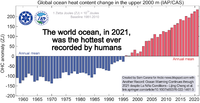
Ocean heat is at record levels, as illustrated by the image below and as discussed in an earlier post.
The image below shows the temperature at the North Pole reaching 0.7°C or 33.3°F (at 1000 hPa, at the green circle) on March 16, 2022, with ocean currents depicted at the background.
How could the temperature at the North Pole get this high, in March?
As said, ocean heat is at record levels. This is heating up the air over the Atlantic Ocean. At times, huge amounts of heat are getting pushed into the Arctic due to a distorted Jet Stream. The image on the right shows the Jet Stream on the Northern Hemisphere on March 16, 2022, with strong winds at 250 hPa pushing heat from the Atlantic Ocean into the Arctic.
Furthermore, the Gulf Stream is pushing huge amounts of ocean heat toward the Arctic.
The image below shows that sea surface temperatures were as much as 14.1°C or 25.3°F higher than 1981-2011 off the North American coast (green circle) on March 5, 2022.
The image below shows that, on March 16, 2022, the temperature in the Arctic was 3.5°C higher than 1979-2000.
Below, a Climate Reanalyzer forecast for March 18, 2022, of very high temperature anomalies over Antarctica combined with a forecast of a diversion over Antarctica of the Southern Polar Jet Stream (wind at 250 hPa).
As the combination image below shows, the temperature on Antarctica was 12.5°C or 54.4°F at 1000 hPa at the green circle on March 17, 2022 at 17:00 UTC. The image in the left panel shows high sea surface temperature anomalies south of Australia, while the Jet Stream (250 hPa) moves over Antarctica. The image in the right panel shows wind and temperature at 1000 hPa.
What causes such distortions of the Jet Stream?
• Emissions by people heat up the air, and heat up oceans and make winds stronger, as discussed in an earlier post.
• Another mechanism affecting the Jet Stream is that, as oceans heat up, the temperature difference between land and oceans widens both in Summer and in Winter and this can cause the Jet Stream to divert deeper from the narrow path it used to follow, as discussed in an earlier post.
• What especially affects the Jet Stream on the Northern Hemisphere is that, as the Arctic gets hit hard by temperature rises, the temperature difference narrows between the Arctic and the Equator, slowing the Jet Stream; this can prolong and amplify extreme weather events.
Signs of the things to come
The above events could be seen as signs of the strength and the speed of the rise to come.
Rise due to La Niña and high sunspots
The image below indicates that the global temperature difference between the top of an El Niño and the bottom of a La Niña period could be more than half a degree Celsius.
The highest temperature anomalies have over the years shown up at the highest latitudes North, i.e. the Arctic Ocean, in particular during El Niño periods.
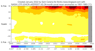
This is illustrated by the image on the right, created with a NASA image that shows temperature anomalies of up to 4.1°C (versus 1951-1980) over the Arctic Ocean.
The next image on the right, by Climate Reanalyzer, illustrates that very high temperature anomalies can show up at the highest latitudes North during Winter on the Northern Hemisphere, in this case a temperature anomaly (vs 1979-2000) of 7°C for the Arctic as a whole on February 28, 2022.
It is ominous for such high anomalies to show up in the Arctic during a La Niña period, and when it's Winter on the Northern Hemisphere when there's only very little sunlight reaching the Arctic.
For comparison, the next image on the right shows a temperature anomaly (vs 1979-2000) of 7.7°C for the Arctic as a whole on November 18, 2016, when there was an El Niño.
We're currently in the depth of a persistent La Niña, as illustrated by the next image on the right, adapted from NOAA. This has been suppressing the temperature and it will keep suppressing the temperature until the start of the next El Niño. The next El Niño could push temperatures up even more strongly than the average El Niño, for a number of reasons.
As the temperature keeps rising, ever more frequent strong El Niño events are likely to occur, as discussed in an earlier post. Furthermore, a 2019 study analyzes how tipping the ENSO into a permanent El Niño can trigger state transitions in global terrestrial ecosystems, as mentioned in an earlier post.
Currently, the temperature rise is additionally suppressed by low sunspots. Within a few years time, sunspots can be expected to reach the peak of their current cycle. Observed sunspots look stronger than predicted, as described at the sunspots page. According to IPCC AR4, warming by solar irradiance ranges from 0.06 to 0.3 W/m².
On top of the temperature rise that can be expected to unfold over the next few years due to variables such as an upcoming El Niño and high sunspots, there is the temperature rise due to further elements.
One of these elements causing the temperature to rise is the falling away of sulfate aerosols, while there could be a further temperature rise due to releases of other aerosols that have a net warming impact, such as black and brown carbon, which can increase dramatically as more wood burning and forest fires take place.
As the temperature of the atmosphere rises, this will trigger self-reinforcing feedbacks such as an increase in water vapor combined with a decrease in lower clouds decks, further increasing the temperature, as described at the clouds feedback page.
What could further push up temperatures a lot over the next few years is the compound impact of feedbacks in the Arctic, including decline of the snow and ice cover, releases of greenhouse gases from degrading subsea and terrestrial permafrost, and further distortion of the Jet Stream causing more extreme weather events.
Conclusion
The situation is dire and calls for the most comprehensive and effective action, as described at the Climate Plan.