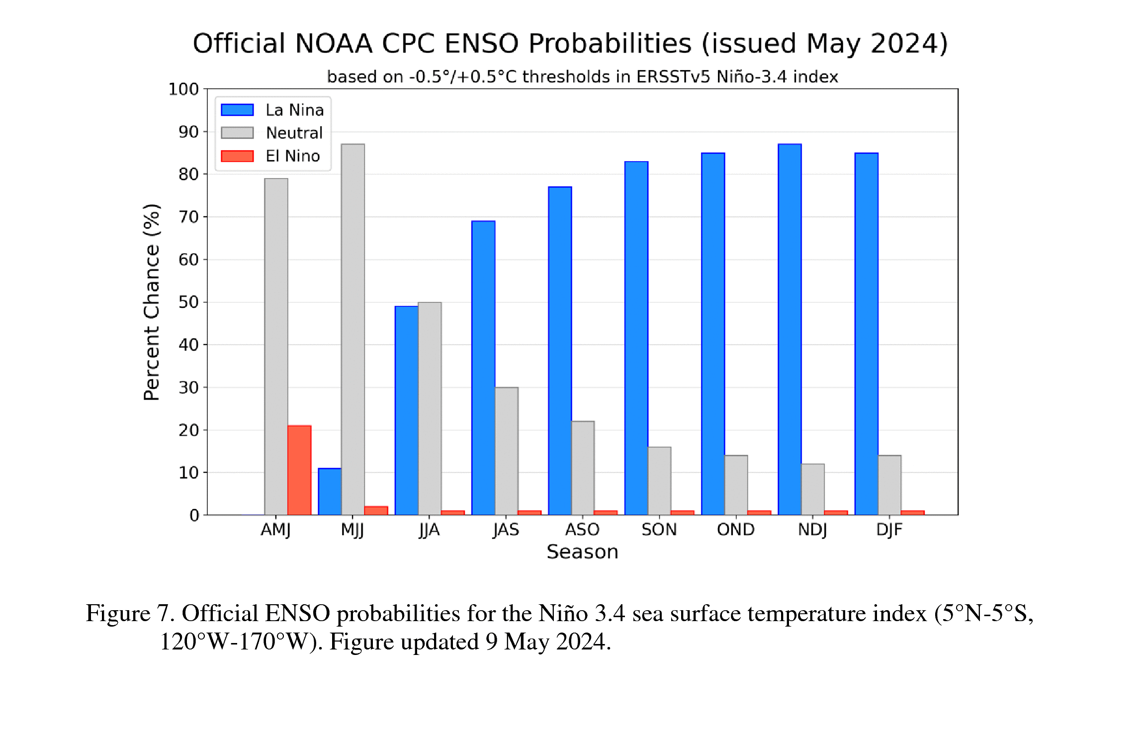
Sea surface temperatures and El Niño
The upcoming El Niño threatens to contribute to loss of virtually all Arctic sea ice in September 2026, which would in turn result in albedo loss, transfer of ocean heat to the atmosphere and additional emissions that could jointly increase the global temperature dramatically and could subsequently also cause virtually all Antarctic sea to disappear a few months later.
Forecasts indicate that the upcoming El Niño will reach historic heights within a few months time.

The above image, adapted from NOAA, shows a sea surface temperature anomaly forecast update for June 6, 2026, for the Niño3.4 region (which is indicative for El Niño development). Forecasts exceed 4°C for part of some forecast members and exceed 3.5°C for part of the forecast for the Coupled Forecast System version 2 (CFS.v2) ensemble mean (black dashed line).
The image below shows a sea surface temperature anomaly forecast update for June 6, 2026, for the Niño3 region, with forecasts exceeding 4°C for parts of some forecast members and approaching 4°C for part of the mean.

The combination image below shows sea surface temperature anomalies in the Niño 1+2 region (located close to South America), where a rise of more than 4°C (from under -1.5°C in the top image to more than +2.5°C in the bottom image) occurred within six months through June 12, 2026.

Forecasts of sea surface temperature anomalies in the Niño regions this high indicate that the 2026-2027 El Niño will be even stronger than the 2015-16 El Niño.
The image below, adapted from Climate Reanalyzer, shows sea surface temperature anomalies versus 1951-1980 in the Niño3.4 region over time and has a potential 2026 El Niño anomaly of 3.5°C added (red dashed line on the right).


The combination image below shows June 1, 2026, ECMWF orecasts for each of the four Niño regions.
 |
| [ click on images to enlarge ] |
High sea surface temperatures were recorded in the Pacific Ocean on May 22, 2026.

The above image highlights sea surface temperature anomalies from 1981–2011 on May 22, 2026, in three areas: 5.3°C off the coast of South America, 4.6°C off the coast of California and 5.4°C off the coast of Asia.
The image below highlights sea surface temperature anomalies from 1981–2011 on May 29, 2026, in four areas: 7.2°C off the coast of France, 8.1°C off the coast of Asia, 5.3°C off the coast of South America, and 6.3°C off the coast of South Africa.

As illustrated by the image below, adapted from NOAA, a huge amount of subsurface ocean heat has accumulated in the last two months across most of the equatorial Pacific Ocean.

The image below shows that on June 5, 2026, the sea surface temperature (SST) was the highest on record for this time of year in the Niño3.4 region (5°S–5°N, 120–170°W), an area in the Pacific Ocean that is indicative for development of El Niño. The inset shows sea surface temperature anomalies on June 5, 2026, with the Niño3.4 region highlighted. On June 5, 2026, the sea surface temperature in Nino3.4 was 29.27°C, a jump of 3.52°C from the 25.75°C on January 9, 2026, in a span of less than 5 months.

SST were higher only when a super El Niño developed in November 2015, as marked on the above image. Forecasts of sea surface temperature anomalies in El Niño regions partly exceeding 3.5°C indicate that the 2026-2027 El Niño will be even stronger than the 2015-16 El Niño and will be the strongest El Niño on record, as discussed in an earlier post.
On June 4, 2026, the world (60°S–60°N, 0–360°E) sea surface temperature (inset also shows anomalies) was 20.98°C, the highest temperature on record for this time of year, as illustrated by the image below.

As illustrated by the image below, a temperature of 52.1°C or 125.7°F was forecast in Pakistan on May 28, 2026, at the location marked by the green circle.

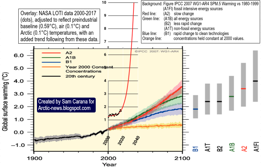
SSP5-8.5 scenario
In the SSP5-8.5 scenario, radiative forcing is projected to increase to 8.5 W/m² by 2100. Below are the IPCC projections for CO₂ concentration and temperature change for the SSP5-8.5 scenario.

The image below shows the CO₂ concentration over the last 31 days at Mauna Loa, Hawaii. The hand points at a daily CO₂ concentration of 433.95 parts per million (ppm) recorded on May 1, 2026.

Ocean heat threatens sea ice
Rising temperatures are threatening to cause dramatic loss in sea ice. Both subsurface ocean heat and ocean heat that has moved from the ocean to the atmosphere during the upcoming El Niño can be expected to contribute to strong loss of Arctic sea ice over the next few months.
The animation below shows the sea ice at the northern tip of Greenland, from June 3 through 8, 2026.

The rise in the Earth Energy Imbalance and in ocean heat is outpacing SPSS5-8.5, as illustrated by the combination image below, by Leon Simons.

As illustrated by the image below, Arctic sea ice extent was 11.06 million km² on June 6, 2026 (black), 2nd lowest extent on record for the time of year and a deviation from 1981-2010 of -2.94σ. Highlighted in blue is the sea ice extent in 2012 (record low year) and highlighted in purple is the sea ice extent in 2016, when there was a strong El Niño. Arctic sea ice extent can be expected to soon reach record low extent for the time of year as temperatures rise with the upcoming El Niño.

The image below, adapted from the Danish Meteorological Institute, shows that the daily Arctic sea ice volume was at a record low for the time of year on June 10, 2026, as it has been for years.

As illustrated by the image below, global sea ice extent was 22.27 million km² on June 6, 2026, second lowest global extent on record for the time of year and a deviation from 1981-2010 of -4.56σ. Highlighted in black is 2026, highlighted in purple is 2023 and highlighted in blue is 2025, until now the record low year for global sea ice extent.

The map below shows an update of an earlier forecast for November 2026 with temperature anomalies over most of the Arctic Ocean at the top of the scale (13°C), adapted from tropicaltidbits.com.

These high temperatures over the Arctic Ocean suggests strong sea ice decline, with the danger that huge amounts of greenhouse gases including methane will be released from the seafloor of the Arctic Ocean and from thawing terrestrial permafrost, coming with huge albedo changes and loss of the latent heat buffer, further accelerating the temperature rise. There are further developments that can contribute to a rapid and potentially huge temperature rise. The potential rise in methane and its impact are discussed in this earlier post.

The map above, from an earlier post, and the map below show forecasts for December 2026 and January 2027, respectively, with temperature anomalies over parts of the Arctic Ocean exceeding 10°C, based on SSP5-8.5 or what used to be called the "worst-case scenario".

Ominously, the forecast for January 2027 below, from an earlier post and adapted from tropicaltidbits.com, shows very high sea surface temperatures anomalies around Antarctica, which spells bad news for Antarctic sea ice, which typically reaches its annual minimum in February.

Is SSP5-8.5 the "worst-case" scenario?
The image below, adapted from ClimateReanalyzer, shows the Coupled Model Intercomparison Project Phase 6 (CMIP6) for the SSP5-8.5 scenario pointing at a temperature rise of 1.661°C in February 2025, of 4.388°C in February 2083 and of 5.163°C in February 2100, when using a 1901-2000 base (temperatures will be higher when a genuinely pre-industrial base is used).

The map below, from an earlier post, shows the CMIP6 SSP5-8.5 rise versus 1881-1920 in February 2100. The map shows that the temperature rise in areas on land (where most people live) could be as much as 8°C higher in Feb 2100 in the SSP585 model.

The map warns that temperatures over large parts of the Arctic may be more than 20°C higher than 1881-1920 in February 2100. This would suggest that by 2100 the snow and ice cover in the Arctic will have declined dramatically and that huge amounts of greenhouse gases will likely have been released from the seafloor of the Arctic Ocean and from thawing terrestrial permafrost, with huge albedo changes as well as loss of the latent heat buffer, further accelerating the temperature rise over the years.
The CMIP6 emission levels (quantified by SSP5-8.5) did not fully include the potential impact of bad climate policy and of feedbacks such as seafloor methane eruptions and loss of lower clouds. For "even-worse-than-SSP5-8.5" scenarios, have a look at the potential for a global temperature rise of more than 20°C by 2050 discussed in this 2013 post and the potential for a 18.44°C rise by the end of 2026 discussed in this recent post.
The immensity of the danger justifies keeping a close and watchful eye on the data, on research, on forecasts and projections, e.g. data from Copernicus' Methane Hotspot Explorer shows that the largest methane emission event in October 2024 occurred from an urban landfill in Kazakhstan, while the top seven methane emission events included landfills, oil and coal, but not natural gas operations, as illustrated by the image below.

Temperatures have risen due to human activities over thousands of years. Over the years, the focus of these activities has shifted four times and a fifth shift is coming up.
1. Moving away from hunting and gathering toward herding animals and agriculture.
2. Moving to cities, where people found work in factories (the Industrial Revolution).
3. Rising urban services and infrastructure, commuters to and from sprawling suburbs.
4. Avoiding damaging the climate and environment, with a focus on electrifying energy.
4. Avoiding damaging the climate and environment, with a focus on electrifying energy.
5. A focus on transforming society through renewal of cities, land use and infrastructure.
The fourth shift is highlighted by the UN's adoption of a resolution that calls on all UN Member States to take all possible steps to avoid causing significant damage to the climate and environment, including emissions produced within their borders, and to follow through on their existing climate pledges under the Paris Agreement. This sends a strong message that tackling the climate crisis is a legal duty under international law, and not just a political choice. The resolution also calls for the UN Secretary-General to submit a report in 2027 on ways to advance compliance with the obligations identified in the International Court of Justice advisory opinion.
The Climate Plan group discusses the fifth shift, i.e transforming society while highlighting the importance of a formal declaration of a climate emergency to raise awareness and to help overcome obstacles that could delay the necessary climate action, with a climate emergency declared globally and with implementation of climate action preferably decided locally provided it is in line with best-available science.

• NOAA - Seasonal climate forecast from CFSv2
https://www.cpc.ncep.noaa.gov/products/CFSv2/CFSv2_body.html
• ECMWF - The European Centre for Medium-Range Weather Forecasts
https://charts.ecmwf.int
The Climate Plan group discusses the fifth shift, i.e transforming society while highlighting the importance of a formal declaration of a climate emergency to raise awareness and to help overcome obstacles that could delay the necessary climate action, with a climate emergency declared globally and with implementation of climate action preferably decided locally provided it is in line with best-available science.
Conclusion
The situation is dire and unacceptably dangerous, and the precautionary principle necessitates the danger to be acknowledged, while facilitating rapid, comprehensive and effective action to reduce the damage and to improve the outlook, where needed in combination with a Climate Emergency Declaration, as described in posts such as in this 2022 post and this 2025 post, and as discussed in the Climate Plan group.

Links
• NOAA - Seasonal climate forecast from CFSv2
https://www.cpc.ncep.noaa.gov/products/CFSv2/CFSv2_body.html
• nullschool.net
https://earth.nullschool.net
• NOAA - ENSO: Recent Evolution, Current Status and Predictions
https://www.cpc.ncep.noaa.gov/products/analysis_monitoring/lanina/enso_evolution-status-fcsts-web.pdf
• NOAA - ENSO: Recent Evolution, Current Status and Predictions
https://www.cpc.ncep.noaa.gov/products/analysis_monitoring/lanina/enso_evolution-status-fcsts-web.pdf
• NOAA - El Niño/Southern Oscillation (ENSO) Diagnostic discussion, Climate Prediction Center, National Center for Environmental Prediction, statement issued 14 May 2026
• ECMWF - The European Centre for Medium-Range Weather Forecasts
https://charts.ecmwf.int
• Climate Reanalyzer
https://climatereanalyzer.org
• NOAA - Global Monitoring Laboratory - Carbon Cycle Greenhouse Gases - Mauna Loa, Hawaii
https://gml.noaa.gov/ccgg/trends/mlo.html
• IPCC Assessment Report 6 Workgroup 1 Chapter 4 - Future Global Climate: Scenario-based Projections and Near-term Information
https://www.ipcc.ch/report/ar6/wg1/downloads/report/IPCC_AR6_WGI_Chapter04.pdf
• NSIDC - National Snow and Ice Data Center, a part of CIRES at the University of Colorado Boulder
https://nsidc.org/sea-ice-today/sea-ice-tools/charctic-interactive-sea-ice-graph
• Danish Meteorological Institute - Arctic sea ice volume and thickness
https://ocean.dmi.dk/arctic/icethickness/thk.uk.php
• Kevin Pluck - sea ice visuals
https://seaice.visuals.earth
• Tropicaltidbits.com
https://www.tropicaltidbits.com
• NASA - Worldview
https://worldview.earthdata.nasa.gov
• Leon Simons - rise in ocean heat and Earth Energy Imbalance
https://bsky.app/profile/leonsimons.com/post/3mloc6c4bas2v
• Transforming Society
https://arctic-news.blogspot.com/2022/10/transforming-society.html
• Climate Plan
https://arctic-news.blogspot.com/p/climateplan.html
• Climate Emergency Declaration
https://arctic-news.blogspot.com/p/climate-emergency-declaration.html


