Showing posts with label anomalies. Show all posts

Wednesday, September 11, 2024

Will we be alive in 2025, who will survive, 2025?


The above image, created with monthly mean global temperature anomalies by LOTI Land+Ocean NASA/GISS/GISTEMP v4 data while using a 1903-1924 base, has a trend added based on Jan 2016-Aug 2024 data. The image also shows that anomalies could be 0.99°C higher when using a more genuine pre-industrial base.

The image below featured in an earlier post and was created with an image from the NASA website while using an 1885-1915 base, illustrating the calculation behind this 0.99°C. More details are here.


The image below from Copernicus illustrates that, for more than 14 consecutive months, the temperature anomaly has been high, i.e. about 0.8°C (± 0.3°C) above the 1991-2020 average and much more when compared to a pre-industrial base, with little or no sign of a return to earlier temperatures.


The image below, from an earlier post and created with an image from the NASA website while using a 1903-1924 base, confirms that the monthly temperature anomaly through August 2024 has been more than 1.5°C above this base for each of the past consecutive 14 months. The post adds that anomalies will be even higher when compared to a pre-industrial base. The red line shows a trend produced by the NASA website (2-year Lowess Smoothing).


Potential causes for such a rapid temperature rise include a cataclysmic alignment of the temperature peak of the next El Niño coinciding with a peak in sunspots expected to occur in July 2025.

The black dashed line in the image below, adapted from NOAA, indicates a transition to La Niña in October 2024, persisting through Jan-Mar 2025.


The image below, adapted from NOAA, illustrates that El Niño conditions were present from June 2023 through April 2024, and that ENSO-neutral started in May 2024.


While El Niños typically occur every 3 to 5 years, as NOAA explains, El Niños can occur as frequently as every two years, as happened in 2002, 2004 and 2006, as the above image shows. Moving from the bottom of a La Niña to the peak of a strong El Niño could make a difference of more than 0.5°C.

The danger is that we could move into a new El Niño in 2025, while temperatures remain high due to feedbacks and while sunspots move toward a peak in this cycle, expected to occur in July 2025.

The image below (top part), adapted from NOAA, shows the observed values for the number of sunspots for cycle 25, through August 2024, as well as the values predicted by NOAA (red line).

[ from earlier post, click on images to enlarge ]

The above image (bottom part) shows the observed values for the F10.7cm radio flux for cycle 25, through August 2024, as well as the values predicted by NOAA (red line).

The observed values are much higher than predicted. If this trend continues, the rise in sunspots forcing from early 2020 to July 2025 may well make a difference of more than 0.25°C.

This - in combination with further events, developments and short-term variables - could constitute a cataclysmic alignment that could result in runaway temperature rise by 2026, as an earlier post concluded.

Natural variability is mentioned by the IPCC, but because such events vary from year to year, their impact is smoothed out in climate change calculations that average the temperature rise over the course of decades. Yet, when such events coincide in a cataclysmic alignment, as could be the case within the next few years, the extra rise in temperature from - say - the year 2021 could be over 0.75°C. Note that this is an extra rise, on top of the long-term rise due to activities by people since pre-industrial.

Furthermore, as emissions and temperatures keep rising, such an extra rise could trigger feedbacks that threaten to grow in strength and strike with ever greater ferocity, further accelerating the temperature rise while extreme weather disasters hit numerous regions around the world more frequently over larger areas, with greater intensity and for longer periods.


Such feedbacks include loss of sea ice and permafrost degradation, both terrestrial and on the seafloor of the Arctic Ocean, which looks set to cause huge releases of greenhouse gases. Temperature anomalies are high and Arctic sea ice volume is very low, as illustrated by the compilation of images below, adapted from nullschool, Climate Reanalyzer and the Danish Meteorological Institute.  


Ominously, high methane concentrations (well over 2400 ppb) were recently recorded at the observatory in Utqiagvik (Barrow), Alaska, as illustrated by the image below, adapted from NOAA


Slowing down of ocean currents could cause less heat to move deep into the ocean and more heat to instead accumulate at the surface, while more water vapor would enter the atmosphere, further speeding up the temperature rise, as discussed in earlier posts such as this one and as illustrated by the image below, created with NOAA data.
[ surface precipitable water through August 2024 ]
The compilation image below, with forecasts for September 20, 2024 03 UTC (run 00 UTC) adapted from Copernicus, illustrates gases and biomass-burning aerosols released due to forest fires burning in the Amazon. Formaldehyde and carbon monoxide cause hydroxyl depletion and thus extend methane's lifetime. 


Conflict and socio-economic stress could add further forcing. Heatwaves, fires, famine, drought, floods, crop loss, loss of habitable land and corrupt politicians threaten to cause violent conflicts to erupt around the world, industrial activity to grind to a halt and the temperature to rise above 3°C from pre-industrial, driving humans into extinction. Sadly, politicians and mainstream media fail to inform people about the danger, and once the full horror reveals itself, panic could be added to the problems the world faces.

Dangers associated with high temperatures are discussed in this earlier post. A 2018 study (by Strona & Bradshaw) indicates that most life on Earth will disappear with a 5°C rise. Humans, who depend for their survival on many other species, will likely go extinct with a 3°C rise, as illustrated by the image below, from an earlier post.


Climate Emergency Declaration

The situation is dire and the precautionary principle calls for rapid, comprehensive and effective action to reduce the damage and to improve the situation, as described in this 2022 post, where needed in combination with a Climate Emergency Declaration, as discussed at this group.


Links

• NASA - Gistemp
https://data.giss.nasa.gov/gistemp

• Pre-industrial
https://arctic-news.blogspot.com/p/pre-industrial.html

• Did the climate experience a Regime Change in 2023? 

• Water Vapor Feedback
https://arctic-news.blogspot.com/2024/09/water-vapor-feedback.html

• NOAA - Monthly Temperature Anomalies Versus El Niño
https://www.ncei.noaa.gov/access/monitoring/monthly-report/global/202408/supplemental/page-4

• NOAA - El Niño and La Niña 

• Sunspots
https://arctic-news.blogspot.com/p/sunspots.html

• Cataclysmic Alignment threatens Climate Catastrophe 


Friday, January 15, 2021

2020: Hottest Year On Record

NASA data show that 2020 was the hottest year on record.


The image below shows that high temperature in 2020 hit Siberia and the Arctic Ocean.

In above images, the temperature anomaly is compared to 1951-1980, NASA's default baseline. When using an earlier baseline, the data need to be adjusted. The image below shows a trendline pointing at an 0.31°C adjustment for a 1900 baseline. 


Additional adjustment is needed when using a 1750 baseline, while it also makes sense to add further adjustment for higher polar anomalies and for air temperatures over oceans, rather than sea surface water temperatures. In total, a 0.78°C adjustment seems appropriate, as has been applied before, such as in this analysis. For the year 2020, this translates in a temperature rise of 1.8029°C versus the year 1750.

Three trends: blue, purple and red

Will the global temperature rise to 3°C above 1750 by 2026? The blue trend below is based on 1880-2020 NASA Land+Ocean data and adjusted by 0.78°C to reflect a 1750 baseline, ocean air temperatures and higher polar anomalies, and it crosses a 3°C rise in 2026.


The trend shows a temperature for 2020 that is slightly higher than indicated by the data. This is in line with the fact that we're currently in a La Niña period and that we're also at a low point in the sunspot cycle, as discussed in an earlier post. The blue trend also shows that the 1.5°C treshold was already crossed even before the Paris Agreement was accepted. 


The second (purple) trend is based on a shorter period, i.e. 2006-2020 NASA land+ocean (LOTI) data, again adjusted by 0.78°C to reflect a 1750 baseline, ocean air temperatures and higher polar anomalies. The trend approaches 10°C above 1750 by 2026. The trend is based on 15 years of data, making it span a 30-year period centered around end 2020 when extended into the future for a similar 15 year period. The trend approaches 10°C above 1750 in 2026.

The trend is displayed on the backdrop of an image from an earlier post, showing how a 10°C rise could eventuate by 2026 when adding up the impact of warming elements and their interaction.


The stacked bars are somewhat higher than the trend. Keep in mind that the stacked bars are for the month February, when anomalies can be significantly higher than the annual average.

Temperature rise for February 2016 versus 1900.
In the NASA image on the right, the February 2016 temperature was 1.70°C above 1900 (i.e. 1885-1914). In the stacked-bar analysis, the February 2016 rise from 1900 was conservately given a value of 1.62°C, which was extended into the future, while an additional 0.3°C was added for temperature rise from pre-industrial to 1900.

Later analyses such as this one also added a further 0.2°C to the temperature rise, to reflect ocean air temperatures (rather than water temperatures) and higher polar anomalies (note the grey areas on the image in the right).

Anyway, the image shows two types of analysis on top of each other, one analysis based on trend analysis and another analysis based on a model using high values for the various warming elements. The stacked-bar analysis actually doesn't reflect the worst-case scenario, an even faster rise is illustrated by the next trend, the red line.

The third (red) trend suggests that we may have crossed the 2°C treshold in the year 2020. The trend is based on a recent period (2009-2020) of the NASA land+ocean data, again adjusted by 0.78°C to reflect a 1750 baseline, ocean air temperatures and higher polar anomalies.


Where do we go from here? 

It's important to acknowledge the danger of acceleration of the temperature rise over the next few years. The threat is illustrated by the image below and shows up most prominently in the red trend. 


Of the three trends, the red trend is based on the shortest period, and it does indicate that we have aready crossed the 2°C treshold and we could be facing an even steeper temperature rise over the next few years.

We're in a La Niña period and we're also at a low point in the sunspot cycle. This suppresses the temperature somewhat, so the 2020 temperature should actually be adjusted upward to compensate for such variables. Importantly, while such variables do show up more when basing trends on shorter periods, the data have not be adjusted for this in this case, so the situation could actually be even worse. 

At a 3°C rise, humans will likely go extinct, while most life on Earth will disappear with a 5°C rise, and as the temperature keeps rising, oceans will evaporate and Earth will go the same way as Venus, a 2019 analysis warned. 

Dangerous acceleration of the temperature rise 

There are many potential causes behind the acceleration of the temperature rise, such as the fact that the strongest impact of carbon dioxide is felt ten years after emission, so we are yet to experience the full wrath of the carbon dioxide emitted over the past decade. However, this doesn't explain why 2020 turned out to be the hottest year on record, as opposed to - say - 2019, given that in 2020 carbon dioxide emissions were 7% lower than in 2019.

James Hansen confirms that the temperature rise is accelerating, and he points at aerosols as the cause. However, most cooling aerosols come from industries such as smelters and coal-fired power plants that have hardly reduced their operations in 2020, as illustrated by the image below, from the aerosols page


Above image shows that on December 17, 2020, at 10:00 UTC, sulfate aerosols (SO₄) were as high as 6.396 τ at the green circle. Wind on the image is measured at 850 hPa.

Could the land sink be decreasing? A recent study shows that the mean temperature of the warmest quarter (3-month period) passed the thermal maximum for photosynthesis during the past decade. At higher temperatures, respiration rates continue to rise in contrast to sharply declining rates of photosynthesis. Under business-as-usual emissions, this divergence elicits a near halving of the land sink strength by as early as 2040. While this is a frightening prospect, it still doesn't explain why 2020 turned out to be the hottest year on record. 

Oceans are taking up less heat, thus leaving more heat in the atmosphere. The danger is illustrated by the image below. 


The white band around -60° (South) indicates that the Southern Ocean has not yet caught up with global warming, featuring low-level clouds that reflect sunlight back into space. Over time, the low clouds will decrease, which will allow more sunlight to be absorbed by Earth and give the world additional warming. A recent study finds that, after this 'pattern effect' is accounted for, committed global warming at present-day forcing rises by 0.7°C. While this is very worrying, it still doesn't explain why 2020 turned out to be the hottest year on record. 

Ocean stratification contributes to further surface warming, concludes another recent study
"The stronger ocean warming within upper layers versus deep water has caused an increase of ocean stratification in the past half century. With increased stratification, heat from climate warming less effectively penetrates into the deep ocean, which contributes to further surface warming. It also reduces the capability of the ocean to store carbon, exacerbating global surface warming. Furthermore, climate warming prevents the vertical exchanges of nutrients and oxygen, thus impacting the food supply of whole marine ecosystems."
"By uptaking ~90% of anthropogenic heat and ~30% of the carbon emissions, the ocean buffers global warming. [The] ocean has already absorbed an immense amount of heat, and will continue to absorb excess energy in the Earth’s system until atmospheric carbon levels are significantly lowered. In other words, the excess heat already in the ocean, and heat likely to enter the ocean in the coming years, will continue to affect weather patterns, sea level, and ocean biota for some time, even under zero carbon emission conditions."
Many feedbacks are starting to kick in with greater ferocity, with tipping points threatening to get crossed or already crossed, such as the latent heat tipping point, i.e. loss of the ocean heat buffer, as Arctic sea ice keeps getting thinner. As the above map also shows, the temperature rise is hitting the Arctic Ocean particularly hard. At least ten tipping points are affecting the Arctic, including the latent heat tipping point and the methane hydrates tipping point, as illustrated by the image below.
 
[ from an earlier post ]

A combination of higher temperatures and the resulting feedbacks such as stronger ocean stratification, stronger wind, decline of Arctic snow and ice and a distorted Jet Stream is threatening to cause formation of a lid at the surface of the North Atlantic Ocean that enables more heat to move to the Arctic Ocean. This could cause huge amounts of methane to erupt from the seafloor, thus contributing to cause the 1,200 ppm CO₂e cloud tipping point to get crossed, resulting in an extra 8°C rise, as an earlier post and a recent post warned.

Dangerous acceleration of the temperature rise

The danger is that methane is erupting in the Arctic from the seafloor and that this increasingly contributes to methane reaching the stratosphere. 

While methane initially is very potent in heating up the atmosphere, it is generally broken down relatively quickly, but in the atmosphere over the Arctic, there is very little hydroxyl to break down the methane. 

Methane also persists much longer in the stratosphere, which contributes to its accumulation there. 


Large amounts of methane may already be erupting from the seafloor of the Arctic Ocean, rising rapidly and even reaching the stratosphere

This danger is getting little public attention. The NOAA image on the right shows the globally-averaged, monthly mean atmospheric methane abundance derived from measurements from marine surface sites. Measurements that are taken at sea level do not reflect methane very well that is rising up from the seafloor of the Arctic Ocean, especially where the methane rises up high in plumes. 

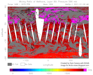
Satellite measurements better reflect the danger. The image on the right shows that the MetOp-1 satellite recorded peak methane levels as high as 2715 ppb at 469 mb on the morning of January 6, 2021. 

Most of the high (magenta-colored) levels of methane are located over oceans and a lot of them over the Arctic Ocean. 

The next image on the right shows the situation closer to sea level, at 586 mb, where even less of the high levels of methane show up over land, indicating that the methane originated from the seafloor. 

The third image on the righ shows the situation even closer to sea level, at 742 mb, and almost all high levels of methane show up over the Arctic Ocean and over areas where the Atlantic Ocean and the Pacific Ocean border on the Arctic. 

Because methane is lighter than air and much lighter than water, methane erupting from the seafloor will quickly rise up vertically. While much of the methane that is released from the seabed can get broken down in the water by microbes, methane that is rising rapidly and highly concentrated in the form of plumes will leave little opportunity for microbes to break it down in the water column, especially where waters are shallow,
as is the case in much of the Arctic Ocean.

As methane hydrates destabilize, methane will erupt with an explosive force, since methane is highly compressed inside the hydrate (1 m³ of methane hydrate can release 160 m³ of gas). Such eruptions can destabilize further hydrates located nearby. Because of this explosive force, plumes of methane can rise at high speed through the water column. 

Because methane is so much lighter than water, large methane releases from the seafloor will form larger bubbles that merge and stick together, developing more thrust as they rise through the water.

Because of this thrust, methane plumes will keep rising rapidly after entering the atmosphere, and the plumes will more easily push away aerosols and gases that slow down the rise in the air of methane elsewhere, such as where methane is emitted by cows. 

A further image of another satellite is added on the right. The N2O satellite recorded methane levels as high as 2817 ppb at 487 mb on the morning of January 10, 2021. 

Such sudden and very high peaks can hardly be caused by agriculture or wetlands, but instead they are likely caused by destabilization of methane hydrates in sediments at the seafloor. 

Further contributing to the danger is the fact that little hydroxyl is present in the atmosphere over the Arctic, so it is much harder for this methane to get broken down in the air over the Arctic, compared to methane emissions elsewhere. 

Finally, the edge of the stratosphere is much lower over the Arctic, as discussed in an earlier post.

All this makes that methane that is erupting from the seafloor of the Arctic Ocean is more prone to accumulate in the stratosphere. Once methane is in the stratosphere, it's unlikely that it will come back into the troposphere.

The IPCC AR5 (2013) gave methane a lifetime of 12.4 years. The IPCC TAR (2001) gave stratospheric methane a lifetime of 120 years, adding that less than 7% of methane did reach the stratosphere at the time. According to IPCC AR5, of the methane that gets broken down by hydroxyl in the atmosphere, some 8.5% got broken down in the stratosphere.

Conclusions

The situation is dire and calls for immediate, comprehensive and effective action as described in the Climate Plan.

In the video below, Paul Beckwith discusses the situation: 


For another perspective, Guy McPherson discusses the situation in the video below, Edge of Extinction: Maybe I’m Wrong


Links

• Climate Plan
https://arctic-news.blogspot.com/p/climateplan.html

• NASA Global Land-Ocean Temperature Index
https://data.giss.nasa.gov/gistemp

• What are El Niño and La Niña?
https://oceanservice.noaa.gov/facts/ninonina.html

• Multivariate El Niño/Southern Oscillation (ENSO) Index Version 2 (MEI.v2)
https://psl.noaa.gov/enso/mei 
 
• Temperatures keep rising
https://arctic-news.blogspot.com/2020/12/temperatures-keep-rising.html

• There is no time to lose
https://arctic-news.blogspot.com/2020/11/there-is-no-time-to-lose.html

• Possible climate transitions from breakup of stratocumulus decks under greenhouse warming, by Tapio Schneider et al. (2019)
https://www.nature.com/articles/s41561-019-0310-1

• A rise of 18°C or 32.4°F by 2026?

• Greater committed warming after accounting for the pattern effect - by Chen Zhou et al. 

• Upper Ocean Temperatures Hit Record High in 2020 - by Lijing Cheng et al. 
https://link.springer.com/article/10.1007/s00376-021-0447-x

• How close are we to the temperature tipping point of the terrestrial biosphere? - by Katharyn Duffy et al.
https://advances.sciencemag.org/content/7/3/eaay1052

• Methane hydrates tipping point threatens to get crossed

• Temperatures threaten to become unbearable

• Cold freshwater lid on North Atlantic

• Aerosols

• NOAA - Trends in Atmospheric Methane
https://www.esrl.noaa.gov/gmd/ccgg/trends_ch4

•  COVID-19 lockdown causes unprecedented drop in global CO2 emissions in 2020 - Gobal Carbon Project
https://www.globalcarbonproject.org/carbonbudget/20/files/International_FutureEarth_GCB2020.pdf

• Global Average Temperatures in 2020 Reached a RECORD HIGH of 1.55 C above PreIndustrial in 1750 - by Paul Beckwith 
https://www.youtube.com/watch?v=O0lgTAEUYyA

• Edge of Extinction: Maybe I’m Wrong - by Guy McPherson
https://guymcpherson.com/2021/01/edge-of-extinction-maybe-im-wrong

• Extinction
https://arctic-news.blogspot.com/p/extinction.html


Monday, November 9, 2015

Ocean Heat

Sea Surface Temperatures

Sea surface temperatures were as high as 15.8°C or 60.4°F near Svalbard on November 7, 2015, a 13.7°C or 24.7°F anomaly. Let this sink in for a moment. The water used to be close to freezing point near Svalbard around this time of year, and the water now is warmer by as much as 13.7°C or 24.7°F.

[ click on image to enlarge ]
Above image further shows that sea surface temperature anomalies as high as 6.7°C or 12.1°F were recorded on November 7, 2015, off the coast of North America, while anomalies as high as 6°C or 10.9°F were recorded in the Bering Strait.

NOAA analysis shows that the global sea surface in September 2015 was the warmest on record, at 0.81°C (1.46°F) above the 20th century average of 16.2°C (61.1°F). On the Northern Hemisphere, the anomaly was 1.07°C (1.93°F).

[ click on image to enlarge ]

How did temperatures get so high near Svalbard? The answer is that ocean currents are moving warm water from the Atlantic Ocean into the Arctic Ocean. The ocean is warmer underneath the sea surface and at that location near Svalbard warm water from below the surface emerges at the surface.

Ocean Heat

The oceans are warming up rapidly, especially the waters below the sea surface. Of all the excess heat resulting from people's emissions, 93.4% goes into oceans. Accordingly, the temperature of oceans has risen substantially over the years and - without action - the situation only looks set to get worse.

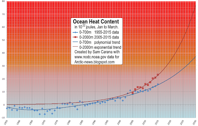
NOAA's ocean heat content figures for 0-2000 m are very worrying, as illustrated by the image below.


The image below was created with data for January through to March, while adding non-linear trendlines for ocean heat at depths of 0-700 m and 0-2000 m. For growth of ocean heat content for 0-700 m, a polynomial trend is added, while for growth of ocean heat content for 0-2000 m an exponential trend is added.

[ click on images to enlarge ]
The image below shows a polynomial trend based on all available quarterly data for ocean heat content from 0 to 2000 m. The trendline shows even faster growth.


The danger is that, as ocean heat continues to grow, ocean currents will keep carrying ever warmer water from the Atlantic and Pacific Oceans into the Arctic Ocean.

Merely watching temperatures at the surface of the ocean may underestimate the warming that is taking place below the sea surface. At the sea surface, evaporation takes place that cools the water. Furthermore, melting of sea ice and glaciers will make that a layer of cold freshwater spreads at the surface, preventing much transfer of heat from the ocean to the atmosphere, as discussed at this earlier post. The blue-colored areas on the Northern Hemisphere on the top image are partly the result of this meltwater. There is another reason why these areas are relatively cool, i.e. sulfates, as further discussed in the section below.

Aerosols

Particulates, in particular sulfate, can provide short-term cooling of the sea surface. Large amounts of sulfate are emitted from industrial areas in the east of North America and in East Asia. On the Northern Hemisphere, the Coriolis effect makes that such emissions will typically reach areas over the nearby ocean to the east of such industrial areas, resulting in the sea surface there being cooled substantially, until the particulates have fallen out of the sky. Since the sulfate is emitted on an ongoing basis, the cooling effect continues without much interruption.

[ click on image to enlarge ]
This sulfate has a cooling effect on areas of the sea surface where ocean currents are moving warm water toward the Arctic Ocean. Because the sea surface gets colder, there is less evaporation, and thus less heat transfer from the ocean to the atmosphere during the time it takes for the water to reach the Arctic Ocean. As a result, water below the sea surface remains warmer as it moves toward the Arctic Ocean.


Similarly, as illustrated by above image, sulfur dioxide emitted in industrial areas in North America and East Asia can extend over the oceans, cooling the surface water of currents that are moving water toward the Arctic Ocean.

Methane

The image below shows that atmospheric methane levels in 2014 were 1833 parts per billion (WMO data) or 254% the pre-industrial level. WMO data are for 1984-2014 and are marked in red, while IPCC data (AR5) are for the years 1755-2011 and are marked in blue.


The image below shows the rise of methane levels from 1984 created with World Metereological Organization (WMO) data. The square marks a high mean 2015 level, from NOAA's MetOp-2 satellite images, and it is added for comparison, so it does not influence the trendline, yet it does illustrate the direction of rise of methane levels and the threat that global mean methane levels will double well before the year 2040.


The image below illustrates the danger that large amounts of methane will erupt from the Arctic Ocean, particularly in East Siberian Arctic Shelf, where the sea is quite shallow, so much of the methane can reach the atmosphere without being broken down by microbes on the way up through the water column.


The video below shows how methane concentrations start to rise close to sea level, and how concentrations strengthen at higher altitudes, and to eventually get lower at even higher altitudes.


The Threat

Ocean heat threatens to increasingly reach the seafloor of the Arctic Ocean and unleash huge methane eruptions from destabilizing clathrates. Such large methane eruptions will then warm the atmosphere at first in hotspots over the Arctic and eventually around the globe, while also causing huge temperature swings and extreme weather events, contributing to increasing depletion of fresh water and food supply, as further illustrated by the image below, from an earlier post.

[ click on image at original post to enlarge ]

The image below gives an indication of the ocean heat that is pushed by the Gulf Stream toward the Arctic Ocean. Note that this image shows the situation on November 15, 2015. Water off the east coast of North America is even warmer at the peak of the Northern Hemisphere summer and it is this water that is now arriving in the Arctic Ocean.


Below is a radio version of this post, roughly as read by Debba Kale Earnshaw at this episode and the next episode of extinctionradio.org


Malcolm Light comments:
To a geologist-oceanographer, the increasing rate of heat gain in the deep water seems obvious. Massive quantities of heat are generated in the earth's interior by radioactivity and find their way to the surface in rising convection systems to erupt along mid-ocean ridges as basaltic lava flows, pushing the plates apart. Under normal circumstances, prior to the arrival of civilized man, the plates cooled as they expanded by passing their heat into the oceans, which then was radiated into space.

Now, with the fast evolving atmospheric greenhouse Arctic methane global warming veil. the heat is simply being reflected back into the oceans and onto the land. Therefore, just like a pressure cooker, the Earth's interior heat is becoming trapped more and more and of course the end result will be a final blow-out. The more than 400 thousand years of ice core data show that we can expect a massive atmospheric methane peak caused by destabilization of the Arctic subsea methane hydrates very soon (8 to 16 years away) and it will produce a Permian style extinction event with a temperature increase of some 8 to 10 degrees C.


Climate Plan

The situation is dire and calls for comprehensive and effective action, as discussed at the Climate Plan.

Sea surface temperatures were as high as 15.8°C or 60.4°F near Svalbard on November 7, 2015, a 13.7°C or 24.7°F anomaly....
Posted by Sam Carana on Monday, November 9, 2015

Monday, June 1, 2015

Heat Wave Forecast For Russia Early June 2015


Following heat waves in Alaska and the north of Canada, the Arctic looks set to be hit by heat waves along the north coast of Russia in early June, 2015. The image below shows temperature anomalies at the top end of the scale for a large area of Russia forecast for June 6, 2015.


Meanwhile, the heat wave in India continues. It killed more than 2,100 people, reports Reuters, adding that the heat wave also killed more than 17 million chickens in May. The number of people killed by the heat wave is now approaching the 2,541 people killed by the 1998 heat wave in India, which is listed as the record number of deaths due to extreme temperatures in India by the Emergency Events Database.

Further records listed by the database are the well over 70,000 people killed by the 2003 heat wave in Europe and 55,736 people killed by the 2010 heat wave in Russia alone.

On above temperature forecast (left image, top right), temperatures over a large area of India will be approaching the top end of the scale, i.e. 50°C or 120°F. While such temperatures are not unusual in India around this time of year, the length of the heat wave is extraordinary. The heat wave that is about to hit Russia comes with even higher temperature anomalies. Even though temperatures in Russia are unlikely to reach the peaks that hit India, the anomalies are at the top end of the scale, i.e. 20°C or 36°F.

The image below shows a forecast for June 6, 2015, with high temperatures highlighted at four locations (green circles).


Below is a forecast for the jet stream as at June 7, 2015.

The animation below runs the time of the top image (June 6, 2015, 0900 UTC) to the above image (June 7, 2015, 1200 UTC), showing forecasts of the jet stream moving over the Arctic Ocean, with its meandering shape holding warm air that extends from Russia deep into the Arctic Ocean.


Below is another view of the situation.
Jet stream on June 6, 2015, 0900 UTC, i.e. the date and time that corresponds with the top image.
Clicking on this link will bring you to an animated version that also shows the wind direction, highlighting the speed (I clocked winds of up to 148 km/h, or 92 mph) of the jet stream as it moves warm air from Russia into the Arctic Ocean, sped up by cyclonic wind around Svalbard.

This is the 'open doors' feedback at work, i.e. feedback #4 on the feedbacks page, where accelerated warming in the Arctic causes the jet stream to meander more, which allows warm air to enter the Arctic more easily, in a self-reinforcing spiral that further accelerates warming in the Arctic.

The implications of temperatures that are so much higher than they used to be are huge for the Arctic. These high temperatures are heating up the sea ice from above, while rivers further feed warm water into the Arctic Ocean, heating up the sea ice from below.

Furthermore, such high temperatures set the scene for wildfires that can emit huge amounts of pollutants, among which dust and black carbon that, when settling on the sea ice, can cause large albedo falls.

The image below shows Russian rivers that end up in the Arctic Ocean, while the image also shows sea surface temperature anomalies as high as 8.2°C or 14.76°F (at the green circle, near Svalbard).


The big danger is that the combined impact of these feedbacks will accelerate warming in the Arctic to a point where huge amounts of methane will erupt abruptly from the seafloor of the Arctic Ocean.
The image below shows that methane levels as high as 2,566 ppb were recorded on May 31, 2015, while high methane levels are visible over the East Siberian Arctic Shelf.


Below is part of a comment on the situation by Albert Kallio:
As the soils warm up the bacteria in them and the insulating capacities of snow themselves tend to lead snow cover melting faster the warmer the soil it rests on becomes. (Thus the falling snow melts very rapidly on British soil surface if compared to Finland or Siberia where the underlying ground is much colder, even if occasionally the summers have similar or even higher temperatures).

The large snow cover over the mid latitude land masses is a strong negative feedback for the heat intake from the sun if the season 2015 is compared with the season 2012, but the massive sea ice and polar air mass out-transportation equally strongly weakens formation of new sea ice around the North Pole (and along the edges of the Arctic Ocean) as the air above the Arctic Ocean remains warm. The pile up of thin coastal ice also increases vertical upturning of sea water and this could have detrimental effects for the frozen seabed that is storing methane clathrates. The sunlight intake of the sea areas where sea ice has already disappeared corresponds largely with the 2012 season.

The inevitable snow melting around the Arctic Ocean will also transport record volumes of warmed melt water from the south to the Arctic Ocean. The available heat in the Arctic may also be later enhanced by the high sea water temperatures that prevail along the eastern and western coasts of North America, as well as El Nino event increasing temporarily air and sea surface temperatures. This leads to more depressions around Japan and Korea from where the warm air, storms and rains migrate towards Alaska and pull cold air away from Arctic over Russia, while pushing warm air through the Baring Strait area and Alaska to the Arctic Ocean region.

Forecasting seasonal out comes is likely to be increasingly difficult to make due to increasing number of variables in the seasonal melting processes and the resulting lack of historic precedents when the oceans and Arctic has been as warm as today. Thus the interplay of the opposing forces makes increasingly chaotic outcomes, in which the overall trend will always be for less ice and snow at the end of the season. Because of these reasons - including many others not explicitly mentioned here - the overall outcome for the blue ocean, or the ice-free Arctic Ocean, will be inevitable.

Whether the loss of sea ice happens this summer, or next, or one after that, the problem isn't going to go away and more needs to be done to geoengineer to save Arctic ice and wildlife dependent on summer sea ice.
John Davies responds:
Albert Kallio is absolutely right in saying that warmer temperatures are leading to a blue ocean event though the problem remains in which year this will happen. Additionally Methane is being released from the bottom of the ocean leading to increased Methane concentrations and all that means for a destabilising global climate. Frustratingly, the higher temperatures and increasing Methane concentrations are not yet quite sufficient for us to persuade the scientific community and the public that Armageddon is on the way. Hence it is not yet possible to be in a position to persuade the world community of the urgent need for Geo-engineering to save the Arctic and Global climate. However we may reach this situation in the near future and that will be the only time when it might be possible to save the global climate and prevent Armageddon.

The situation is dire and calls for comprehensive and effective action, as discussed at the Climate Plan page.


This image shows Russian rivers that end up in the Arctic Ocean, while it also shows sea surface temperature anomalies...
Posted by Sam Carana on Monday, June 1, 2015