Showing posts with label pre-industrial. Show all posts

Tuesday, October 14, 2025

Emissions and Temperature Rise

The image below shows the Planet by land biome, i.e. forests, grassland, desert, tundra and shrubland. Rainforests are common in equatorial areas and they have steady temperatures year-round and high precipitation allowing for evergreen and semi-evergreen trees. Boreal forests, also called Taiga, cover much of the planet’s northern latitudes and their trees are coniferous (non-shedding), while trees in temperate areas do shed their leaves (deciduous). 


Forests come with many climate benefits. Trees take carbon out of the atmosphere and store the carbon in the trees and in the soil, thus reducing global warming. Less carbon dioxide in the atmosphere also reduces ocean acidification. The top layer (canopy) of rainforests contains giant trees that can grow to heights of 75 m (about 250 ft) or more. The canopy prevents much sunlight from reaching the ground, thus cooling the surface locally. Trees hold the soil together and can pump up water from deep in the soil and, through evaporation, keep the surface and soil cool, thus also avoiding erosion and reducing fire hazards.  

So, trees are responsible for cooling in many ways. Trees can darken the surface, which can cause more sunlight to be absorbed, thus resulting in more warming, but trees can also cause cooling in another way. Trees also release terpines and other biogenic volatile organic compounds (BVOCs) into the air. These BVOCs can react chemically in the atmosphere to form aerosols that reflect incoming solar radiation and thereby cause global cooling. These aerosols can also act to start clouds to form that result in rainfall and that shade the surface, reflecting more solar radiation back into space and thus cause further global cooling. 

While BVOCs have many benefits, they can also indirectly increase potent greenhouse gases including ozone and methane by depleting hydroxyl. A study led by Gillian Thornhill found that this could cause half the cooling effects of BVOCs to be lost. A recent study led by James Weber found that, when all the effects are combined, they can reduce the net climate benefit of wide scale tree-planting by up to one third.


The above image shows that organic matter aerosol optical thickness (55 nm) as high as 0.93 τ was recorded over North Australia on October 14, 2025 06:00 UTC. 

A recent study led by Hannah Carle finds that a transition from sink to source has occurred for the aboveground woody biomass of the Australian moist tropical forests. Forests need to be supported and not just for their capacity to sequester carbon. The net climate benefit of trees is huge and is underestimated. While trees can cause some warming, they also cause more cooling. Their BVOCs are responsible for some depletion of hydroxyl, but this should be no reason to withhold support for forests. Instead, climate action should strongly support forests, while greater hydroxyl abundance is best accomplished by cleaning up industry sectors such as agriculture, transport and electricity generation. 

IPCC downplays the temperature rise

The IPCC downplays the temperature rise in efforts to hide some of the most effective and necessary action, e.g. by presenting the impact of land use, gases and aerosols in most peculiar ways. Instead of comparing the climate impact of forests versus agriculture in commonly comprehensible language, such as a rise in degrees Celsius, the IPCC uses technical terms to make things less comprehensible for the typical reader (and voter). 

As an example, the IPCC seeks to present deforestation as a change in land use that results in greater cooling, e.g. by arguing that deserts reflect more light back into space. As another example, the IPCC makes it look as if the temperature started rising only from 1850-1900, in efforts to hide the huge impact of deforestation that took place before those years. 

Of the 14.9 billion hectares of land on the planet, only 71% of it is habitable – the other 29% is either covered by ice and glaciers, or is barren land such as deserts, salt flats, or dunes. About 10,000 years ago, 57% of habitable land was covered by forest and 42% was covered by wild grassland and shrubs. In 2023, 45% of habitable land was used for agriculture, as illustrated by the image below


People have been herding animals and burning or cutting down trees for thousands of years. While much of the forests could initially regrow, the result of people's activities was a strong increase in emissions of carbon dioxide, methane and black carbon. 

The rise from 1750 to 2024 in methane, carbon dioxide and nitrous oxide is illustrated by the image on the right, based on IPCC and WMO data.  

While emission by people did accelerate since the start of the Industrial Revolution and even more recently, the rise in emission by people had already started thousands of years ago with growth in agriculture, herding of animals and associated deforestation, as illustrated by the combination image below, based on Ruddiman et al. (2015)

The temperature has risen accordingly since those times.

[ from earlier post ]
Emission caused by people's activities include carbon dioxide, methane and black carbon. A 2013 study by Bond et al. calculates that black carbon has a warming effect of about 1.1 W/m², part of which is caused by black carbon darkening the snow and ice cover since pre-industrial times, as discussed on the aerosols page. By some calculations, the temperature in 1520 had risen by 0.29°C, compared to thousands of years earlier.

September 2025 temperature anomaly

The image below shows how much higher the September 2025 temperature was than it was in 1951-1980. 


The above image shows that the September 2025 temperature anomaly was high over both poles and especially high over some areas in Antarctica, where anomalies higher than +10°C versus 1951-1980 were recorded. 

As the image below shows, the temperatures recorded over Antarctica throughout September 2025 were higher than in most earlier years, while a record daily high temperature was recorded on October 10, 2025, a +3.62°C anomaly compared to 1979-2000. The inset shows high temperature anomalies versus 1991-2020 at both poles on October 10, 2025.


The image below shows that the global September 2025 temperature anomaly was 1.306°C higher than 1951-1980. Note that the 2025 anomalies were reached under borderline La Niña conditions that suppress temperatures and that the monthly temperature anomaly would be significantly higher when calculated from 1850-1900, which is typically used by the IPCC as baseline. 

[ Temperature Rise, click on images to enlarge ]
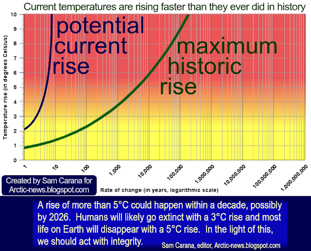
The full historic temperature rise and the rise to come soon could be much higher, as described on the image and below. The inset is also displayed and discussed in more detail below. 

Emissions and Temperature Rise

The observed temperature rise (O) is actually masked by aerosols (M) and the IPCC only includes the rise from the period 1850-1900, ignoring the rise before the period 1850-1900 (P) and the rise that took place to negate the natural fall in temperature. Aerosols could fall out of the air soon, so when adding things up (E1+E2), the historic temperature rise from pre-industrial (O+M+P) is huge. 

When also taking into account that the temperature would have fallen naturally (i.e. in the absence of these emissions and in line with Milankovitch cycles, the rise caused by people to negate that could also be included (E3), adding up to an even higher historic temperature rise (O+M+P+H).


Additionally, the full impact of all past emissions may not be fully felt yet, e.g. the full effect of carbon dioxide emissions reaches its peak only a decade after emission (E4). Furthermore, humans are likely to continue to cause emissions in the near future (E5). Finally, additional releases of greenhouse gases are likely to come from what was once called permafrost and from sinks turning into sources, resulting in an additional rise that's already baked into the cake (E6). Therefore, the historic rise plus the rise to come soon (O+M+P+H+F) may approach 5°C.  

The diagram below further illustrates the importance of feedbacks and deforestation. Removal of trees has caused deforestation and soil carbon loss since prehistoric times, in turn causing emissions including carbon dioxide, methane and black carbon, while also reducing cooling aerosols released by trees and while also reducing the heat buffer of evaporation that previously cooled the atmosphere. Since prehistoric times, burning wood and deforestation has caused emissions of black carbon and dust that blackened the snow and ice cover, thus speeding up its decline. 

[ from earlier post ]

The image below illustrates how much the temperature may have risen from pre-industrial times and how much potential there is for a 3°C rise as early as in 2026.

[ from earlier post ]
Climate Emergency Declaration

UN secretary-general António Guterres recently spoke about the need for “a credible global response plan to get us on track” regarding the international goal of limiting the global temperature rise. “The science demands action, the law commands it,” Guterres said, in reference to a recent international court of justice ruling. “The economics compel it and people are calling for it.”

What could be added is that the situation is dire and unacceptably dangerous, and the precautionary principle necessitates rapid, comprehensive and effective action to reduce the damage and to improve the outlook, where needed in combination with a Climate Emergency Declaration, as described in posts such as this 2022 post and this one and as discussed in the Climate Plan group.


Links

• NASA - Earth by Biome

• Nullschool.net

• Climate-driven chemistry and aerosol feedbacks in CMIP6 Earth system models - by Gillian Thornhill et al. (2021) 

• Missing the forest for the trees: The role of forests in Earth’s climate goes far beyond carbon storage - by Sarah Blichner and James Weber (2024) 
https://thebulletin.org/2024/05/missing-the-forest-for-the-trees-the-role-of-forests-in-earths-climate-goes-far-beyond-carbon-storage

• Chemistry-albedo feedbacks offset up to a third of forestation’s CO2 removal benefits - by James Weber et al. (2024) 

• Aerosols

• Aboveground biomass in Australian tropical forests now a net carbon source - by Hannah Carle et al. 
discussed on Facebook at: 

• Pre-industrial

• The World lost one third of forests

• WMO news release: Carbon dioxide levels increase by record amount to new highs in 2024
https://wmo.int/news/media-centre/carbon-dioxide-levels-increase-record-amount-new-highs-2024
WMO Greenhouse Gas Bulletin - No. 21 (issued October 15, 2025)
https://wmo.int/files/greenhouse-gas-bulletin-no-21
discussed on Facebook at:
https://www.facebook.com/groups/arcticnews/permalink/10163357891699679

• Record low Arctic sea ice volume minimum highlights methane danger
• Transforming Society
https://arctic-news.blogspot.com/2022/10/transforming-society.html

• Climate Plan
https://arctic-news.blogspot.com/p/climateplan.html

• Climate Emergency Declaration
https://arctic-news.blogspot.com/p/climate-emergency-declaration.html


Saturday, July 12, 2025

Will humans go extinct soon?

The image below shows the June 2025 temperature anomaly versus 1951-1980, using ERA5 data.

[ June 2025 temperature anomaly, click on images to enlarge ]
    [ from earlier post, click to enlarge ]
The above image shows relatively low anomalies over the Arctic Ocean, with a relatively cool area persisting in the North Atlantic, south of Greenland. This appears to reflect heavy melting, slowing down of the Atlantic Meridional Overturning Circulation (AMOC) and strong evaporation followed by more rainfall further down the track of the Gulf Stream, as illustrated by the image on the right.

The above image also shows high anomalies over parts of Antarctica and Antarctic sea ice. This appears to reflect changes to the Southern Meridional Overturning Circulation (SMOC).

Rising temperatures result in a loss of carbon storage, concludes a recent study led by Thomas Werner into marine heatwaves. 

   [ marine heatwave in North Pacific ]
The image on the right shows that the sea surface temperature was as much as 7.5°C (13.4°F) higher than 1981-2011 on July 16, 2025, 12:00 UTC, at the location marked by the green circle, reflecting a strong marine heatwave in the North Pacific. The image also shows a distorted Jet Stream (at 250 hPa).

Covering more than 70% of Earth’s surface, our global ocean has absorbed 90% of the warming that has occurred in recent decades due to increasing greenhouse gases, and the top few meters of the ocean store as much heat as Earth's entire atmosphere, as described by a NASA post

A small reduction in the 90% uptake of heat by oceans could result in a huge rise in the global air temperature, and studies warn about changes that are occurring in the AMOC and SMOC, as discussed in earlier posts such as this one. Such feedbacks could strike hard very rapidly, i.e. as fast feedbacks. 

The IPCC (AR6 WG1 SPM page 11) uses an equilibrium climate sensitivity of 3°C, but James Hansen says fast-feedback equilibrium climate sensitivity is 4.8°C and equilibrium global warming for today’s amount of greenhouse gases (4.1 W/m²) is 10°C, which includes a 2°C rise that would eventuate by the falling away of the aerosols that currently mask the temperature rise. 

A 2024 study led by Judd finds that climate sensitivity has historically been about 8°C. 

[ Temperature rise vs 1901-2000 (ClimateReanalyzer) and vs 1850-1900 (IPCC, inset left) ]

The IPCC appears to be downplaying the temperature rise in multiple ways, including by using linear trends, a late baseline and a low climate sensitivity, to give the false impression that polluters could continue to pollute for decades to come. 
 
The above images illustrate what the world would look like under a CMIP6 SSP5-8.5 scenario by February 2100, compared to 1891-1910. Obviously, such a rise would devastate sea ice and permafrost, triggering and accelerating numerous feedbacks, resulting in widespread forest fires and releases of greenhouse gases.


The 36-month running average for albedo (reflectivity) for May 2025 is down to a record low of 28.711%, as illustrated by the above Eliot Jacobson image.


The 36-month running mean for the Earth energy imbalance grew in May 2025 to 11.36 Hiroshimas per second. That's roughly 980,000 Hiroshimas per day in planetary warming, adds Eliot Jacobson.

As said, the IPCC keeps downplaying the potential impact of feedbacks such as changes to ocean currents, wind patterns, clouds and water vapor, and loss of sea ice and permafrost, thus failing to warn people about a near-future in which temperatures could rise strongly due to such feedbacks, especially during an El Niño, and due to further reduction of the aerosol masking effect, developments that could rapidly speed up existing feedbacks and trigger new feedbacks, resulting in more extreme weather events striking with a ferocity, frequency and ubiquity that keeps increasing at an accelerating pace.

   [ NOAA ENSO outlook ]
The updated ENSO outlook (CFSv2 ensemble mean, black dashed line, image on the right, adapted from NOAA) favors borderline La Niña during the Northern Hemisphere fall and early winter 2025-2026.

The image below illustrates the outlook of borderline La Niña for the Northern Hemisphere fall and early winter 2025-2026. On July 29, 2025, the average temperature in Niño 3.4, an area in the Pacific that is indicative for El Niño development (inset), had fallen to 26.7°C, an anomaly of -0.35°C from 1991-2020.


The current ENSO conditions make it even more significant that on July 14, 2025, the global temperature was 16.86°C, i.e. higher than the temperature was in 2023 or 2024 on this day, as illustrated by the image below, adapted from Climate Reanalyzer. 


The earlier image below shows a preliminary 16.85°C that was later upgraded to 16.86°C (final). The point is that this is a record high for that day and 0.3°C below the highest daily temperature on record (17.16°C) that was reached on July 22, 2024 (image adapted from Copernicus).

The image below shows monthly temperature anomalies through June 2025, based on ERA5 anomalies vs 1951-1980 from Jan 2014-June 2025 (red circles). 
In the above image, data are adjusted by 1°C to reflect a pre-industrial base (black circles). Cubic trends are added to show that 3°C could be crossed late 2028 (red) or early 2027 (black). 

The image below shows surface air temperature anomalies April 1, 2023, through July 14, 2025 (final), with a red trend added that warns about a potentially huge temperature rise later in 2025.


Furthermore, sea surface temperatures are on the rise again. The image below shows the global sea surface temperature through July 20, 2025 (60°S–60°N, 0–360°E).


How much could temperatures rise? The image below is a combination image. The top image shows a trend based on annual sea surface temperature anomalies in the Northern Hemisphere through 2022. The bottom image shows a trend based on annual sea surface temperature anomalies in the Northern Hemisphere through 2023. The trend in the bottom image shows an even steeper rise than the trend in the top image. This shows that a polynomial trend can sometimes be a good indicator of the rise to come.


The current ENSO conditions also make it even more significant that the global sea ice area anomaly was 2.56 million km² below the 1981-2010 mean on July 30, 2025, a standard deviation of -4.33σ from 1981-2010.
Global sea ice extent was 21.92 million km² on July 31, 2025, a deviation of -4.88σ, as illustrated by the image below. 


Arctic sea ice volume was at a record daily low on August 3, 2025, as it has been for more than a year, as illustrated by the image below.

The image below shows Arctic sea ice concentration on August 3, 2025.


Seafloor methane

As the temperature of the water of the Arctic Ocean rises, more ocean heat can penetrate sediments at the seafloor of the Arctic Ocean, which can destabilize methane hydrates contained in these sediments and cause eruptions of huge amounts of methane from the hydrates and from free gas kept underneath these hydrates.

The image below shows that methane concentrations as high as 2535 parts per billion (ppb) were recorded at a pressure level of 695.1 mb by the NOAA 20 satellite on July 30, 2025 AM. High concentrations of methane show up at latitudes higher than 30°N.


The image below shows hourly methane measurements taken at the Barrow Atmospheric Baseline Observatory (BRW), a NOAA facility located near Utqiaġvik (formerly Barrow), Alaska, at 71.32 degrees North.


The image below repeats the IPCC's response, or rather its failure to respond.


A 3°C rise constitutes an important threshold, since humans will likely go extinct with such a rise. As illustrated by the image below, we may already be more than 2°C above pre-industrial and face a potentially huge temperature rise over the next few years.

[ from the post When will humans go extinct? ]
   [ from: When Will We Die? ]
Recent research led by David Fastivich finds that, historically, vegetation responded at timescales from hundreds to tens of thousands of years, but not at timescales shorter than about 150 years. It takes centuries for tree populations to adapt - far too slow to keep pace with today’s rapidly warming world.

Note that vegetation depends on the presence of a lot of things including healthy soil, microbes, moisture, nutrients and habitat. 

A 2018 study by Strona & Bradshaw indicates that most life on Earth will disappear with a 5°C rise (see box on the right). Humans, who depend on a lot of other species, will likely go extinct with a 3°C, as discussed in the earlier post When Will We Die? 

Climate Emergency Declaration

The situation is dire and the precautionary principle calls for rapid, comprehensive and effective action to reduce the damage and to improve the situation, as described in this 2022 post, where needed in combination with a Climate Emergency Declaration, as discussed at this group.


Links

• Climate Reanalyzer
https://climatereanalyzer.org

• IPCC AR6 WG1 Figure 4.35 | Comparison of RCPs and SSPs
https://www.ipcc.ch/report/ar6/wg1/downloads/figures/IPCC_AR6_WGI_Figure_4_35.png
https://www.ipcc.ch/report/ar6/wg1/figures/chapter-4/figure-4-35

• Saltier water, less sea ice
https://arctic-news.blogspot.com/2025/07/saltier-water-less-sea-ice.html

• Nullschool.net
https://earth.nullschool.net

• Marine heatwaves as hot spots of climate change and impacts on biodiversity and ecosystem services - by Thomas Wernberg et al.
discussed on Facebook at: 
https://www.facebook.com/groups/arcticnews/posts/10162992131044679

• Copernicus
https://pulse.climate.copernicus.eu

• NASA - Ocean warming (December 2024) 
https://climate.nasa.gov/vital-signs/ocean-warming/?intent=121

• Arctic Blue Ocean Event 2025? (update June 2025)
https://arctic-news.blogspot.com/2025/06/arctic-blue-ocean-event-2025-update-June-2025.html

• A 485-million-year history of Earth’s surface temperature - by Emily Judd et al. (2024) 
https://www.science.org/doi/10.1126/science.adk3705
discussed on Facebook at: 
https://www.facebook.com/groups/arcticnews/posts/10161741588279679

• Global warming in the pipeline - by James Hansen et al. 
https://academic.oup.com/oocc/article/3/1/kgad008/7335889
discussed on Facebook at: 
https://www.facebook.com/groups/arcticnews/posts/10161110558744679


• Pre-industrial
https://arctic-news.blogspot.com/p/pre-industrial.html

• NOAA - Climate Prediction Center - ENSO: Recent Evolution, Current Status and Predictions
https://www.cpc.ncep.noaa.gov/products/analysis_monitoring/lanina/enso_evolution-status-fcsts-web.pdf

• When will humans go extinct? 

• Coupled, decoupled, and abrupt responses of vegetation to climate across timescales - by David Fastovich et al. (2025)
discussed on Facebook at: 

• Danish Meteorological Institute - sea ice thickness and volume
• University of Bremen
https://seaice.uni-bremen.de/start

• Kevin Pluck - sea ice visuals
https://seaice.visuals.earth

• NOAA - satellite methane measurements
https://www.ospo.noaa.gov/products/atmosphere/soundings/heap/nucaps/new/nucaps_products.html

• NOAA - flask and station methane measurements
https://gml.noaa.gov/dv/iadv/index.php

• When Will We Die?

• Transforming Society
https://arctic-news.blogspot.com/2022/10/transforming-society.html

• Climate Plan
https://arctic-news.blogspot.com/p/climateplan.html

• Climate Emergency Declaration
https://arctic-news.blogspot.com/p/climate-emergency-declaration.html


Thursday, May 22, 2025

Paris Agreement thresholds crossed (update May 2025)

High temperatures persist

In the image below, created with NASA data, the decade from 1904 through 1913 is used as a custom base, illustrating that the temperature anomaly has been more than 1.5°C above this base for each of the past consecutive 22 months (July 2023 through April 2025), and even longer when compared to a pre-industrial base. The red line shows a trend (two-year Lowess Smoothing) that is pointing at 2°C above this base (1904-1913) getting crossed in the course of 2026.

[ trend points at 2°C above 1904-1913 getting crossed in 2026 ]
The temperature rise on land looks even more threatening, as illustrated by the image below. 

The above image shows land only monthly temperature anomalies from 1880-1920, with the red line (2-year Lowess Smoothing trend) showing an acceleration in April 2022. If extended, the red line points at crossing 3°C in the course of 2026. Humans are likely to go extinct with a 3°C rise, as discussed in earlier posts such as this one

An earlier analysis mentions that, when using 1750 as a base, this could add 0.3°C to the historic rise. The analysis adds that when using an even earlier base, even more could be added to the historic temperature rise.

Those who seek to delay or sabotage climate action typically call for use of a late base, in efforts to minimize the historic temperature rise. Using an earlier base can mean that temperatures are already higher than the thresholds that politicians at the adoption of the Paris Agreement pledged wouldn't be crossed, and it can also imply that the temperature rise is accelerating faster and further, due to stronger feedbacks such as more water vapor in the atmosphere and disappearance of lower clouds, all of which would constitute a stronger call for climate action.

The image below illustrates that air temperatures in the Northern Hemisphere have been very high over the past few months, at times reaching record high temperatures for the time of year, e.g. the temperature in the Northern Hemisphere was 10.08°C on May 14, 2025, the highest temperature on record for that day.

[ from earlier post, click on images to enlarge ]

These record high temperatures are the more significant as they were reached under ENSO-neutral conditions. On May 24, 2025, the sea surface temperature was 27.51°C, 0.35°C below 1991-2020, in Niño 3.4, an area in the Pacific (inset) that is critical to the development of El Niño, as illustrated by the image below. The Niño 3.4 anomaly is now lower than it has been for each day in March 2025, when La Niña conditions dominated.


The ENSO outlook below is dated May 8, 2025. It shows that ENSO-neutral conditions are likely to persist for the remainder of 2025, edging on La Niña conditions.


The ENSO outlook is dated May 18, 2025.


As said, to see such high temperatures under ENSO-neutral conditions is significant, it indicates that feedbacks are stronger than many models have anticipated, which implies that feedbacks will continue to grow stronger, given the rapid temperature rise over the past few years (black trend). A new El Niño may develop soon, potentially in April 2026, as the red trend in the image below warns about. The result could be a huge rise in temperature over the course of 2026 (red trend).


As said, different bases can be used, e.g. in the above images anomalies are calculated versus bases such as 1904-1913, 1880-1920, 1991-2020 and 1901-2000. None of them is pre-industrial. So, what would the temperature anomaly look like when a genuinely pre-industrial base was used? 

The image below, from an earlier post, uses NASA monthly data through March 2023. Data are first adjusted from NASA's default 1951-1980 base to an earlier 30-year base, i.e. a 1886-1915 base, and then further adjusted by 0.99°C to reflect ocean air temperatures, higher polar anomalies and a pre-industral base

The image below is an update, the same adjustments are made to data through April 2025.  


How the 0.99°C adjustment in the above images is calculated is shown in the bright yellow inset of the image below. 

[ from April 2024 post, click on images to enlarge ]
The images show that, when adjusting the data and using a genuinely pre-industrial base, the temperature rise may have already crossed both the 1.5°C and the 2°C thresholds that politicians at the 2015 Paris Agreement pledged shouldn't and wouldn't be crossed.

IPCC keeps downplaying the danger

The IPCC keeps downplaying the danger in many ways. One way the IPCC does this is by selecting a base that minimizes the temperature rise and then to keep making the claim that we're still well below the 1.5°C threshold. The above image, from an April 2024 post, shows that the February 2024 temperature was 1.76°C above 1885-1915, and potentially 2.75°C above pre-industrial (bright yellow inset right). The red line (a six-months Lowess smoothing trend) highlights the steep rise that had already taken place by then. Minimizing the temperature rise will also minimize feedbacks that come with the temperature rise, such as a rise in water vapor and loss of lower clouds, which are self-amplifying feedbacks that further accelerate the temperature rise. In other words, by minimizing the historic temperature rise, the IPCC also seeks to minimize the rise to come. 

[ from a 2014 post, click on images to enlarge ]
An additional way used by the IPCC to downplay the danger is to suggest there was a "carbon budget", as if there was an amount of carbon to be divided among polluters that could continue to be consumed for decades to come.

The image on the right, from a 2014 post, points at the fallacy and deceit that comes with a carbon budget, carbon credits, offsets and net-zero emission targets that would, according to the IPCC, accomplish and maintain a "balance" between sources and sinks.

Instead, comprehensive and effective action is needed on multiple lines of action, simultaneously yet separately.

Indeed, action is needed to reduce concentrations of carbon both in oceans and in the atmosphere, while on land, the soil carbon content needs to increase, which can best be achieved by methods such as pyrolysis of biowaste and adding the resulting biochar to the soil, to reduce emissions, reduce fire hazards, sequester carbon, support the presence of moisture & nutrients in the soil and thus support the health & growth of vegetation, as discussed at the Climate Plan group and the biochar group.

The IPCC has failed on at least three points:
1. failed to warn about the historic temperature rise and associated larger feedbacks 
2. failed to warn about mechanisms that could cause further acceleration of temperature rise soon  
3. failed to point at the best ways to combat climate change.

Higher temperatures come with feedbacks, as illustrated by the image below, from an earlier post.

[ the temperature in the atmosphere can keep rising, even in the absence of further emissions ]
The above image illustrates how feedbacks and crossing of tipping points can cause the temperature of the atmosphere to keep rising, even in the absence of further emissions, due to shrinking heat sinks (e.g. sea ice thickness loss and oceans taking up less heat).

The IPCC failed to warn about Antarctic sea ice decline, and - importantly - the amplifying impact of Antarctic sea ice decline on the global temperature rise. This was addressed in an earlier post as follows:
Sea ice loss results in less sunlight getting reflected back into space and instead getting absorbed by the ocean and the impact of Antarctic sea ice loss is even stronger than Arctic sea ice loss, as Antarctic sea ice is located closer to the Equator, as pointed out by Paul Beckwith in a video in an earlier post. A warmer Southern Ocean also comes with fewer bright clouds, further reducing albedo, as discussed here and here. For decades, there still were many lower clouds over the Southern Ocean, reflecting much sunlight back into space, but these lower clouds have been decreasing over time, further speeding up the amount of sunlight getting absorbed by the water of the Southern Ocean, and this 'pattern effect' could make a huge difference globally, as this study points out. Emissivity is a further factor; open oceans are less efficient than sea ice when it comes to emitting in the far-infrared region of the spectrum (feedback #23 on the feedbacks page).

2024 study led by Norman Loeb finds that large decreases in stratocumulus and middle clouds over the sub-tropics and decreases in low and middle clouds at mid-latitudes are the primary reasons for increasing absorbed solar radiation trends in the northern hemisphere.

Slowing down of the Atlantic meridional overturning circulation (AMOC) can cause more heat to accumulate at the ocean surface. Higher sea surface temperatures also come with greater stratification (image below, from earlier post).

Stratification and further changes in oceans and in wind patterns can cause a freshwater lid to form on top of the ocean surface, enabling more hot & salty water to flow underneath this lid (feedback #28), contributing to calving of glaciers and destabilization of sediments at the seafloor.


Increases in water vapor in the atmosphere, loss of sea ice and loss of lower clouds are three self-amplifying feedbacks, i.e. as temperatures rise, such feedbacks will push temperature up even further and due to their self-amplification, the temperature rise will accelerate.

Sea ice loss

One feedback of high temperatures and high concentrations of greenhouse gases is loss of sea ice. Polar amplification of the temperature rise is hitting the Arctic hard, and is also causing dramatic loss of Antarctic sea ice. Global sea ice area has been very low for the past few years, as illustrated by the image below. This has caused a lot of sunlight that was previously reflected back into space, to instead get absorbed by the sea surface. On May 24, 2025, global sea ice area was 17.75 million km², lowest on record for the day.


The image below, adapted from the Danish Metereological Institute, shows that Arctic sea ice volume on May 29, 2025, was at a record low for the time of year, as it has been for more than a year.


Sea ice is disappearing over large parts of the Arctic Ocean. The image below, adapted from the University of Bremen, shows sea ice concentration on May 29, 2025.


The screenshot below, from an earlier post, further illustrates the dangers that come with sea ice loss. Eruptions of methane from the seafloor of the Arctic Ocean is one of the most terrifying dangers. 

As the image below illustrates, some of the thickest sea ice disappears from the Arctic Ocean as it gets broken up by sea currents and the pieces get moved out along the edges of Greenland. The image shows how, on May 27, 2025, the sea ice gets broken up just north of Greenland, due to ocean currents that will also move the pieces to the south, alongside the edges of Greenland, toward the North Atlantic.

[ click on images to enlarge ]

Climate Emergency Declaration


The situation is dire and the precautionary principle calls for rapid, comprehensive and effective action to reduce the damage and to improve the situation, as described in this 2022 post, where needed in combination with a Climate Emergency Declaration, as discussed at this group.


Links

• NASA - datasets and images
https://data.giss.nasa.gov

• When Will We Die?
https://arctic-news.blogspot.com/2019/06/when-will-we-die.html

• Copernicus - Climate Pulse
https://pulse.climate.copernicus.eu

• Climate Reanalyzer
https://climatereanalyzer.org

• NOAA - Climate Prediction Center - ENSO: Recent Evolution, Current Status and Predictions
https://www.cpc.ncep.noaa.gov/products/analysis_monitoring/lanina/enso_evolution-status-fcsts-web.pdf

• NOAA - Climate Prediction Center - El Niño/Southern Oscillation (ENSO) Diagnostic Discussion

• Pre-industrial
https://arctic-news.blogspot.com/p/pre-industrial.html

• Feedbacks
https://arctic-news.blogspot.com/p/feedbacks.html

• NOAA - Office of Satellite And Product Operations - Sea Surface Temperatures
https://www.ospo.noaa.gov/products/ocean/sst/contour/index.html

• Nullschool.net
https://earth.nullschool.net

• Jet Stream
https://arctic-news.blogspot.com/p/jet-stream.html

• Cold freshwater lid on North Atlantic
https://arctic-news.blogspot.com/p/cold-freshwater-lid-on-north-atlantic.html

• Danish Meteorological Institute - Arctic sea ice volume and thickness
https://ocean.dmi.dk/arctic/icethickness/thk.uk.php

• University of Bremen
https://seaice.uni-bremen.de/start

• NASA - Worldview satellite images
https://worldview.earthdata.nasa.gov

• Transforming Society
https://arctic-news.blogspot.com/2022/10/transforming-society.html

• Climate Plan
https://arctic-news.blogspot.com/p/climateplan.html

• Climate Emergency Declaration
https://arctic-news.blogspot.com/p/climate-emergency-declaration.html