Showing posts with label 2026. Show all posts

Saturday, April 16, 2022

Runaway temperature rise by 2026?

March 2022 temperature anomaly

The NASA image below shows the March 2022 temperature anomaly. The Arctic is heating up strongly. 


The above image shows a temperature rise for March 2022 of 1.06°C, which is the rise from 1951-1980. The image below shows a temperature rise from 1900 for March 2022 of 1.36°C. 


[ click on images to enlarge ]
The box on above image shows that, when including further adjustment, the temperature rise from pre-industrial to March 2022 could be as much as 2.35°C. Details of the adjustment are described at the pre-industrial page. A 2.35°C rise is only 0.65°C away from a 3°C rise and, as described before, a 3°C rise will likely drive humans (and many other species) into extinction. 

Note that the March 2022 temperature is suppressed, as we're currently in the depth of a persistent La Niña, as illustrated by the NOAA image on the right. 


[ click on images to enlarge ]
The above NOAA image shows that the difference between the top of El Niño and the bottom of La Niña could be more than half a degree Celsius. The peak of the next El Niño may well coincide with a high number of sunspots (NOAA image right). 

The image below features two trends. The black trend is based on adjusted Jan.1880-Mar.2022 NASA data and shows how 3°C could be crossed in 2027. The blue trend is based on adjusted Apr.2012-Mar.2022 NASA data and better reflects short-term variables such as sunspots and El Niño. The blue trend shows how 3°C could be crossed in 2025, triggered by an emerging El Niño and high sunspots. 


Runaway temperature rise

[ click on images to enlarge ]
A strong El Niño combined with high sunspots could cause the global temperature rise to cross 3°C in 2025.

Moreover, this could trigger runaway temperature rise, starting before 2026 where the temperature rise is felt most strongly, i.e. in the Arctic, especially during El Niño events, as illustrated by the image on the right that shows anomalies (vs 1951-1980) as high as 6.6°C in the Arctic.  


[ see the Extinction page ]
The potential temperature rise is illustrated by the bar on the right.

As temperatures rise, loss of Arctic sea ice and of its latent heat buffer will cause more heating of the atmosphere, while changes to the Jet Stream will cause more extreme weather. 

As humans go extinct, transport and industrial activities will stop that currently co-emit sulfur that masks the full extent of the temperature rise. 

In addition, as also discussed at the aerosols page, worldwide forest fires and trash fires could cause huge amounts of black carbon to be emitted. 

Rising temperatures will result in more water vapor in the atmosphere (7% more water vapor for every 1°C warming), further amplifying the temperature rise, since water vapor is a potent greenhouse gas. 

As the IPCC warns (see above image), for each additional 1°C of warming, the global volume of perennially frozen ground to 3 m below the surface is projected to decrease by about 25% relative to the present volume, and the IPCC adds that these decreases may be underestimates. As permafrost declines, huge amounts of carbon dioxide, methane and nitrous oxide get released. 

As the ocean heats up, a huge temperature rise could be caused by releases of seafloor methane, further contributing to the clouds tipping point (at 1200 ppm CO₂e) to get crossed, causing a further rise of 8°C. Altogether, the temperature rise could exceed 18°C.

The situation is dire and calls for comprehensive and effective action, as described in the Climate Plan.

In the video below, Jennifer Hynes and Sandy Schoelles discuss the temperature rise. 


Links

• NASA Gistemp
https://data.giss.nasa.gov/gistemp

• Pre-industrial
https://arctic-news.blogspot.com/p/pre-industrial.html

• When Will We Die?
https://arctic-news.blogspot.com/2019/06/when-will-we-die.html

• NOAA - Monthly Temperature Anomalies Versus El Niño
https://www.ncei.noaa.gov/access/monitoring/monthly-report/global/202203/supplemental/page-4

• NOAA - ENSO: Recent Evolution, Current Status and Predictions
https://www.cpc.ncep.noaa.gov/products/analysis_monitoring/lanina/enso_evolution-status-fcsts-web.pdf

• NOAA - Solar cycle sunspots progression
https://www.swpc.noaa.gov/products/solar-cycle-progression

• Sunspots
https://arctic-news.blogspot.com/p/sunspots.html

• Extinction
https://arctic-news.blogspot.com/p/extinction.html

• Aerosols
https://arctic-news.blogspot.com/p/aerosols.html

• Arctic Hit By Ten Tipping Points
https://arctic-news.blogspot.com/2020/04/arctic-hit-by-ten-tipping-points.html

• IPCC - FAQ on water vapor
https://wg1.ipcc.ch/publications/wg1-ar4/faq/wg1_faq-3.2.html

• IPCC - AR6 WG1 TS on permafrost
https://www.ipcc.ch/report/ar6/wg1/downloads/report/IPCC_AR6_WGI_TS.pdf

• Clouds feedback
https://arctic-news.blogspot.com/p/clouds-feedback.html

• Climate Plan
https://arctic-news.blogspot.com/p/climateplan.html


Tuesday, December 15, 2020

Temperatures keep rising


Temperatures keep rising. Above image uses NASA data that are adjusted to reflect a 1750 baseline, ocean air temperatures and higher polar anomalies, while showing anomalies going back to September 2011, adding a blue trend going back to 1880 and a red trend going back to September 2011. 

The map below also shows that in November 2020, especially the Arctic Ocean, again was very hot.


Anomalies in the above NASA image are compared to 1951-1980, while NOAA's default baseline for temperature anomalies is the 20th century average. In the Copernicus image below anomalies are compared to the 1981-2010 average. 

Using a different baseline can make a lot of difference. An earlier analysis pointed out that, when using a 1750 baseline and when using ocean air temperatures and higher Arctic anomalies, we did already cross  2°C above pre-industrial in February 2020.  

Above Copernicus image shows temperatures averaged over the twelve-month period from December 2019 to November 2020. The image shows that the shape of the global anomaly over the past twelve months is very similar to the peak reached around 2016. This confirms that global heating is accelerating, because the peak around 2016 was reached under strong El Niño conditions, whereas current temperatures are reached under La Niña conditions. Furthermore, sunspots are currently low. The La Niña and the low sunspots are both suppressing temperatures, as discussed in a recent post.

Future rise?

By how much will temperatures rise over the next few years?


Above image, from the U.N. Emissions Gap Report 2020, shows that growth in greenhouse gas emissions continued in 2019, with emissions reaching a total of 59.1 GtCO₂e. The commitments promised at the Paris Agreement in 2015 were not enough to limit the temperature rise to 1.5°C and those commentments were not even met, said António Guterres, United Nations Secretary-General, calling on all nations to declare a state of Climate Emergency until carbon neutrality is reached. Earlier, António Guterres had said: "We are headed for a thundering temperature rise of 3 to 5 degrees Celsius this century." 

What could cause a steep temperature rise over the next few years? 

A temperature rise of more than 3°C above pre-industrial could occur, and this could actually happen within a few years time. There are a number of reasons why the temperature rise could take place so fast, as described below.

As said, the temperature is currently suppressed by the current La Niña and the currently low sunspots (Hansen et al. give the sunpot cycle an amplitude of some 0.25 W/m²). Such short-term differences show up more in the red trend of the image at the top, which uses a polynomial trend over a short period. 

Compensating for the fact that sunspots are currently low and the fact that we're currently a La Niña period can already push the temperature anomaly well over the 2°C threshold that politicians at the Paris Agreement pledged would not be crossed.  


The above NOAA image and the NOAA image below illustrate that we are currently experiencing La Niña conditions
 

How long will it take before we'll reach the peak of the next El Niño? NOAA says:
El Niño and La Niña episodes typically last nine to 12 months, but some prolonged events may last for years. While their frequency can be quite irregular, El Niño and La Niña events occur on average every two to seven years. Typically, El Niño occurs more frequently than La Niña.
There are further reasons why the temperature rise could strongly accelerate over the next few years. Loss of cooling aerosols is one such reason. Another reason is the growing frequency and intensity of forest fires, which come with high emissions of methane, of heating aerosols such as black carbon and brown carbon, and of carbon monoxide that causes hydroxyl depletion, thus extending the lifetime of methane and heating aeosols. 

Map from earlier postThe vertical axis depicts
latitude, t
he North Pole is at the top (90° North),
the Equator in the 
middle (0°) and the South Pole 
at the bottom (-90° South). GHCN v4 land-surface
air + ERSST v5 sea-surface water temperature 
anomaly. The Arctic anomaly reaches 4.83°C or 
8.69°F 
vs 1951-1980, and 5.57°C vs 1885-1914.
A hotter world will will also hold more water vapor, a potent greenhouse gas. 
 
Furthermore, many tipping points affect the Arctic, e.g. more methane and nitrous oxide emissions can be expected to result from continued decline of what once was permafrost. 

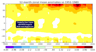
The temperature rise is felt the strongest in the Arctic, as illustrated by the zonal mean temperature anomaly map on the right, from an earlier post.

As one of the tipping points gets crossed in the Arctic, multiple feedbacks can start kicking in more strongly, resulting in multiple additional tipping points to subsequently get crossed. 
 
At least ten tipping points affect the Arctic, as described in an earlier post, and it looks like the latent heat tipping point has already been crossed, as illustrated by the image below, from an earlier post, which shows two such tipping points. 
 
[ from an earlier post ]

Huge temperature rise

When extending the vertical axis of the image at the top, a picture emerges that shows that a temperature rise of more than 13°C above 1750 could happen by 2026. The trend shows that 10°C is crossed in February 2026, while an additional rise of 3°C takes place in the course of 2026. The temperature could rise this much, in part because at 1200 ppm CO₂e the cloud feedback will start to kick in, which in itself can raise temperatures by an additional 8°C.


And the rise wouldn't stop there! Even when adding up the impact of only the existing carbon dioxide and methane levels, and then adding large releases of seafloor methane, this alone could suffice to trigger the cloud feedback, as described in an earlier post

Of course, there are further warming elements, in addition to carbon dioxide and methane, and they could jointly cause a rise of 10°C by 2026 even in case of smaller releases of seafloor methane, as illustrated by the image below. 
 
[ from an earlier post ]

[ from an earlier post ]
Above image illustrates how a temperature rise of more than as 10°C could eventuate as early as February 2026 when taking into account aerosol changes, albedo changes, water vapor, nitrous oxide, etc., as discussed in an earlier analysis

The joint impact of all warming elements, including the cloud feedback, threatens to cause a total rise of 18°C, as an earlier post warned, adding the image on the right. 

How high could the temperature rise? At a 3°C rise, humans will likely go extinct, while most life on Earth will disappear with a 5°C rise, and as the temperature keeps rising, oceans will evaporate and Earth will go the same way as Venus, a 2019 analysis warned. 

The situation is dire and calls for immediate, comprehensive and effective action, as described in the Climate Plan.


Links

• Climate Plan
https://arctic-news.blogspot.com/p/climateplan.html

• NOAA Global Climate Report - November 2020
https://www.ncdc.noaa.gov/sotc/global/202011

• NASA GISS Surface Temperature Analysis - maps
https://data.giss.nasa.gov/gistemp/maps/index.html

• What are El Niño and La Niña?
https://oceanservice.noaa.gov/facts/ninonina.html

• Multivariate El Niño/Southern Oscillation (ENSO) Index Version 2 (MEI.v2)
https://psl.noaa.gov/enso/mei

• Copernicus - surface air temperature for Novmber 2020
https://climate.copernicus.eu/surface-air-temperature-october-2020

• NOAA ISIS Solar Cycle Sunspot Number Progression
https://www.swpc.noaa.gov/products/solar-cycle-progression

• Secretary-General's address at Columbia University: "The State of the Planet"
https://www.un.org/sg/en/content/sg/speeches/2020-12-02/address-columbia-university-the-state-of-the-planet

• U.N. Emissions Gap Report 2020 
https://www.unenvironment.org/emissions-gap-report-2020

• U.N. Climate Ambitions Summit, December 12, 2020
https://www.climateambitionsummit2020.org/ondemand.php

• U.N. Paris Agreement (2015)
https://unfccc.int/process-and-meetings/the-paris-agreement/the-paris-agreement

• Why stronger winds over the North Atlantic are so dangerous
https://arctic-news.blogspot.com/2020/02/why-stronger-winds-over-north-atlantic-are-so-dangerous.html

• Feedbacks in the Arctic
https://arctic-news.blogspot.com/p/feedbacks.html

• September 2015 Sea Surface Warmest On Record
https://arctic-news.blogspot.com/2015/10/september-2015-sea-surface-warmest-on-record.html

• When will we die?
https://arctic-news.blogspot.com/2019/06/when-will-we-die.html

• A rise of 18°C or 32.4°F by 2026?
https://arctic-news.blogspot.com/2019/02/a-rise-of-18c-or-324f-by-2026.html

• Methane Hydrates Tipping Point threatens to get crossed
https://arctic-news.blogspot.com/2020/08/methane-hydrates-tipping-point-threatens-to-get-crossed.html

• Arctic Hit By Ten Tipping Points
https://arctic-news.blogspot.com/2020/04/arctic-hit-by-ten-tipping-points.html

• Crossing the Paris Agreement thresholds
https://arctic-news.blogspot.com/p/crossing.html

• 2°C crossed
https://arctic-news.blogspot.com/2020/03/2c-crossed.html

• Most Important Message Ever
https://arctic-news.blogspot.com/2019/07/most-important-message-ever.html

• Blue Ocean Event
https://arctic-news.blogspot.com/2018/09/blue-ocean-event.html

• Record Arctic Warming
https://arctic-news.blogspot.com/2016/04/record-arctic-warming.html

• There is no time to lose
https://arctic-news.blogspot.com/2020/11/there-is-no-time-to-lose.html

• Temperatures threaten to become unbearable
https://arctic-news.blogspot.com/2020/09/temperatures-threaten-to-become-unbearable.html

• Warning of mass extinction of species, including humans, within one decade
https://arctic-news.blogspot.com/2017/02/warning-of-mass-extinction-of-species-including-humans-within-one-decade.html

• Extinction
https://arctic-news.blogspot.com/p/extinction.html


Wednesday, August 16, 2017

Temperature Rise


How much could temperatures rise by 2026? The above image shows how a rise of 10°C (18°F) could occur by the year 2026, based on temperature anomalies from 1750 for February and on progressive growth of warming elements. The image below shows the same rise in another way.


Such a rise could take place even more rapidly, as discussed in the earlier post 10°C or 18°F warmer by 2021? For more on calculating the temperature rise from 1750 to 2016, see this page and this post.


Crucial will be the decline of snow & sea ice and associated feedbacks. Ominously, global sea ice is at a record low at the moment, as illustrated by the graph below by Wipneus.


[ click on images to enlarge ]
Arctic sea ice extent on August 15, 2017, was the 2nd lowest on record for the time of year (behind only 2012), as illustrated by the image on the right.

While extent was lower on August 15, 2012, Arctic sea ice is very thin at the moment, as the Arctic Ocean has become warmer, and sea ice could disappear altogether in one month time, as discussed in earlier posts such as this one.

And ominously, July 2017 was the hottest July on record, as illustrated by the image below.


[ click on images to enlarge ]
The July temperature anomaly was particularly high on land on the Southern Hemisphere (1.53°C or 2.75°F, compared to 1901-2000), as illustrated by the image on the right, showing a linear trend over the period 2012-2017.

Above image shows that July 2017 was 2.25°C (4.05°F) warmer than the annual global mean 1980-2015 (seasonal cycle). Only in August 2016 was it warmer (2.29°C), but then again, August 2017 looks set to be warmer than that yet.

The fall in thickness of the sea ice indicates that the buffer has gone that until now has consumed heat entering the Arctic Ocean during the melting season. In the absence of this buffer, where can all this extra heat go? Sea ice will start sealing off much of the surface of the Arctic Ocean by the end of September 2017, making it hard for more heat to escape from the Arctic Ocean by entering the atmosphere.

The Buffer has gone, feedback #14 on the Feedbacks page
The danger is that much of the extra heat will instead reach sediments at the seafloor of the Arctic Ocean that contain huge amounts of methane in currently still frozen hydrates.

[ click on images to enlarge ]
Higher temperatures could destabilize methane hydrates, resulting in huge methane eruptions.

A polynomial trend, based on NOAA July 1983 to January 2017 global monthly mean methane data, points at twice as much methane by 2034, as the image on the right shows. Stronger methane releases from the seafloor could make such a doubling occur even earlier. Over the next decade, methane will cause more warming than CO₂  twice as much methane will cause more than twice as much warming.

Methane reached peaks as high as 2881 ppb at 479 mb on August 18, 2017, as the combination image below shows (left panel, top left corner).
[ click on images to enlarge ]
The image doesn't specify the origin of the peak, but when levels are that much above the mean, the likely cause is either wildfires or clathrate destabilization. As the image in the right panel shows, methane levels at 280 mb were also very high over the Arctic Ocean north of Canada in the morning that day, which is unusual at such an altitude.

The image below shows that mean global methane reached a level of 1881 ppb at 280 mb (MetOp-1, am) on August 15, 2017.


The situation is dire and calls for comprehensive and effective action, as described at the Climate Plan.


Links

• Climate Plan
https://arctic-news.blogspot.com/p/climateplan.html

• Extinction
https://arctic-news.blogspot.com/p/extinction.html

• Temperature rise from 1750 to 2016
https://arctic-news.blogspot.com/p/temperature.html

• How much warming have humans caused?
https://arctic-news.blogspot.com/2016/05/how-much-warming-have-humans-caused.html

• Feedbacks
https://arctic-news.blogspot.com/p/feedbacks.html

• How much warming have humans caused?
https://arctic-news.blogspot.com/2016/05/how-much-warming-have-humans-caused.html

• 10°C or 18°F warmer by 2021?
https://arctic-news.blogspot.com/2017/04/10c-or-18f-warmer-by-2021.html

• Arctic Sea Ice Break Up August 2017
https://arctic-news.blogspot.com/2017/08/arctic-sea-ice-break-up-august-2017.html


Saturday, March 18, 2017

Which Trend Is Best?

NASA just released temperature data for February 2017. Should we be worried? Yes, there are many reasons to be very worried.

Let's go back in time. This is from a post written ten years ago:
We may suddenly face a future in which many if not most people will have little or no access to food, water, medicines, electricity and shelter, while diseases go rampant and gangs and warlords loot and devastate the few livable areas left. Human beings as a species will face the risk of total extinction, particularly if many species of animals and plants that humans depend on will disappear. The post continues: Many people are still in denial about the severity of the problem of global warming, the accumulation of dangers and their progression. 

Indeed, even today many people will still deny that such events could strike suddenly, e.g. within a few years time. Many people use linear trends to predict the future many years from now. As an example, the straight blue line on the graph below is a linear trend based on NASA 1880-current meteorological stations data. The problem is that linear trends, especially when based on data that go back many years, can make people overlook important recent changes such as the temperature rise that has taken place over the past few years, the decline of glaciers and sea ice and the recent increases in concentrations of carbon dioxide in the atmosphere.

[ click on image to enlarge ]
An alternative approach is to use recent data, e.g., from the year 2012, and then calculate a polynomial trend that extends a few years into the future. Taking such an approach can result in a polynomial trend (red curved line) that is contained in the NASA Land+Ocean data from January 2012 to February 2017. This trend shows the potential for a 10°C (18°F) rise four years from now, and this should act as a powerful warning.

The appropriateness of linear versus non-linear trends was also discussed earlier at the Controversy page.

In addition to looking at trends that are contained in such data, it makes sense to analyse the different elements contributing to such a rise. Such elements are discussed in more detail at the extinction page, which confirms the potential for a 10°C temperature rise within years, i.e. by the year 2026.

The situation is dire and calls for comprehensive and effective action as described in the Climate Plan.


Links


• Climate Plan
http://arctic-news.blogspot.com/p/climateplan.html

• Ten Dangers of Global Warming
http://arctic-news.blogspot.com/p/ten-dangers-of-global-warming.html

• Extinction
http://arctic-news.blogspot.com/p/extinction.html

• Controversy
http://arctic-news.blogspot.com/p/controversy.html

• Warning of mass extinction of species, including humans, within one decade
http://arctic-news.blogspot.com/2017/02/warning-of-mass-extinction-of-species-including-humans-within-one-decade.html


Wednesday, February 8, 2017

Warning of mass extinction of species, including humans, within one decade


[ click on images to enlarge ]
On February 10, 2017, 18:00 UTC it is forecast to be 0.1°C or 32.1°F at the North Pole, i.e. above the temperature at which water freezes. The temperature at the North Pole is forecast to be 30°C or 54°F warmer than 1979-2000, on Feb 10, 2017, 18:00 UTC, as shown on the Climate Reanalyzer image on the right.

This high temperature is expected as a result of strong winds blowing warm air from the North Atlantic into the Arctic.

The forecast below, run on February 4, 2017, shows that winds as fast as 157 km/h or 98 mph were expected to hit the North Atlantic on February 6, 2017, 06:00 UTC, producing waves as high as 16.34 m or 53.6 ft.


A later forecast shows waves as high as 17.18 m or 54.6 ft, as illustrated by the image below.


While the actual wave height and wind speed may not turn out to be as extreme as such forecasts, the images do illustrate the horrific amounts of energy contained in these storms.

Stronger storms go hand in hand with warmer oceans. The image below shows that on February 4, 2017, at a spot off the coast of Japan marked by green circle, the ocean was 19.1°C or 34.4°F warmer than 1981-2011.


As discussed in an earlier post, the decreasing difference in temperature between the Equator and the North Pole causes changes to the jet stream, in turn causing warmer air and warmer water to get pushed from the North Atlantic into the Arctic.

The image below shows that on February 9, 2017, the water at a spot near Svalbard (marked by the green circle) was 13°C or 55.3°F, i.e. 12.1°C or 21.7°F warmer than 1981-2011.

[ click on images to enlarge ]
Warmer water flowing into the Arctic Ocean in turn increases the strength of feedbacks that are accelerating warming in the Arctic. One of these feedbacks is methane that is getting released from the seafloor of the Arctic Ocean. Update: The image below shows that methane levels on February 13, 2017, pm, were as high as 2727 ppb, 1½ times the global mean at the time.

[ click on image to enlarge, right image added for reference to show location of continents ] 
What caused such a high level? High methane levels (magenta color) over Baffin Bay are an indication of a lot of methane getting released north of Greenland and subsequently getting pushed along the exit current through Nares Strait (see map below). This analysis is supported by the images below, showing high methane levels north of Greenland on the morning of February the 14th (left) and the 15th (right).


The image below shows methane levels as high as 2569 ppb on February 17, 2017. This is an indication of ocean heat further destabilizing permafrost at the seafloor of the Laptev Sea, resulting in high methane concentrations where it is rising in plumes over the Laptev Sea (at 87 mb, left panel) and is spreading over a larger area (at slightly lower concentrations) at higher altitude (74 mb, right panel).


This illustrates how increased inflow of warm water from the North Atlantic into the Arctic Ocean can cause methane to erupt from the seafloor of the Arctic Ocean. Methane releases from the seafloor of the Arctic Ocean have the potential to rapidly and strongly accelerate warming in the Arctic and speed up further feedbacks, raising global temperature with catastrophic consequences in a matter of years. Altogether, these feedbacks and further warming elements could trigger a huge abrupt rise in global temperature making that extinction of many species, including humans, could be less than one decade away.

Youtube video by RT America

Without action, we are facing extinction at unprecedented scale. In many respects, we are already in the sixth mass extinction of Earth's history. Up to 96% of all marine species and 70% of terrestrial vertebrate species became extinct when temperatures rose by 8°C (14°F) during the Permian-Triassic extinction, or the Great Dying, 252 million years ago.

During the Palaeocene–Eocene Thermal Maximum (PETM), which occurred 55 million years ago, global temperatures rose as rapidly as by 5°C in ~13 years, according to a study by Wright et al. A recent study by researchers led by Zebee concludes that the present anthropogenic carbon release rate is unprecedented during the past 66 million years. Back in history, the highest carbon release rates of the past 66 million years occurred during the PETM. Yet, the maximum sustained PETM carbon release rate was less than 1.1 Pg C per year, the study by Zebee et al. found. By contrast, a recent annual carbon release rate from anthropogenic sources was ~10 Pg C (2014). The study by Zebee et al. therefore concludes that future ecosystem disruptions are likely to exceed the - by comparison - relatively limited extinctions observed at the PETM.

An earlier study by researchers led by De Vos had already concluded that current extinction rates are 1,000 times higher than natural background rates of extinction and future rates are likely to be 10,000 times higher.

from the post 2016 well above 1.5°C
As above image shows, a number of warming elements adds up to a potential warming of 10°C (18°F) from pre-industrial by the year 2026, i.e. within about nine years from now, as discussed in more detail at the extinction page.


Above image shows how a 10°C (18°F) temperature rise from preindustrial could be completed within a decade.

https://sites.google.com/
site/samcarana/climateplan
The situation is dire and calls for comprehensive and effective action, as discussed in the Climate Plan.


Links

• Climate Plan
http://arctic-news.blogspot.com/p/climateplan.html

• Arctic Ocean Feedbacks
http://arctic-news.blogspot.com/2017/01/arctic-ocean-feedbacks.html

• Extinction
http://arctic-news.blogspot.com/p/extinction.html

• How much warming have humans caused?
http://arctic-news.blogspot.com/2016/05/how-much-warming-have-humans-caused.html

• Estimating the normal background rate of species extinction, De Vos et al. (2015)
https://www.ncbi.nlm.nih.gov/pubmed/25159086

• Anthropogenic carbon release rate unprecedented during the past 66 million years, by Zebee et al. (2016)
http://www.nature.com/ngeo/journal/v9/n4/full/ngeo2681.html

• Evidence for a rapid release of carbon at the Paleocene-Eocene thermal maximum, Wright et al. (2013)
http://www.pnas.org/content/110/40/15908.full?sid=58b79a3f-8a05-485b-8051-481809c87076

• RT America Youtube video
https://www.youtube.com/watch?v=OSnrDRU6_2g

• RT America Facebook video
https://www.facebook.com/RTAmerica/videos/10154168391051366