The image below, with the title Global Warming from 1900, featured in a 2016 post, now ten years ago.

In the above image, data are adjusted, showing the 1.5°C threshold crossed for two months in 2016. The added trend ominously shows the 1.5°C threshold getting crossed more permanently in 2022, while pointing at 2°C getting crossed in 2030.
What is pre-industrial?
The above 2016 image uses adjusted NASA data and a polynomial trend to illustrate the accelerating temperature rise from 1900. An adjustment of +0.28°C caters for the rise from 1900 to 1951-1980, since 1951-1980 is NASA's default base, which isn't a pre-industrial base. For more on such adjustment, also see this 2015 post. Of course, the year 1900 isn't pre-industrial either. For an analysis of the temperature rise going further back in time, have a look at the pre-industrial page.
Which trend works best?
Next to the question which base can best be used, there is a question which trend works best.
The image below, from a recent analysis led by Qinjian Jin, uses linear trends showing the temperature rising during 2011–2025 at a rate of 0.40°C per decade (purple), twice as much as the 0.20°C per decade during 1971–2025 (yellow). Extrapolating the accelerated (purple) rate projects a crossing of the 1.5°C threshold by 2028. The analysis shows that the temperature rise has doubled, but stops short from using polynomial trends and instead sticks to linear trends.

The analysis is also discussed by Paul Beckwith in the video below.
By comparison, the IPCC in AR6 gives values as depicted in the image below.

The image below is adapted from a 2023 analysis by James Hansen et al.

James Hansen et al. also conclude that the temperature rise is accelerating, but they also stop short from using polynomial trends and instead stick to linear trends.
One problem with linear trends is that they calculate the average temperature during a period, thus showing the average temperature over past years, while masking the current temperature and a potentially steep rise in future. In other words, linear trends can obscure both recent and future acceleration. By contrast, polynomial trends are better equipped to illustrate potential acceleration, while also smoothing out seasonal and temporary changes.
One problem with linear trends is that they calculate the average temperature during a period, thus showing the average temperature over past years, while masking the current temperature and a potentially steep rise in future. In other words, linear trends can obscure both recent and future acceleration. By contrast, polynomial trends are better equipped to illustrate potential acceleration, while also smoothing out seasonal and temporary changes.
Huge temperature rise
 |
| [ from the Extinction page ] |
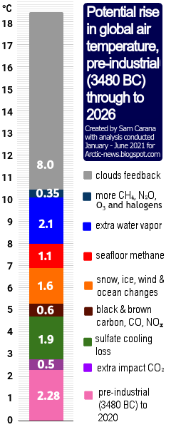
Eruptions of methane from the seafloor could, on their own, cause the 1200 ppm CO₂e cloud feedback tipping point to be crossed, which in turn can cause global temperatures to rise by 8°C, as discussed in this earlier post.
Temperatures look set to rise further due to the falling away of sulfate aerosols, while there could be a additional temperature rises due to releases of other aerosols that have a net warming impact, such as black and brown carbon, which can increase dramatically due to more wood burning and forest fires taking place as industrial activity collapses.
Pursuing efforts?
The temperature rise is clearly accelerating and denying such acceleration is yet another sick trick in the books of politicians, next to using an inappropriate base (instead of pre-industrial) and inappropriately using linear trends, even when polynomials obviously work better.
Conclusion
A decade ago, the post concluded as follows: the situation is dire and calls for comprehensive and effective action as described in the Climate Plan. This applies even more today. The situation is dire and unacceptably dangerous, and the precautionary principle necessitates the danger to be acknowledged, while facilitating rapid, comprehensive and effective action to reduce the damage and to improve the outlook, where needed in combination with a Climate Emergency Declaration, as described in posts such as in this 2022 post and this 2025 post, and as discussed in the Climate Plan group. For an update of the Climate Plan, see the Climate Plan by Sam Carana.
Links
• Pursuing efforts? (2016)
the image at the top is discussed on facebook at
• NASA GISS Surface Temperature Analysis (GISTEMP)
http://data.giss.nasa.gov/gistemp
http://data.giss.nasa.gov/gistemp
• A recent doubling of global warming rate signals a 1.5 °C breach by 2028 - by Qinjian Jin et al. (2026)
• Global Warming Rate Has Recently Doubled Meaning We Pass 1.5C By 2028 and 2.0C by as Early as 2038 - video by Paul Beckwith
discussed on facebook at
https://www.facebook.com/groups/arcticnews/posts/10164884114399679
https://www.facebook.com/groups/arcticnews/posts/10164884114399679
• Global warming in the pipeline - by James Hansen et al. (2023)
https://academic.oup.com/oocc/article/3/1/kgad008/7335889
• Pre-industrial
• Paris Agreement (2015)
https://unfccc.int/resource/docs/2015/cop21/eng/10a01.pdf
https://unfccc.int/resource/docs/2015/cop21/eng/10a01.pdf
https://unfccc.int/resource/docs/2015/cop21/eng/l09r01.pdf
• How Much Warming Have Humans Caused? (2016)
http://arctic-news.blogspot.com/2016/05/how-much-warming-have-humans-caused.html
• When Will We Die? (2019) • How Much Warming Have Humans Caused? (2016)
http://arctic-news.blogspot.com/2016/05/how-much-warming-have-humans-caused.html
https://arctic-news.blogspot.com/2019/06/when-will-we-die.html
• Extinction (2016)
https://arctic-news.blogspot.com/p/extinction.html
• Transforming Society (2022)
https://arctic-news.blogspot.com/2022/10/transforming-society.html
• Climate Emergency Declaration (2023)
https://arctic-news.blogspot.com/p/climate-emergency-declaration.html
https://arctic-news.blogspot.com/p/climateplan.html
• The Climate Plan by Sam Carana (2026)
https://arctic-news.blogspot.com/p/the-climate-plan-by-sam-carana.html