Above image shows NOAA Land+Ocean monthly temperature anomalies from the 20th century average. A trend has been added, based on the Jan.1880-Jan.2020 data. The trend shows that data in the early 1900s were some 0.28°C below the 20th century average.
Adjustment
When using a 1750 baseline, the data need to be adjusted even more than that 0.28°C, since it was even colder in 1750. The total baseline adjustment may well be 0.58°C, as discussed in an earlier post. Furthermore, ocean data in above image are sea surface temperatures. To reflect air temperatures, a further 0.1°C adjustment is applied. Finally, an extra 0.1°C adjustment is applied to reflect higher polar temperatures (as opposed to leaving out missing data). Altogether, this adds up to a 0.78°C adjustment, which implies that the temperature in January 2020 was 1.92°C above pre-industrial.
Which trend is most applicable?
How much and how fast could temperatures keep rising? That question looks even more important than this 0.78°C adjustment. Indeed, the trend added to even the unadjusted data (in above image) points at temperatures crossing 2°C average by 2026.
The image below shows a blue trend, similar to the trend in above image. In the image below, this blue trend points at temperatures crossing 3°C above pre-industrial by 2026.
As discussed in an earlier post, a 3°C temperature rise may well drive humans into extinction, while the rise could continue to exterminate all life on Earth.
As the image shows, the January 2020 anomaly is well above the blue trend. As discussed in an earlier post, a 2020 El Niño could be the catalyst to trigger feedbacks, including huge methane releases from the Arctic Ocean seafloor. While these feedbacks are already active in many ways, a 2020 El Niño could make them start kicking in much more strongly.
A short-term trend (in red) has therefore been added as well, to illustrate El Niño/La Niña variability and to highlight this danger. Ominously, the January 2020 anomaly is above this red trend as well. This is even more the case when the same analysis is done with NASA data, which produces similar results while the January 2020 adjusted temperature anomaly gets even higher, i.e. 1.96°C above pre-industrial.
The situation is dire and calls for immediate, comprehensive and effective action, as described in the Climate Plan.
The image below shows high temperatures over Antarctica. News reports show that temperatures as high as 18.3°C or 65°F were recently recorded on Antarctica. The image also shows high temperatures for the time of year over the North Atlantic, with strong winds along the path of the Gulf Stream.
Wind and temperature on February 8, 2020 at 18:00 UTC, near sea level (~100m, at 1000hPa)
The image below shows that wind speeds as high as 430 km/h or 267 miles per hour (mph) were recorded (at 250 hPa, jet stream, at green circle).
Wind on February 8, 2020 at 18:00 UTC, at 250 hPa (jet stream)
Above image also shows that Instantaneous Wind Power Density at the time was as high as 330.1 kW/m² (at the green circle). This is almost as strong as the wind was in 2015. Then, the Jet Stream at a nearby location reached a similar speed while Instantaneous Wind Power Density was slightly higher, at 338.3 kW/m².
So, why are stronger winds over the North Atlantic so dangerous?
Emissions by people heat up the air, which heats up oceans and makes winds stronger, in turn speeding up global ocean currents.
A recent study found increased kinetic energy in about 76% of the upper 2,000 meters of global oceans, as a result of intensification of surface winds since the 1990s.
As oceans heat up, more water evaporates from the sea surface. This evaporation will cool the sea surface somewhat, thus making that the sea surface can be colder than the water underneath the sea surface. Some of the water vapor will return to the ocean in the form of precipitation, but for each degree Celsius of warming, the atmosphere will hold 7% more water vapor, so much of the water vapor will remain in the atmosphere.
More water vapor in the atmosphere will further speed up global heating, since water vapor is a potent greenhouse gas.
Much of the water vapor will also get blown further along the path of the Gulf Stream in the direction toward the Arctic before precipitating, thus contributing - along with meltwater - to the formation of a cold freshwater lid at the surface of the ocean.
Stronger winds along the path of the Gulf Stream can make huge amounts of warm, salty water travel underneath this cold freshwater lid toward the Arctic, pushing up temperatures and salinity levels at the bottom of the Arctic Ocean and threatening to destabilize methane hydrates that are contained in sediments at the seafloor of the Arctic Ocean.
In summary, stronger winds can trigger huge eruptions of methane. Another recent study found that Arctic permafrost thaw plays a greater role in climate change than previously estimated. All this should be reason to take strong action to reduce this danger.
Emissions keep rising
Sadly, emissions show no sign of decline. The daily average CO₂ level at Mauna Loa, Hawaii was 416.08 ppm on February 10, 2020, higher than it has been for millions of years.
Since the annual peak is typically reached in May, even higher levels can be expected soon.
During the Paleocene–Eocene Thermal Maximum (PETM), about 55.5 million years ago, massive amounts of carbon dioxide were released into the atmosphere. The period lasted for some 200,000 years and global temperatures increased by 5–8°C. From the way emissions are rising now, it looks like we could reach even higher CO₂e forcing soon.
Indeed, the situation at Barrow, Alaska, doesn't look better, as illustrated by the image below, showing CO₂ levels up to February 13, 2020.
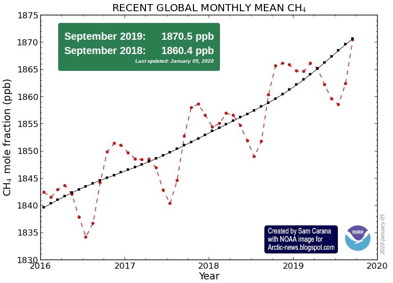
Very worrying is the rise in methane levels, as illustrated by the image below.
The image below shows methane levels at Barrow, Alaska, up to February 13, 2020.
High methane levels were recorded over the East Siberian Arctic Shelf (ESAS) by the MetOp-2 satellite on February 10 & 11, 2020, pm at 469 mb.
In the video below, recorded January 3, 2020, Guy McPherson and Josef Lauber discuss the track we're on.
Below is a video of an earlier discussion (February 25, 2019) between Guy McPherson and Josef Lauber.
The situation is dire and calls for immediate, comprehensive and effective action, as described in the Climate Plan.
Above image depicts how humans could go extinct within years. The image was created with NASA LOTI 1880-Dec.2019 data, 0.78°C adjusted to reflect ocean air temperatures (as opposed to sea surface temperatures), to reflect higher polar temperature anomalies (as opposed to leaving out 'missing' data) and to reflect a 1750 baseline (as opposed to a 1951-1980 baseline), with two trends added. Blue: a long-term trend based on Jan.1880-Dec.2019 data. Red: a short-term trend, based on Jan.2009-Dec.2019 data, to illustrate El Niño/La Niña variability and how El Niño could be the catalyst to trigger huge methane releases from the Arctic Ocean. This updates an earlier post with more detail on how the image was created.
The image below shows El Niño/La Niña variability going back to 1950, added to the NOAA monthly temperature anomaly.
Ocean heat is increasing rapidly, especially on the Northern Hemisphere, as illustrated by the NOAA image below, showing the rise from 1980 through 2019.
The image underneath uses the same data and has a trend added pointing at a 1.5°C anomaly from the 20th century average by the year 2026.
As discussed in an earlier point, there is a tipping point at 1°C above the 20th century average, i.e. there are indications that a rise of 1°C will result in most of the sea ice underneath the surface to disappear. This sea ice used to consume the inflow of warm, salty water from the Atlantic Ocean and the Pacific Ocean. So, while there may still be sea ice left at the surface, the latent heat buffer will be gone.
[ click on images to enlarge ]
Loss of the latent heat buffer speeds up heating of the Arctic Ocean, with the danger that huge amounts of methane will be released from the seafloor. The image below illustrates the danger, showing that peak methane levels as high as 2670 parts per billion (ppb) were recorded by the MetOp-1 satellite on January 2, 2020 pm at 469 mb.
Most worryingly, above image shows a large almost-solidly magenta-colored area blanketing the East Siberian Arctic Shelf (ESAS), with magenta indicating levels above 1950 ppb. Such satellite measurements indicate that large amounts of methane are erupting from the seafloor of the Arctic Ocean.
Above image shows that, a few years ago, methane was accumulating most strongly at an altitude corresponding to a pressure of some 400 mb. More recently, methane has been accumulating most strongly at higher altitudes, corresponding to a pressure of just under 300 mb, which is the upper limit of the troposphere over the North Pole. Methane tends to follow the Tropopause, i.e. at higher altitudes methane will be present in higher concentrations closer to the Equator, where the troposphere extends further into space, as discussed in an earlier post.
The NOAA graph below indicates that methane levels are growing at over 10 parts per billion per year, and this may actually underestimate global methane concentrations. The graph uses land-based measurements taken at sea level that can miss methane rising from the seafloor, especially from the seafloor of the Arctic Ocean, since there are few measuring stations in the Arctic in the first place. Land-based measurements can additionally overlook methane that is moving along the Tropopause from the Arctic toward the Equator.
Ominously, the image below shows high methane levels at Barrow, Alaska, at the end of January 2020.
Rising CO₂ levels are also worrying. A daily average CO₂ level of 415.79 ppm was recorded by NOAA at Mauna Loa, Hawaii, on January 21, 2020, a level that is unprecedented for millions of years. Since an annual peak is typically reached in May, we can expect even higher levels over the coming months.
It's not just at Mauna Loa that such high CO₂ readings were recorded recently. The image below shows CO₂ levels recorded recent;y at Barrow, Alaska.
Fires in Australia have contributed to these high CO₂ levels. The image below shows smoke plumes from fires in Australia on January 4, 2020.
Such fires can generate huge amounts of smoke, with smoke rising up high in the atmosphere and entering the stratosphere, while circumnavigating Earth. The ferocity of these fires is also shown in the NASA video below.
In the video below, Guy McPherson gives examples of species that went extinct rapidly.
Meanwhile, the Bulletin of the Atomic Scientists has moved the Doomsday Clock closer to Midnight, to 100 seconds to Midnight, adding that Civilization-ending nuclear war—whether started by design, blunder, or simple miscommunication—is a genuine possibility. Climate change that could devastate the planet is undeniably happening. And for a variety of reasons that include a corrupted and manipulated media environment, democratic governments and other institutions that should be working to address these threats have failed to rise to the challenge. Faced with a daunting threat landscape and a new willingness of political leaders to reject the negotiations and institutions that can protect civilization over the long term, the Bulletin of the Atomic Scientists Science and Security Board moved the Doomsday Clock 20 seconds closer to midnight—closer to apocalypse than ever.
The image below, created with thebulletin.org content and data from 1991 to 2020, has a linear trend added that points at Midnight by 2022.
The situation is dire and calls for immediate, comprehensive and effective action, as described in the Climate Plan.
by Andrew Glikson Earth and climate scientist Australian National University
Global warming and its disastrous consequences are now truly with us since the second part of 2019. At the moment a change in the weather has given parts of the country a respite from the raging fires, some of which are still burning or smoldering, waiting for another warm spell to flare up. The danger zones include the Australian Capital Territory, from where these lines are written. To date, 18.6 million hectares (186,000 square kilometers) were burnt, including native forests, native animals, homesteads and towns, and 24 people died. The firestorms betray harbingers of a planetary future, or a lack of such, under ever rising temperatures and extreme weather events inherent in fossil fuel driven global warming.
Global heating
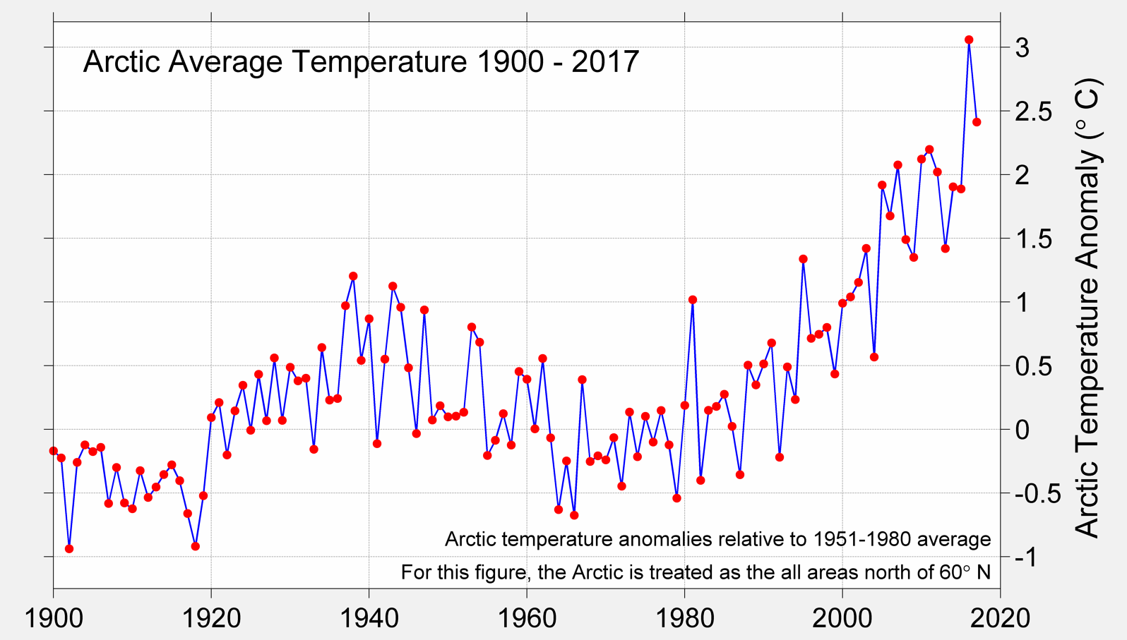
As the atmospheric concentration of the well-mixed greenhouse gases rise (CO₂ >411.76 ppm; CH₄ >1870.5 ppb; N₂O >333 ppb plus trace greenhouse gases) land temperatures soar (NASA global sea-land mean of 1.05°C since 1880). According to Berkeley Earth global land temperatures have increased by 1.5C over the past 250 years and mean Arctic temperatures have risen by 2.5°C to 3.0°C between 1900 and 2017. According to NASA :
“Extreme heatwaves will become widespread at 1.5 degrees Celsius warming. Most land regions will see more hot days, especially in the tropics.
At 1.5°C about 14 percent of Earth’s population will be exposed to severe heatwaves at least once every five years, while at 2 degrees Celsius warming that number jumps to 37 percent.”
“Risks from forest fires, extreme weather events and invasive species are higher at 2 degrees warming than at 1.5 degrees warming.”
“Ocean warming, acidification and more intense storms will cause coral reefs to decline by 70 to 90 percent at 1.5 degrees Celsius warming, becoming all but non-existent at 2 degrees warming.”
However, bar the transient masking effects of sulphur aerosols, which according to estimates by Hansen et al. (2011) induce more than 1.0°C of cooling, global temperatures have already reached near 2.0°C (by analogy to the requirement for a patient’s body temperature to be measured before and not after aspirin has been taken). As aerosols are not homogeneously distributed, in some parts of the world temperatures have already soared to such levels. Thus the degree to which aerosols cool the earth, which depends on aerosol particle size range, has been grossly underestimated.
The rate of global warming, at ~2 to 3 ppm year and ~1.5°C in about one century, faster by an order of magnitude then geological climate catastrophe such as the PETM and the KT impact, has taken scientists by surprise, requiring a change from the term climate change to climate calamity.
“The Indian Ocean Dipole (IOD) has returned to neutral after one of the strongest positive IOD events to impact Australia in recent history ... the IOD’s legacy of widespread warm and dry conditions during the second half of 2019 primed the Australian landscape for bushfire weather and heatwaves this summer. In the Pacific Ocean, although indicators of the El Niño–Southern Oscillation (ENSO) are neutral, the tropical ocean near and to the west of the Date Line remains warmer than average, potentially drawing some moisture away from Australia.”
Figure 2. (A) Australian mean temperature. (B) Severe fire weather. (C) Drought. (D) Driest year. Bureau of Meteorology
The prolonged drought (Figure 2 C, D), low fuel moisture, high temperatures (Figure 2A) and warm winds emanating from the inland have rendered large parts of the Australian continent tinder dry, creating severe fire weather (Figure 2B) subject to ignition by lightning and human factors. Fires on a large scale create their own weather (see: bushfire raging in Mount Adrah and firestorm). Observations of major conflagrations, including the 2003 Canberra fires, indicate fires can form atmospheric plumes which can migrate and as hot plumes radiating toward the ground (fire tornadoes).
The underlying factor for rising temperatures and increasingly severe droughts in Australia is the polar-ward shift in climate zones (see map Oceania) as the Earth warms, estimated as approximately 56-111 km per decade, where dry hot subtropical zones encroach into temperate zones, as is also the case in South Africa and the Sahara.
Smoke signals emanating from the Australian fires are now circling around the globe (Figure 3) signaling a warning of the future state of Earth should Homo sapiens, so called, not wake up to the consequences of its actions.
Figure 3. (A) Smoke emanating from the southeastern Australian fires (January 4, 2020);
(B) smoke from the pyro-cumulonimbus clouds of the Australian fires drifting across the Pacific Ocean.
The fire clouds have lofted smoke to unusual heights in the atmosphere. The CALIPSO satellite observed smoke soaring between 15 to 19 kilometers on January 6, 2020—high enough to reach the stratosphere. NASA.
Andrew Glikson
Dr Andrew Glikson
Earth and climate scientist
Australian National University


